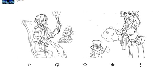
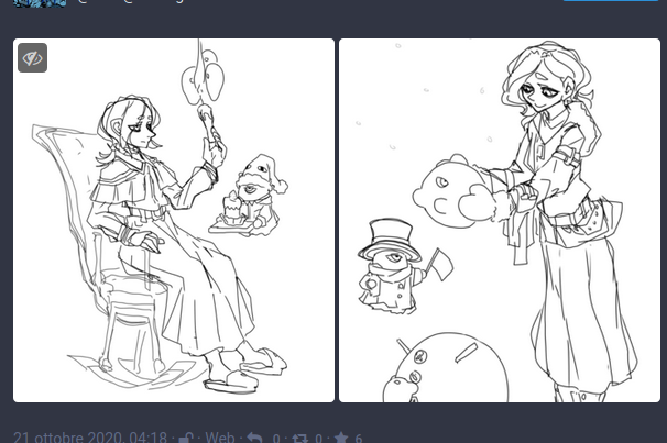
That's an issue that annoys me quite a lot too. If images are displayed fully though, it should be up to a given ratio, e.g. we don't want images like http://longc.at/longcat to take the app over.
But I think displaying the images fully isn't exactly what we want, what we probably want is an images section that is taller than it currently is and has a constant ratio, so the way images are presented remains consistent when I resize the window, maybe 3:2 or 16:9. The images probably should be zoomed in as they are now though, to avoid empty borders. Basically, I think what's in the web view is good.
What is even more important though IMO, is to be able to fully see an image, zoom in it, etc., without opening the whole post in a web browser, it should be doable in Tootle itself, e.g. the image could be opened in a subpage thanks to a HdyDeck wrapping the whole window.
What should happen:
The images should be fully displayed
What happened instead:
The post's blank expands on the images, cutting the lower and upper sides.
Screenshots (if applicable):
What it is The actual post view via web

Build context: