 sago007
commented
7 years ago
sago007
commented
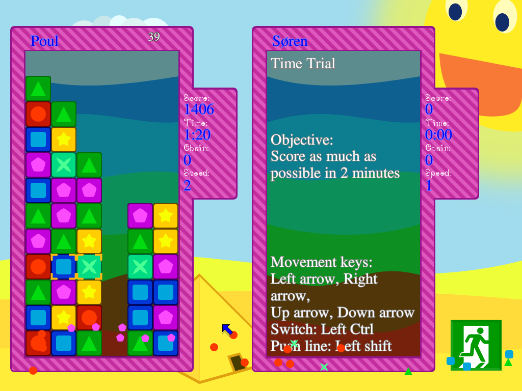
7 years ago Are you talking about 2.0.1 or the master version? I changed the menu font to FreeSerif in the menu some time ago (commit 72383a9e4333ecc1699c17fef457b6ac9bc741a8) to make it easier to read.
 scootergrisen
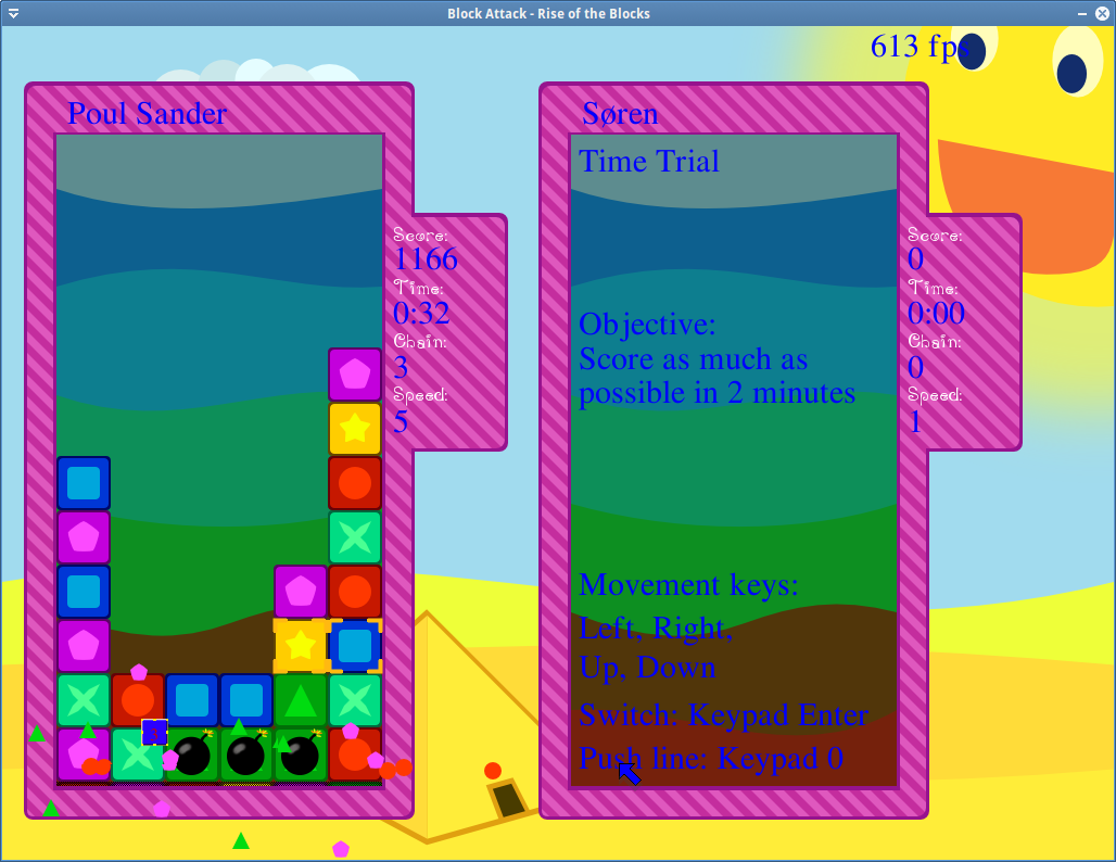
The font choice and color and placement could be better so the text was easier to read.