 sayan10rakshit
commented
1 year ago
sayan10rakshit
commented
1 year ago Top 50 Fast Food Chains in The US
Name: SAYAN RAKSHIT
Roll No: 21F1002696
 Image source:
 What works
- The visualization is visually descriptive and informative
- The use of brand logos makes the information more visually appealing
- The different groups are easily distinguishable from each other
- The color palette and font family make the visualization readable
What doesn't work
- The size and placement of the group labels makes it difficult to interpret the nature of the groups at a glance
- The visualization looks cluttered
- No aggregate information is provided for each group
- The brand boxes are not proportional, making it difficult to compare the brands within and across groups
- The small brand boxes are difficult to read
What can be improved
- A legend could be added to show the color coding of the groups
- The brand boxes could be made proportional so that it is easier to compare the brands within and across groups
- Distribution of the brand outlets can be shown by a supporting geospatial visualization to make the visualization more informative
- A sunburst chart can be used as a supporting visualization to compare between the groups and where the brands lie within the groups
 h1m4n3hu
 Source:
  anant7k
 savindraiitm
 Khushiin
 iSarthakGautam
 sejalanandIITM
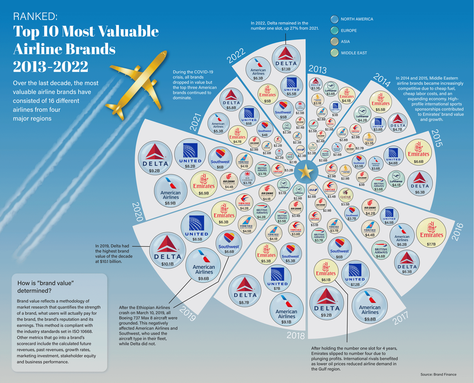
 ghost
ghost blackpearl006
 upatil98
 deep87we
 Vishvam10
 Prahlad19
 afnan-ahmad
 dipak-patil-iitm
 VarnikaRB
 abulaman8
 PavanReddy28
 Varun-Sood-IIT
 21f1004666
 SrivinaySridhar
 S-D-P
S-D-P viboognesh
 21f1005173
 priyanka-maz
 Image Source:
  mb1AtGithub
 SrijanShukla
 abhishekVH
 Shreyays
 harshadpaikrao
 faridkhan5
For the graded assignment 1, find a simple, stand-alone, static visualization and write a short critique on: How effective is it at what it aims to do? What works well and what doesn't? What could be better? (See Week 1, Part 7 lecture video for a briefing of the assignment)
Make your submission as a comment. It should contain:
Here are samples (sample 1,sample 2, Sample 3) of how this is to be submitted. Use examples that are not used in the samples.