btcpayserver / btcpayserver-doc

BTCPay Server Official Documentation
https://docs.btcpayserver.org
379 stars 257 forks source link

Move documentation front-end from GitBook to vuepress #495

Closed pavlenex closed 4 years ago

pavlenex commented 4 years ago

Current documentation front-end is hosted by GitBook. While this was fantastic and easy start for us which allowed us to have a quick nicely looking solution, the complexity of our documentation is growing. Unfortunately, the need for customization can't be done all via GitBook.

Here are current feature we're missing:

Multi-repo documentation

The multi-repo docs would allow us to have docker, transmuter or any other repository presented on the front-end while on-the back-end their documentation stays in the respective repositories. This makes maintainance of documentation easier, since the changes are made on the back-end of respective repo. For example, our docker documentation on the front-end is very brief, where as btcpay-docker is one of most extensive documentations we have. With multi-repo access we'll be able to render btcpay-docker without having to maintain a page for it in the docs.

Design consistency

Efforts to make BTCPay Server look like a coherent piece of software accross multiple platforms continues. We've already had people asking for for a dark mode of our docs, which with GitBook limitation is not possible.

Gitbook itself has advantages over VueJS for sure. They have an analytics and rating system, but to be honest we've never looked at that. Furthermore as a privacy orientated software, we don't really care about them. Perhaps a feedback system would be nice to have.

@dennisreimann will take a lead on this since he's helped Wasabi Documentation and has plenty of experience in this field. Of course, we will first test on forks to see if we can make it all work as we want.

If you have any suggestions please let us know. I'll leave it up to @dennisreimann to expand on other advantages that we get with vue.js.

For those interested into seeing vuepress in action here is a list of projects using it in different ways. We've been recomended Agora as well, but it has a markdown language of it's own which would require an insane amount of modifications on our end, which is not what we want.

dennisreimann commented 4 years ago

Alright, I've set up a fork and deployment, so that we can test everything and build a proof of concept for the steps involved:

After the migration

One more thing I'd advise: Let's apply for Algolia for Open Source. Their search is great and easy to integrate into VuePress. From my experience it takes a while until they approve open source accounts, so let's just do that right away. Ok, @pavlenex?

Note: Right now only part of the navigation is converted, but what's there works for getting a feel for the basics. The configuration and public files (like images) are in the docs/.vuepress directory and here are the details of how to configure the site.

Feedback welcome!

dennisreimann commented 4 years ago

Multi-repo build works and @Kukks set up a trigger for the btcTransmuter build which kicks off the main build via repository dispatch. (One thing we found out though: this only works for the master branch of the receiving repository)

repository-dispatch

The Docker and Transmuter docs appear last in the nav on the left right now -> Docs.

pavlenex commented 4 years ago

That's so freaking cool guys, fantastic work so far! I applied or Algolia that one should be done soonish.

dennisreimann commented 4 years ago

Light/dark theme are integrated, need to add the theme switch to make it an explicit choice next :)

dennisreimann commented 4 years ago

Added the theme switch (OMG is this nice 😍) and improved the video and image integration 👍

dennisreimann commented 4 years ago

Videos are now lazy loaded on demand and played inline, which feels very nice imho.

dennisreimann commented 4 years ago

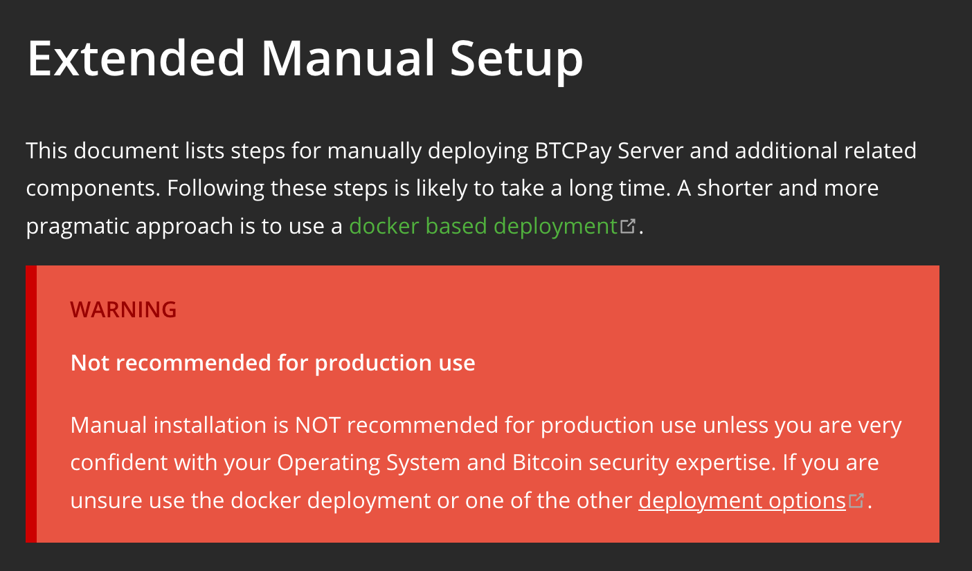
And we have custom blocks like this one here with danger, warning, and tip:

warning

Reference for custom containers.

pavlenex commented 4 years ago

Thanks for making the videos load properly. It's been a nightmare to maintain and a terrible UX so far. Great work Dennis.

dennisreimann commented 4 years ago

Updated the Algolia config and now the basic integration work. Nevertheless they configured it for the current docs.btcpayserver.org, that's why we should also send in a PR to update the config once we've merged and deployed the new version with the correct selectors. I've added a TODO for that.

@pavlenex Let's figure out the new structure next. This one is almost ready to go 🤟

pavlenex commented 4 years ago

With #501 in mind, I've been thinking quite a bit, and here's what I suggest. If something is unclear, let me know so I can elaborate on why something is structured that way.

Documentation

User Docs

Introduction

Basics

Deployment

Getting Started

Features

Integrations

-WooCommerce -Drupal -Magento -PrestaShop -Custom Integration

Support and community

-FAQ and common issues --FAQ Table of Contents --General FAQ --Deployment FAQ --Synchronization FAQ --Integrations FAQ --Server Settings FAQ --Stores FAQ --Wallet FAQ --Apps FAQ --Lightning Network FAQ --Altcoins FAQ -Troubleshooting an issue -Support -Contribute -Translate -Community

Dev Docs

A few notes:

Feedback is welcome of course, this is still not perfect, and needs actual docs re-works for it to take full effect.

pavlenex commented 4 years ago

@dennisreimann Just a side note,I'm personally not a fan of content:not(.custom) { max-width: 740px; it looks like a bit too much unused space. Not an expert on this, but I find existing docs easier to focus on while reading, at least on my 27 monitor.. Would be cool if we can get different iteration on that layout. Perhaps a sidebar could use some padding on the right as well.

existing docs newdocs

Also the Edit This Page link at the bottom is broken. (Probably due to folders you use on your fork, so that's okay, I prefer we finally use folders as well)

Kukks commented 4 years ago

From a quick glance it looks good from my end

dennisreimann commented 4 years ago

Added Docker plugins section where we can document third-party plugins like PiHole, Tranmsuter, etc @dennisreimann is is realistic to expect people that add plugins will allows us to automate deployments from their repo? How would that work?

We can pull and integrate their docs, but I would refrain from changes in their repos/docs triggering an update of our docs. The main reason for that is we'd need to provide a personal access token from an account of ours that has the permission to trigger the build. The permissions on GH aren't fine grained enough though, so that we'd hand out all kinds of permissions along with that … Anyways, I don't think that this is a show stopper for the idea, beecause our docs should be building frequently (we could also set up a scheduled build like once daily, even though nothing changed) and worst case is that they'd have to request a new build once their docs changed.

dennisreimann commented 4 years ago

Updated the structure according to your proposal and what we discussed in the chat – let me know if I got something wrong or what needs further changing :)

The update also sets a maximum width for the wraper and centers the page if the browser is more than 1280px wide.

Mobile navbar is also fixed now.

pavlenex commented 4 years ago

Feedback from 13" MacAir now :) Tested on Firefox, Safari and Chrome.

@dennisreimann I noticed a few things:

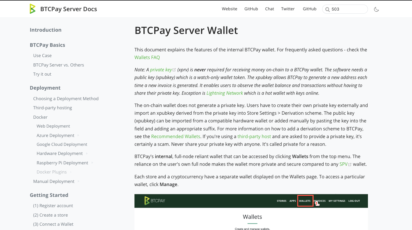
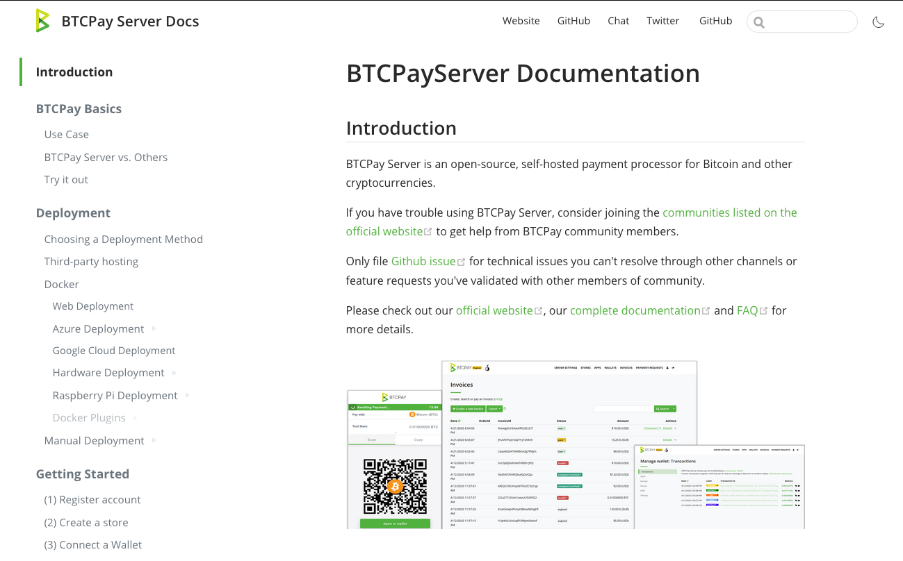
  1. The light-mode background is grey. Our current is white and looks better and easier to read. Any particular reason why you went with gray here? Demo docs Screenshot 2020-05-06 at 22 44 23

Current docs Screenshot 2020-05-06 at 22 25 21

  1. Payjoin link has no nesting and leads to a broken url
  2. I still feel the main content is congested. On 13".theme-default-content:not(.custom) { max-width: 900px; did this which I personally found easier to read (unsure about what others think) With 900px Screenshot 2020-05-06 at 22 47 01

Current Screenshot 2020-05-06 at 22 47 12

  1. We need to add walkthrough.md (I forgot it in the above proposal), unsure where to put it, maybe just add in basics for now

  2. Do you think we should nest all sub-FAQ things, looks a bit too much, doesn't it?

  3. Leaving this as a reminder - don't deploy until we fix development section and determine what goes there

  4. Nesting icons don't exist in the light-mode.

Will post some feedback from a desktop tomorrow though.

dennisreimann commented 4 years ago

The light-mode background is grey. Our current is white and looks better and easier to read. Any particular reason why you went with gray here?

That's to match the same look we've got in the main app interface, website, directory etc. Here's what it looks like plain white:

white

  1. Payjoin link has no nesting and leads to a broken url

For me both of that works – can you try a hard refresh circumventing the cache?

  1. I still feel the main content is congested. On 13".theme-default-content:not(.custom) { max-width: 900px; did this which I personally found easier to read (unsure about what others think)

imho 900 is too wide and the lines grow too long, which makes it harder to read. Tried a bit and would not recommend a value bigger than 800.

We need to add walkthrough.md (I forgot it in the above proposal), unsure where to put it, maybe just add in basics for now

Will re-add it to the Basics section with the next commit.

Do you think we should nest all sub-FAQ things, looks a bit too much, doesn't it?

I think the FAQ could get an own main category (like Features or Integrations) so that we move it out of Support and Community.

Nesting icons don't exist in the light-mode.

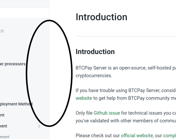
They are too light, will make them more prominent in both modes.

pavlenex commented 4 years ago

I am quite certain some of the issues I pointed out are due to different monitors and color calibrations, that said:

Here's what it looks like plain white:

@dennisreimann Can you check this on your Mac as well? On desktop monitor the gray does not look that weird and width there is good. I am thinking we should slightly adjust the width for 13" but please check the colors on your end. When I look it on a smaller screen, the gray makes it quite distracting to read, though this is a personal taste.

I think the FAQ could get an own main category

The FAQ need to undergo a huge cleanup #504 so I'd keep them as they are now nested, until we figure out the structure there, it's a bit messy rn.

For me both of that works – can you try a hard refresh circumventing the cache?

It leads to https://btcpaydocs.uix.space/FAQ/Payjoin which gives 404, not cache related it seems.

Tested the widths and other things on desktop and double-checked on mobile (to make sure earlier bugs no longer occur) and it all looks good now.

pavlenex commented 4 years ago

Just noticed we have two GitHubs, we can use icons for twitter and GH? (I'd leave gh pointing to main repo github

Zaxounette commented 4 years ago

Pavlenex asked for more eyes for feedback, so here is my tiny contribution =)

Links (broken, misdirects and such)

Menu item changes

Miscellaneous

I have seen no UX/UI or broken by code issues for the time being.

That's all I have for tonight. Got up to the end of the "deployment" menu with this.

dennisreimann commented 4 years ago

Hey @Zaxounette, thanks for the valuable feedback! The links are fixed, for the "Menu item changes" I'm awaiting @pavlenex' feedback on how to proceed.

pavlenex commented 4 years ago

Thanks Dennis for great work and @Zaxounette for in-depth feedback. I really did my best to break stuff around, but imo this thing is very close to being ready for merging.

Our priority right now is to make sure docs are displayed properly and it's critical that no internal links and absolutely critical that no external links are broken. It seems that @dennisreimann has taken care of that.

My questions:

To Do

Critical

Not a prioriry

Not a priority but would be nice before we merge

After the merge

Here are just minor annoyances I noticed that are unrelated to Dennis work but once merged we can tackle them, it's good to list things as you test.

Zaxounette commented 4 years ago

Before merging, i'll do the same checks I did previously up to "deployment" for the rest of the docs, except maybe the FAQ pages, since i'm working on them (i'll just check for broken links on the FAQ).

I'll work on that tomorrow evening.

dennisreimann commented 4 years ago

First the bad news: I haven't found a way to do proper 301 redirects on GitHub Pages, yet. From my research this isn't possible on an HTTP level, we can just approach this with a hacked 404 page, but that won't make search engines happy. From what I see we'd havee to add a custom frontend proxy for that.

On a more positive note though:

Also rebased it to match the origin master :)

dennisreimann commented 4 years ago

As GitHub Pages does not support 301 redirects out of the box, I've generated custom HTML pages that contain a redirect via the <meta http-equiv="refresh"> tag. According to some resources this should be handled equivalently by most search engines.

Firefox and Chrome also report these redirects as 301 in the network inspector, that's what I tried to confirm the desired behaviour. I think this is as far as we can get with GH Pages.

pavlenex commented 4 years ago

Yup, was reading on that as well this morning. In my experience if it's 301 in the network inspector it should be enough. I assume we're ready for a PR.

Zaxounette commented 4 years ago

@pavlenex @dennisreimann

Alright ! Second batch of review is in ! Mainly focused on broken links.

Links (broken, misdirects and such)

Menu item changes

Miscellaneous

pavlenex commented 4 years ago

Ok, so nothing critical left over as this can all be done after the merge. Ready when you are @dennisreimann.

dennisreimann commented 4 years ago

Done, except for the Menu item changes as I think we should postpone these to upcoming restructurings after the merge.