Team's Response
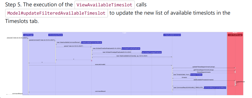
Cosmetic issue due to too detailed sequence diagram. Duplicated
The 'Original' Bug
[The team marked this bug as a duplicate of the following bug]
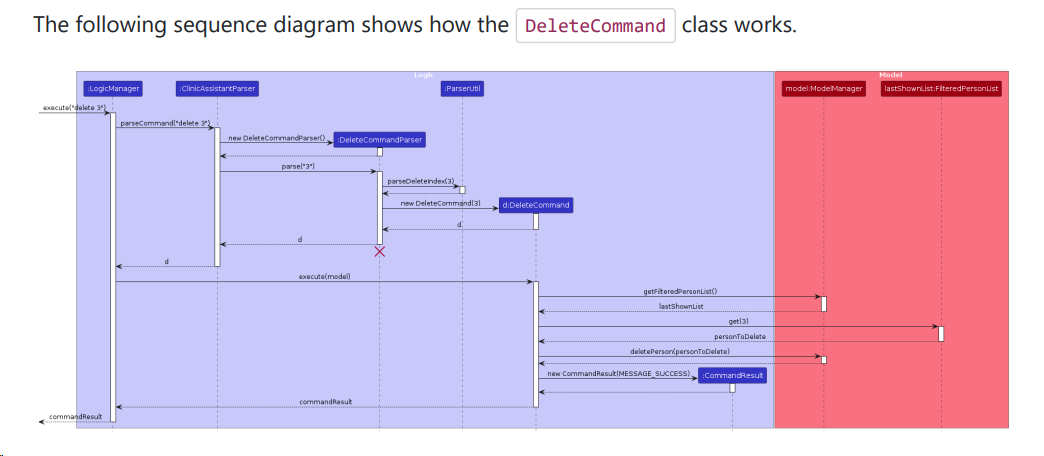
Diagram for command implementations too small and detailed
Note from the teaching team: This bug was reported during the Part II (Evaluating Documents) stage of the PE. You may reject this bug if it is not related to the quality of documentation.

The sequence diagram for DeleteCommand is too cluttered and hence unreadable without zooming in.
Similar applies to many of the other diagrams.
It would have been better to split each diagram into two (or more) parts.
[original: nus-cs2103-AY2324S1/pe-interim#40] [original labels: type.DocumentationBug severity.VeryLow]
Their Response to the 'Original' Bug
[This is the team's response to the above 'original' bug]
Agreed with testers on this comestic issue.
Items for the Tester to Verify
:question: Issue duplicate status
Team chose to mark this issue as a duplicate of another issue (as explained in the Team's response above)
- [ ] I disagree
Reason for disagreement: [replace this with your explanation]
## :question: Issue severity Team chose [`severity.VeryLow`] Originally [`severity.Low`] - [ ] I disagree **Reason for disagreement:** [replace this with your explanation]

Too many unnecessary details are given, making the diagram too unnecessarily complicated.