Team's Response
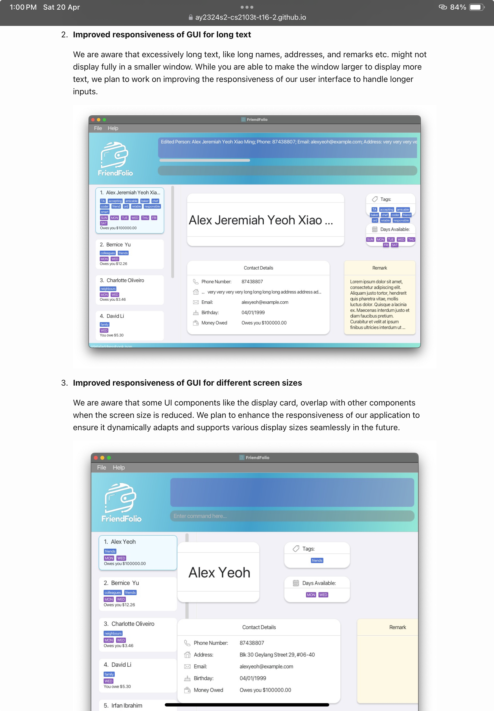
This seems to be addressed by these 2 planned enhancements.

Items for the Tester to Verify
:question: Issue response
Team chose [response.Rejected]
- [x] I disagree
Reason for disagreement: My argument is that the elements of the UI gets pushed out of the screen, not what is mentioned in the planned enhancements. The developer mentions:
- long text, like long names, addresses, and remarks etc. might not display fully in a smaller window.
- Ul components like the display card, overlap with other components when the screen size is reduced.
Neither of which addresses UI components being out of the screen itself. This can problematic for the user since he is unable to view a key feature of your product (tags and days available).
Description
The UI is not handled properly as the tags and calendar components are not within the screen when the name is too long. The remarks are also partially blocked.
Fix
You could consider limiting the size of your containers and components with a fixed value such that no one component would push the other out of the screen.