 proteche
commented
3 years ago
proteche
commented
3 years ago Open Trancever opened 4 years ago
proteche
commented
3 years ago  gabimoncha
commented
3 years ago
gabimoncha
commented
3 years ago TextInputTextInput involves a hack that disables useNativeDriver on iOS Awais6
commented
3 years ago
Awais6
commented
3 years ago It would be amazing to have props hint in WebStorm.
I don't know why intellisense is not working for React Native Paper, but sure it would be a big thing for us, developers using WebStorm, so we don't need to go to the docs each time we forget a prop name/options.
If someone can point my to the right direction, I could try to implement/fix it myself.
I have resolved the issue by adding typescript package
yarn add -D typescript @types/jest @types/react @types/react-native @types/react-test-renderer
& set it up according to https://reactnative.dev/docs/typescript
Now it shows intellisense in Jetbrains Idea & Webstorm
 ghulamhaider1
commented
3 years ago
ghulamhaider1
commented
3 years ago Right now, there is no way to customise or remove the arrow icon on the right. I really like this package but I had to switch only because I couldn't customise the right icon on the

 aggarwaldev
commented
3 years ago
aggarwaldev
commented
3 years ago There's no Drawer container in React native paper. It depends upon react-navigation for the container. https://github.com/callstack/react-native-paper/issues/2009#issuecomment-648911904 states the same problem but the issue was marked as slate. I mean drawers can do much more than just navigating around.
 nurmohammed840
commented
3 years ago
nurmohammed840
commented
3 years ago A backdrop appears behind all other surfaces in an app, displaying contextual and actionable content.

Date pickers let users select a date, or a range of dates.
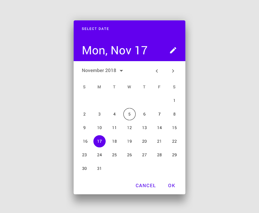
Image lists display a collection of images in an organized grid.


Navigation rails provide ergonomic movement between primary destinations in apps.
Bottom sheets are surfaces containing supplementary content that are anchored to the bottom of the screen.
Side sheets are surfaces containing supplementary content that are anchored to the left or right edge of the screen.

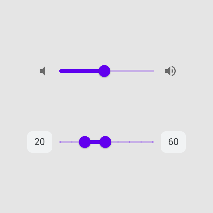
Sliders allow users to make selections from a range of values.
Time pickers help users select and set a specific time.
Tooltips display informative text when users hover over, focus on, or tap an element.

 edx-mohamed-khamis
commented
3 years ago
edx-mohamed-khamis
commented
3 years ago My issue #2635
 PrateekGoyal18
commented
3 years ago
PrateekGoyal18
commented
3 years ago I would like to be able to import
<Icon/>fromreact-native-paperInstead of
import Icon from 'react-native-vector-icons/MaterialCommunityIcons'I could just
import { Icon } from 'react-native-paper'
This is the main thing I would like to see in the upcoming versions!
 brunohkbx
commented
3 years ago
brunohkbx
commented
3 years ago Add Missing Material Components
Backdrop
A backdrop appears behind all other surfaces in an app, displaying contextual and actionable content.

Date pickers
Date pickers let users select a date, or a range of dates.

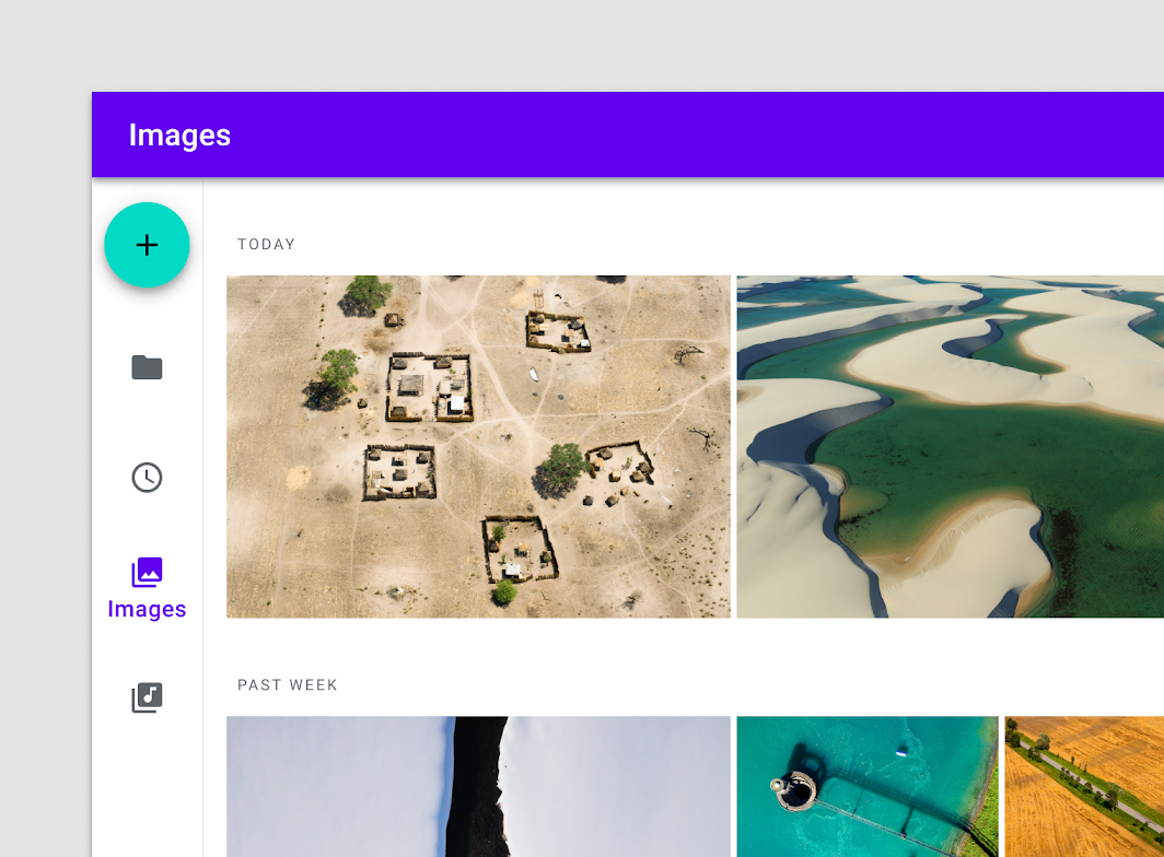
Image lists
Image lists display a collection of images in an organized grid.


Navigation rail
Navigation rails provide ergonomic movement between primary destinations in apps.

Sheets: bottom
Bottom sheets are surfaces containing supplementary content that are anchored to the bottom of the screen.

Sheets: side
Side sheets are surfaces containing supplementary content that are anchored to the left or right edge of the screen.

Sliders
Sliders allow users to make selections from a range of values.

Time pickers
Time pickers help users select and set a specific time.

Tooltips
Tooltips display informative text when users hover over, focus on, or tap an element.

Backdrop I think you can use this lib that I created a year ago https://github.com/brunohkbx/react-native-material-backdrop-modal It doesn't cover all use cases described in MD docs but I think it might help you.
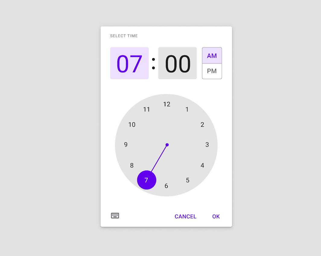
Time Pickers @RichardLindhout created the lib https://github.com/web-ridge/react-native-paper-dates. It looks very good.
 mastrock
commented
3 years ago
mastrock
commented
3 years ago I had a tough time with RTL without i18nManager, especially with the TextInput, I would love it if I can pass a param (isRTL) to switch to RTL instead of the implicit calculation based on i18nManager.
 RichardLindhout
commented
3 years ago
RichardLindhout
commented
3 years ago @nurmohammed840 react-native-paper-dates implements the date picker and time picker :)
 Stevemoretz
commented
3 years ago
Stevemoretz
commented
3 years ago Typing does not work in intellij, it's been years :)
 k3-cat
commented
3 years ago
k3-cat
commented
3 years ago DialogI would like to use dialog like:
<Dialog>
   ...
</Dialog>
instead of:
<Portal>
  <Dialog>
     ...
  </Dialog>
</Portal>
since every time we use Dialog with Portal, so I think put Portal inside the render of Dialog will make things simpler and can also reduce the level of indents.
k3-cat
commented
3 years ago I would like to use Button Dialog.Title Snackbar like:
<Button label='foobar' />

<Dialog.Title label='foobar' />

<Snackbar text='foobar' />
instead of:
<Button>foobar</Button>

<Dialog.Title>foobar</Dialog.Title>

<Snackbar>foobar</Snackbar>
The first way could reduce duplicated codes. And also, Drawer.Item List.Item Menu.Item Checkbox.Item Card.Title RadioButton.Item and etc. use the first way to specify labels or titles, so unifying them will also be helpful.
 AuroPick
commented
3 years ago
AuroPick
commented
3 years ago I can't pre-render because material bottom tabs don't have lazy property.
 shafkathullah
commented
3 years ago
shafkathullah
commented
3 years ago Menu ComponentAlthough the visually very much corresponds to native android menus, there is very observable lag between tap and appearance of the Menu. Is it because of JS only animation? could this be made better with say something like reanimated?
 manuelgarciacr
commented
3 years ago
manuelgarciacr
commented
3 years ago Add a focus method to other controls besides TextInput, like CheckBox, Switch, etc.
 kulothunganug
commented
2 years ago
kulothunganug
commented
2 years ago The Menu component takes atleast 1s to open or close, Please fix it soon
 likeSo
commented
2 years ago
likeSo
commented
2 years ago Improvement of Menu
The
Menucomponent takes atleast 1s to open or close, Please fix it soon
Are you in the DEV environment or using Expo?
kulothunganug
commented
2 years ago @likeSo I am using expo sdk 42.0.1
likeSo
commented
2 years ago @likeSo I am using expo sdk 42.0.1
It seems not about Paper, most components got this problem on Expo in DEV mode. Maybe you should file a new issue to the Expo team?
 joeyfigaro
commented
2 years ago
joeyfigaro
commented
2 years ago It'd be great if we had more control over icon positioning* / content styling for at least FAB – current app is using one and it's way too tiny. Can override width/height of the button, but the icon isn't centered.
 matinzd
commented
2 years ago
matinzd
commented
2 years ago It does not feel native. Ripple effect does not work on ios.
 sepsol
commented
2 years ago
sepsol
commented
2 years ago It would be great if we could optionally disable or configure the ripple effect for different components.
In my case I think I would be fine with a Checkbox.Item without ripple effect, because in my eyes the ripple hints at a visually non-existing button area around the Checkbox.Item which I don't like. I think the checkbox animation itself is sufficient in my case.
I also am using the ToggleButton and I have a roundness defined both in its style props and in the global theme object provided by the PaperProvider. Unfortunately though the ripple effect on the ToogleButton doesn't respect the roundness and there's no way to get around it. It would be nice if we had props regarding ripple to configure it wherever it's present in a component.
 osh91
commented
2 years ago
osh91
commented
2 years ago Each component is very limited, you can't edit e.g. IconButtons or there is no toggle switch button (like in rectangular shape). To call themes in TypeScript is horrifying to newbies. It cost energy and time to solve out how to call and sadly some doesn't work.
Today got bug IconButton because it is missing properties hasTVPreffered Focus and Properties..... but in the RNP docs doesn't say that it is required to call.
Why? Why is this so painful to use this?
 timdp
commented
2 years ago
timdp
commented
2 years ago A lot of components use TouchableRipple internally, but only some of them use prop drilling. In particular, the ripple color gets computed from the theme's text color on the fly. This means that you cannot have a different ripple color without changing your text color. I would like to have the ripple color be part of the theme rather than relying on magic constants locked inside TouchableRipple.
In case anyone is looking to work around this for now: you can monkeypatch TouchableRipple to support theme.colors.ripple by overloading React's render() method. Obviously, this is really hacky.
timdp
commented
2 years ago List.Item takes a titleEllipsizeMode and a descriptionEllipsizeMode but List.Accordion doesn't.
 ghost
commented
2 years ago
ghost
commented
2 years ago Docs are pretty ugly. Could use some inspiration: https://reactnavigation.org/docs/getting-started/
 aprilmintacpineda
commented
2 years ago
aprilmintacpineda
commented
2 years ago [Typescript] Some component prop types are not exported
I would like to extend
TextInput. To do so, I need the prop type,TextInputProp. As of today, I have to import the types like this:import { TextInputProps } from 'react-native-paper/lib/typescript/src/components/TextInput/TextInput'This is very unsatisfying, because this path could change at any time and depends on your build logic. A tool such as
api-extractorwould rightfully forbid you from not exporting indirect types, as it undermines the clear identification of your library API surface and prevent users from easily extending core features.Component props are obviously part of the API surface, and as such must be exported.
2022 and still the same. Code above won't even work for all components, this makes it really hard to extend react-native-paper components.
aprilmintacpineda
commented
2 years ago fontConfig in theme is pretty useless I think, or at least the docs doesn't tell us how to use it.
So I have:
const fontConfig: Fonts = {
  regular: {
    fontFamily: 'Roboto-Regular',
    fontWeight: 'normal'
  },
  medium: {
    fontFamily: 'Roboto-Medium',
    fontWeight: '500'
  },
  light: {
    fontFamily: 'Roboto-Light',
    fontWeight: '300'
  },
  thin: {
    fontFamily: 'Roboto-Thin',
    fontWeight: '100'
  }
};

export const paperTheme: Theme = {
  ...DefaultTheme,
  colors: {
    ...DefaultTheme.colors,
    primary: primary,
    text: text,
    error: red,
    accent: accent
  },
  fonts: configureFonts({
    ios: fontConfig,
    android: fontConfig,
    web: fontConfig
  })
};
however, if I do:
<Text style={{ fontWeight: '500' }}>
Hello
</Text>
It will only work for ios, it won't work for android, because in Android, I have to do:
<Text style={{ fontWeight: '500', fontFamily: 'Roboto-Medium' }}>
Hello
</Text>
For it to work. My current workaround is:
import React from 'react';
import { TextStyle } from 'react-native';
import { Text as RNPText } from 'react-native-paper';

const fontConfigs: Record<string, TextStyle> = {
  regular: {
    fontFamily: 'Roboto-Regular',
    fontWeight: 'normal'
  },
  medium: {
    fontFamily: 'Roboto-Medium',
    fontWeight: '500'
  },
  light: {
    fontFamily: 'Roboto-Light',
    fontWeight: '300'
  },
  thin: {
    fontFamily: 'Roboto-Thin',
    fontWeight: '100'
  }
};

const Text: React.FunctionComponent<{
  style?: TextStyle;
  font?: keyof typeof fontConfigs;
}> = ({ children, font = 'regular', style }) => {
  const styleFromFontConfig = fontConfigs[font];

  return (
    <RNPText style={[styleFromFontConfig, style]}>
      {children}
    </RNPText>
  );
};

export default Text;
Then I'll use this custom text instead of the one that RNP provides.
aprilmintacpineda
commented
2 years ago It is extremely hard to extend components of RNP, it's my first time using RNP with TS, I used RNUILib before, and I didn't encounter these kinds of problems which I will consider BASIC.
TextInput.tsx
import React from 'react';
import {
  HelperText,
  TextInput as RNPTextInput
} from 'react-native-paper';
import { TextInputProps } from 'react-native-paper/lib/typescript/components/TextInput/TextInput';
import { flatten } from 'utils/arrays';

const TextInput: React.FunctionComponent<
  {
    error: string;
  } & TextInputProps
> = ({ style, error, ...textProps }) => {
  return (
    <>
      <RNPTextInput
        mode="outlined"
        style={flatten({ backgroundColor: '#fff' }, style)}
        error={Boolean(error)}
        {...textProps}
      />
      <HelperText type="error">{error}</HelperText>
    </>
  );
};

export default TextInput;
custom component above will produce:

Doing:
type Props = TextInputProps & {
  error: string;
};
Produces:

This is crazy.
aprilmintacpineda
commented
2 years ago RNP IS VERY HARD TO USE WITH TS.
 vicary
commented
2 years ago
vicary
commented
2 years ago @aprilmintacpineda While React Native Paper may not be perfect, your issues are resolvable.
You may forcibly pull un-exported props out with the built-in type utility in React.
import type { ComponentProps } from "react";

const MyTextInput: FunctionComponent<ComponentProps<TextInput>> = (...) => { ... };
When there are field conflicts, typescript will friendly reminds you that this type is not even possible by spitting out a never type. { error?: boolean } & { error: string } logically means never.
You may remove the original fields you override with &:
type Props = Omit<TextInputProps, "error"> & { error: string };Or, depends on how you prepare to use your component, at least make yours compatible with the parent type:
type Props = TextInputProps & { error: boolean | string };Thanks for the insights, very helpful, I will try them out!
EDIT:
this worked for me:
import { ComponentProps } from 'react';
import { TextInput } from 'react-native-paper';

type RNPTextInputProps = ComponentProps<typeof TextInput>
effinrich
commented
2 years ago
effinrich
commented
2 years ago I've only recently started using react-native and react-native-paper. RNP is great, easy to use, no cross-platform hiccups and performs as claimed in that way. The only issue I have is preferential and lies in the styling. I've been a user and proponent of styled-system/styled-components and anything built on those systems for years, because they simply make component customization incredibly fast. Everything is built with the same props using attributes to space, shape, color, whatever, as well as most components made with a grid system in mind. So this:
const styles = StyleSheet.create({
  button: {
    flexDirection: 'row',
    marginTop: 50,
    marginHorizontal: 16,
    marginBottom: 33,
    height: 40,
    backgroundColor: color.primary,
    alignItems: 'center',
    justifyContent: 'center'
  }
})

const Button = () => {
  return (
    <Button
      style={styles.button}
      onPress={nextScreen}
      mode="contained"
    >
      Sign in
    </Button>
  )
}
Becomes this:
const Button = () => {
  return (
    <Button
      direction="row" //flexDirection: 'row'
      mt={50} // marginTop: 50,
      mx={16} // marginHorizontal: 16
      mb={33} // marginBottom: 33
      h={40} // height: 40
      bg={color.primary} // backgroundColor: color.primary
      align="center" // alignItems: 'center'
      justify="center" // justifyContent: 'center'
      onPress={nextScreen}
      mode="contained"
    >
      Sign in
    </Button>
  )
}
In the same vein and based on the same styled-system, a Flex and Box grid system would be great using the same attributes in the button example. This example also illustrates the array based breakpoint system:
<Flex direction={['column', 'row']}>
  <Box w={[1/2, 1]}>
   {stuff}
  </Box>
  <Box w={[1/2, 1]}>
   {stuff}
  </Box>
</Flex>
joshraker
commented
2 years ago
joshraker
commented
2 years ago As some have mentioned, including #2529, it would be nice to be able to disable the ripple effect for touchable components.
I tried making a simple software keyboard with react-native-paper buttons but onPress and each subsequent button press isn't triggered until after the ripple effect finishes so it's basically useless on Android. iOS is fine since all it does is highlight. I tried to work around this by using the onTouchStart and onTouchEnd events instead but, even though the ripple didn't occur, the delay still exists.
I don't mind the ripple effect and I think having a way to make the ripple async so that onPress triggers immediately and subsequent presses aren't delayed would be ideal but simply being able to disable it would also be sufficient.
 midhungopipk
commented
2 years ago
midhungopipk
commented
2 years ago can any one explain why the button label is not in ios.
<Button mode="contained" color="#F6AA41" style={{ height: height(6), width: width(90), borderRadius: height(1), }} labelStyle={{ color: 'white', fontSize: totalSize(1.8), fontFamily: typography.FONT_FAMILY_BOLD, }} contentStyle={{ alignItems: 'center', height: '100%', }} onPress={()=>} TYPE CODE INSTEAD
its bold in android only....why is that...?
 PakDragoon
commented
1 year ago
PakDragoon
commented
1 year ago The datatable are pain, the docs are useless.
 njoromyke
commented
1 year ago
njoromyke
commented
1 year ago Are you working on select and Datepickers?
PakDragoon
commented
1 year ago Are you working on select and Datepickers?
No, datatables with fetched data.
 whitedark9
commented
1 year ago
whitedark9
commented
1 year ago onPressIn, onPressOut in all ButtonsActivityIndicator.Screen for whole screen to use when a list of data is not visible. or Skeleton.FileInput like web <input type='file' /> or TextInput.Group like in bootstrap. With 'Touchable + Input' row, with 'onPress' function. d4rky-pl
commented
1 year ago
d4rky-pl
commented
1 year ago What grinds my gears the most is that React Native Paper 5 in theory supports both Material Design 2 and 3 but in practice what happens is the moment you actually switch to MD2, you're on your own. The documentation doesn't mention that there are major differences in how themes, components and sizings work (for ex. I just learned the hard way that Text component no longer supports variant if you switch to 2). It's actually much easier to just downgrade to version 4 and use the docs from there.
 bockoblur
commented
12 months ago
bockoblur
commented
12 months ago It would be great to be able to import Material Themes generated and exported using Material theme builder, namely some of
Or maybe this should be a feature request for material-theme-builder repo? What do you think makes more sense?
njoromyke
commented
12 months ago Are you working on select and Datepickers?
Any progress on this?
 Abdalrzakalsouki
commented
4 months ago
Abdalrzakalsouki
commented
4 months ago  crystalarcus
commented
3 months ago
crystalarcus
commented
3 months ago I'd love to see complete set of colors from Material You, I have created an issue here: https://github.com/callstack/react-native-paper/issues/4343
Currently, Paper don't have
surfaceContainer
surfaceContainerHigh
surfaceContainerHighest
surfaceContainerLow
surfaceContainerLowest
surfaceBright
surfaceDim
Currently paper have this:
primary
primaryContainer
secondary
secondaryContainer
tertiary
tertiaryContainer
surface
surfaceVariant
surfaceDisabled
background
error
errorContainer
onPrimary
onPrimaryContainer
onSecondary
onSecondaryContainer
onTertiary
onTertiaryContainer
onSurface
onSurfaceVariant
onSurfaceDisabled
onError
onErrorContainer
onBackground
outline
outlineVariant
inverseSurface
inverseOnSurface
inversePrimary
shadow
scrim
backdrop
elevation
The surfaceContianer colors provides amazing palette for surfaces, should be included in Paper 👍
 deepakkumardk
commented
1 month ago
deepakkumardk
commented
1 month ago For example I want to override the Surface component mode prop and change from the default value from elevated to flat like mode={'flat'}
If there is any way to do it now, please let me know, if no, then I guess it would be better to have it to override/set the component props just like overriding the theming. For reference rn-ui-lib also has this
 meftunca
commented
1 month ago
meftunca
commented
1 month ago It would be very good to be globally editable like @mui https://mui.com/material-ui/customization/theming/

We, the React Native Paper core team, would like to get a current list of all the things that people are having problems with when using React Native Paper. This is first time we are running this community feedback gathering initiative, but we are planning to do it cyclically - twice a year. We hope this will help us better understand our users and prioritize the work for the upcoming 2020 year.
Please reply with all the issues that you are having with React Native Paper. Keep your descriptions short and ideally link to other places with more context. Feel free to mention not just technical things but rather any issue that can be ascribed to the React Native Paper project.
If something has been mentioned already, please use the upvote/emoji buttons instead of repeating the same thing so that it's easier to see how many people care about each issue. Please make one comment per topic so that people can upvote just one thing at a time.
Hypothetical Example:
Some of the animations are not native
That would be really nice if js based animations (e.g. Checkbox or RadioButton) were replaced with native ones. Please consider reimplementing animations with reanimated for better performance.
Simple template with header (feel free to copy and paste)