carbon-design-system / carbon

A design system built by IBM
https://www.carbondesignsystem.com
Apache License 2.0
7.75k stars 1.79k forks source link

2021 Release Proposals #7538

Closed joshblack closed 3 years ago

joshblack commented 3 years ago

This planning issue is currently a WIP. Everything listed here is subject to change

This umbrella issue is going to be organized into multiple topics. Each topic refers to a proposed change to our ecosystem of packages that will be shipped in our Q2 2021 release. Topics can relate to several packages, or just one, and should have an accompanying discussion linked at the bottom of the section.

Overview

Topic Status Discussion Planning
Convert warning usage to console.warn N/A https://github.com/carbon-design-system/carbon/issues/8017
Combing spacing + layout tokens N/A https://github.com/carbon-design-system/carbon/issues/5602
CSS Grid Support In Progress N/A https://github.com/carbon-design-system/carbon/issues/8141
Color token updates In Progress https://github.com/carbon-design-system/carbon/discussions/7743 https://github.com/carbon-design-system/carbon/issues/8148
Transition to Sass Modules In Progress https://github.com/carbon-design-system/carbon/discussions/7539 https://github.com/carbon-design-system/carbon/issues/8138
Rename the size field prop in components In Progress N/A https://github.com/carbon-design-system/carbon/issues/8370
Icon modules with size Prop In Progress N/A https://github.com/carbon-design-system/carbon/issues/8139
Refactoring test suite In Progress N/A https://github.com/carbon-design-system/carbon/issues/8143
Bringing in IBM Plex In Progress https://github.com/carbon-design-system/carbon/discussions/7531 https://github.com/carbon-design-system/carbon/issues/8710
Component Accessibility Primitives In Progress N/A https://github.com/carbon-design-system/carbon/issues/8293
Tooltip Refactor In Progress TODO TODO
Notification Refactor In Progress TODO https://github.com/carbon-design-system/carbon/issues/8406
Theming the UI Shell In Progress TODO #8409
Inline theming In Progress TODO #8408
Package renames and dependency updates In Progress TODO TODO
Officially deprecate carbon-icons Accepted N/A https://github.com/carbon-design-system/carbon/issues/8137
useNotification hook Accepted TODO https://github.com/carbon-design-system/carbon/issues/8405
Package bundle performance Accepted TODO https://github.com/carbon-design-system/carbon/issues/8407
Not listed Accepted TODO TODO
Remove deprecated code Accepted TODO #8410
Focus style updates Not pursuing N/A N/A
joshblack commented 3 years ago

Transition to Sass Modules

Status: Proposal

Towards the end of 2020, there was an announcement that LibSass, and the corresponding ecosystem, was officially deprecated. As a result, it seemed important that we take a look at leveraging Dart Sass as opposed to Node Sass in our upcoming release. In addition, we have several existing problems that we'd like to see addressed in our upcoming release:

Discussion Link: https://github.com/carbon-design-system/carbon/discussions/7539 Planning Issue: TODO

Packages impacted

LInks & Resources

joshblack commented 3 years ago

Bringing in IBM Plex

Status: Proposal

Currently, we offer support for a handful of font faces (Sans, Mono, Serif) and a handful of weights (light, normal, semibold). We also offer a way for these fonts to be loaded easily through Google Fonts by default.

However, it seems like the usage for IBM Plex has grown broadly to include the following use-cases:

Discussion Link: https://github.com/carbon-design-system/carbon/discussions/7531 Planning Issue: TODO

Packages impacted

Links & Resources

joshblack commented 3 years ago

Convert warning usage to console.warn

Status: Proposal

We currently use the warning module to emit warnings to developers when a code path they have encountered is deprecated. However, the warning module uses console.error under the hood, instead of console.warn, which has caused some issues that both our team and those in the React ecosystem has faced in terms of confusion.

Instead, it would be great if we could transition to console.warn usage instead of console.error, most likely through our own implementation of warning that we could then use in the codebase.

Packages impacted

Discussion Link: TODO Planning Issue: TODO

joshblack commented 3 years ago

Icon Modules with size Prop

Status: Proposal

We currently have ~1,250 icons in our icon packages. Since our system supports 4 sizes, this ends up with ~5,000 modules (1250 icons * 4 sizes each). Add in a default entry point for each icon and its size, and that becomes ~6250 files that get shipped in a package.

Historically, we've had to invest some time to fix infrastructure issues that have come from trying to satisfy packages that can grow to this size. In addition, it is easy for these packages to deopt and cause consumers to ship megabytes more code than they intend to when using this module.

It would be great if we could explore going from our "component per icon/size" strategy to a "icon with size prop" approach. While this could increase the size of individual icons that support multiple sizes, this would decrease the overall file size of each package and would allow better code re-use for icons that are downsized from 32x32 (which are the majority)

Packages impacted

Discussion Link: TODO Planning Issue: TODO

joshblack commented 3 years ago

Theming the UI Shell

Currently our UI Shell is offered in one variant with custom tokens and is unable to be themed by those using the UI Shell. In the past, we explored sharing variants of UI Shell here and for our next release we would like to find a way to ship the deliverable in that issue.

Packages impacted:

Discussion LInk: N/A Planning Issue: https://github.com/carbon-design-system/carbon/issues/4839

joshblack commented 3 years ago

Component Accessibility Primitives

Our team and those who use Carbon often run into accessibility problems when using the following set of components:

As we've investigated these issues, it seems like certain use-cases are inaccessible when used with these components because of either improper implementation on the component side or teams using a component for a different purpose than which it was intended.

The most notable example of this is with tooltips and overflow menus. Often, teams will use these components for their visual style but not their underlying semantics (text-only tooltips, role="menu" respectively). As a result, we would like to revisit these modules and come up with a core set of accessible component primitives that can be used to implement the above components accessibly, along with being exposed to teams to build more accessible product features.

These component primitives include:

Packages impacted:

Discussion Link: TODO Planning Issue: TODO

joshblack commented 3 years ago

useNotification hook

We offer a variety of notification styles but unfortunately leave much of the animation and logical round display notifications to the end-user. We would like to codify this behavior/logic into a single hook, useNotification, that would encapsulate this behavior and make it easier for product teams to display/render notifications in their UI. This may look like:

function MyComponent() {
  const send = useNotification();

  function sendNotification() {
    send({ title: 'This is the notification title' });
  }

  return <button type="button" onClick={sendNotification}>Send test notification</button>;
}

Packages impacted

Discussion Link: TODO Planning Issue: TODO

joshblack commented 3 years ago

Tooltip Refactor

Currently, our tooltps are a combination of well-intentioned (but inaccessible) ARIA techniques that we need to fix in either an upcoming minor release or in the upcoming major release.

In general, our tooltips will be text-only information that can be applied to buttons, links, and inputs. They will visually be rendered using our "Popover" component. As a result, our tooltips should be updated to include the following:

Links & Resources:

Packages impacted:

Discussion Link: TODO Planning Issue: TODO

joshblack commented 3 years ago

Notification Refactor

Currently, our Notification components support rendering interactive content inside of the notification itself. This content includes components like links or buttons. Unfortunately, Notifications in their current implementation are unable to correct relay this information to screen readers as all semantics are stripped in the content of a notification.

This update to Notification will include some research in order to figure out the correct way to provide accessible options for both text-only notifications and notifications with action items.

Links & Resources

Packages impacted:

Discussion Link: TODO Planning Issue: TODO

joshblack commented 3 years ago

Focus style updates

Currently, we provide custom focus styles that will trigger when users interact with an interactive element. By default, browsers will choose not to display focus styles but because we specify custom focus styles they will appear. This lead to a question by teams across IBM: is it possible to mirror the browser behavior with custom focus styles?

There is a proposal for this behavior, using :focus-within, along with JavaScript-based solutions that could be integrated per-framework. This refactor work would be to evaluate if we can move forward with either solution to help address this visual behavior.

Links & Resources

Packages impacted:

Discussion Link: TODO Planning Issue: TODO

joshblack commented 3 years ago

CSS Grid Support

Our grid implementation uses flexbox as the underlying layout mechanism for teams to achieve 12/16 column layouts. As we look towards dropping support for IE11 in our next release, it would make sense for us to provide first-class support for CSS Grid.

Packages impacted:

Planning Issue: TODO

joshblack commented 3 years ago

Package bundle performance

Our packages ship more JS and CSS than they need to. As part of our next release, it'd be great to refactor away some of the dead code that is not needed for a package. We could also use this as a chance to move away from dependencies that may be larger than we want to ship, or are unintentionally included even when not used.

In terms of CSS, it'd be great to get a handle our the size of each stylesheet. Reducing selector complexity and limiting our use of nested mixins to generate CSS will go a long way to reducing the overall footprint of Carbon's styles.

Packages impacted:

Planning Issue: TODO

aagonzales commented 3 years ago

Color tokens update

Updates to the component color tokens with two main objectives:

  1. Make token names more user-friendly by applying usage specific names in order to help users more easily understand what the token is used for and when/where to apply it without having to frequently reference the usage guide.
  2. Better account for the background layering modal. At the moment we only account for two layers and it needs to account for at least three. Third layer stacking currently breaks in the dark themes. See discussion post for more details
    • There are two possible solutions to solve this: creating a nested solution with each theme (proposal 1) or implementing inline theming (proposal 2)

Links and resources:

Packages impacted:

Discussion Link: https://github.com/carbon-design-system/carbon/discussions/7743 Planning Issue: https://github.com/carbon-design-system/carbon/issues/8148

aagonzales commented 3 years ago

Inline theming

[stub]

aagonzales commented 3 years ago

Combine spacing + layout token scales

There is little value in having two distinct spacing and layout scales. It could easily all be one scale. Need to look at adding a few larger scale steps as well.

Packages impacted:

aagonzales commented 3 years ago

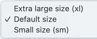
Rename the size props in components

Currently size in component code are: image

But should be:

With potential to add:


Packages impacted:

joshblack commented 3 years ago

Package renames and dependency updates

We offer up a mix of @carbon scoped packages and non-scoped packages for teams to use. Our core entrypoints, carbon-components and carbon-components-react are both un-scoped. In order to use carbon-components-react, you also will need to install carbon-components as a peer dependency.

It would be great if we could simplify this to just one package install across the ecosystem. In other words, if you want to use React you use @carbon/react. Angular, @carbon/angular. Vue, @carbon/vue.

Under the hood, these packages could internally depend on @carbon/styles and @forward the public files using Sass modules from @carbon/styles.

Packages impacted:

joshblack commented 3 years ago

Officially deprecate carbon-icons

carbon-icons was the defacto way to access iconography in Carbon v9 and before. Now, with our elements packages, this package is no longer required. In this release cycle, we should officially deprecate carbon-icons, archive the repo, and make sure it is removed as a dependency by the core packages

Packages impacted:

joshblack commented 3 years ago

Not listed

This is an umbrella comment for items that we talked about but maybe don't have an official "proposal" attached with them.

joshblack commented 3 years ago

className convention

We currently vary with respect to what location a className prop is placed. With this update, it'd be nice to stay consistent with respect to where className is placed in a component, along with what to do if you need access to an inner node on which you want to place a custom class name.

Packages impacted:

joshblack commented 3 years ago

Refactoring test suite

Currently, our test suite is a mixture of enzyme, custom test setup, and React Testing Library. As part of our push towards v11, it'd be great to consolidate on React Testing Library along with some testing guidelines for what we thing should be covered by the Public API of a component.

Packages impacted:

joshblack commented 3 years ago

Prop Name Consistency

We currently vary with respect to prop names and how we name props in functionality added to components. This update would be a great opportunity to finally consolidate these names into a standard set along with guidelines and how we name props in components.

Packages impacted: