 sgoudham
commented
1 month ago
sgoudham
commented
1 month ago Hey :wave:,
This is quite an old issue but I've come to realise that the colours here are the same as the ones defined for "File Colors" which recently got updated on the darker flavours to have higher contrast (#162)
I'm going to close this issue as resolved now but if you still find the contrast to be too low, please use the "Custom" colour functionality to define your own colours with whatever you like best. Thanks!
Is there an existing issue outlining your improvement?
What would you like to see added and/or changed?
The connection colors for database connections in DataGrip (or when using the database plugin) are very dark and look quite similar, which makes it hard to differentiate them: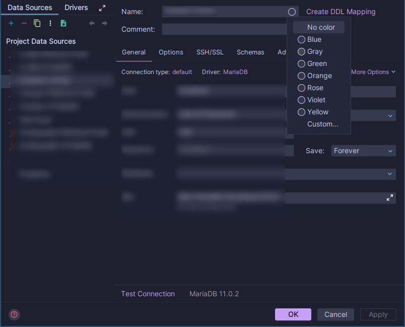
In the default dark theme, the colors have much more contrast between them: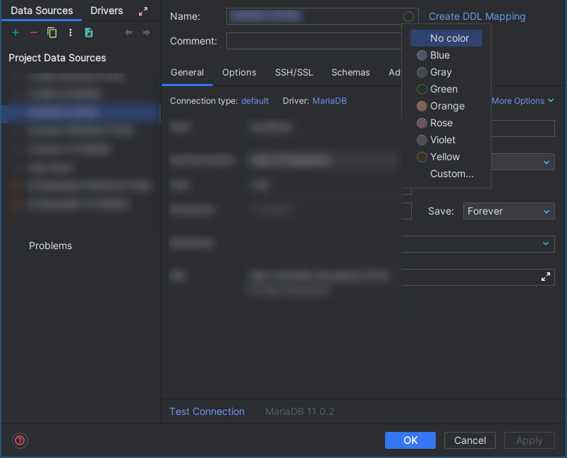
It would be great if the colors in the Catppuccin Macchiato theme would be more easly distinguishable from each other.