chartjs / Chart.js

Simple HTML5 Charts using the <canvas> tag
https://www.chartjs.org/
MIT License
64.51k stars 11.9k forks source link

Use ticks.stepSize instead of time.stepSize in time scales #10651

Closed stockiNail closed 2 years ago

stockiNail commented 2 years ago

Feature Proposal

As reportedin SO - ChartJs, stepSize doesn't working for type 'day', the stepSize option must be defined in time options node. It could be misleading having the same option for ticks node with the same meaning.

Possible Implementation

Remove the stepSize option from time and use the stepSize of the ticks node. It's breaking change.

dwpoint commented 1 year ago

@etimberg It works for me if I change like this: scales = { x: { ticks: { stepSize: 5 } } }

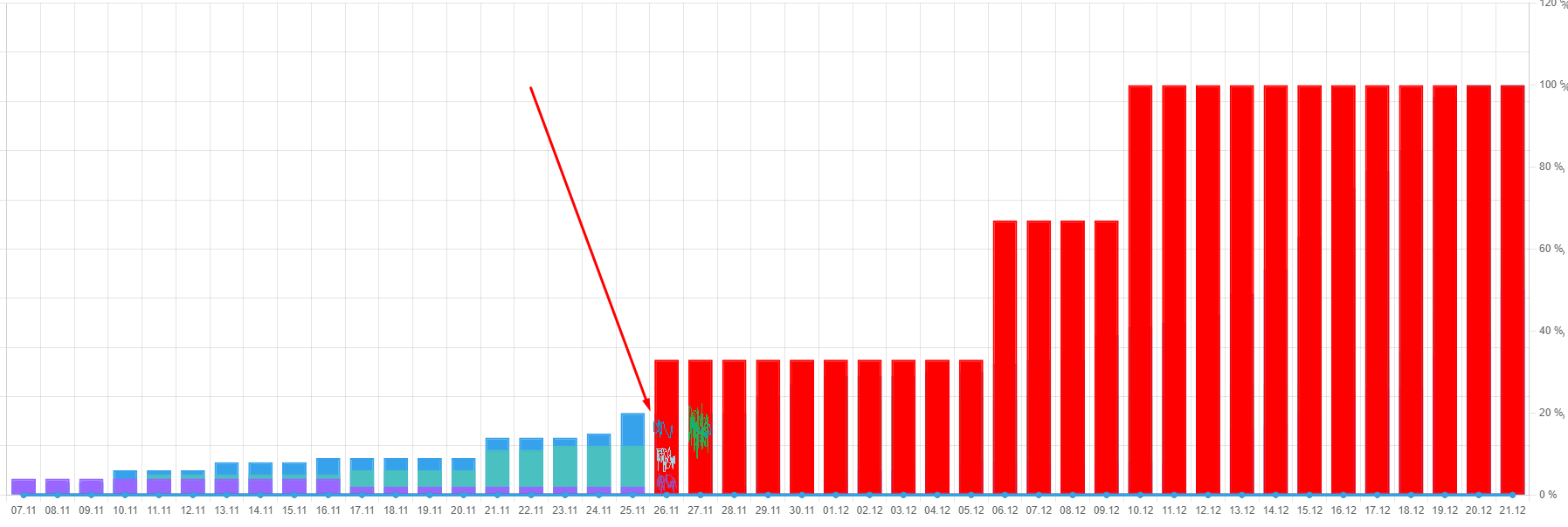
I need it to be displayed every day on the x-axis But as soon as the data becomes more than 50, CHartJs automatically starts skipping 1 day. How to fix?

stockiNail commented 1 year ago

@dwpoint can you provide a codepen in order to reproduce that behavior?

dwpoint commented 1 year ago

@stockiNail https://codepen.io/dwpoint/pen/gOKVBwb

dwpoint commented 1 year ago

@stockiNail this is just a modest example that I managed to make on codepen. For some reason, I could not write there on the 4th version.

dwpoint commented 1 year ago

@stockiNail I realized that ChartJS still displays as specified in the settings. But due to the scale of the page, the graph adapts and skips days. Can this be fixed?

At page scale 80%, the days go one after another. But at 100% days start skipping and showing after 1.

stockiNail commented 1 year ago

@dwpoint I'm not sure if I understood well but I think you could add autoSkip: false, to your scales.x.ticks configuration. Turning off autoskip option, CHART.JS will show all labels no matter what.

dwpoint commented 1 year ago

@stockiNail You got me right! Thank you so much! Works!

dwpoint commented 1 year ago

@stockiNail And tell me, please, is there an option for weights that will automatically add +2 days to the data at the end so that the type bar is shown not cut off at the end?

kurkle commented 1 year ago

@dwpoint offset: true for the x-scale should make room for the bars to be fully visible. Does that help?

dwpoint commented 1 year ago

@kurkle Wow! Thank you so much! It worked!

dwpoint commented 1 year ago

@kurkle Good afternoon! Allow me, please, a question off topic? The fact is that I use a custom tooltip and for null values the bar type shows 0%.

How can this be corrected? Moreover, this is not in the standard tooltip from ChartJs, and everything works great there.

But I would like to implement this principle in a custom version.

dwpoint commented 1 year ago

I'm not sure if I understood well but I think you could add autoSkip: false, to your scales.x.ticks configuration. Turning off autoskip option, CHART.JS will show all labels no matter what.

@stockiNail I'm using version 4.1 and time type for scales and this version doesn't have autoskip?( It's just that if I remove the time type, then the autoskip works, but as soon as the time type, the autoskip configuration does not work

stockiNail commented 1 year ago

@dwpoint afaik autoskip is a common options, available for all cartesian axes (time included). Can you post the scale config?

dwpoint commented 1 year ago

@stockiNail https://codepen.io/dwpoint/pen/gOKVBwb

Now try to remove the type of time from the scales. And then AutoSkip will work.

stockiNail commented 1 year ago

@dwpoint when you use the time scale, you should add source: 'ticks', in the ticks configuration of time scale.

  scales: {
    x: {
      type: 'time',
      // grace: 86400,
      time: {
          unit: 'day',
          distribution: 'series',
          tooltipFormat: 'dd.M.yyyy',
          displayFormats: {
              day: 'dd.M',
          },
      },
      ticks: {
        source: 'ticks',
        autoSkip: false,
      },
      beginAtZero: true,
      display: true,
      stacked: true,
      offset: false,
      title: {
          display: true,
          color: "#019ff5",
          font: {
              size: 22
          }
      }
  },
dwpoint commented 1 year ago

@stockiNail Yes! Works! Hooray! Thank you so much!

But is it really written in the documentation? I feel like I've read all the important stuff but didn't find it.

stockiNail commented 1 year ago

Have a look here: https://www.chartjs.org/docs/latest/axes/cartesian/time.html#ticks-source

dwpoint commented 1 year ago

@stockiNail Thank you! Could you please also see my question above related to null data and custom tooltip when bar type null data shows as 0%?

You helped me a lot. And I feel embarrassed when I bother you with my questions. Please tell me if you are tired of me and you do not have time to answer me. I'll understand everything.

stockiNail commented 1 year ago

@dwpoint I'm quite busy on other tasks therefore I cannot answer you fast... ;) Don't feel embarrassed, nop at all. About tooltip, can you share your customization and toolitp config?

dwpoint commented 1 year ago

@stockiNail https://codepen.io/dwpoint/pen/JjBdPzL

You are very kind, thank you very much for your help and your clear and detailed explanations! In no way am I trying to get an instant response. I'm willing to wait as long as it takes.

I sent you the configuration setting with a tooltip. If you hover over null data, the tooltip shows 0. Is it possible to make it so that null data is not shown?

stockiNail commented 1 year ago

You can change intersect option of tooltip, setting it to true. In this way the tooltip will be shown only if the mouse is hovering the data element, and when data element doesn't exist (because null), tooltip is not shown.

dwpoint commented 1 year ago

@stockiNail Yes, this solves the problem of displaying null data, but I really would like the tooltip to be displayed without hovering over a specific data element.

Can this be done somehow? For some reason, this is only characteristic of the bar type. line type works great.

dwpoint commented 1 year ago

@stockiNail https://codepen.io/dwpoint/pen/JjBdPzL Updated the example and added a line type

stockiNail commented 1 year ago

@dwpoint try the following code (starting from your codepen) and tell me if it is ok (see comments):

....
const externalTooltipHandler = (context) => {
    // Tooltip Element
    const {
        chart,
        tooltip
    } = context;
    const tooltipEl = getOrCreateTooltip(chart);

    if (tooltip.dataPoints) { //<=check datapoints
      const filtered = tooltip.dataPoints.filter((item) => item.raw !== null); //<=gets only datapoint where not null
      if (!filtered.length) { // if all datatpoints are null
        tooltipEl.style.opacity = 0; // don't show tooltip
        return;
      }
    }
......
dwpoint commented 1 year ago

@stockiNail I am delighted! Cool! Yes! This is what I needed! You are a true professional! I am eternally grateful to you.

dwpoint commented 1 year ago

@stockiNail I am very worried about another point related to the drawing order of the bar data type.

I'll attach a screenshot below that shows how the red color overlaps the other color data. For a specific example, this can be solved using the order option. But this is a private example and, probably, not quite what I need. Is it possible to make the draw order smart?

That is, I want ChartJs to understand what weight the bar type should use in order to reflect all the colors on the chart.

https://i.paste.pics/KL39D.png

stockiNail commented 1 year ago

it's difficult to me to understand what it's not working as you expect. The order option sets the order of dataset drawing but it shouldn't have any impact on the colors. Furthermore, from the picture, it seems you have stacked datasets. The chart data and options (config) are needed.

dwpoint commented 1 year ago

@stockiNail What I'm trying to say is that since November 26 (November 26) there is red data that overlaps others, and it is impossible to do analytics in this case.

For understanding, I made a stack :false : https://i.paste.pics/KL45I.png

But I want to use stacked: true And I get this plot: https://i.paste.pics/KL46S.png

As of November 26, I stop seeing blue, green, and purple data. And I can't do analytics because of this.

But I would like to see something like this: (See Nov 26): https://i.paste.pics/KL48K.png

For this particular example, I can use the order setting, but the data for the chart comes in via Ajax, and there may be a completely different order to see all the colors of the data.

And I'm trying to ask if ChartJs with stacked: true can decide for itself what draw order to use to display so that all the data is visible?

dwpoint commented 1 year ago

@stockiNail Ultimately, for the background, I will make it transparent. But first, I would like ChartJs to render without transparency. Since the colors will overlap each other, resulting in confusion of the true color. Therefore, the column that has the lowest height should be in the foreground.

stockiNail commented 1 year ago

@dwpoint the order option shouldn't affect the the datasets array items but the drawing (useful for combined types chart).

I think you should set your datasets in the order you need (being an array) and CHARTJS will draw in the order you set.

About stacked, I have the feeling (but not sure, the config is needed also to reproduce the behavior) that not all scales are configured as stacked. It should be something like that:

    scales: {
      x: {
        ......
        stacked: true,
        .....
      },
      y: {
        .....
        stacked: true,
        .....
      }
    }
dwpoint commented 1 year ago

@stockiNail thank you! I will study.

And you want to say that I should arrange the data arrays in the order in which I want? But the order depends on the data array. It turns out that before drawing, you need to go through all the arrays and decide which data set will be the first, second, etc.?

stockiNail commented 1 year ago

What I want to say is that you have 4 datasets (if I understood well from your picture) and the order how to add these to the chart config, data { datasets: [........]}, depends on your logic. CHARTJS will draw the datasets following the sequence of the array.

dwpoint commented 1 year ago

@stockiNail thank you!

dwpoint commented 1 year ago

@stockiNail, @kurkle Hello! Tell me, please, do you know why the dataLabels labels do not work for me? I did everything according to the documentation. An example is also taken from there. But what am I missing? https://codepen.io/dwpoint/pen/vYzxrZY

stockiNail commented 1 year ago

@dwpoint because it is not registered. See doc https://chartjs-plugin-datalabels.netlify.app/guide/getting-started.html#registration.

You need to add the following, to use globally

// Register the plugin to all charts:
Chart.register(ChartDataLabels);

or the following, to have in inline mode (for single chart instance)

// OR only to specific charts:
const chart = new Chart(ctx, {
  plugins: [ChartDataLabels],
  options: {
    // ...
  }
})
dwpoint commented 1 year ago

@stockiNail Yes it works! Thanks a lot. I just haven't done it with other plugins. I only specified in options.

dwpoint commented 1 year ago

@stockiNail Please allow me to ask you for a solution to the following problem: I have many days displayed on the chart (more than 3 months) and due to the fact that the columns are narrow due to the width of the window, the labels are not displayed very nicely. I am attaching a screenshot of what it looks like: https://paste.pics/M2MR5

And the question actually is, is there any way to add a horizontal scroll and make the chart wider so that the type bar is wider? I attach the implementation on the BI: https://paste.pics/M2MRG

Do you think it is possible to overcome the problem?

stockiNail commented 1 year ago

@dwpoint have a look to SO answer: https://stackoverflow.com/questions/68293473/chart-js-making-this-chart-more-readable-scrollable, maybe it can help you.

Otherwise you can use the zoom plugin (pan options)

dwpoint commented 1 year ago

@stockiNail Thanks a lot! The Zoom plugin works great for my purpose. I checked the examples and he's cool! But for some reason, all scaling methods work for me, except for holding the mouse button and moving it.

I managed to change the scale in the following ways:

  1. Mouse wheel
  2. Hold down and select the area in which you want to use the approximation

But I could not change the scale by holding down the mouse button and moving to the desired area. I understand that this is the "pan" option. But for some reason, only with her I can do it. Tell me what is my mistake? https://codepen.io/dwpoint/pen/vYzxrZY

stockiNail commented 1 year ago

I'll have a look tomorrow (today I cannot sorry) but be aware that Zoom plugin needs Chart.js >=3.2.0. In your codepen I have seen 3.0.0. I don't think that's the issue but better to be aligned.

dwpoint commented 1 year ago

@stockiNail Everything is fine, my working day has just ended and I will only continue work tomorrow.

Look, please, tomorrow, when it's time.

On production, I use the latest versions (4.2)

dwpoint commented 1 year ago

@stockiNail Recreated the problem on the latest versions. Moreover, the usual zoom from the mouse wheel works, but the pan does not. It's like I'm missing some extra connection for it. https://codepen.io/dwpoint/pen/poOPemE

stockiNail commented 1 year ago

@dwpoint you forgot to include hammerjs. See doc: https://www.chartjs.org/chartjs-plugin-zoom/latest/guide/integration.html#script-tag

dwpoint commented 1 year ago

@stockiNail Works! Thanks a lot. I'm very embarrassed.

stockiNail commented 1 year ago

I'm very embarrassed.

no problem, it happens

dwpoint commented 1 year ago

@stockiNail And let me ask you about the labels and the width and length of the bar type. The point is that I want to make the labels show only if the label fits in the width and length of the bar type. That is, if the bar type has a value of 0, then it will not be able to draw the label and fit it in any way. Specifically for zero, you can use the following:

plugins: { datalabels: { color: 'white' display: function(context) { return context.dataset.data[context.dataIndex] > 0; }, } }

But for all other values, I don't understand how to check if it draws the label beautifully or not (there is enough space for it to draw or not).

That is, I need a check that looks at whether the label fits in the bar type or not. If it fits, then it is drawn. If not, then no.

I found such a code, but it does not work for me, because an error occurs that many of these methods do not exist.

datasets: [{ backgroundColor:Utils.color(2), data: [20, 30, 49], datalabels: { anchor: 'end', align: 'start', formatter: function(value, context) { let chart = context.chart; let scale = context scale; let fontSize = Chart.helpers.getValueOrDefault(context.datalabels.fontSize, Chart.defaults.font.size); let maxBarWidth = scale.getPixelForValue(scale.max) - scale.getPixelForValue(scale.min) - (2 * fontSize); let labelWidth = chart.ctx.measureText(value).width; if (labelWidth < maxBarWidth) { return value; } else { return null; } } } }]

Here is my example where I would like to check if a label can be inserted or not: https://codepen.io/dwpoint/pen/vYzmRoe

Tell me, please, is it possible to somehow check the width and length of the bartype at the time of display, in order to put labels only where possible?

For example, at this scale, it is clearly seen that the labels are wider than the width of the bar type. And they don't need to be displayed: https://i.paste.pics/M3REQ.png

stockiNail commented 1 year ago

@dwpoint I think you should use clamp option of datalabels plugin. Have a look here: https://chartjs-plugin-datalabels.netlify.app/guide/positioning.html#clamping

dwpoint commented 1 year ago

@stockiNail Unfortunately, also((( https://codepen.io/dwpoint/pen/vYzmRoe https://i.paste.pics/M3RP8.png

stockiNail commented 1 year ago

To be more flexible, the formatter callback could be:

        formatter: function(value, context) {
          const {chart, dataIndex, dataset, datasetIndex} = context;
          // CALCULATE label size
          // to calculate a text, you need the font  
          const font = Chart.helpers.toFont(dataset.datalabels.font);
          const ctx = chart.ctx;
          ctx.save();
          ctx.font = font.string;
          let labelWidth = ctx.measureText(value).width;
          ctx.restore();
          // get BAR element 
          const meta = chart.getDatasetMeta(datasetIndex);
          const barElement = meta.data[dataIndex];
          // compare labelWidth and bar element width
          if (labelWidth < barElement.width) {
            return value;
          }
          return null;
        }

In your codepen case, try adding the font and you can see that the label will be shown only with font.size <= 9.

dwpoint commented 1 year ago

@stockiNail Wow, cool! It works! Is it possible to add some more length to the condition? Since often for the values 0, 1, 2, 3, 4, 5 there is not enough length to insert a label. Example: https://codepen.io/dwpoint/pen/vYzmRoe

I wanted to add this line: let labelheight = ctx.measureText(value).height; But this is not possible (

What do i do?