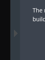
the menu is a button the left: 
but this is really hard to see
Closed dkwo closed 8 months ago
the menu is a button the left: 
but this is really hard to see
thank you. you're right, somehow i missed it. maybe one could use a different color.
yeah, the color should definitely be changed as the existing contrast is nonexistent
it looks completely fine in the light variant, i would probably use the text color or the reddish one for the arrow in the dark one
The documents are unreadable for me on the smartphone (pixel 6a, running graphene os, the browser is a fork of chromium): there's no way to move past the initial page, as the menu is not visible (the three bars only direct to the other parts of chimera website). E.g. void linux docs display the menu on the top, which works fine on my smartphone.