Team's Response
The usage of whitespaces would indeed add clarity to our program.
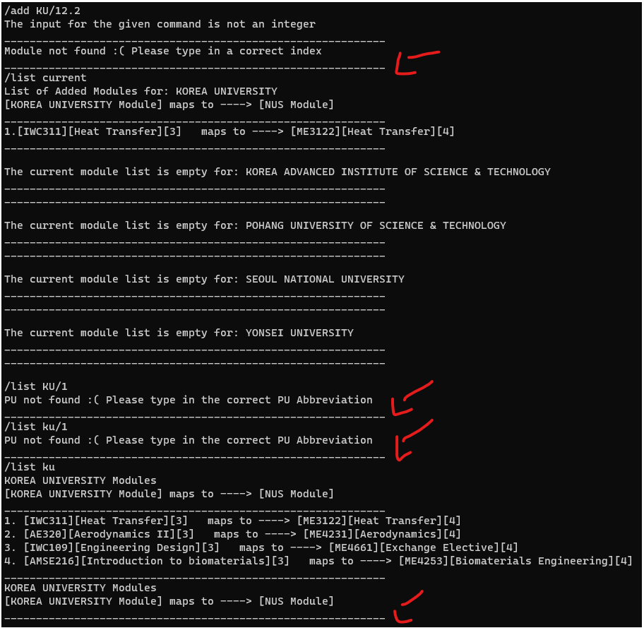
However, I believe that this is not a FeatureFlaw as the use of the string line "-------------------------------------" is used for this purpose of clarity.

The use of both whitespaces and this string line was also considered. However we realised that when printing out long list of modules, users will most likely have to scroll up using a mouse which go against the Command-Line interface preference. Hence, the use of the line string "-----------------------------" was used.
Items for the Tester to Verify
:question: Issue response
Team chose [response.Rejected]
- [x] I disagree
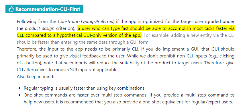
Reason for disagreement: I understand that the team has chosen to use ---- to not go against the Command-Line interface preference, however, in the constraints stated on the module website, there is no mention that the user prefers Command line interface or that scrolling is not allowed/recommended. As shown in the screenshot below, the constraints are to target user who type fast and prefer typing over other means of input, and that input to the app should be primarily via CLI. Thus, I believe that there can be whitespaces between the output for better readability and that it is a valid bug.


The input and output of the program are clunked together which may be hard to read for the user.
Team can consider adding whitespaces between each command or output for better readability.