 soc-se-bot
commented
2 months ago
soc-se-bot
commented
2 months ago Team's Response
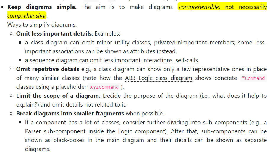
It is worth noting that the classes elaborated are truly the main classes of concern for the feature, and that there are other classes used by this feature that is omitted in the diagram.
Items for the Tester to Verify
:question: Issue severity
Team chose [severity.VeryLow]
Originally [severity.Medium]
- [x] I disagree
Reason for disagreement: While I understand that the classes elaborated are the main classes of concern for the feature, the CS2113 teaching team has mentioned that diagrams should be simple (screenshotted below). In fact, comparing this class diagram to the examples provided on the CS2113 website on UML Diagrams: Negative Examples, the Class diagrams for Fitness motivator has:
- too many classes within the diagram (13 in total)
- too many member details that get outdated quickly
Given that these classes are important to the feature, it seems important that the reader is able to understand the structure between the classes. This wasn't a report regarding text size, but on complexity of the diagram. Thus, "severity.VeryLow" meant for cosmetic issue does not seem appropriate.
It is possible for the class diagram to be simplified even if the team believes that all classes are important. As mentioned in the original report, the team can try to split up the class diagram into different components. This would also allow them to have shorter descriptions for each class diagram within Fitness component that will allow the reader to understand the feature better. For example, one image for commands + parser and one for fitness (but omit classes like Ui, Storage, UiMessageConstants).
Screenshots from the Developer Guide Deliverables:
UML Diagrams: Negative Examples
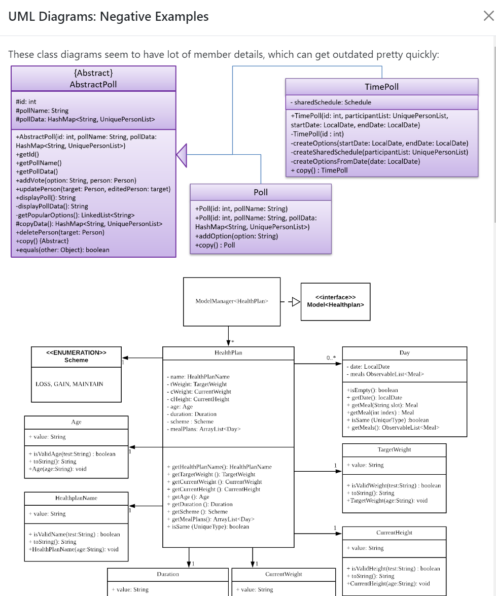
Class diagrams for example Fitness motivator was overly-complicated, making the text small and blurry. The diagram text thus became unreadable. Try to split up the class diagram into different images or by using references.