cobyism / gridism

A simple responsive CSS grid.
http://pages.cobyism.com/gridism
MIT License
660 stars 85 forks source link

SCSS #10

Closed jakiestfu closed 11 years ago

jakiestfu commented 11 years ago

Great work, mate. I am building an internal frontend framework for the company I work with and we are looking for a no bullshit, no frills, aesthetic grid system, and this seems to be it.

We are writing our core code in SCSS, do you plan to have support for SCSS in the future at all?

Also, what is the browser support on this? I think that should be included somewhere. Thanks!

cobyism commented 11 years ago

do you plan to have support for SCSS in the future at all?

All CSS is already valid SCSS, so this should be ready to plug in. If there’s something that doesn’t play nice with it for some reason, please let me know.

What is the browser support on this?

Honestly, I haven’t ever given it a thorough cross-browser test—I’m sorry I don’t have a better answer for you than that. The only properties this relies on though are box-sizing: border-box (which has pretty wide support), max-width: … (which also has pretty good support), and media queries (which are basically good everywhere except IE8 or lower). Essentially if you’re using anything vaguely modern this should work as expected.
jakiestfu commented 11 years ago

I realize this is valid SCSS, I was curious as to if the code could be even lighter if it were written as such, that's all. Thanks for the quick response!

cobyism commented 11 years ago

if the code could be even lighter

Ah, I see. Yeah, I’m sure there’s room for optimization, however I just had a quick go of converting the main gridism.css over to SCSS (pasted as a gist here), and it actually ends up being a couple more lines of code because of the extra nesting required in a couple places. Sure, there’s less a little less selector repetition, but basically it’s a small enough file and simple enough code that I don’t think any of the advantages of Sass apply here. Worth thinking about though, so thanks for the suggestion! :smile:

jakiestfu commented 11 years ago

Also, quick question, can you please explain to me what .golden-large and .golden-small classes are?

cobyism commented 11 years ago

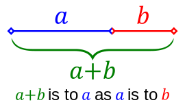
@jakiestfu Sure thing. Those classes allow you to create grid elements that conform approximately to the golden ratio:

golden ratio

A container with the class .golden-large will produce a grid unit the width of the larger section in the above diagram, and .golden-small will produce one the width of the smaller section. To paraphrase the diagram, width: 100% is proportional to .golden-large as .golden-large is to .golden-small.

In practical usage, I often find that this combination becomes handy when .one-third + .two-thirds doesn’t quite feel right:

2013-09-20 at 12 10 pm

Does that make sense?

jakiestfu commented 11 years ago

Thanks dude! You should add that to the docs!

robertcedwards commented 9 years ago

Had the same questions, great conversation solved it all for me. Thanks! :+1:

durasj commented 8 years ago

Hey,

I still think it would be great to have scss support. One of the things I had to add myself just now was variable gutter.