 ghost
commented
4 years ago
ghost
commented
4 years ago 
Closed matshou closed 4 years ago
ghost
commented
4 years ago
 matshou
commented
4 years ago
matshou
commented
4 years ago Looks great! However I do have a few improvement proposals:
On a side note I have to be honest and say that I truly dislike how that camel looks. My personal taste aside I think we can both agree that it objectively goes way too much out of the comfort zone of Vanilla which for better or for worse does have an impact on how our mod comes off.
ghost
commented
4 years ago @yooksi
I'll try and implement your suggestions regarding the banner.
After our discussion regarding the preferred art style for the camel, I went about looking at the existing minecraft creatures to see what level of detail I could go to.
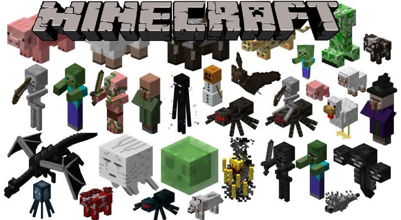
The pig, sheep, and wolf especially, all have snouts protruding from their heads; as well as ears. From this, I knew I could implement those features and stay consistent.
The dog has a tail, so I added that also.
The hump was as simplified as I could make it without it looking odd.
The texture isn't too detailed; no more or less in my eye's than the chicken or cow.
I honestly don't understand why you think it goes too far out of the vanilla style; it really doesn't have any more detail than the rest (especially the dragon).
The legs are only two parts because the walking animations/sitting looked very odd when I tried doing it with just 1 element.
I hope that you can see I did the best I could to take your preferences into consideration.
ghost
commented
4 years ago If your worried about it putting people off, just look at the ZAWAM mods 800K + downloads.
https://www.curseforge.com/minecraft/mc-mods/zoo-wild-animals-rebuild
The top 5 most downloaded animal mods have a similar or greater level of complexity.
ghost
commented
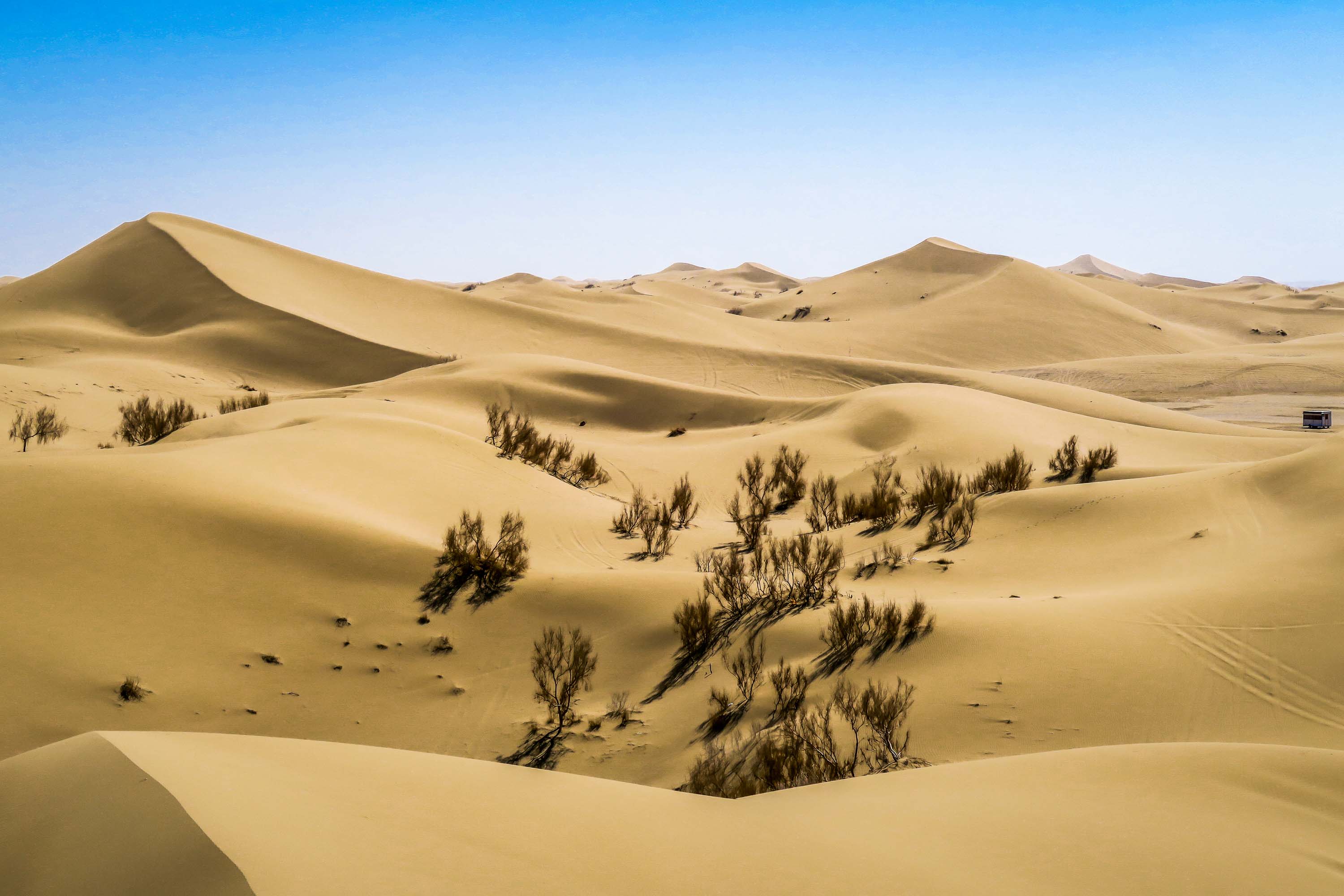
4 years ago What do you think of this more stylised version?

matshou
commented
4 years ago I like it a lot more and it removes two of my complaints :smile:
The environment looks much smoother and letters are more pronounced like they should be.
Just remember (or even better write down) which chain of filters you used in Gimp in case you want to change elements in the scene, like adding more DUNES!
Think we need more dunes, actually I know we need more dunes:
ghost
commented
4 years ago What do you think?

matshou
commented
4 years ago Now we're talking, this looks close to perfect in my opinion!
The only thing I can think of is perhaps a bit less cubism effect in the front (including the player and the camel) and a bit more in the front where the sky meets the dunes to create that effect of haziness on the horizon due to heat (don't know how it's called) like you did in the left side of the image (notice how the dunes in the left have stronger cubism applied to them).
But that's a really minor thing and something we can both play around with in Gimp once you share the image project file (xcf) with me. All in all I think you've done a great job :+1:
ghost
commented
4 years ago I added a slight cubism blur to the distant sand dunes. Couldn't find a way to reduce the cubism on the player/camel; the final product should be fine though.

ghost
commented
4 years ago Just checking with you wherever this issue should be closed.
Am I right to believe you are also satisfied with the final design?
matshou
commented
4 years ago I am quite happy with the banner and hope others will be too!
We need a banner that represents our mod in README and CurseForge page.