Sounds good! @ujjwalagrawal17 can you include a link to Google's guideline for reference. :)
Closed ujjwalagrawal17 closed 6 years ago
Sounds good! @ujjwalagrawal17 can you include a link to Google's guideline for reference. :)
It's the correct way to use colorPrimaryDark on status bar and colorPrimary on toolbar as suggested by @ujjwalagrawal17
@maskaravivek you can find it in Google's Android studio developer manual here
#3F51B5
<!--   a darker variant of the primary color, used for
       the status bar (on Android 5.0+) and contextual app bars -->
<color name="colorPrimaryDark">#303F9F</color>

<!--   a secondary color for controls like checkboxes and text fields -->
<color name="colorAccent">#FF4081</color>Dropping our primary / dark blue colors into Google's material design Color Tool shows how the colors should be used visually.


Can we change the primary/primary dark color to any one of these?
|  |  |
@nicolas-raoul @maskaravivek what do you think?
Pinging @neslihanturan , as the current color scheme was created by her.
If I had to choose between Image 1 and Image 2 in your comment two days ago, I guess I would choose Image 2 :-)
Should I close this issue?
Summary:
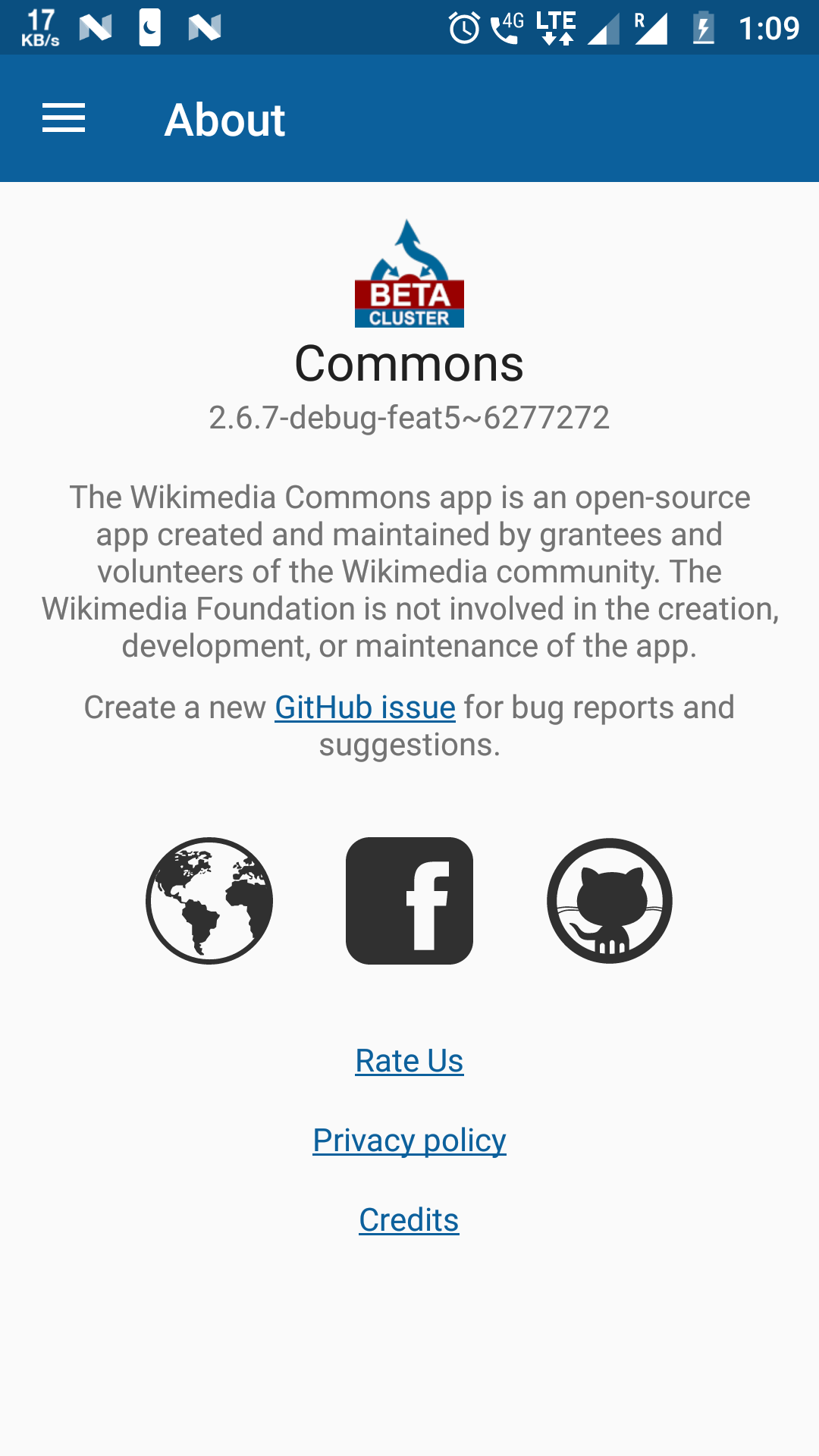
According to guidelines by Google Toolbar background color should be the primary color. Statusbar background color should be primary Dark color.
Steps to reproduce:
Change toolbar background to primary color in toolbar.xml
Expected behavior:
Toolbar background color should be the primary color.
Observed behavior:
Toolbar background color is primary dark color.
Screen-shots:
Image 1->Before
Image 2->After