 cpritcha
commented
5 years ago
cpritcha
commented
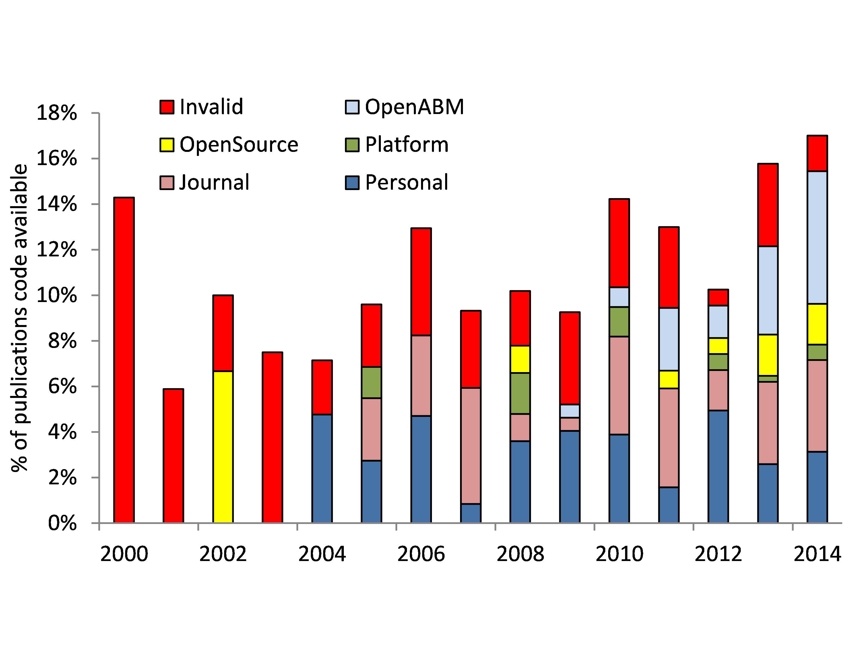
5 years ago - Publications over time
- (% of ) publications over time with code available (user can choose to see absolute numbers or % of the publications)
- (% of) publications over time which use ODD protocol
- (% of) publications over time which use math description
- (% of) publications over time which use flow diagrams
- (% of) publications over time which use pseudocode
- (% of publications) over time which model code is available in one of the 6 higher level categories (archive, code repository, etc), and a similar figure for the 20 details categories. See http://jasss.soc.surrey.ac.uk/20/1/2/figure3.jpg as an example of an older version of the database.
- (% of) publications over time which use one of the top 10 or top 25 platforms.
- Note that all those graphs could be one graph, with the option to select absolute or %, and the users can choose items they want to see in the graph.
- Histogram for the top 10/25 most popular journals, authors, platforms, sponsors
160
Could you explain what is unclear?