contiki-os / contiki

The official git repository for Contiki, the open source OS for the Internet of Things
http://www.contiki-os.org/
Other
3.71k stars 2.58k forks source link

Contiki Logo #1066

Open g-oikonomou opened 9 years ago

g-oikonomou commented 9 years ago

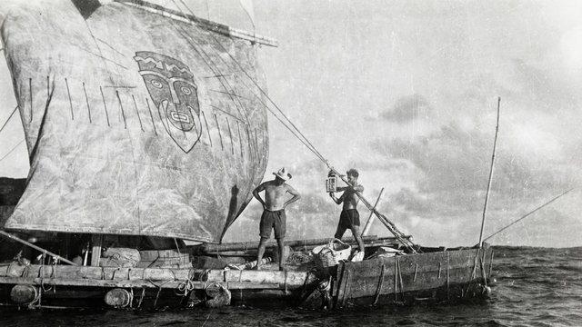
I have discussed this internally with exactly zero people, so if anyone disagrees feel free to shoot this down or even close it!

I think Contiki needs a logo.

My artistic impression is rubbish and I couldn't draw a straight line even if you gave me a ruler.

So basically this is a "If you have decent art skills and an idea you want to share, upload it here and if it turns out to be popular, it may become the 'official' logo". The only prize will be the attribution!!!

There is one rule though: If you upload something you must be prepared to share it with a free license. My personal preference would be CC BY 4.0 CC BY-SA 4.0.

Other than that, it would be great if it was something that could easily be transformed into a favico and a small .ico file.

Please post in this issue, don't open new ones. Ta!

marcas756 commented 9 years ago

Hello,

I am not sure about legal or copyright issues for my suggestion on this topic, but the first symbol I got in mind would be another but more simplified iconification of the Kon-Tiki figure on the raft's sail .

http://www.filmarkivet.no/upload/image/kon-tiki%201.jpg

http://en.wikipedia.org/wiki/Viracocha

https://www.google.at/search?q=viracocha&biw=1294&bih=819&tbm=isch&tbo=u&source=univ&sa=X&ei=jOhSVavwDcje7Abzg4HoDQ&sqi=2&ved=0CC0Q7Ak

Regards marcas

simonduq commented 9 years ago

:+1: on the fact we badly need a logo!

alignan commented 9 years ago

:+1:

sumanpanchal commented 9 years ago

:+1:

uknoblic commented 9 years ago

:+1:

igi-sh commented 9 years ago

Hi Guys,

Did you try the http://www.designmantic.com/ with "Contiki" and "Research & Development options?

oliverschmidt commented 9 years ago

Hi,

If you check out https://en.wikipedia.org/wiki/Contiki you see two examples of the old Contiki desktop with icons. There's one icon used for all programs that don't have an individual icon. So one can consider this THE Contiki icon.

That's the reason why I used that icon for Contiki programs in general in the Apple GS/OS finder (https://github.com/adamdunkels/contiki-1.x/commits/master/contiki-apple2/contiki.icon). For that purpose I resized the 24x24 icon to 44x44 by just doubling the inner 22x22 pixels.

Later I used that 44x44 icon as part of the Contiki default web page displayed by the Contiki web server when compiled as static web server (https://github.com/contiki-os/contiki/tree/master/examples/webserver/httpd-cfs) - see image below.

In case there would be a momentum to use that icon as Contiki logo one could/would redo the artwork as scalable vectors consisting of of a square, several circles/arcs and nine solid lines.

Regarding the authorship there are two references: http://cc65.github.io/mailarchive/2003-03/2677.html http://www.statemaster.com/encyclopedia/Contiki

Regarding the license there's no doubt as it's i.e. in 'abouticon_bitmap' here: https://github.com/contiki-os/contiki/blob/master/apps/about/about-dsc.c

Regards, Oliver

contiki

aguirrem commented 9 years ago

At the risk of having an opinion in a conversation I wasn't invited into I like @marcas756 suggestions

remyleone commented 9 years ago

My good friend @agersant on twitter made this:

logos

I like the one on the right ;-) better

remyleone commented 9 years ago

We sketched with @simonduq and @joakimeriksson an other idea. Feel free to commentimg_20150819_131354

cmorty commented 9 years ago

I like the suggestions by @agersant. Especially that there are two variants. You might even put the C around the O in the long variant. @sieben Does the background matter? For Print you want the white version.

remyleone commented 9 years ago

Of course but I think the color sets we use depends on the situation whether it's for printing or being the logo on a trendy/hipster website ;)

2015-08-28 10:18 GMT+02:00 Moritz Strübe notifications@github.com:

I like the suggestions by @agersant https://github.com/agersant. Especially that there are two variants. You might even put the C around the O in the long variant. @sieben https://github.com/sieben Does the background matter? For Print you want the white version.

— Reply to this email directly or view it on GitHub https://github.com/contiki-os/contiki/issues/1066#issuecomment-135669476 .

remyleone commented 9 years ago

I also think that the color look a little bit like the ones on http://www.riot-os.org/#home haters are gonna hate ;)

alignan commented 9 years ago

@sieben the first thing I thought when I opened the email was "why is RIOT logo in here?" xD

I like the suggestions, but not so much the black background.

adamdunkels commented 9 years ago

I know this is all made with the best of intentions, which is something I really appreciate. I don't want to curb any of the enthusiasm here, but if we are going to update or create a new Contiki symbol/logo, it needs to look good.

A couple of years ago I was involved in an organization where the logo issue was discussed. One of the persons involved was really enthusiastic and had put together a huge list of potential logos. They all looked like the kind of stuff a really enthusiastic amateur would be able to put together. All made with the best of intentions, and all with way more enthusiasm than design skills. Many were of the kind "let's put one letter around the others" - those tended to look a lot like slugs. Everybody was too polite to say it out loud, but none of the logos looked any good.

Fortunately one of the other guys happened to have their office next to a professional design firm, who they would sometimes go to lunch with. They went to lunch later that day and discussed logos. As they got back, one of the designers did a super quick ~2 minute logo, for free, as a friendly favor. That super-quick-and-dirty logo beat all the enthusiastic amateur logos. By far.

So the trick with having a logo/symbol is to let someone who has some real design skills create it. Having no logo is better than having a non-logo. There are some extremely embarrassing logos out there (e.g. look here: http://www.gnu.org/graphics/package-logos.en.html). We really don't want to look like that.

The original Contiki symbol, which @oliverschmidt mentions, is made with such design skills (by Mikael Backlund), but it was hand pixelled and not vectorized. We could try to vectorize it, which would be risky as we might very well end up looking like something an amateur enthusiastically wanted to vectorize. (I actually tried to do that a few years back - and it looked just like an enthusiastic amateur vectorization. But if someone here is good with vectorization, it would be really cool to see a good vectorization.) Or we could see if there are any designers around.

remyleone commented 9 years ago

How the decision about the logo is going to be taken anyway? Will it be by a jury (open or restricted) and a poll?