Team's Response
A duplicate issue from #3076.
The 'Original' Bug
[The team marked this bug as a duplicate of the following bug]
Scroll bar doesn't work for person list pane
Description: Once the number of contacts displayed exceeds the space allowed, I am unable to scroll down.
Steps to reproduce: Add contacts until the new contact can no longer be viewed in the person list pane.
Expected result: Use scrollbar to scroll down to view the other parts of the list.
Actual result: Unable to scroll up and down.
[original: nus-cs2103-AY2425S1/pe-interim#1627] [original labels: severity.High type.FunctionalityBug]
Their Response to the 'Original' Bug
[This is the team's response to the above 'original' bug]
Thanks for pointing this out! We agree that not being able to scroll through the person list is inconvenient, especially when there are too many contacts to display. That said, there are workarounds, like using
filtertagto show a subset of contacts orfindto locate specific ones. While these aren't perfect, they help mitigate the issue for now.We’ll classify this as
severity.Mediumbecause it does cause inconvenience, but the app is still usable with the available workarounds. We’ll consider improving this in a future update. Thanks again for bringing it to our attention!Items for the Tester to Verify
:question: Issue duplicate status
Team chose to mark this issue as a duplicate of another issue (as explained in the Team's response above)
- [ ] I disagree
Reason for disagreement: [replace this with your explanation]
## :question: Issue severity Team chose [`severity.Medium`] Originally [`severity.High`] - [x] I disagree **Reason for disagreement:** While I agree that there are workarounds, I feel that these suggested workarounds are far less than ideal to mitigate the bug present, given the intended use cases, intended users, and the reason why this bug needs to be rectified. The bug present also inconveniences users in other ways the developer team does not seem to realise. Moreover, based on the examples shown in the PE readiness Canvas quiz, I believe this bug's severity should be rated as high.
**Summary of Reasons in point form** Note: it may be better to read the longer answer to understand how I arrive at the pointers below
Inherent Reasons * product is meant for users to do things **efficiently**. The bug present undermines the efficiency severely. * product is designed for managing **large** databases. E.g. supporting **200 contacts**, based on the use case example in the user guide * viewing all contacts, including viewing contacts in **filtered list**, is expected to be a **frequently** used operation * The inability to scroll not only severely limits contact viewing (of all contacts AND contacts in filtered lists) but also misleads users about **the number of contacts** displayed: * Users cannot confidently determine (and have to guess) valid indexes to input for `view INDEX` command when there are more than 8 contacts listed * Users risk missing out contacts that are beyond the 8th contact because he/she is unable to view all contacts listed. * the workaround suggested by the developer team does not address the risk of missing out contacts that arise from the incomplete view of contacts listed * for the suggested workaround to be effective, users must conscientiously tag contacts with a specific tag and ensure that each tag is assigned to at most 8 contacts. **Conscientiously keeping track of the number** for each tag highly inconveniences users. Supporting Reasons * PE Readiness Quiz on Canvas: reference is made to the explanations given for why bugs are categorised as high severity * The product need not be rendered unusable before the bug can be determined as high severity * the developer team has also ranked the user story related to this feature as "Priority: High (must have)", indicating that any incompleteness of such feature is a severe bug All the above reasons suggests that the use of this app remains highly inconvenient even with the workarounds, and has a high risk of deterring users to even use the application. Thus, the severity of the bug should be high.
**Longer answer:** For most parts of the developer's team response: > ...not being able to scroll through the person list is inconvenient, especially when there are too many contacts to display. That said, there are workarounds, like using `filtertag` to show a subset of contacts or find to locate specific ones. While these aren't perfect, they help mitigate the issue for now. > ...it does cause inconvenience, but the app is still usable with the available workarounds. I agree.
However, I disagree with the following reasoning
> We’ll classify this as severity.Medium because it does cause inconvenience, but the app is still usable with the available workarounds. While the app indeed is still usable with the workarounds and I acknowledge that the developer team recognises the inconvenience, it seems to me that the basis for the severity downgrade is purely based on the fact that the product is still usable. To me, this reason is insufficient as the product need not necessarily be rendered unusable before a bug is considered of high severity. In the definition of severity.High: > A flaw that affects most users and causes major problems for users. i.e., only problems that make the product almost unusable for most users should have this label. I pay attention to the use of word "almost". That means, even a bug with high severity can still allow the product to work.
Moreover, based on the PE readiness quiz on Canvas (picture below), a bug that cause an inconvenience (a **major** one) can be classified as high severity.
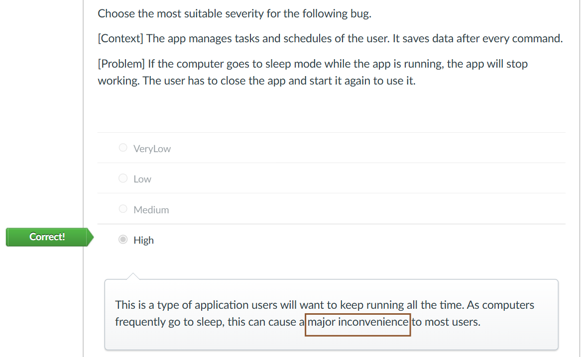 Not being able to see all the contacts is a major inconvenience. (more on that below)
 To be fair, whether something should be classified as high or medium severity is quite subjective, and the difference between the two is determined based on how we interpret the severity of the issue. A better way is perhaps to refer to how the teaching team categorises bugs under high severity.
Other than the one shown above, let's look another example found in the PE readiness quiz on Canvas:
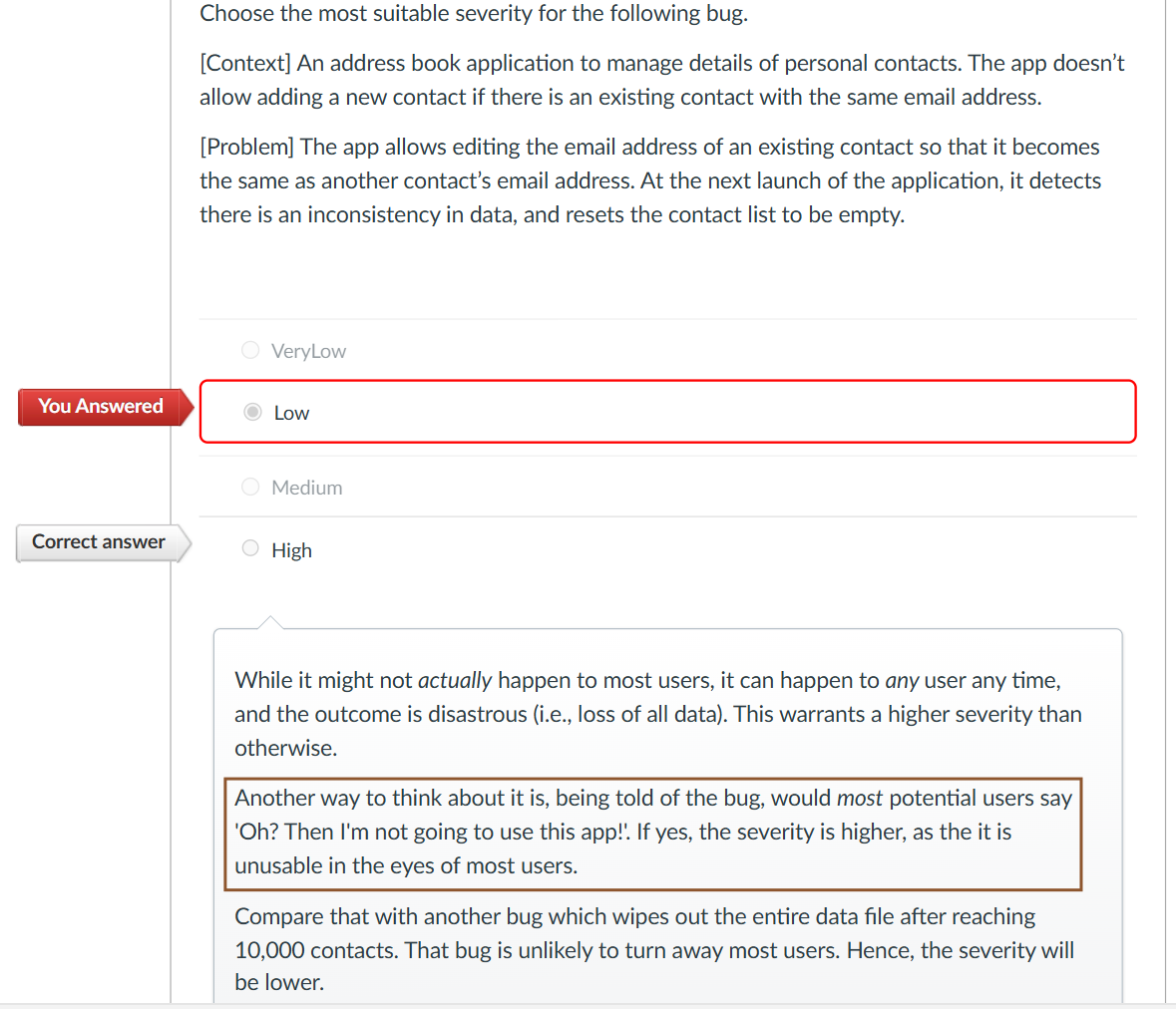 I noted the yardstick given in the explanation:
> Another way to think about it is, being told of the bug, would most potential users say 'Oh? Then I'm not going to use this app!'. If yes, the severity is higher, as the it is unusable in the eyes of most users.
Given that such a yardstick is given in a question where the bug described is of high severity, I took this as a way to determine if a bug is considered to be of high severity. For myself, If I'm told about this bug, I think I won't use the app because it really is inconvenient despite the suggested workarounds.
 **Why a major inconvenience?** Preliminary view on why the workarounds don't work According to the developer, some workarounds we can do is * `filtertag` to show a subset of contacts * `find` to locate specific ones Showing a subset of contacts by `filtertag` does not guarantee that all the contacts to be displayed can fit into the UI. In order to use `find`, users must already know the names of the contacts, which may not be possible if users cannot in the first place view all the contacts to find the name. Moreover, users likely will only use `find` if they already have a specific contact they want to look at, which is not what viewing all contacts serve to do. Magnitude of the Issue Firstly, we must first understand the magnitude of the problem, which is indicated by the maximum number of contacts that can be viewed at any one time. Maximising the scroll pane that contains all the contacts:
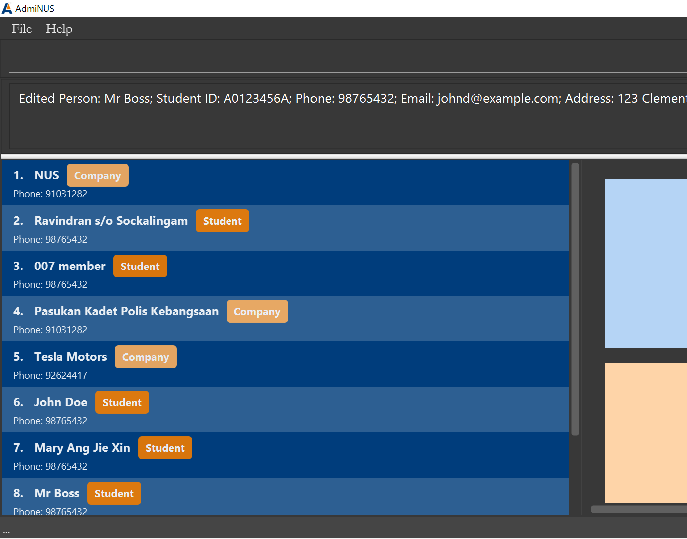 we can only see 8 contacts at any one time.
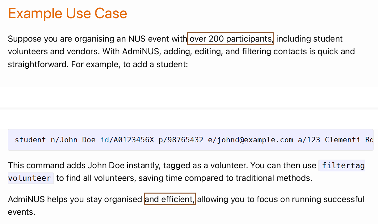
 The severity is indeed not high if the product is meant to keep track a small number of contacts like 5 to 20. However, in the user guide, it is specifically mentioned that the product is for users who need to manage _large_ databases (see first screenshot below), mentioning an example use case involving over 200 contacts (see 2nd screenshot below). This implies that their product is supposed to support at least 200 contacts. Moreover, both screenshots attached alluded to the idea that the product is meant to allow for **efficient** contact management. 1st screenshot

2nd screenshot
Understanding the function of a scroll pane Secondly, we should be clear why the scroll pane needs to be working. One of which is to view all contacts, which is line with the user story found in the Developer Guide (DG): > As a user, I want to view all contacts so that I can see all my contacts saved in one screen Note: For this user story, the developer team did not rate the priority as low or medium but "High (must have)". This itself implies that if the feature isn't fully met, it is a rather severe problem, making this bug having a greater severity.
Given that the scroll pane is to allow viewing of all contacts listed (regardless if the list is filtered), the principle behind the workaround is to **view the contacts list by list**.
Let's use examples to illustrate. If I have 9 contacts with a mix of students and companies, I can first input `track student` and view the list which would show all the student contacts. Then, I input `track company` to view the company contacts. By viewing the two lists of contacts one at a time (what I refer to as "list by list"), I can eventually view all the contacts. However, this becomes seriously ineffective if an admin user has large database. If there were 200 contacts, there are 200 / 8 = 25 lists of contacts the user need to view list by list, which is too much. In addition, `track student` or `track company` does not solve the problem as it is most likely that the number student contacts and/or company contacts will exceed 8, implying that it is still not possible to view all contacts.
Even if a user not need manage so many contacts, a reasonable number is perhaps 40 -- 30 students in a club and 10 contacts representing external stakeholders, NUS departments and NUS partners (staff advisor, other NUS clubs etc.). 40 / 8 = 5 lists, which I think (yes I agree is subjective) is still too troublesome to warrant the use of the app.
Other commands as workarounds While the `track` command may not be able to effectively group all the contacts listed into two categories with each containing at most 8 contacts, it is still true that we can use other commands, like what the developer suggested. Extracting the relevant ones: * `track CATEGORY`: track contacts by category (i.e. student or company) * `filtertag KEYWORD [MORE_KEYWORD]…`: view contacts by tags' keyword(s): * `find KEYWORD [MORE_KEYWORD]…`: Locate persons by name: * `view INDEX`: viewing a contact by showing the details of a contact We should bear in mind that when users want to view all contacts, users in the first place are not finding a specific contact, thus using `find KEYWORD [MORE_KEYWORD]…` or `view INDEX`, which is to find a specific contact(s) or to view the details of a specific contacts respectively, is unsuitable. In order to use the `find` command, users must know the contact's name in order to search for it, which may not be known if users cannot view all the contacts. While users may use `view INDEX` (e.g. `view 9`, `view 10`) to view contact details of contacts that cannot be seen given that users can't scroll down, users have to first determine how many contacts there are, and then the valid indexes for command input. Determining the maximum valid index have to be done through trial and error, since there is no easy way to know the **number** of contacts expected to be in the list, aggravating the issue.
Number problem The current product does not have a way to inform users how **many** contacts there are in the app or how many contacts should be listed at any given time, except by "scrolling down the list of contacts displayed to the very end and reading off the index associated with the last contact". That number is the number of contacts expected. As the only way to know the number is by scrolling, and the scroll functionality is not working, users cannot easily verify how many contacts are supposed to be displayed. This has implications which will be explained with an example.
Let's say I input `track company` and 9 company contacts are listed. But because the app can only fit 8 contacts within the scroll pane, there's a risk that users wrongly conclude that there are only 8 company contacts in the list, especially if they tried scrolling down the list and conclude that this is the complete list given that the list didn't move. If the product has a UI component indicating the total number of contacts displayed, users at least know the expected number of contacts in the list which can be used for verification, and users can directly know the maximum valid index allowed for `view INDEX` command. But this product doesn't have such a UI component. Hence, users like me, had to guess the number of contacts present by recalling the our vague memory of the number of contacts added, and enter the most likely number for `view INDEX`. If the index value is invalid, I will try again with a smaller index value. If the index is valid, I will try my luck and try with a bigger number. By trial and error, I will be able to deduce the maximum index allowed, but the entire process was slow and inconvenient. It's very important for users to know the number of contacts displayed because the only way for users to view more details of a specific contacts is by the `view` command, which necessitates the **index**, and which can sadly only be determined by looking at the display.
Therefore, the inability to scroll down the list is **not just about whether users can view all the contacts at one go, but also about informing users how many contacts there should be**. This forms a crucial functionality of the app. But the developer did not address what kind of workarounds there should be for this.
Going back to other commands Eliminating `find` and `view` command as workarounds, we left with `filtertag` command, which is indeed a better and valid workaround. However, it seems to me that the developer team fails to realise the other non-trivial costs that comes with it -- users now have to conscientiously tag every contact a tag (say group1, group2, group3, so on and so forth), and **conscientiously ensure that every group only contains at most 8 contacts.** I.e. each tag can be tagged to at most 8 contacts. If the user choose not to add such a special tag just to group contacts into groups of 8, users should ensure that if for any tags used, each tag ideally is tagged to at most 8 contacts. Otherwise it risk the contacts not being shown.
Similarly, there is no easy way to tell how many contacts are tagged to a single tag. For users to conscientiously ensure that at most 8 contacts are tagged to a tag is highly inconvenient. While one may argue that "we can tag each contact with a unique tag, every contact thus has a unique identifier and keeping track of the number of contacts to a tag becomes unnecessary, since it will definitely be just 1 contact to a tag", this is not ideal because (1) that is akin to saying displaying 1 contact per list at a time, which mean 40 contacts = 40 times of viewing and (2) this is no different from using `find` to locate a specific contact by name, since name more or less serves as a unique identifier.
Moreover, similar to using `track CATEGORY`, there are many lists the users have to look through before being able to view all the contacts for large databases, increasing the inconvenience of the app. Moreover users may not easily remember the tags used for grouping contacts into 8, and that `filtertag` does not guarantee in addressing the issue of not being able to see all the contacts as it is up to the user's discretion and conscientiousness to ensure that groups of 8 are enforced.
All that being discussed, perhaps we can `export` the data into a csv file? And view all the contacts at one go from the csv file? That is another valid workaround, but what's the point of using the app if we have to export the csv file, view all the contacts, and import it back again?
Moreover, we must not forget that viewing all the contacts in the list, including **filtered lists**, is an operation most users will use frequently. The high frequency warrants the need to rank the bug severity as high too.
In all, while the developers acknowledge that the workarounds are not perfect, the developer team does not seem to fully internalise, (or if they do, did not show their full understanding) the implications of the bug and the inconvenience that arise, especially given that their intended target users have to manage a large database.
Note to teaching team: while this rather lengthy response does not seem to be good use of time spent just to dispute over medium vs high severity, especially when there's a untrivial level of risk of being rejected at the end, I think expressing my opinion and arguing for the truth as clear as possible is more important (and is actually fun haha).
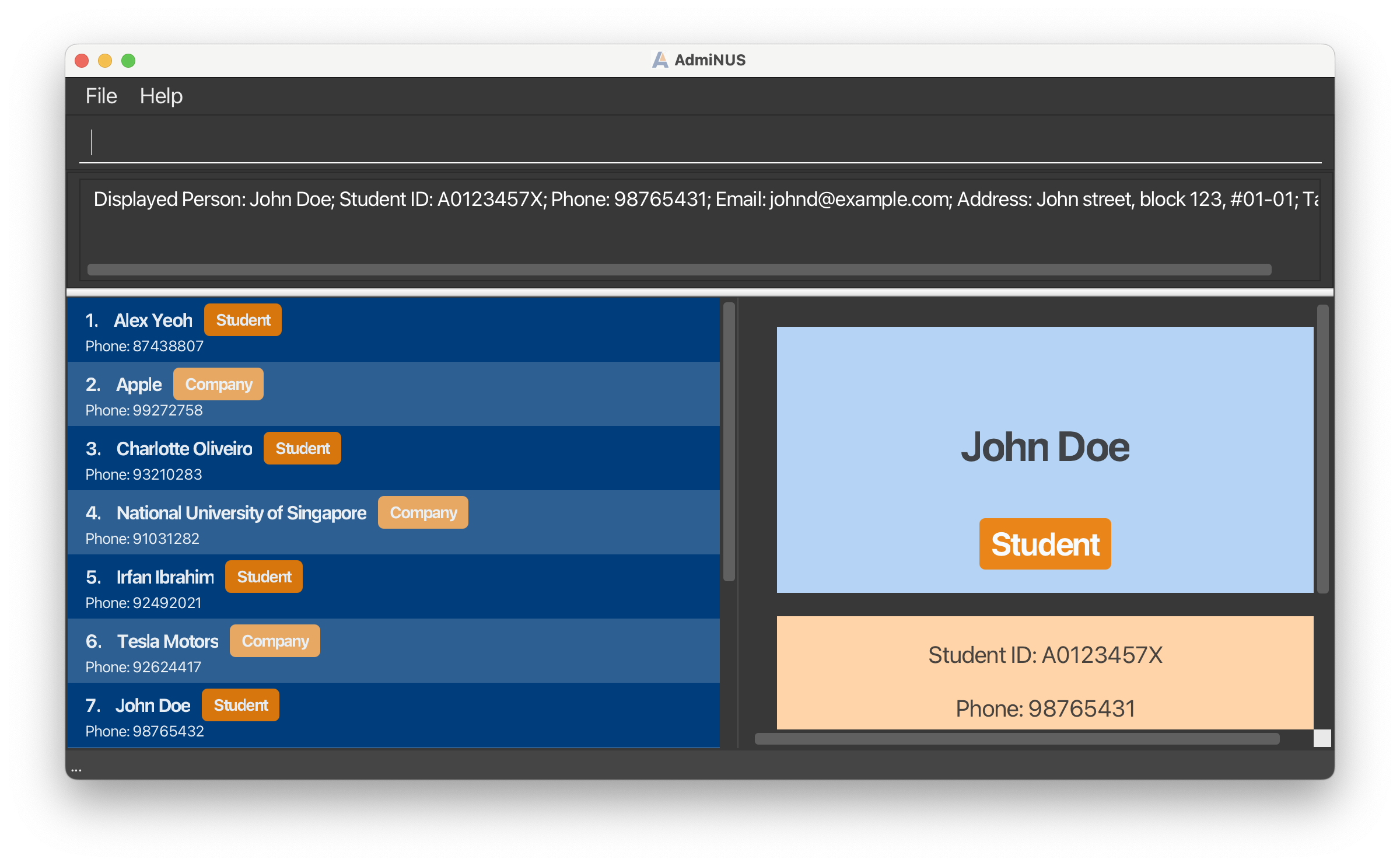
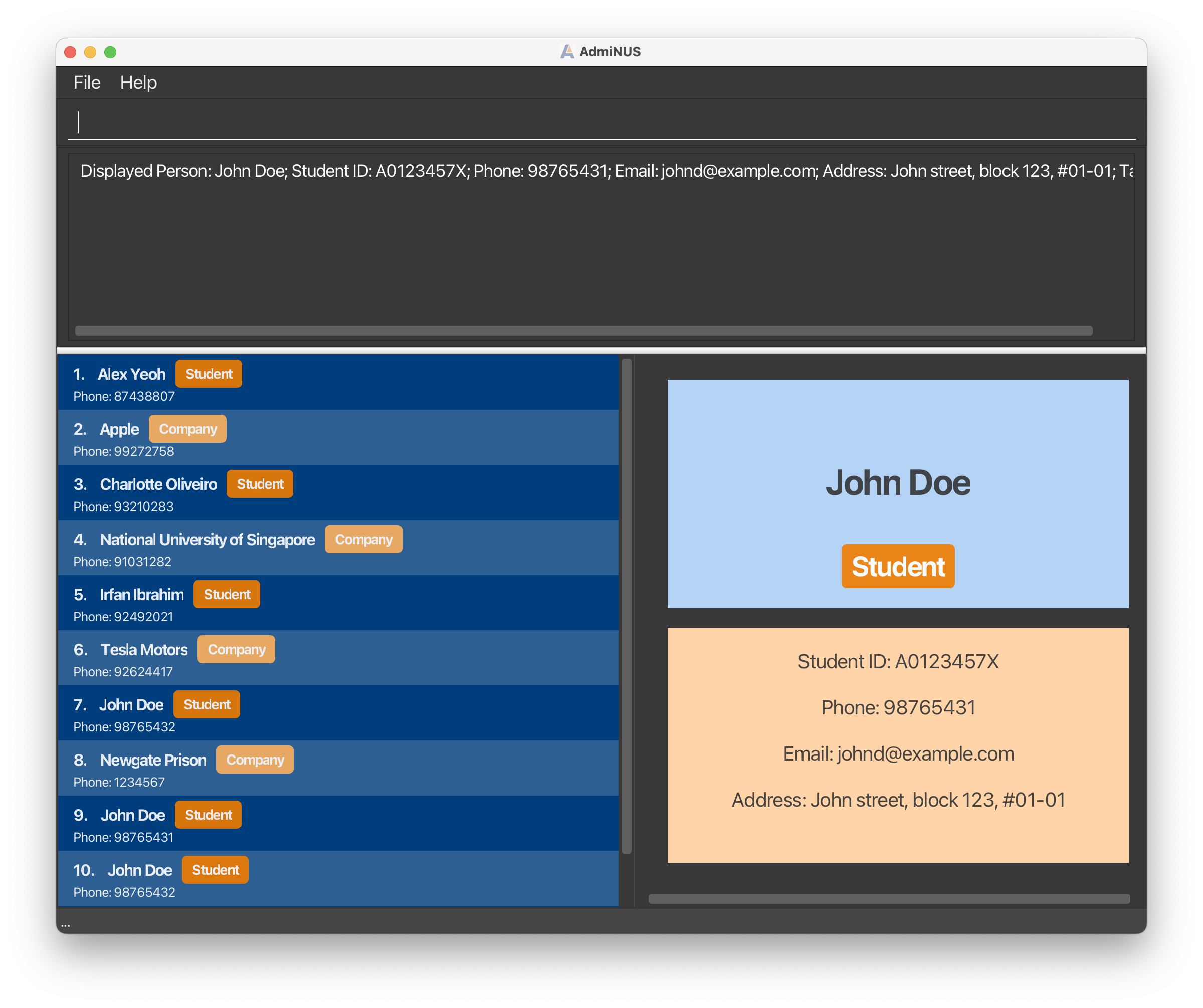
^For the left pane (as boxed in green), I tried to click on the scroll bar view other contacts below but I am unable to. I click on the left pane and use my mouse to scroll down but am unable to scroll down to view the other contacts. At the point in testing, I should have 7 to 8 contacts in the list and I have maximised the app window size as much as possible already.
While I understand that users can view the details of the contact via another command, it feels inconvenient to users that users are unable to scroll down to look at the overview of contacts I have in the app.
In the terminal, there seems to be an error message: