Team's Response
Decision of Bug Type
We agree that it is a feature flaw since it is just to have a more informed message for the user.
Decision of Severity
We feel that it is very low since it is purely a GUI improvement since the error message already informs the user that changes has been reverted. And by adding what was changed is does the same thing as the current message but just makes it more specific what was changed
Decision for Response
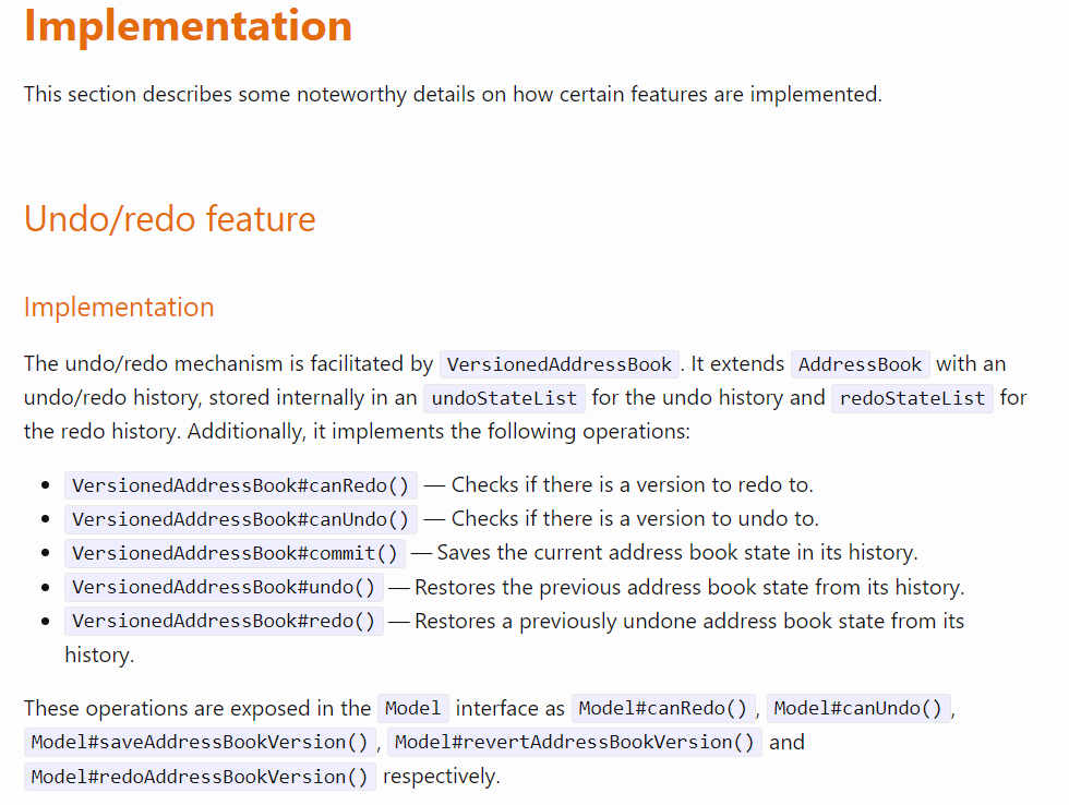
We feel that it is not in scope, since firstly in the DG our team did document how the undo feature works as it saves the previous address book state. And by definition of the undo function it does captures the changes made after executing a command. Secondly, we feel that if we were to add a specific message we will need to re-implement the back end for the undo command because we will need to remember each individual command instead of the state of the address book.

Items for the Tester to Verify
:question: Issue response
Team chose [response.NotInScope]
- [x] I disagree
Reason for disagreement: I believe that their justification for why this issue is not in scope has some issues.
- Firstly, I from this bug from a user perspective. I do not think a user will be reading the DG to understand why the undo command is unable to "remember" the changes that were made. What I propose the user would want is to have some indication of what changes were undone or redone to have some positive feedback they are doing the right thing.
- I don't see how giving me the implementation of a feature would make its error message not in scope sorry 😅
## :question: Issue severity Team chose [`severity.VeryLow`] Originally [`severity.Low`] - [x] I disagree **Reason for disagreement:** As mentioned I believe this is not purely a cosmetic issue and can cause actual inconveniences. For example usually when we `Ctrl-Z` to undo in a word document, we are brought to the exact location that the change was undone giving some form of visual feedback as to what just happened. So I have 2 gripes which are connected to each other 1. The error message for undo and redo are **exactly** the same when they do the exact opposite things. Users may get confused when they redo but see "revert" 2. There is no feedback in the UI. After using `find` when I undid my last tracked task, I was confused because nothing changed (the UI did not go back to the `list`) so there was no visual feedback for the user. So I do not think this is merely a cosmetic issue
video:https://raw.githubusercontent.com/curtischang2510/pe/main/files/5b5e0957-7f12-4784-8671-f9a66c202cce.mov
Steps to reproduce: