Hi,
First, I would like to thank all the contributors for this wonderful tool that allows almost anyone to have a the custom lovelace card of their dream.
Is your feature request related to a problem? Please describe.
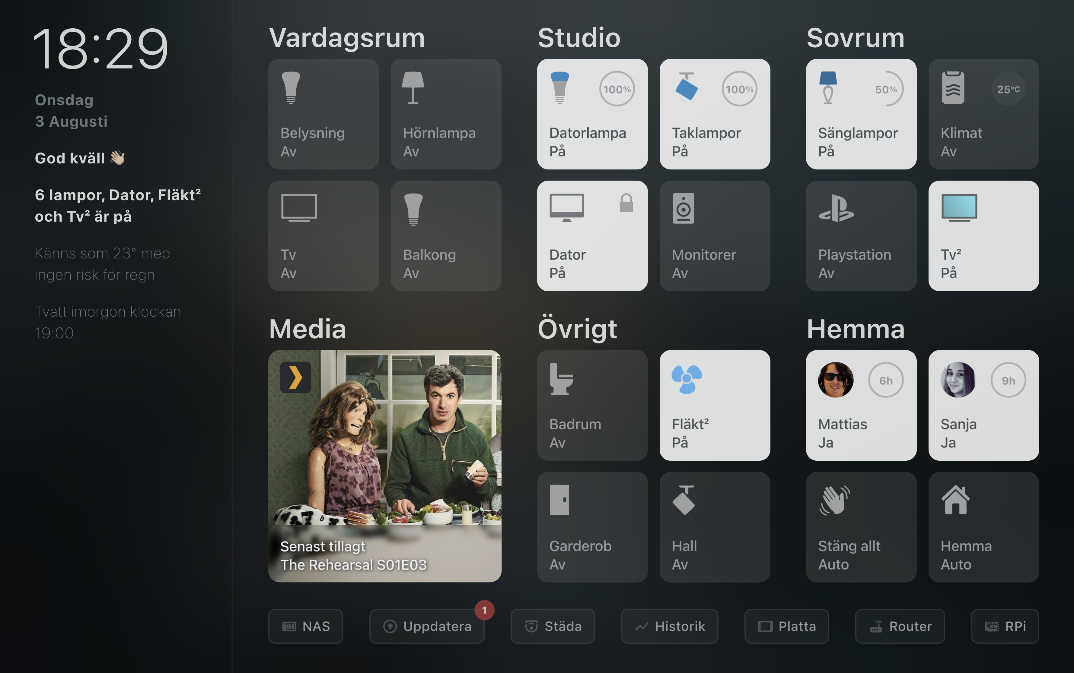
I'm always frustrated when I want to show an icons with multiples colors and that there is no easy way to do it. The only way is to create a custom field.
Describe the solution you'd like
It would be so much easier if the icon field could also return HTML. But according to my tests and the documentation, this field supports JS templates but only if it returns a String in the format mdi:icon.
icon: This needs to return a string in the format mdi:icon
So I would like it to be possible to do this:
- type: custom:button-card
  entity: switch.bathroom
  variables:
    svg_icon:
      fill: '#959595'
      fill_on: '#FCD663'
      fill_off: '#393939'
      path_on: m 11,10 h 2 v 10 h 3 v 2 H 8 v -2 h 3 z
      path_off: m 11,10 h 2 v 10 h 3 v 2 H 8 v -2 h 3 z
      path_colored_on: m 15,2 2,7 H 7 L 9,2
      path_colored_off: m 15,2 2,7 H 7 L 9,2
  icon: |
    [[[
      if (variables?.svg_icon) {
        if (entity.state == 'on') {
          return `<svg viewBox='0 0 24 24'>
                    <path fill='${variables?.svg_icon?.fill}' d='${variables?.svg_icon?.path_on}'/>
                    <path fill='${variables?.svg_icon?.fill_on}' d='${variables?.svg_icon?.path_colored_on}'/>
                  </svg>`;
        } else {
          return `<svg viewBox='0 0 24 24'>
                    <path fill='${variables?.svg_icon?.fill}' d='${variables?.svg_icon?.path_off}'/>
                    <path fill='${variables?.svg_icon?.fill_off}' d='${variables?.svg_icon?.path_colored_off}'/>
                  </svg>`;
        }
      }
      return entity?.attributes?.icon;
    ]]]
And get this:
Describe alternatives you've considered
Unfortunately, this is not possible at the moment. So I have to resolve to use custom_fields.
Which gives about the same result but it's less clean and intuitive in my opinion:
- type: custom:button-card
  entity: switch.bathroom
  name: Couch
  variables:
    svg_icon:
      fill: '#959595'
      fill_on: '#FCD663'
      fill_off: '#393939'
      path_on: m 11,10 h 2 v 10 h 3 v 2 H 8 v -2 h 3 z
      path_off: m 11,10 h 2 v 10 h 3 v 2 H 8 v -2 h 3 z
      path_colored_on: m 15,2 2,7 H 7 L 9,2
      path_colored_off: m 15,2 2,7 H 7 L 9,2
  show_icon: false
  styles:
    grid:
      - grid-template-areas: '"svg_icon" "svg_icon" "n"'
    custom_fields:
      svg_icon:
        - width: 38%
        - margin: auto
  custom_fields:
    svg_icon: |
      [[[
        if (variables?.svg_icon) {
          if (entity.state == 'on') {
            return `<svg viewBox='0 0 24 24'>
                      <path fill='${variables.svg_icon?.fill}' d='${variables.svg_icon?.path_on}'/>
                      <path fill='${variables.svg_icon?.fill_on}' d='${variables.svg_icon?.path_colored_on}'/>
                    </svg>`;
          } else {
            return `<svg viewBox='0 0 24 24'>
                      <path fill='${variables.svg_icon?.fill}' d='${variables?.svg_icon?.path_off}'/>
                      <path fill='${variables.svg_icon?.fill_off}' d='${variables.svg_icon?.path_colored_off}'/>
                    </svg>`;
          }
        }
        return entity.attributes.icon;
      ]]]
Community
Here Some community members that also have to use custom_fields to be able to achieve this style:
Hi, First, I would like to thank all the contributors for this wonderful tool that allows almost anyone to have a the custom lovelace card of their dream.
Is your feature request related to a problem? Please describe.
I'm always frustrated when I want to show an icons with multiples colors and that there is no easy way to do it. The only way is to create a custom field.
Describe the solution you'd like
It would be so much easier if the icon field could also return HTML. But according to my tests and the documentation, this field supports JS templates but only if it returns a String in the format
mdi:icon.So I would like it to be possible to do this:
And get this:
Describe alternatives you've considered
Unfortunately, this is not possible at the moment. So I have to resolve to use
custom_fields.Which gives about the same result but it's less clean and intuitive in my opinion:
Community
Here Some community members that also have to use
custom_fieldsto be able to achieve this style:hass-config
eximo84