Open barijaona opened 3 months ago
Hey @barijaona - thanks for taking the time to leave feedback! That should be a simple enhancement; I'll add an Accessibility setting to show text descriptions instead of the glyphs. I'll get that into the next release!
I'll note that the "Status" icons on the summary view only represent the pull request status from GitHub, which is one of:
You mentioned "Approved" in the solution you'd like, and that's more complicated. A review can have an "Approved" status, but that doesn't necessarily mean the pull request is ready to merge. Some repositories require pull request workflows to pass before a pull request is ready to merge (or possibly have other branch protections). PR Focus doesn't currently attempt to discover what repository branch protection rules apply to a pull request, and therefore it can't say whether a pull request is ready to merge.
So aside from the option to display text instead of the glyphs, it sounds like you are also requesting some indicator in the summary view to know a pull request is ready to merge? (Or maybe just that it has a Review that has been left on the pull request with an Approved status?)
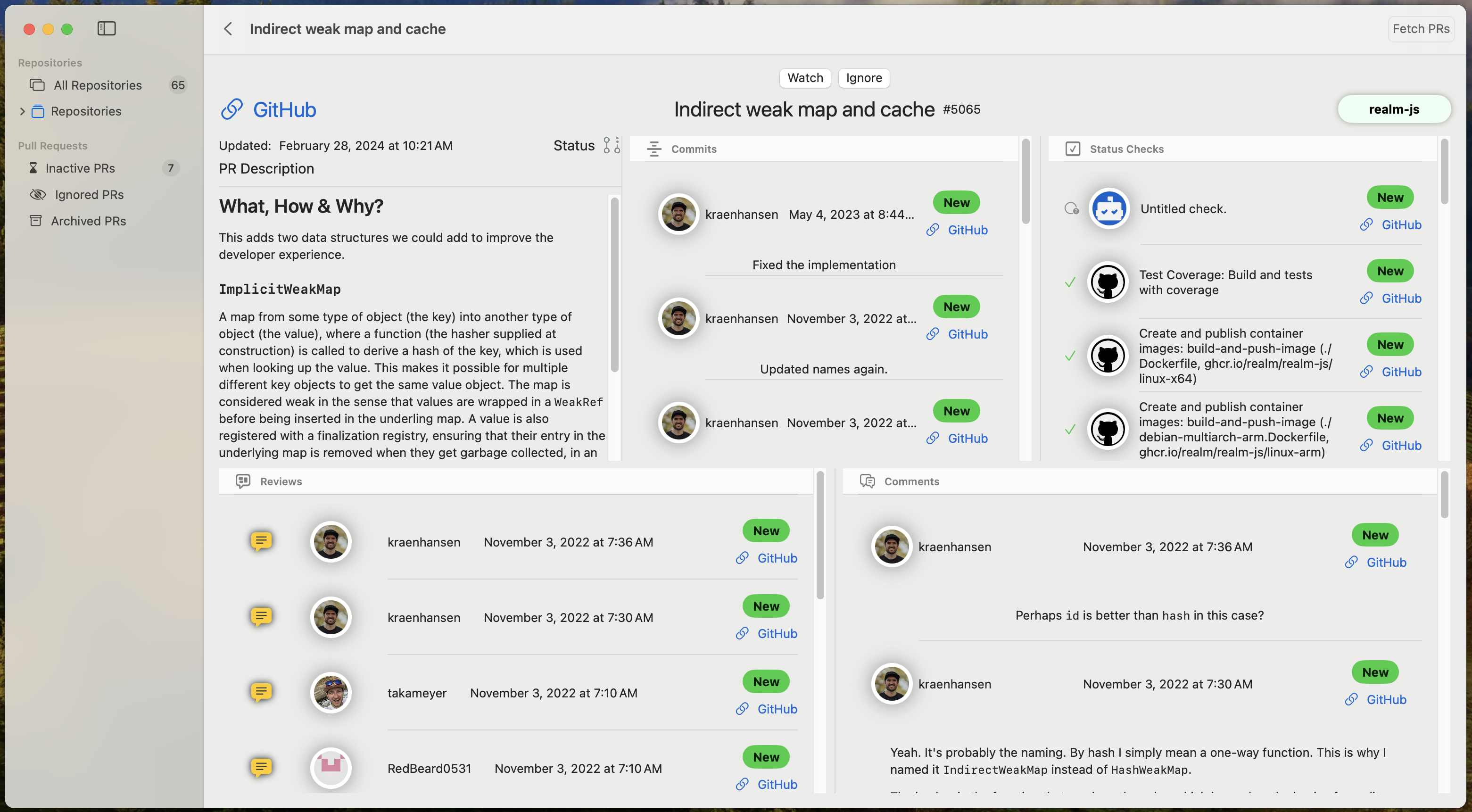
My interest here is on reviews approving the PRs.
Got it.
Ok, I'll add a setting to display text labels instead of the glyphs in the next release.
I'll try to think of a nice way to display review approvals on the summary that you see in the list view. It's not as simple as mixing it in with the pull request status, because those are different data points. But in the meantime, you can already click into the PR summary to view the PR details in the app, and can see the status of each review in the PR details.
In this screenshot from the PR Detail documentation, the PR has two reviews - the top one is just a comment, and the second one is requesting changes:
If a PR has a review that is an approval, it has a green "Approved" icon with a checkmark, shown here in the Reviews documentation.
Hopefully, having this information in the PR detail view can solve your need in the short term while I try to think of how I might fit this info into the summary design.
While I'm adding a setting to display text instead of the PR status glyphs - would you want a similar setting for the review status glyphs - to display text instead of the review status icons?
Yes, it makes sense. Text labels will be a good option regarding accessibility. I am asking myself if having the text labels use the same colors than the equivalent icons would make sense ?
I'm still planning more work to expose the review status in the PR summary, but PR Focus v1.1.0 is now live, with two new accessibility settings to display text instead of glyphs for these statuses. It may take some time to distribute across the App Store, but you should be able to see it soon and update to this version.
I've posted an announcement here summarizing the new features, with links to the documentation: https://prfocus.app/news/2024/08/12/introducing-tags-and-filtering-in-pr-focus/
I'll follow up when I have better exposed the review status on the summary view, so you don't have to click into a PR, but that should be in my next release.
Is your feature request related to a problem? Please describe. The app is really confusing as it is mainly the color (green or purples) that allows the user to distinguish between a submitted PR and a merged PR. The icons are not differentiated enough.
Describe the solution you'd like Add text descriptions of status : draft / submitted / approved / merged…