dask / community

For general discussion and community planning. Discussion issues welcome.
20 stars 3 forks source link

Improving how Dask looks on the web #220

Open jacobtomlinson opened 2 years ago

jacobtomlinson commented 2 years ago

Hey all. I just wanted to provide an update on the progress made by the working group thinking about Dask's branding, websites, visual identity, etc. We will add more updates to this issue as things progress.

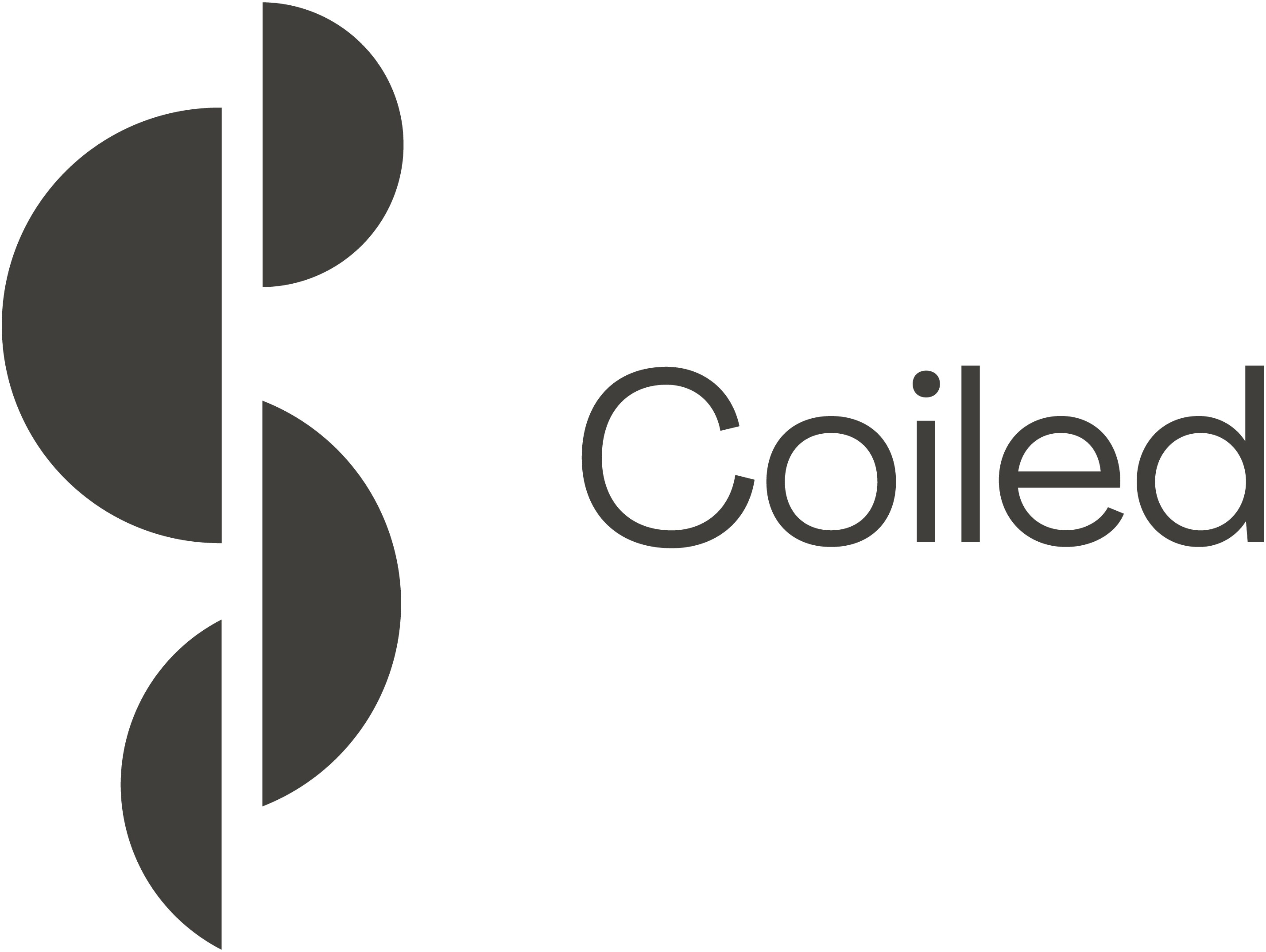
Coiled has provided some design resources for taking a high level look at Dask's websites, logos, colour schemes, etc. To make the best use of this resource @adireske, @jsignell, @mrocklin, @jrbourbeau and I have been meeting with Adi's team to talk about how we can improve things.

This effort started with a look at how Dask's various websites are performing in terms of getting the right information in front of folks. We have a bunch of different "foo.dask.org" Sphinx sites for the various subprojects under Dask. We also have a landing page at dask.org, a blog at blog.dask.org and the Dask dashboard. All of these web pages exist for different reason, are built in different ways and are often maintained by different folks. One big goal of the working group is to try and improve how Dask performs on search engines when folks are looking for ways to scale Pandas, NumPy and the PyData ecosystem. The way things are today aren't doing us many favours. We had an expert deliver some updates at the last Dask Community meeting which you can find summarised in these slides.

image

To improve this we are looking at building a new website for Dask which will hold non-documentation content as well as refreshing the documentation as a whole (#170).

The other task we've been working on is thinking about Dask's branding. This was started in #135 and #140 where we looked into things like colour schemes, diagrams, charts, etc.

The working group has rebooted those efforts as part of the holistic look at Dask's identity on the web and we are now exploring things like a logo refresh, colour pallettes, etc. Ideally we want to get to a point where the designers can give us enough structure that those of us (including me) who work on things like the Dask dashboard can apply colours and layouts that fit with the rest of Dask.

The first step on this activity has been to explore updating the Dask logo and I wanted to share some options that we are considering here. Ultimately the decision will be down to the working group but feedback is always welcome. These logos represent incremental change, evolutionary change and revolutionary change. You can read more about the thought process behind this here.

image image

Once we've made some decisions here we will move on to addressing the goals of #135 where we can explore colours that we can use throughout Dask and iconography that members of the Dask community can use to build new diagrams that fit with our style.

ncclementi commented 2 years ago

Thanks for putting this up @jacobtomlinson, I'm adding here some extra options that were brought up in one of the meetings.

Screen Shot 2022-02-15 at 2 26 23 PM

Screen Shot 2022-02-15 at 2 24 16 PM

Screen Shot 2022-02-15 at 2 24 37 PM

hayesgb commented 2 years ago

I really like the parallel computing logo. I have mixed feelings on the lowercase vs uppercase.

From the recording, there was some interesting conversation about upper vs lowercase. I have a preference for the upper case. Thoughts?

jcrist commented 2 years ago

One of my biggest pet peeves is people that write dask in all caps, so my preference is for the lowercase (or title case like "Dask").

mrocklin commented 2 years ago

I share the pet peave about people upper-casing DASK in communication, however I think that we shouldn't use the logo in order to solve that problem. That feels like the tail wagging the dog a little. Aesthetically I like the upper-case. The letters fill out the space a bit better to my eye. That's totally subjective though.

jcrist commented 2 years ago

The only reason why I mention this is that everytime I correct the spelling of Dask to someone, they mention that the logo is all uppercase and that's why they spell it that way. Seems like an easy thing to get right now if we're thinking of changing the logo.

jsignell commented 2 years ago

I tend to agree with Jim that the logo being all caps leads people to think it's an acronym. This is definitely subjective, but I also think the lowercase feels more approachable and friendly.

I have been thinking about it and I really do like the simplified/single color wings. If it's not too much, I was wondering if we could see an all lower-case dask with the single color wings?

In my mind some of the good things about the wings are: 1) They don't look like any other logos 2) They work really well in single color on tshirts with dark or light backgrounds 3) The color goes well with a black "dask" word for cases where the style of the word is out of our control (I'm mostly thinking of github) 4) People already associate the logo with Dask. (I know this is kind of unfair to the other logos, but it is a real pro)

jacobtomlinson commented 2 years ago

I agree it would be nice to see mockups of the other logos with the lowercase. I also wonder if we could have a titlecase mockup too, perhaps with the "as" in "Dask" stylized a little more.

I'm not a huge fan of the "evolution" logo, for me it is a close call between the "wings" and "parallel computing".

I agree with all of @jsignell's points about why the wings would be good to keep.

Things I like about the "parallel computing" one are:

A couple of negatives might be:

As I say I'm very on the fence about which I like best.

jacobtomlinson commented 2 years ago

I also think any of the options here are an improvement over what we have today. This is exciting!

AdiReske commented 2 years ago

Hi, Thank you for all the feedback. I've asked the designers to do another revision as per @jsignell . It feels like most people are happier with the lower case option and the rectangles icon. https://www.dropbox.com/sh/35iykmtyiz7qf1t/AACHr60Ssl2NwdCccGjD8FCYa?dl=0

martindurant commented 2 years ago

I would also vote for keeping the sails/wings, sorry. I find the rectangles generic, especially in the coding world. I think having something does that not fit a typical hexagon is a good thing!

jsignell commented 2 years ago

I love this one!!

image

mrocklin commented 2 years ago

I like both the evolution and parallel computing logos. I think that Dask could use a more modern image. I also want to give a +1 to this comment from @jacobtomlinson

It is fresh and represents a new chapter for Dask

I'd like for us to think about Dask as dynamic and changing, and not as static with past decisions. This applies to technology choices (I've been urging people to revisit old decisions/constraints) and I think that it should apply visually as well. We're all going to have a bias for the familiar. I think that we should prioritize not for existing users, but for future users who aren't yet bought in to the old design.

mrocklin commented 2 years ago

It feels like most people are happier with the lower case option and the rectangles icon

FWIW I'm seeing two in favor of lower case, two in favor of upper case, and one asking to see title case.

martindurant commented 2 years ago

We're all going to have a bias for the familiar.

I'm not sure that's fair! Some might have a bias for "new" even when it's not warranted.

mrocklin commented 2 years ago

You're right, I shouldn't have said "all". But in general people have a strong bias for the familiar.

Changing logos has a long history of pretty much everyone not liking the change because it's familiar, and then once it happens people connect pretty strongly to the new logo.

So yeah, I didn't mean to say anything about folks here in particular, just about humans and this process in general.

ian-r-rose commented 2 years ago

My two cents: I like the "evolution" logo. It rhymes with the older logo, but does look fresher. I also agree with @jsignell that the lower-case text looks friendliest and is least likely to be confused for an acronym.

The "parallel squares" looks a touch generic to me, and is perhaps a bit too similar to xarray: image

mrocklin commented 2 years ago

If folks like podcasts, I recommend listening to this 99 Percent Invisible podcast on making marks and logos

https://99percentinvisible.org/episode/making-mark-visual-identity-tom-geismar/

mrocklin commented 2 years ago

Oh wait, no, I think that it was this episode: https://99percentinvisible.org/episode/negative-space-logo-design-michael-bierut/

mrocklin commented 2 years ago

I just showed the slide decks to a friend who is not in our space for neutral feedback. General takeaways:

Don't ask me to interpret most of that (I don't know what paper flipping means :) ). I did find it interesting to ask people outside of our space their opinion. I wouldn't over-rotate on these views. I do recommend that folks present this presentation to other folks to get their opinion. It's a fun ride 😄

jakirkham commented 2 years ago

Agree with what Ian said above ( https://github.com/dask/community/issues/220#issuecomment-1043549109 ).

Evolution is a nice touch up.

Too many things in the ecosystem with squares/cubes/etc.. Would rather skip this.

Also ok with wings (either as-is now or touched up).

Have we taken into account color blindness when deciding colors?

GenevieveBuckley commented 2 years ago

Very cool!

I like both Wings and Evolution a lot. I really like the colour scheme in Evolution, that's a nice one. I don't feel any different emotions based on which way "up" the shapes go, although perhaps other people might.

I don't like Parallel. The shapes feel very generic to me, like they could apply to many different companies. The shapes in the other options feel more dynamic to me, and more recognizably unique for branding purposes.

It's always fun to see parts of what the designers are doing, thanks for sharing a peek into the process.

jacobtomlinson commented 2 years ago

Have we taken into account color blindness when deciding colors?

Yeah in one of the follow ups above there is an "accessibility colours" option that the designer put together when we raised colour blindness as an issue.

jacobtomlinson commented 2 years ago

Hey folks! I thought I’d share the latest from the Dask web presence working group.

A quick reminder of our goals:

To achieve these goals we are starting with the foundations of Dask’s branding, the logo. Then the overall brand/look/feel for Dask. Then mock up websites and things.

At this point, we have a recommendation for the logo and also a stylescape.

Logo

Let’s start with the logo. As we shared earlier in this thread we experimented with iterating a little on the logo, evolving it into something else and transforming things in another direction completely.

After much discussion in the working group, we’ve decided to recommend we go with the more transformative logo.

image

Let me unpack why we are recommending this. For many of us who have been around Dask for a while, the current logo will be evocative. I personally was hesitant to move away from the wings logo because it is meaningful to me. However a key goal here is to grow Dask, and new users do not have that same attachment, so we should try and put those feelings to one side.

The new logo gives us a simpler design, some more shapes to work with and more colours in our palette. Moving to an all-lowercase logo also helps with folks mistaking DASK for an acronym. It also fits more nicely with the rest of the community, many projects have all lowercase wordmarks because the project is not a company or an entity, it is a community.

Here are some notes from Jeromy/Chat, the visual designers that we’re working with on why this logo is compelling from a design perspective

When Ashandelle and the Dask Working Group looked into the Dask website and brand, we thought about how to best represent the Dask project and community. We wanted our rebrand to better embody Dask and appeal to its core audience: data professionals.

While we didn’t intend to redesign the logo, we needed a revamp to create a cohesive design language. What story did the original logo tell? What did people see when they looked at it? How did that fit into the story of what Dask is and what it does? Through those lenses, we believed a new logo could help tell a fuller story.

We didn’t enter the design process lightly. When we design (or redesign) a logo, we make it resonate with the audience, align with the project's brand attributes, fit within the product space, and look distinct from competitors.

To communicate Dask’s personality, the logo needed mass appeal, while remaining serious and credible. It needed to feel both authoritative and young, which led us to balance many design elements thoughtfully. After we and the working group collaborated, we designed a logo with repeating shapes to better represent parallel computing and community. The lowercase word mark connects the viewer to Dask’s community traits and references the history of many open source projects using all lowercase logos.

By switching to a logo like this it enables us to build a stronger design on top of it.

Stylescape

The next thing to show you is our recommendation for a stylescape. Before we started this process I had never heard of a stylescape, so I’m going to assume this term is new to others and unpack it a little. A stylescape is an example of an overall look/feel for a project’s branding. It isn’t a website, document, slide or anything so formal. Rather it’s a collection of text, images, colours, headings, diagrams, etc to show how elements look together. It is also not a final branding guide and can continue to evolve, but it helps us to converge on some shared ideas before we start investing a lot in a new website, where iteration is harder.

Dask-stylescapes-Final 76

This is the working group's recommendation for the stylescape we should progress with.

We can see font recommendations and a colour palette on the left, both created to compliment the logo. Then some examples of headings, diagrams, callouts, icons, etc.

We are trying to hit two marks with this. First is an authoritative and technical voice, a group that is listened to in the PyData and Scientific Computing ecosystem. We went with a grid that feels like graph paper, technical line drawings and stark black, grey, and white backgrounds. Elements that would suit the branding of a news outlet, textbook or election campaign.

The second is a welcoming voice where new users feel at ease and excited to explore Dask. For this, we went with primary colours and chunkier lines in some diagrams. This allows us to be a little more playful and not intimidating.

When discussing who else hits this mark we thought of a well-liked elementary school teacher. Someone you are pleased to see and can have fun with, but there is no doubt that they are the authority in the room and should be listened to in more serious moments. This is the feeling we are aiming for.

To get to this place the designers took the logo and expanded it in three different directions to see what voices we could achieve with it.

image

The first option was inspired by outlets such as the New York Times and Tesla. It leans heavily into the authoritative voice but was perhaps too stark and clinical for my taste.

To me, the second option was an easy yes, it was warm, welcoming and fun. I often try and steer the Dask community in this direction, while other maintainers strive towards that authoritative voice. But I could appreciate that perhaps it was too warm and not serious enough.

The third option had a different feel to me. That was exciting, but also made me nervous. It had a little bit of a startup vibe, which in my mind can mean flashy with no substance. But it also felt the strongest in terms of having its own identity. However, I had some concerns about how well those of us could reproduce that look/feel due to the complexity of the elements.

After a few iterations on top of those three, we worked with the designers to amplify the feelings we liked, and reduce the ones we didn’t. This has evolved into the recommendation we put forwards today.

Here are some notes from Jeromy/Chat, the visual designers that we’re working with on their thinking about this stylescape, and what it accomplishes

We extended the visual language of the logo into a cohesive style for the Dask project. The boxes now represent branching processing tasks, hold iconography, create blocks of content, and more. The updated style combines a technical, structured layout with welcoming, friendly properties.

The grid acts as a unifying tool, which breaks up negative space and can be used to anchor design components on. Where we desire authority and expertise, we often use the structured alignment of this composition. We soften the authoritative tone with rounded corners on lines, fluid placement of elements on the grid, and cheerful colors to balance the brand’s personality successfully.

What next?

As we’ve already discovered in this issue, finding consensus is impossible, especially when it comes to subjective things like design. I am hoping to see some discussion here about what we have put forward and for folks to raise any red flags that they see to ensure we are going in a good direction. However, we’re also at a point where it would be good to move on. The recommendations made above weren’t easy and took into account a variety of different perspectives.

Once we have decided on a stylescape to move forward with, the designers will begin figuring out how we want to structure our content online and mock up what our new website could look like. We need to decide what should be moved to the website (the more content we have there the more SEO type stuff we can do to improve our rankings), the blog may be a good candidate for consolidation. We also need to figure out a plan for content that can not be consolidated such as the documentation, this needs to remain a sphinx site for technical reasons and so we need it to look and feel like part of the Dask website as a whole. There are technical conversations to be had, but we are keen to save those for another issue on another day and focus on the design here.

We are confident that the recommendations put forward here will move us to a stronger place as a community.

hayesgb commented 2 years ago

At the start of the conversation, I was a little unsure of the switch to lower case, but I really like this coupled with the new logo.

mrocklin commented 2 years ago

Just so that people are aware of timing constraints, I think that the web team is planning to move forward with this. If folks have thoughts on these deisgns that they'd like considered, now is a much better time to bring up these thoughts than later down the line.

AdiReske commented 2 years ago

Hi,

On Monday next week (the 6th) we are finally going live with the new Dask website and visual look. We are also refreshing the Youtube look to match as well as the docs and other channels.

As you may or may not know, a new website is a little bit like a new beta launch. We may need some hot fixes in the first few days. Things may break or appear in the wrong place. Please be patient with us as we are trying to make this transition as smooth as possible.

Here is a link to the draft site https://dask-2-0.webflow.io

As you are reviewing, I'd like you all to look for major structural issues that would be roadblocks to going live. By this I mean core content missing, or links improperly working. We currently have mobile responsive comments noted on an internal list as well as logo updates for the home page.

Blogs: We’re working on integrating the current posts & will have them included before going live. These are placeholders.

Brand Guide: is still being build for mobile devices.

I also want to share that this website is V1 and just like any other software there will be sprints and V2 and V3 etc. We hope that makes sense.

MrPowers commented 2 years ago

Site looks great, messaging is on point.

Perhaps we can update the page title from DASK => Dask, so it matches the logo.

Screen Shot 2022-06-01 at 4 09 09 PM

Great work!

jakirkham commented 2 years ago

Seeing "Community" twice in the header. One appears to show a dropdown menu. Other doesn't have a link. Guessing one of these should be dropped?

Also on Safari 15.3 on macOS 12.2.1.

Screen Shot 2022-06-01 at 6 09 14 PM
pavithraes commented 2 years ago

Thanks for sharing, @AdiReske! The site looks great!

Some notes:

I'm on Chrome 102.0.5005.61 (arm64), macOS 12.1

ncclementi commented 2 years ago

I'm assuming these blog entries are some sort of lorum ipsum generator? See https://dask-2-0.webflow.io/blog unless we are trying to link some existing blogs and it's not working. Maybe we can pull the blogs from https://blog.dask.org Screen Shot 2022-06-02 at 11 41 24 AM /

AdiReske commented 2 years ago

@ncclementi - "Blogs: We’re working on integrating the current posts & will have them included before going live. These are placeholders."

@pavithraes - can you please send me a better description of the training you referred to?

fjetter commented 2 years ago

Is it intentional that there is no shortcut / link to the documentation on the landing page? I eventually found a link at the bottom of the "Get Started" page but that was very hard to find. I would've expected this in the header next to Community/Blog/Get Started

ian-r-rose commented 2 years ago

Quick note: the animation shows "FILE.IPYMB", and doesn't appear to be a notebook :)

I'd recommend calling it something like WORKFLOW.PY

shughes-uk commented 2 years ago

There's no docs link directly in the header bar. I'm frequently annoyed by products that don't have prominent docs links on their SEOed landing pages, please please add one and make it super obvious!

AdiReske commented 2 years ago

good call about the link to docs. Thank you!

pavithraes commented 2 years ago

@pavithraes - can you please send me a better description of the training you referred to?

@AdiReske Sure!

The "Dask Tutorial" card has the following description currently: "Open-Source machine learning for time series analysis". However, it links to https://tutorial.dask.org/, which covers a lot more than machine learning and time series analysis -- it is a complete introductory tutorial presented at SciPy that talks about all collections, the distributed scheduler, and more.

The description could instead be something like: "This collection of Jupyter Notebooks, presented in the Dask Tutorial at SciPy, helps new users get started with Dask."

hendrikmakait commented 2 years ago

This looks awesome! I have one usability issue: The hover effect of the elements in https://dask-2-0.webflow.io/#Advantages has confused me quite a bit. So far all color-changing elements on the website were clickable, but these are not even though they have one of the most visible hover effects of any element I was able to find. The only contenders are the individual blog posts at https://dask-2-0.webflow.io/blog, which are clickable. Is there a plan to link these to some other piece of documentation? Not that the elements above under Why Choose Dask? are also "descriptive boxes", yet they do not have any interactive effect attached to them.

hendrikmakait commented 2 years ago

Other small things I noticed:

AdiReske commented 2 years ago

Thank you @pavithraes !

@hendrikmakait these are all good suggestions that we will add to the v2 of the website. Thank you!!

ntabris commented 2 years ago

The Coiled logo image used on the new website is a low resolution png

image

I see this both on https://dask-2-0.webflow.io/get-started and https://dask-2-0.webflow.io/powered-by

The current dask website uses a much better image

https://raw.githubusercontent.com/coiled/logos/master/Coiled-Logo_Horizontal_Black-RGB.png

ntabris commented 2 years ago

The "mailing list" link in "Community" menu at top brings up the overlay card but doesn't take you to "mailing list" tab of the card if you weren't already there. The "mailing list" link in footer does work correctly.

AdiReske commented 2 years ago

We just went live with the new site. Still working on the blogs section and pushing the rebranded docs.

douglasdavis commented 2 years ago

Quick note: the animation shows "FILE.IPYMB", and doesn't appear to be a notebook :)

I'd recommend calling it something like WORKFLOW.PY

re-pinging Ian's comment ^^^

jacobtomlinson commented 2 years ago

@douglasdavis the designers are working on it. Apparently the animation was created by a third-party so they are going back to them to fix it.

jacobtomlinson commented 2 years ago

@douglasdavis @ian-r-rose fixed now 😄

gjoseph92 commented 2 years ago

Meta-comment: this thread is collecting ideas for things to fix, discussion around them, and then confirmation that they've been fixed.

Most other places in the dask world, that would accomplished through GitHub issues per idea, PRs, and discussion on both. Previously, that would have occurred in the https://github.com/dask/dask.github.io repo (which I imagine should be archived now).

  1. How will the dask community have ownership of the content on dask.org now? As far as I understand, it's now effectively closed-source / off GitHub since it's built in Webflow. A few people have access to modify it. When other people see something wrong, how are they empowered to fix it (as they would be with anything else in open-source dask?)
  2. How will we track issues and fixes now? i.e., what's the equivalent of the public issue -> PR -> code review -> merge flow now? Should we have an issue-only GitHub repo for now at least, so we don't just keep adding to this thread (which would be hard for anyone to find who didn't know about it)?
jacobtomlinson commented 2 years ago

@gjoseph92 the plan is to move from this issue to a mailing list where website-related things can be tracked. Previously everything was very developer-centric, part of the goal here is to become more inclusive towards non-developers. For example contributing blog posts is going to shift from needing to raise a PR to a Jekyll blog to needing to submit a Google Doc to a public mailing list.

We are definitely making trade-offs with this change. The main exchange here is increasing friction for a few (those of us who will have to maintain this new system) in order to reduce friction for many.

The goal is still to be as transparent as possible. Coordination will be done in public groups, and updating of the website and content will be managed by the web steering group, which effectively anyone can join in exchange for a long-term commitment to help manage it.

TomAugspurger commented 2 years ago

Question about the new dask-sphinx-theme. On https://ml.dask.org/ I get a double vertical scrollbar:

image

And I'm not sure if it's related, but the footer is cutoff halfway:

image
gjoseph92 commented 2 years ago

the plan is to move from this issue to a mailing list.

This seems a bit harder to manage to me, and easy for things to get lost. (See this thread, for reference.) What's wrong with an issue-only GitHub repo (just like dask/community)? Why create a new communication pattern here when the one we use everywhere else seems to work pretty well?

gjoseph92 commented 2 years ago

In the meantime, I'll keep adding to this thread, since that seems to be the approach for now:

Landing page

  1. I land on the homepage and after reading every section, I still don't know what dask is. If I've never head of dask before, I'm aware that it claims to be able to "scale any Python code" and "deploy anywhere"... but what is it that I'm deploying? I would have expected a one-sentence explanation underneath "Scale the Python tools you love". Like "Dask is a flexible library for parallel computing in Python", as the sub-heading on the docs landing page explains.
  2. What’s the motivation for the code samples being animated? They’re so fast, I can barely read them, and I know dask. If I wasn’t that familiar with it, they wouldn't be meaningful to me. Plus, they’re not copy-pasteable. A static code snippet seems much more useful to me, since you can read, understand, and copy it at your own pace.
  3. Why are the installation instructions at the very bottom of the page, and not copy-pasteable, but animated?
  4. "Scale PyData libraries" links only to "learn about DataFrames", but also mentions arrays and scikit-learn. We should arguably link to all three.
  5. "Scale any Python code" links to Futures. I'd say Delayed is a better and more commonly-used and approachable interface for doing this.

Get started page

  1. The copy

    Dask is included by default in Anaconda. You can also install Dask with Pip, or you have several options for installing from source. You can also use Conda to update Dask or to do a minimal Dask install.

    is somewhat awkward and verbose for explaining a very simple thing. Installing from source is not relevant to most people; the fact that you can "use conda to update dask" makes it sound like this is some special dask feature as opposed to just what any package manger does. Why not just "you can install dask with pip or conda"?

  2. "Learn your way around" suggests links to tutorials and videos, but doesn't mention the docs.