tasks
- design website terminal frame
- go over the feedbacks -
19min - gather references -
24min - draw a sketch and make a terminal frame UI -
2h3min - update task and record worklog -
22min @outputterminal_frame_v0.0.1
- go over the feedbacks -
Closed Mehrabbruno closed 1 year ago
19min24min2h3min22min@output terminal_frame_v0.0.1feedback 2022.01.24
First impression. Looks cool. Ninas gut reaction also was that it's better. But: We need to get to implementation, so that we don't end up with nice wireframes but never get to an actual page. That would be worst case.
Now your questions. I think the green from our palatte would be a must, not the pale one. Font looks cool too, but so does the other one. Keep in mind the project pages, they are all extremely plane, just black and white mostly and with focus on extreme minimalism
By the way - monospace font just means every character has the same width. Your pixelated fonts is a monospaced font too (+ our theme picker could allow to even switch fonts). Computer terminals almost always feature "monospaced fonts" as do coding editors. The web safe fonts have a default mono spaced font, but you can find plenty mono spaced fonts online.
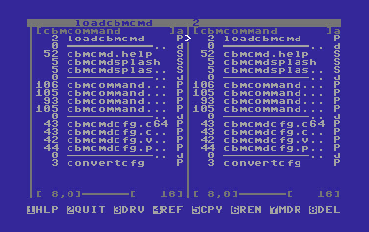
So while the new design somehow resembles a retro desktop, which is good, the "pixel shadow" effect, etc.. is too much in my opinion. GEOS and other real retro systems where absolutely flat designs, not even the square shadow boxes, but even that looks mostly flat and they were basically monochrome (we might have some colorful accents, but i think keeping mostly monochrome would be good to keep). We already have our "art works", maybe the sound effect as an easter egg, still, the graphics you chose look 90s "Super Nintendo", which is cute, but GEOS is beginning of 80s C64 flat monochrome by default. 90s is not retro enough. Roughly "GEOS" (from the C64 (=Commodore 64 area)) is your best bet for some inspiration, but just wth the tweak to be minimalistic where possible to match pages of the ecosystem i shared initially with you. Basically pixelated flat more than bezel i'd say. But let's not do grain or any other paper effect. A real retro computer would not have had that.
I also like the cleanliness and minimalism of the previous or rather still current design. I even don't find the combination of that with your new frame so bad, maybe the solution is in the middle? I like the non-scrollable of the new design - maybe a window can be scrollable still if needed, but i hope maybe it can be combined with more minimalism and cleanliness of the first design and still do the pixel
If we add stuff, lets try to make things very functional and they all should be able to be coded with vanilla css/js (apart from the artworks we have of course). for example, a read only terminal could show some text. pictures wrapped in a screen. using some ideas of ancient retro desktop environments, but sparsly and minimalistically, so things stay lean.
So the "artwork" in a real system back then would probably show in a "window".
Maybe we can be unusual and allow "retro hexagon windows" in our window manager.
We can still consider to e.g. pixelate the image with 3px pixel distortion with a tool like https://pinetools.com/pixelate-effect-image to make it fit or maybe some other retro effect overlays
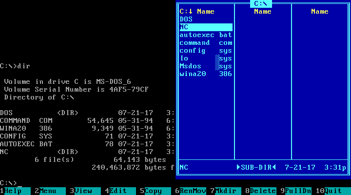
So you show this one too https://imgur.com/KTr87BF.png and it is noticable that it is mostly monochrome, not completly, it has black, white and blue, but at least color variation is quite minimal (for that we can have the theme color picker in the corner - maybe it can be a dropdown later on). Noticable this one again doesnt have any shadows or "3Dish effects". It looks basically flat, but has the retro structure - which makes use of a bit pixelated and retro pixel patterns, which can be emulated in css
And the regarding the onscroll transition. let's see - not sure how that would work https://imgur.com/aFtVwrk.png
https://encrypted-tbn0.gstatic.com/images?q=tbn:ANd9GcShoHQUu6DfkzTrKfrip9De8-NTsO1PYlfiqg&usqp=CAU
we might do a dropdown theme picker, but by default monochrome, maybe using our signature color pallette green would be better. bright is ok, but mostly monochrome.
Anyway, let's keep going towards implementing! :-)
8min10min12min@output terminal_frame_v0.0.253min
27min@output terminal_frame_v0.0.315min
11min18min9min@output terminal_frame_v0.0.4feedback 2023.02.27
The terminal icon looks great. thanks. You haven't shown the terminal itself, which should slide in onclick from bottom or top. user should be able to set it to semi transparent user should be able to resize the height (not width) to make the terminal overlay just one line, a small fraction, a big fraction or the entire page, by default maybe a third to half of the page.
7min12min@output 📦 terminal_frame_v0.0.5feedback 2023.03.02
+1 terminal design (maybe tabs could be on the bottom? just t make it more retro and unusual? (a lot of design is still to much standard 2020s)
love it.
otherwise, perfect, leave it as is, below is just some minor comments regarding tabs below and more retro icons and stuff
I know, those are not really tabs, but mostly commands on the bottom, but at least the "drive" command actually switches, so, love it, but let's keep it a bit more retro and to be different let's have the tabs below.
see
 and
and
 and
and

the [x] and [+] buttons to close or add tabs it great, but modern. it makes sense so lets keep it, but we have to see how we also keep things retro.
also fullscreen and those icons are perfect, but need to look more retro.
if nothing else, maybe a bit more pixelated, check the scrollbar in the screenshot below

70
@todo@input`navbar_v0.0.3 from #72@outputterminal_frame_v0.0.1from comment@inputterminal_frame_v0.0.1@outputterminal_frame_v0.0.2from comment@inputterminal_frame_v0.0.2@outputterminal_frame_v0.0.3from comment@inputterminal_frame_v0.0.3@outputterminal_frame_v0.0.4from comment@inputterminal_frame_v0.0.4@input📦 navbar_v0.0.6 from #72@output📦terminal_frame_v0.0.5from comment