dat-ecosystem / organization

Organizational documentation for the dat-ecosystem
https://dat-ecosystem.org/organization/
7 stars 2 forks source link

dat-ecosystem website_consortium_page #99

Closed Mehrabbruno closed 1 year ago

Mehrabbruno commented 1 year ago

70

todo


Mehrabbruno commented 1 year ago

tasks


worklog

worklog-109


feedback


proposals

serapath commented 1 year ago

feedback 2023.02.01

Just checked the consortium page wireframe. While I like all the others, I am not really super happy with the consortium page yet. I share my feedback below. It looks a bit messy and not yet as retro computer as others.

https://www.figma.com/file/1zBxgchAmrDGw2FDzu7uxX/dat-ecosystem-website?node-id=903%3A17034&t=hWtlnvwzAdva9CAW-0

Here is the old layout that we thought a lot abouthttps://github.com/dat-ecosystem/organization/issues/22#issuecomment-991341275

It starts with a header that is supposed to include a mission statement and make sure it is about the projects mainly and the goal those projects have.

Then a bit later the mission that dat ecosystem has and what tools and practices are used to achieve that goal - with our focus being that we will replace and/or use open source p2p tools for everything we do as soon as possible (there are not yet enough cool p2p tools to replace all our tooling with them)

Next is about responsibilities of the consortium, the duties and so on, then some links, which are added/shared on that link above, basically we have links to our code of conduct github repos manifesto open collective account and meeting notes from regular meetings of the consoritum.

all this can be seen here https://dat-ecosystem.org/consortium.html

and finally we can also list consortium members, but more in a small bullet point list with links to peoples github/twitter/etc... link and maybe a tiny avatar or picture, BUT not member profile picture cards. Let's not make it big, because the consortium neither has a lot of funding nor is it important. It exists and people should be able to look up current and previous members, but it should be listed at the end and be minimal to not put importance on the names.

Consortium members are mostly there to administrate and do the mostly unthankful job to keep things going.

Mehrabbruno commented 1 year ago

Tasks


worklog

worklog-113


feedback


proposals

serapath commented 1 year ago

feedback 2023.02.18

general

Just in general next to looking like a retro computer and having the green nature & scientists theme, the page overall should feel more and more like a tool, e.g.:

  1. the projects page with the interactive visualization will become a project explorer
  2. the growth program is for people to actually apply and manage their progress in the p2p garden
  3. the timeline is like a interactive news feed with notifications and calendar features (past/present/future)
  4. the consortium is almost like a public admin tool that shows finances and all business processes and workflows
    • also which proposals are currently open and will get voted on by members, etc...

We are not there yet, but the page should look like that. We want to integrate either discord or later a real p2p chat as part of the website, so all of the above (all website sections) will become part of some sort of "discord" like tool, with those particular features integrated.

So - we at least visually and with some gimmicks want to prepare for that future, which is why we want the "terminal/shell" in the website footer too. We will improve those and make them more interactive over time.

Of course - it needs to work desktop/mobile, but below i list some links and more thoughts for inspiration.


consortium page

Again, looks lovely. Love the pixelated icons for tools and link.

Still not happy with the "Consortium" page though :-) Again, like on the top - it doesn't look like a tool. And of course nothing on the website will yet be a functional tool. The point is to make it feel like that. e.g. datdot.org is not a "desktop" yet, but it gives a tiny bit the impression where it will go in the future. So we have a retro computer design with nature/scientist theme. And each of the sections is one or multiple tools integrated into our desktop.

In conext of the "Consortium Page", this looks like a public (read only for non members) admin page.

A read who reads through the consortium page should of course understand, but at the same time, instead of a presentation, it should feel like "backstage". The user will learn about members/tools/responsibilities/important documents/... But as embedded in a productivity tool (that just looks like one) in a retro computer desktop with nature/mad scientist style. Maybe again using inspiration from a terminal, but instead of linux, how would that look like in a more pixelated retro C64 Geos style desktop

geox c64

...imagine those infos are just work in progress in documents that are currently open?

tbis blog for example has each post open in something that somewhat resembles a basic text editor, but for visitors in read only mode.

http://ascii.textfiles.com/

By the way, i could imagine this could use also some sort of "tiling window manager" layout, but it is not necessary.

The main point is to make it more in the spirit of what i described in the feedback, instead of a traditional website.

serapath commented 1 year ago

feedback 2023.02.27

tools "tools we use" part of consortium page was meant to be a bunch of launcher items if that clarifies your question?

For example:

  1. On the bottom below you see "tools we use" (so that is what i meant to be changed in that way) consortium page
  2. all "important documents" and the "mission statement" where once proposals.
    • Some proposals where "passed" and some where "rejected",
    • so maybe that can inspire the folder structure
    • because it is what all documents have in common regardless of content.

a folder for important documents (we have a box for it) (think: "passed proposals")

The mission statement document could be open by default when a user comes to the page. A document, once open (e.g. mission statement), might contain links to other documents and when the user clicks it opens those documents too, just like when the user would have clicked their icon. Other documents can be open as well. if we need more space, maybe the user just scrolls, because we have a scrollable desktop?

page So yes, could be as icons here and some of them might open folders with more icons. And some of them might be icons to open a document or a tool directly. And some of them could be "open by default" (so users see it already opened when they come to the page)

The mission statement is one of them, that is open by default so the user immediately sees the text and also the "tools we use" should be open so users can quickly open one


datdot I think it is an interesting idea to make a datdot-style box, but it also again makes it even more similar to datdot. Maybe we can do another iteration in the future, once things are more standardized to turn it into that, but for now i would keep it in terms of desktop/icons/files/folders.

The advantage is, that because it is so basic, we can over time make more "sophesticated components", which will take multiple files or content and present it in new ways, because that is what conceptually our page will support - installing a new app that views the data differently.

Mehrabbruno commented 1 year ago

Tasks


worklog

worklog-116


feedback


proposals

serapath commented 1 year ago

feedback 2023.03.02

menubar

+1 navbar with buttons/icons, perfect.


timeline

timeline My thinking goes, the timeline dropdown, once it "drops down" could show on the side, just like the white timeline you designed.

dropdown So if i scroll and jump in that timeline i am a lot faster and potentially i can autocomplete a date as compared to scrolling timeline entries in the main view.

Otherwise cool.


consortium page

+1 consortium page.

minor thing - "mission statement" should be open by default i think. we can have even 2 folder open by default (on mobile i guess they join into one with tabs)


also:

  1. it should be mission_statement.md

    • the "layout", when open, should resemble markdown text
    • which supports tables, headlines, bulletpoints, etc...
  2. and tools we use is a "folder" to contain 6 files (which are links/shortcuts)

    • given enough space, it could look the way you made it
  3. important documents (same thing, markdown files or links/shortcuts to such)

so let's make it consistent with out desktop/icons/files/folder methaphor, which means opening a folder or a file of a certain type should look consistent, but otherwise, love it, we can keep it. Of course, big icons, small icons, table, there are many different file explorer standards and we can just pick one that works well as long as it fits with our old timer 80s monochromish retro design.

folder 
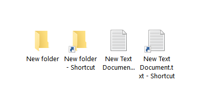
So we need a standard icon for a link/shortcut to anything (file/folder/url/etc...) I'd say let's use the default program icon or icon of the thing and add a sub icon in case it is a link/shortcut, e.g. shortcuts

And a convention, so if it's e.g. a link to a markdown, we migth call it mission.md.link (instead of mission.md)

...but not to forget it should look retro (c64 geos)

Anything that doesn't fit into the standard files/folder/desktop metaphor (e.g. timeline looks different), should probably be a full screen program that is open and contains the custom UI)


members

not sure, what do you think about: our_members/members.html our_members/ninabreznik.json our_members/serapath.json our_members/.... opening the members.html will show listing of all members with their picture and details and it pulls that from those "json" files.

Mehrabbruno commented 1 year ago

tasks


worklog

worklog-119


feedback


proposals

serapath commented 1 year ago

feedback 20230.03.9

+1 perfect I think this is great.

noticed: MENU BAR in figma shows it under home menu button, but i guess that's a minor mistake and meant to be the consortium/about button, but i thought about that too, and maybe can make the consortium/about button just a tiny icon style ":information_source:" info icon button next to the socials instead of a regular button to give the consortium as little importance as possible.

scrollbar is also super amazing and retro - love it :-) maybe we can even consider to have the scrollbar always there, but disabled if there is nothing to scroll. many old school retro desktops functioned like that, check:


markdown

the "markdown editor view" and the titles in the document could maybe include little emoji icons potentially to spice things up a little, but not too much - i really love how you made it look monochrome and minimal:-)


icons

you talked about icons

and yes, they are retro and not bad, just thinking maybe improvable. check all the links and many icons they use and mostly they use larger pixels, dither to emulate certain colors or gradients ...and people put a lot of effort into details, because those few details is all they had and the budgets where huge. ...similar to how today some artists spend enormous amounts of time to make amazing pixelart :-) ...and also they now have stunning tools. ...basically it needs lots of love and attention for retro details

also icons yeah, if pixels become more, like pixels in the scrollbar arrow, this probably works well.

also maximize hell yeah :-) this makes it still recognizable but a lot more retro. maybe even lines could be a tiny bit bolder? ...lots of retro systems had lower resolutions and lots of dithering to "simulate" something like gradients and colors by overlaying pixel patterns of the basic colors they had available.

document bars with titles that have the file name with an underscore are awesome.

tools are also great with the little shortcut sub icon, but again, more pixelated or styles being really smooth and retro, probably this can be fine tuned, but definitely amazing how you did it :-) also +1 for .link file extension, i think that works great.


color contrast

retro I believe this is actually just form the bad picture, because retro systems are known for high contrast, including GEOS, so making it low contrast is actually a bad thing. This is due to those old systems having very monochrom or few color palettes available.

  1. so either things were black/white (most common) oldschool
  2. or they were a bit colored (one that sood out was GEOS C64), e.g. geos c64 
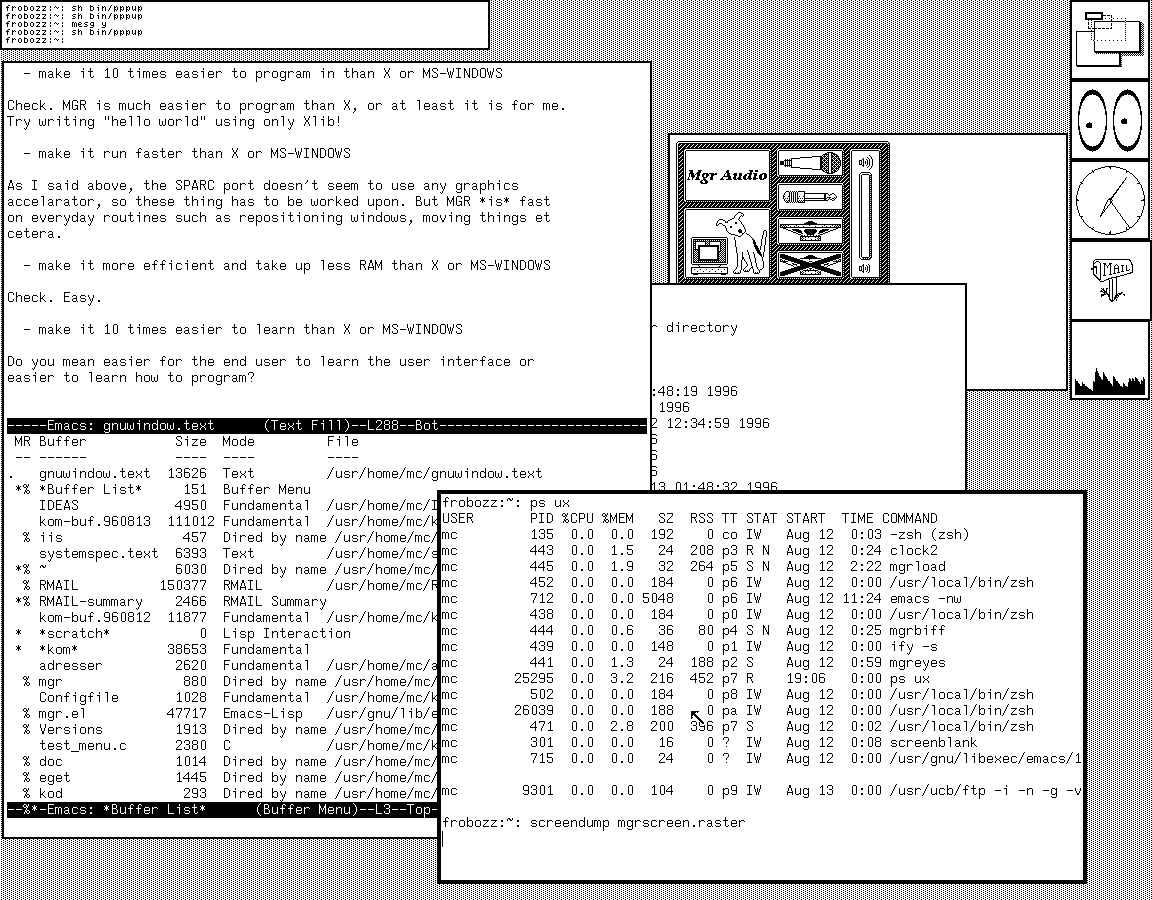
It had actually high color contrast, but here are some more links, so based on pictures it sometimes looks as if it had low color contrast and the C64 maybe actually had slightly less high contrast than others, but still high contrast.

members

you asked about the members pages....

answer: you show it as a folder which is great. i was just thinking in my previous feedback. If somebody opened "our_members" folder (retro would probably display the "underscore") Then what would they see? I imagine ...maybe an index.html file icon And an additional <membername>.json file for each member.

If a user clicked the member json file it might open a json viewer to show the raw data If a user clicked the index.html it would open a little "in page browser" component which loads it's data to show members from those local <membername>.json files ...it all happens in the frontend, because we are builing a static website (no backend)

Mehrabbruno commented 1 year ago

tasks

worklog

worklog-124


feedback


proposals

serapath commented 1 year ago

feedback 2023.03.21

woohoo! yes, nailed it too. I think this is amazing. Love the little corner item to indicate text vs folder/directory

I think making the members as a markdown file the way you did it with a table totally works! awesome, especially because that could include links to a members website or social media.

dither

So comparing those screens, the "dithered" versions looks a lot more unified and retro and homogenous, but of course not great yet. The left side without dither looks less retro, but different parts of the websites look as if they have different styles.

The overall border is/was meant as a "monitor" (so maybe that works), but the content is also not unified. The background pattern is already amazing as are the title bars on the consortium page windows with it's horizontal lines, because those "patterns" make it look retro.

we can use few colors/monochrome, vertical lines, compact more ascii text style alined pixelated elements (i think you did a great job with the latest UI on the timeline on the bottom of the screen) ...and where we use some images we can try to apply "dither", but it is all about balance and finding the right retro vibe :-) dither

comsortium page

Maybe the dither can only be applied to the green monitor menubar and border of the page?

right now the border has a lot of structure, including some grey inset shadow? Maybe it is fine, but yeah, not an expert - so i'm just throwing links and ideas at you and feedback to see how we can make the retro vibe perfect :P border

Also the background has one pattern. Maybe scrollbar (as seen in many screenshots of retro systems) can have its own separate pattern and maybe icons or different programs and title bar parts too.

Instead of all having the same pattern, we apply certain specific patterns to specific kinds of elements and UI parts. pattern

interactive ui/ux Next, if something is "selected" or in "focus" or active/passive, etc... Or maybe if something is "disabled" ...how do we indicate that in a retro way? a specific color to mark focus? a specific pattern? how do retro systems do it?

we need ideas for that too :-) ...check the links i provided on the shell/terminal issue.

Lastly - a specific distrotion pattern could actually really overlay everything, ...maybe even with an animation to give an even more retro vibe?

For example check this - it is a little experimental project i did some time ago. Don't bother, but you can see there is some sort of effect that makes it flicker.

https://natural-mango-zenobia.glitch.me/

Basically there could be an overlay over the entire page or maybe just the inner part of our "green monitor" ...and then we give it a "high z-index" and make it ignore all page events so when a user clicks or scrolls they just pass through. that works with css pointer-events: none; for example.

So don't bother too much with dither maybe - what you could try is if there is a css or javascript based technique to apply that dither to our images on the home page. The tree and mad scientists. Dither is mainly applied to images, so if we can turn those into cool dithered version, that would be sweet.

maybe also to the shine on the active menu bar button e.g. "home"

We could also try to see how it looks on our logo :-)

And we could try it to apply it to the menu bar as a css/js filter if that is possible. or maybe also to - as you mention - the different shadows of consortium page windows. menubar

Mehrabbruno commented 1 year ago

tasks - 2023-04-08

worklog

worklog-127


feedback


proposals

serapath commented 1 year ago

feedback 2023.04.09

Interesting. A lot of visual changes, but mostly great :-)

  1. **The window bar icons are nice pixelated, but can we maybe start with only the x icon

    • and also align it with the scrollbar (currently it isnt aligned) x + scrollbar
  2. The "dat" logo itself might be better if it stays large?

    • and also use #29364800 the dark blue instead of the black?
    • basically let's choose a color palette
      • black, white, pink, green, dark_blue, grey
      • ... let's see what else we need ... what's our focus/active color?
    • the old one had clear separation for icons, a fixed icon square
      • maybe we can keep that in the new design too? (or maybe not?0 datlogo navbar old window bar one
  3. just wondering if the green should maybe be the "active/focus" color

    • if so, maybe we should keep the white square, but maybe give it a black border?
    • which one is it? sub icons old sub icons
  4. lastly if we can use the "dark blue" to keep as much of the old page theme for the first release, so people clearly recognize it's the old dat in retro now.

    • one thing to consider is if we want a column/row gap maybe.
    • some retro package manager had those tiles but a little gap between windows everything grid gap
Mehrabbruno commented 1 year ago

tasks - 2023-04-14

worklog

worklog-133


feedback


proposals

serapath commented 1 year ago

feedback 2023.04.14

all feedback, if any, was given here

Mehrabbruno commented 1 year ago

tasks - 2023-04-17

worklog

worklog-136


feedback


proposals

serapath commented 1 year ago

feedback 2024.04.17

+1 love it. the window bar with lines and vertical separators looks great too. one thing though would be good to make the x and program icon (e.g. folder, text viewer) on the left as large as our basic "grid slot unit", and probably have them be squares not rectangles i guess. Again, the maximize/minimize button might go away, to simplify things and the feature would still be availablee by double clicking the window bar.


So here the icon with vertical separator is great. I think we should do that everywhere, but the "highlight" color here is still green, even though you said pink, BUT - as said in another comments feedback, maybe we can use the "pink" only for the terminal navbar icon and the terminal window bar, but otherwise use the green for the highlight color, also in window bars.

I personally think the pink is better, but the problem is that dat-ecosystem is 10 years old and it has always been green and later green/dark_blue, so using pink as the highlight color, even though it is a dat color, would make pink/dark_blue the dominant colors and green would almost not exist and that is a significant change to the character and i think that should not be the default theme. Maybe it can be a theme option in the theme picker, but let's go for the green highlight color for the sake of conserving the character/identity of how dat always looked and felt :-) icons

let's get rid of minimize/maximize icon :-) We need to find a good way to explain/teach people all features anyway. Maybe we can have another ? navbar button to activate "help mode" which highlights all spots and/or shows an overlay window to explain all the features. This is anyway true for keyboard navigation which we need to support, so let's take it as a challenge to find a way to explain such "hidden featuers" as the doubleclick feature of the window bar instead of keeping an icon around.

"Icon sized" doesn't mean necessarily "navbar icon sized" (they are bigger), but can also mean "scrollbar arrow" (which is a much smaller square and probably a navbar icon should be 4 times a scrollbar arrow square.

Basically the lower bars here are great, especially the icon on the left because it is square. On the right they should be square too, which either means it takes more space for both icons or we remove the maximize/minimize icon so we get all the space for a square x (=close) icon, that fits multiples (4x) of our basic invisible imaginary "grid square".

potential issue: It would make the x be twice the size (width) of the scrollbar though, but maybe that is ok?

alternative1: so maybe we can keep things tiny and make the x the size of a scrollbar arrow and hence we need to make the program icon also that small size and if we do, then the window bar becomes much thiner and the text smaller. bars

alternative2:

alternative3 why wouldn't an icon be able to be a rectangle and strecth over 1x2 base grid slots? so maybe keeping it the way it is would suggest the x button is 2 icons stacked on top of each other, like a Ë„ and a Ë… but like that: Ë… Ë„ so that would be a way to draw an X and maybe that works?

I think the more we stick to that square grid idea for everything, the closer we get to a real retro looking system.

Mehrabbruno commented 1 year ago

tasks 2023.04.22


worklog

worklog 138


feedback


proposals

serapath commented 1 year ago

feedback 2024.04.22

consortium page is golden :-) i mean, i can only say i love it.