datdot-ui / datdot-ui

component gallery & issues for datdot-ui organization
https://datdot-ui.github.io/datdot-ui/
MIT License
0 stars 0 forks source link

datdot-ui project plan #2

Open Mehrabbruno opened 1 year ago

Mehrabbruno commented 1 year ago

@todo

1


Mehrabbruno commented 1 year ago

tasks


feedback

I created two hackmd containing list of tasks. 1 for the repos on the github org and other one for the wireframe of the datdot.org. another document is in progress where I am listing all the components for the apps.

All the components are mostly taken from the Adobe XD files. I couldn't seem to download any wallet or test it any way except for the adobe xd. So, I am using those files as a reference for now.


worklog


proposal

serapath commented 1 year ago

feedback 2022.11.23

I restructured the top level comment tasksand the adobe interactive prototype is really incomplete. We need also the old versions of every component, so this will be a lot of work, but the problem is that older versions contain specific features we did not model in detail in newer versions yet, because we were not thorough in the past in always starting with a duplication of the previous version to not miss any features we already modelled.

You need to download the documents and we need to find a way to thoroughly process ALL of the input documents.

BUT: You do not have to thoroughly process all the documents yet to create the task structure, but instead you can create tasks in your proposed plan that will then process specific input documents in detail when the time comes, so just maybe browse through to aproximately understand the content and what it is about so you can make tasks in that overall plan for later for when to actually go through.

If specific input document links are confusing or even worse you can't open them, let me know so i can explain them or help to be able to make it work so we can add them as inputs for specific sub tasks in the overall project plan we are creating now.


Please also double check if the adapted top level comment and your first worklog are still accurrate.

I will give additional feedback on the output documents you have created in the next feedback comment.

serapath commented 1 year ago

feedback 2022.11.23

i recorded a video and i can see how you must feel, so here is some feedback including about your hackmd's: https://share.vidyard.com/watch/XzoR7zVDUUKMHFefxbLxo9?

The old "issues" i am talking about can be found here. The old pinned "roadmapping" issue tries to explain the old structure. check https://github.com/datdotorg/datdot-ui/issues

I recommend you go through it slowly and take it easy and just record screencasts interviewing me or asking some questions. If you feel having a live video call would help, we can schedule that too.


goal: is to get a good understanding of the overall high-level structure of the datdot project and all apps and components and their history to define precisely how they relate in terms of dependents and dependencies in each component issue.

**please let's do this slowly, step by step to not get too stressed. :hugs:

Any thoughts about task details and links to some of the many old assets and documents we already have can be linked to those issues, so we can process them later when we actually focus on an individual component.

You already wrote a lot of task details per component in the hackmd. it is not wasted, but as just said - let's focus on that and process them when we focus on an actual component issue and focus on main inputs/outputs between component issues for now.

Sorry for not making that more clear - i definitely see how that must have been a lot of exhausting work.

Mehrabbruno commented 1 year ago

tasks


worklog

worklog - 83 worklog - 84 worklog - 85


Feedback

hey, I address most of the stuffs on the videos. I may group the tasks in the main comment to approach each UI/wireframe separately. Currently they are all grouped under 1 task which is making it harder to read and edit in comment. Hope you are okay with that.


Proposed tasks

serapath commented 1 year ago

feedback 2022.11.24

I'm sorry that it is probably difficult with me. I will try to improve :-)

  1. yes - you are right - i asked for only tasks, no input/output yet.
  2. i was imagining we would only list tasks which are github issues and then sub tasks which link to their separate github issues - and no detailed tasks yet
  3. i wasn't aware that some of the sub tasks are exactly that - you link to other main issues, but they are not visually indicating to do so, maybe they could be "bold"?
  4. we probably now should alos add input/output to relate issues i guess.

Regarding next steps. Yes, we need to identify all components in datdot-ui (which means datdot-app) which basically include what should be split into (datdot-wallet-app => user + apps tab) and (datdot-storage-network-app => plan + work/jobs tab). Also datdot-org has lots of components and is itself just yet another component.

Because those apps are made up of components, even though we have a few different main apps, they all potentially share some components and especially they do share components when it comes to basic components like input or button, etc...

Most importantly I hope we can identify all components and historic versions using the adobe wireframes and the PDFs and other assets we have, including the screenshots on old issues, to add all of it into one single big figma file with lots of pages.

Some of the old components might be deprecated and have susccessor components. The goal is to try to capture the entire project and all it's history as well as possible.

importantly in each figma component version we would link and describe the link in the description section to know where this particular historic component came from.

That way, I can go through the figma and check all those links and compare it with all materials we have to see if we forgot something.

It is basically consolidation work AND at the same time we "rehash" the entire project in all it's detail and can answer open questions and clarify things to get (again) familiar with every aspect of the project.

serapath commented 1 year ago

feedback 2022.11.24

The latest wireframes are most correct, but some features might be missing which were expressed in older wireframes. The implemented components are the least authoritative - they only focus on general functionality, not at all on theme or style yet, which we will or should improve to make them look like in the wireframes.


Your 3 documents (hackmd's) are a great start. The goal is to merge everything into one hackmd at some point and where possible make components re-use other components. e.g. a button on datdot-org can re-use the output from the button repository or issue, which we will also use in datdot-app => or rather datdot-wallet-app and datdot-storage-networka-app, because that is how we split the current but old datdot-app into 2 apps instead.


I would recommend just continue the way you do.

  1. Maybe start with the structure of the current versions (repos/datdot-org+datdot-app wireframes) so we have one component structure that covers everything.
  2. Then we continue (before we do figma) to check out ALL old wireframes and versions to add missing components and/or add links to those older version documents to the issues for each latest component task, so when we translate things to figma, we know what historic versions existed.
  3. when creating the actual figma file with all the pages and component versions, we take into account all that history and also link on each component version to the original documents that contain the original material of that component
serapath commented 1 year ago

feedback 2022.11.24

...

One thing about the PDFs:

We call them v0, v1, v2 .... v13, BUT you have to know that we did not create a strict system in the past like the one we have now with figma.

So the way you have to think about those "versions" is ... it is just "new work" the previous designer created.

  1. sometimes it is a slight upgrade to the UI components of the previous version
  2. sometimes it is a different part of a different app

All versions (=all PDF's) cover everything, but think about them as different incomplete hypothetical "snapshots" of "some parts" of a complete figma file with all versions of all components.

I think, we have to link each PDF as input to one or more tasks in the overall design components task structure, so when we come to a specific component task, we see ALL PDF's that show that specific component in different version and then translate that into Figma. Then we go to the next component task and check all the PDFs that are related to that component and do the same thing.

=> Basically, when you go through the PDFs, the goal would be to decide under which of all the "Component Tasks" you made so far should have that PDF as an input.

Once we have ALL OLD MATERIALS linked as inputs to the specific "tasks" you created and think everything is great. We can then create the real github issues from your hackmds

Then we can start working on a figma file and going through all tasks and for each task designing component versions based on all the inputs.

When we finish all of that we can check if some dependencies/dependents relationships can be improved for all those component versions by going through them systematically.

serapath commented 1 year ago

feedback 2022.11.24

ALSO for old github issue discussions. Just link those as "@input" to the component tasks you plan in your hackmd's where those are relevant and when we have all tasks prepared and start working on those tasks to create our single figma document and make all the pages one by one for each task the version controlled component designs, then ...we will have all the links to old documents and old github issues that talk about a component.

...and i would just say, take some time, lay back, relax, and work your way through those components and discussions, bit by bit ...and take notes to summarize what the details of those components where to then add the figma component version designs and any details can be added to the components description section.

IF there are too many details how a specific component works, then put those descriptive details into a hackmd and link it into the component design version's description section :-)


  1. we won't implement/code historic versions
  2. we don't make extra tasks, but have one component tasks with all the historic documents linked
  3. we do need to have them designed in historic component design versions on our figma.

It is possible that a few components actually do not use any of the historic features, BUT, this is not how we worked back then. Back then we on purpose worked in a way to leave out details in newer component designs that we already covered in older designs, so we could instead focus on parts that we have not yet designed in older version with the goal to one day put it all together ...but that day sadly never yet came.

Bear in mind - the crypto wallet UI is also special, because we are not designing a traditional crypto wallet, but something called a "data wallet" which works slightly different, so we can just e.g. copy metamask and call it a day sadly.

Lastly Older designs have more design details, but to speed things up, we started simplifying the wireframes more and more to capture the essence and move faster and lose less time with "pretty designs" ...which doesnt mean that we want the newer versions to "look simpler"... it was just a technique to save time, but makes the historic components important to not lose what we already brainstormed and decided in the past sadly :/

serapath commented 1 year ago

feedback 2022.11.25

datdot app walk through https://share.vidyard.com/watch/Sdaez4Vdk2PmPjokwur11F? https://share.vidyard.com/watch/Yu4jQm4Gntyu7PxfgT37Ys?

Mehrabbruno commented 1 year ago

tasks


worklog

worklog - 86


feedback

I suggest we layout the entire flow and connection between components and pages in Figjam. Once then it will be easier for us to pin point all the components at once, their links, version etc that then we can focus on 1 specific components and their version at a time. Scroll through HackMD doc mostly get a bit confusing or hard to read when there are more text.


proposal

Since I'm doing the FigJam while going through the pdfs we should start creating outputs for each version I cover. Therefore I suggest restructuring the task. I updated it a bit but may update it later as well, so there is a proper link between out tasks and their outputs

Mehrabbruno commented 1 year ago

tasks


worklog

worklog - 87


feedback


proposal

Mehrabbruno commented 1 year ago

tasks


feedback


worklog


proposal

serapath commented 1 year ago

feedback 2022.12.02

feedback video 86


1. welcome screen component

welcome screen component 
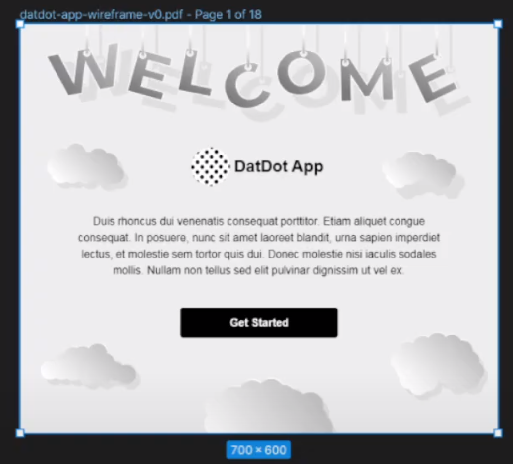
you mention the button component, but no the rest. 
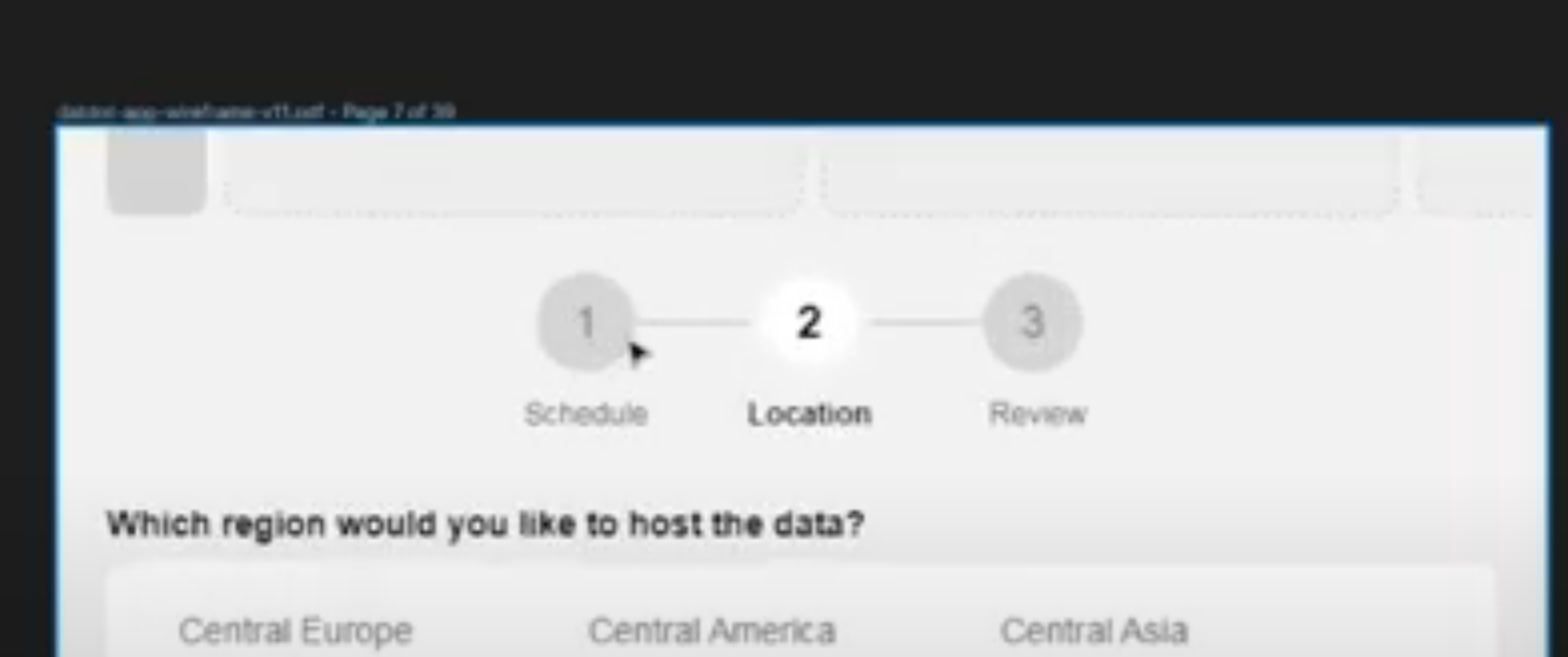
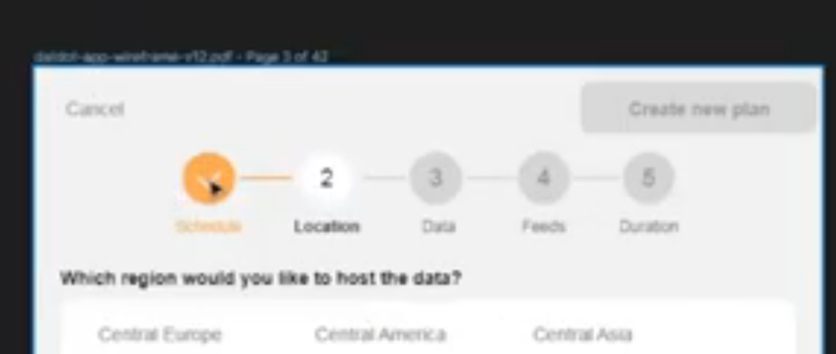
When a user opens the app for the first time and have no account and no hosting plans or apps yet, the app is mostly blank/empty, so the idea is to maintain a "welcome splash screen component" to display and it might include text or even a little video to introduce first time users.

We haven't decided yet the details, but we definitely need a "datdot splash screen" component :-)


2. link to specific pdf pages

as you figured out, github is not showing all pdf pages directly If you open a pdf (not embedded in github, but choose the raw pdf link) e.g. try http://www.pdf995.com/samples/pdf.pdf#page=3

check how you can do it: https://share.vidyard.com/watch/d1dZ4jG6c3MmmNM1fFsCEC?

you can use #page=X at the end of the pdf to make browsers (e.g. chrome) open that particular page of the pdf to link more specifically to components.

I think this is very valuable for component design versions to quickly check all the original sources and not searching through the pdf's where something came from exactly.


3. confusing dependency lines

dependency grid 
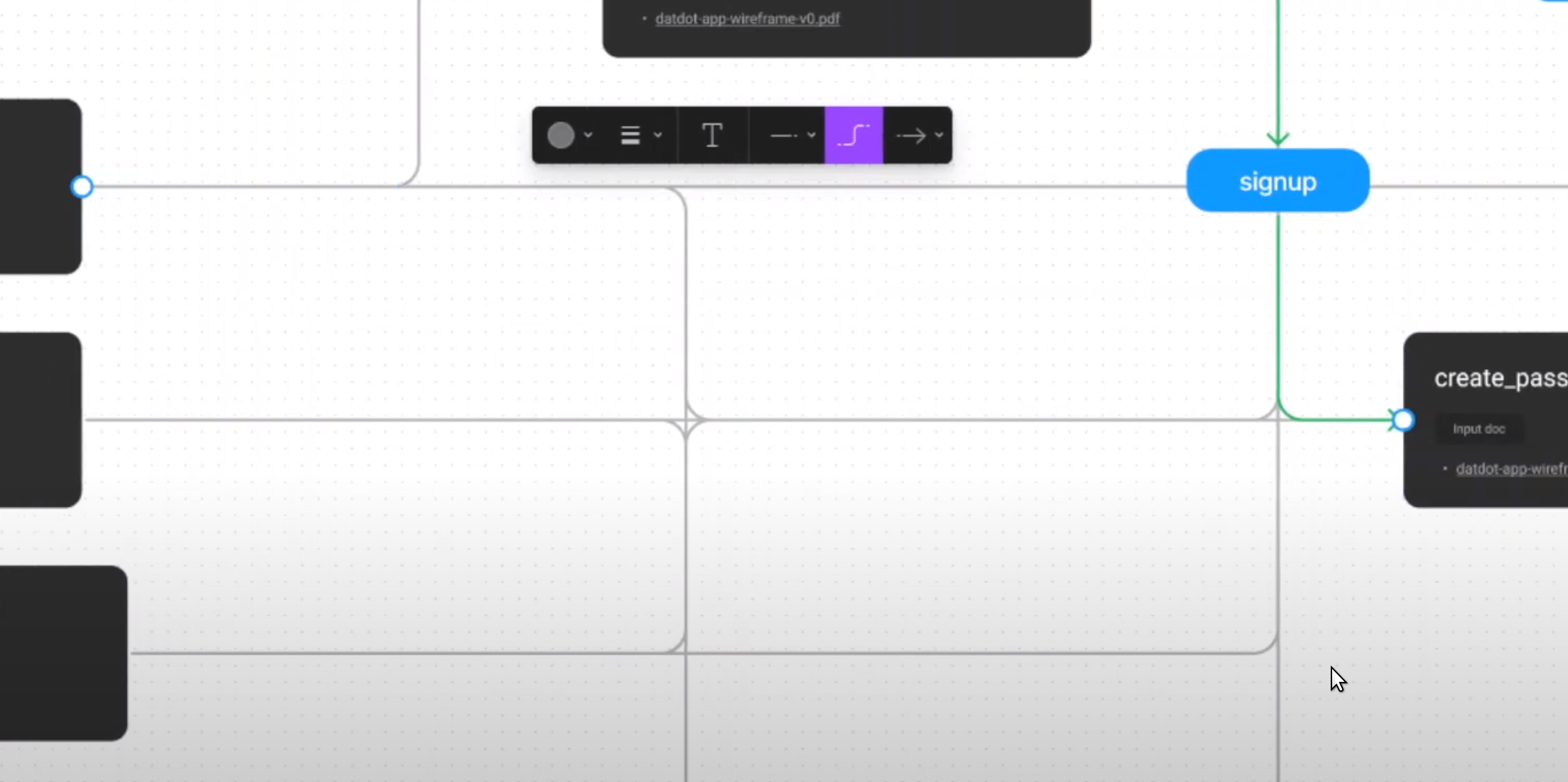
makes sense when i select a line, but without selecting it, it is hard to tell what goes into what. all lines seem to connect into a grid that goes everywhere.

Maybe less neat but more direct lines would make it a bit more clear without the need to click select lines first?


4. actions

action buttons

Ok, if it helps you try - my guess is that this could get very tricky and very messy quickly if we tried to express the interaction (UX) too, so try - but maybe it is good enough to just express which component uses which one without describing any transitions or interactions and so on...

I personally think that is adding even more lines to the document and although they have a different color it obfuscates the component dependencies, so please be careful to either skip that part for now so we do another document or somting maybe later when we have everything in version controlled figma component designs.


5. "progress bar"

progress bar 
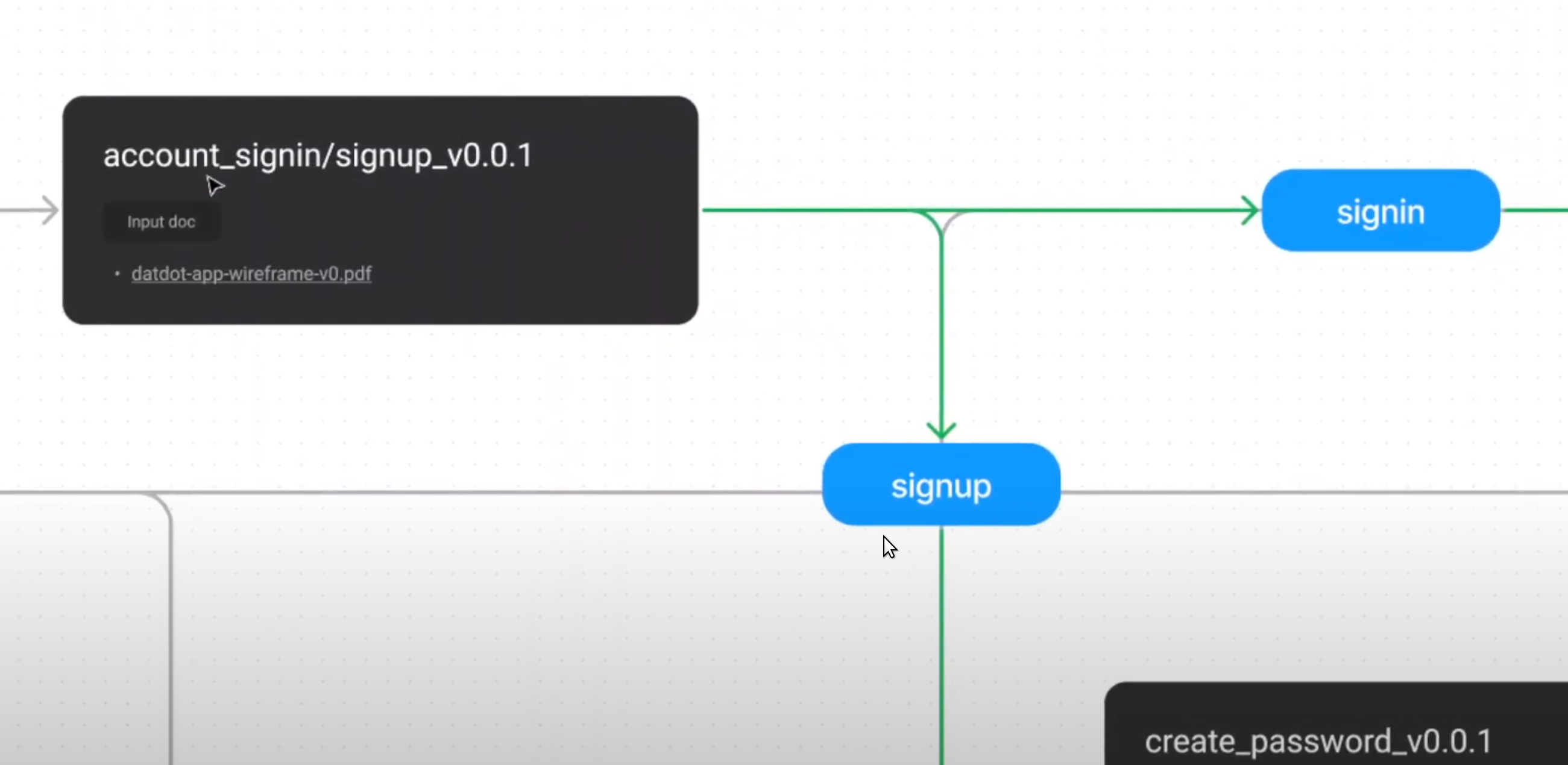
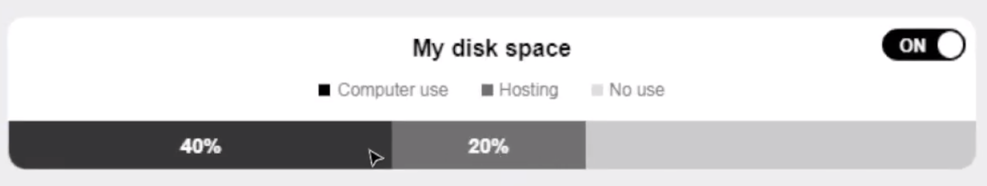
This is not a progress bar. It shows the utilization of your computer.

...probably this can be expressed better and we changed it in later versions, but a pie chart would probably be worse in utilizing the available screen space.

**instead of progress bar i would call it stacked chart ...it's like a pie chart but as a vertical bar...


6. panel navigation component

This should probably called action menu component. It is a single button to execute the default action. it can be expanded to select a different action. The available actions depend on the app context (e.g. which screen you are on)

It is not for navigation. The circle with dots in is meant to show more and is not related to the "panel navigation component".

This is/was meant to be an action menu, but some of those actions might have been to show a specific extra view in the very beginning when we started it, but it is meant to be specifically about actions and not about navigation.


7. overview

overview 
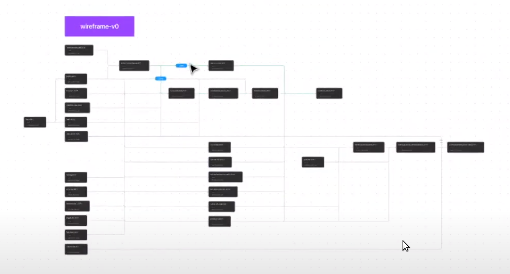
This is a good approach, but as said above, maybe lines could be less grid like overlapping to make things even more clear.

I am compelled to add this kind of chart on one extra special figma page to show give an overview how all components relate and clicking on a specific component will jump to the component page and to that specific designed version of the component.

That "overview component" itself can also have or should have versions, every time a new component is introduced and/or the relations between components change, so in this way it is not different from other components.

We might even decide in the very end to make this "dependency tree" or "component dependency network" a real component and use it on a design system page for all components ...as a menu :-)

So, yes! I agree with your proposal shown below wireframes 
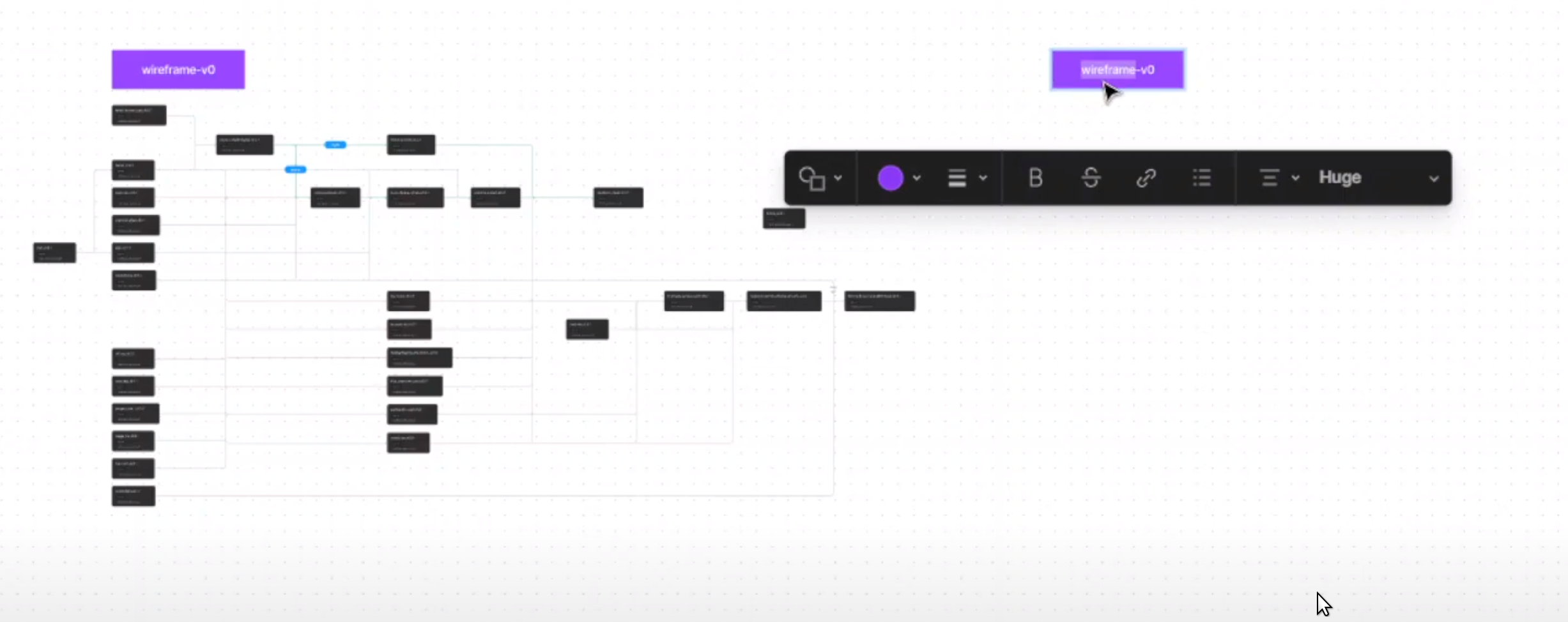
BUT, please just call it a "component dependency network** component or something like that and treat it just like any other real component and make versions in the same style. The lines or cards (maybe they are button cards) might be themselves a component or maybe we decide that this component has no dependencies and no dependents for now. One componeent version below the other, like for all other components.

Every iteration is using all the components we have and will make in figma :-)


serapath commented 1 year ago

feedback 2022.12.02

worklog video 87


pdfs in figma

I see you scrolling around to show e.g. the "filterable archive list screen or component. It takes some time, so moving copies of those screens onto the same page you create for the v0.0.0 component design of that thing would show them all at once and additionally they would have a description that includes the links to the original pdfs to the exact page.

...

pdfs in figma 
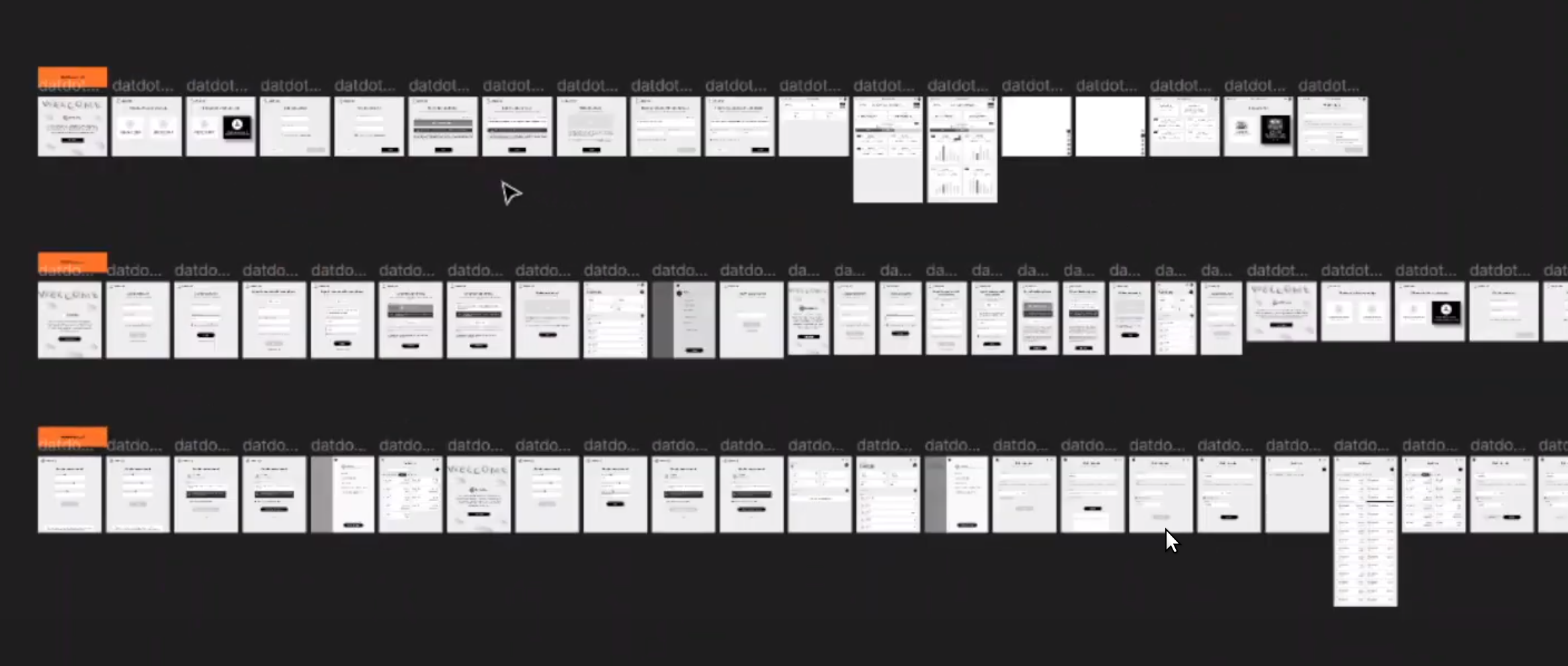
do you think it is possible move/copy those pdf screenshots into each specific component, v0.0.0 of course and make them "just regular figma version controlled components, with description and link to the original pdfs instead of creating a separate figma page where you just have all of them next to each other?

The "component dependency network" can still use or link to those


deprecation - password vs account component

deprecation 
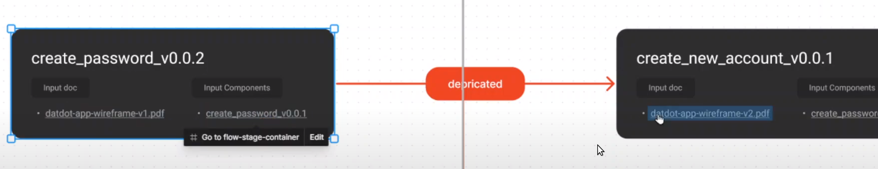
:+1: i love it. good idea to indicate deprecation like this :-)

BUT The "create password" and "create account" both exist, even though it might not look like that, which is what i meant when i said some screens or components where not designed in future versions, but they are still relevant even though only included in old versions.

The way it works:

  1. creating an account is creating a "seed/recovery phrase" for your keypair which never changes
  2. ADDITIONALLY you define a password, which encrypts the seed phrase on your device
    • you have to type it into your app to unlock the seed phrase
    • you can change your password, but not your seed phrase
    • if you setup a new device and import your seed phrase, you have to set the password again
      • you can choose a different password if you want

So this is not replacing the password component.


serapath commented 1 year ago

feedback 2022.12.03

The last worklog has not worklog video, so it was a bit difficult to follow from the figjam alone. It made me realize though, that just the graph is difficult to understand. I thought it tells me more from looking at it than the bullet point list, but it doesn't.

I imagine, if each "component/screen box" in that graph would be a tiny shrunken copy of the pdf screenshot of the component so you can zoom in to see details, would be better, because i could see the overview and component names, but zooming in i can also visually see how things relate.

Without having that, it is really helpful for me if you have a worklog video where you switch back and forth between pdf's so i actually undertand what the individual entries in the graph are meant to represent.

Still - seeing your last worklog - if you could copy/paste a minified thumbnail sized component pdf screenshot into or next to each box, that would be very valuable.

Basically merge the two figma files you have :-)

Also - if you go back to your "wireframe0" (basically component tree graph v0.0.0) when you finish, it might also help you to quickly remember what means what if there is a visual aid.

Mehrabbruno commented 1 year ago

tasks


feedback


worklog


proposal

Mehrabbruno commented 1 year ago

tasks


worklog

worklog-88


feedback


proposals

serapath commented 1 year ago

feedback 2022.12.09

The black colored "plan cards" on the left are black because they are currently selected. On the right you can still see them towards the bottom, but they are white, because they aren't currently selected by the user. They are one of them any details of the currently selected Plan1.

plan and cards

Those bigger "plan cards" you can see are basically parts of a single plan like Plan1

Maybe think of it like orchestrating or composing music. You have multiple tracks and on each track you define a different instrument and how it plays. So a "plan card" inside a plan is a single track and all the plan cards define every little detail about one hosting plan.

Example Let's say you wanted to organize streaming the cricket world cup. You would want data to be well hosted during matches when there is a peak/spike in viewers. You also want it to be well available within the UK, Australia, India and countries that are into cricket, while leaving out countries such as central europe, where almost nobody follows cricket. After matches are over, you might still want to host matches for people who want to watch them later, but its not spike/peak anymore and you might slowly fade out hosting plans after the cricket worldcup is over. Additionally per country you have a bunch of local shows which you will all treat the same, but you change the geographic location of the australian cricket news channel to only be hosted in australia for example. You still might tweak things further to host critical moments of matches for a long time as if it was during the game, because people will still be checking those moments ...and you can customize things further by analyzing usage behavior and adjusting your plans. In the end it's about perfect control over tweaking your hosting plans to be most cost effective or rather maximizing the utility of the hosting you pay for.


steps wizard

schedule, location, review

v11

schedule, location, data, feeds, duration

v12

schedule, location, data + feeds, chunks, duration

v12.1a v12.1b

ok, let me tell you the story :-)

  1. So we started with schedule, location, review initially
  2. Then we figured we need more steps, but it became a lot and still something was missing
  3. So we decided to invent **"sub steps"* instead, in this case the data step**
    • has the sub steps feeds, chunks, duration

Which means

  1. you start by selecting an overall rought schedule, e.g. from January-December
  2. then you select a location, then data and then...
  3. for the data step, you have to select which feeds and chunks and duration for each
  4. ...and we will in later versions refine that steps wizard with sub steps even more

Basically, the progress is in part content, like how to structure the UX and all the steps necessary to make hosting plans, and in part "component", from a menu to a steps wizard to a sub steps wizard, and also we later move it to the bottom and change it from "bubbles" to "buttons" and inculde better navigation including edit/accept/cancel per each step, to formalize the process, because we have many such wizards, not just for the "plan screen", but also again in the "work screen" and also in the "setup account screen".

Mehrabbruno commented 1 year ago

Tasks


Worklogs

worklog 89 worklog 90 worklog 91 worklog 92 worklog 93 worklog 94 worklog 95


Feedback


Proposals

I think we should start moving to create tasks on either HackMd or create components in Figma directly. Either way is fine with me

Mehrabbruno commented 1 year ago

tasks


feedback

I added the tasks into hackmd doc. I couldn't track time by version so I divided the total by the n of tasks


worklogs


proposal task

serapath commented 1 year ago

feedback 2022.12.21

worklog 89

color or typography components is what we will make in the end when we do themes. But themes wont be components the way we treat them, but we get to details later.

worklog 90

agree, maybe we only need one button, but we have had experiences in the past, where the button component became extremely complex and we should avoid that. Let's try, but if the button component becomes again complex, lets rather have many button components - each one simple

worklog91

+1

worklog 92

You mention it introduces plan cards and/or plan grid, but this is just an iteration of the former plan filter or what you called it. That "plan filter" had only a single row and now it has a double row. So just to mark that in the dependency graph as a "merge" or "next version" of it.

also tabs is a good name and later (in future versions) we will move from tabs to steps wizard. It is a different concept or way of thinking about it, but we decided to move into that direction to guide users how and when to use which parts of an otherwise already very complex UI.

worklog 93

just noticed you were again searching which component card in the figjam graph belongs to which exact PDF and that happens while you are working on the project, so again - important indicator - that we should urgently link things properly, so the links will help us to remember exactly when we try to remember days or weeks later what exactly was meant to be what and why :-)

also - i don't recall how exactly we allowed switching a plan to edit mode, when we initially introduced it. probably just something like "double click". So I think your assumption is correct.

the chunk info is again a "successor" of the more tiny tool tip that was shown in early versions of the chunk grid

You are also right wigh noticing: "The arrangement is changing"

Yes, we decided to turn the entire app into a "messenger" as much as possible. Of course it is not a messenger, but anything that can make it more like a messenger, we will try it, whether (discord/telegram/whatsapp/tiktok/snapchat/instagram/...)

Yes, the subject or topic of our app is different, but we want it real time and simple, as much as possible given the complexity we have.

worklog 94

+1

worklog 95

answer: the lower create new plan button that seems a duplicate of the above should probably be named create new plan card Every plan can have one or more "plan cards". I think that is exactly what I tried to describe in my previous feedback see here

You mention them later as "project info cards" I suppose. We'll see what the best final name will be :-)


summary

I noticed that the last version is still not yet our latest version. Maybe that is ok and we first capture all of this version controlled as pages with figma component versions and then we continue addint iterations.

There are still massive changes ahead that are captured in the adobe stuff.

But thx, good job capturing all of this so far :-)

serapath commented 1 year ago

feeback 2022.12.21

1. missing ## prefix for @todo

all tasks in markdown should start with

## `@todo`

2. wireframe1: has a task that just says a - might need a fix

### welcome_aboard

`@todo`

- [ ] a
    - `@input` [welcome_aboard_v0.0.1]() from #
    - [ ] update button to rounded radious
    - `@output` [welcome_aboard_v0.0.2]() from [comment]()

---

3. wireframe0-6.1: changes in components not entirely clear

e.g. in wireframe1 when looking at pdf screenshots it is possible to see, but:

e.g. also in wireframe1 but quite a few tasks look like for example import_account:

### import_account

`@todo`

- [ ] update import account page
    - `@input` [button_v0.0.2]() from #
    - `@input` [checkbox_input_v0.0.1]() from #
    - `@input` [text_input_v0.0.1]() from #
    - `@input` [import_account_v0.0.1]() from #
    - [ ] update the button with border-radius
    - [ ] replace `Cancel` button with text_btn `create new account`
    - `@output` [import_account_v0.0.2]() from [comment]()

e.g. same here in wireframe1, but i think it's a problem in many places


### create_password

`@todo`

- [ ] update create password panel/page
    - `@input` [button_v0.0.2]() from #
    - `@input` [create_password_v0.0.1]() from #
    - [ ] update the button with border-radius
    - [ ] replace `Cancel` button with text_btn `Already have an account`
    - `@output` [create_password_v0.0.2]() from [comment]()

I found these issues in quite a few more places, so this is something that should be fixed when we translate things into github issues

serapath commented 1 year ago

feedback 2022.12.22

component structure

The goal is to have the root component be the entire app. Everything else is sub bullet points. At the end of each line is described in which wireframe iteration things exist.

also: every task in hackmds should include an additional input, which is the specific PDF page and/or figma pdf screenshot it came from. Some component tasks with no dependencies are just introduced without the pdf input link

-----------------------------------------------
W0:
-----------------------------------------------
* account_signin/signup                       | w0
  * select_account_card                       | w0
    * icons                                   | w0
-----------------------------------------------
* import_account                              | w0,w1
  * seed_phrase                               | w0,--
    * icons                                   | w0
  * checkbox_input                            | w0,w1
    * icons                                   | w0
  * text_input                                | w0,w1
    * icons                                   | w0
  * buttons                                   | w0,w1
    * icons                                   | w0,--
-----------------------------------------------
* welcome_aboard                              | w0,w1
  * buttons                                   | w0,--
    * icons                                   | w0,--
-----------------------------------------------
* hosting_&_service_panel                     | w0
  * top_navbar                                | w0,w1
    * buttons                                 | w0,--
      * icons                                 | w0,--
  * card_info                                 | w0
  * action_menu                               | w0
    * buttons                                 | w0
      * icons                                 | w0,--
  * archive_info_card                         | w0,w1,??
    * buttons                                 | w0,--
      * icons                                 | w0,--
    * pill_tag                                | w0,--
    * bar_chart                               | w0,--
    * toggle_btn                              | w0,--
    * line_chart                              |    w1
 * hosting_&_service_(choose_service)_panel   | w0
  * card_info                                 | w0
  * action_menu                               | w0
    * buttons                                 | w0
      * icons                                 | w0,--
-----------------------------------------------
* hosting_&_service_(publish data)            | w0,  ,w2
  * select_input_1                            | w0,  ,--
    * icons                                   | w0,  ,--
  * buttons                                   | w0,  ,w2
    * icons                                   | w0,--,--
  * text_input                                | w0,  ,--
    * icons                                   | w0,  ,--
  * action_menu                               | w0,  ,--
    * buttons                                 | w0,  ,--
      * icons                                 | w0,--,--
-----------------------------------------------
* dashboard_panel                             | w0,w1
  * top_navbar                                | w0,--
    * buttons                                 | w0,--
      * icons                                 | w0,--
  * account_info                              | w0,--
    * buttons                                 | w0
      * icons                                 | w0,--
  * hosting/backing_info_card_1               | w0,w1
    * buttons                                 | w0,--
      * icons                                 | w0,--
  * disk_space_info_card                      | w0,--
    * point_tag                               | w0,--
    * stacked_chart                           | w0,--
    * toggle_btn                              | w0,--
  * archive_info_card                         | w0,w1,??
    * buttons                                 | w0,--
      * icons                                 | w0,--
    * pill_tag                                | w0,--
    * bar_chart                               | w0,--
    * toggle_btn                              | w0,--
    * line_chart                              |    w1
  * action_menu                               | w0
    * buttons                                 | w0
      * icons                                 | w0,--
-----------------------------------------------
W1:
-----------------------------------------------
* login_page                                  |    w1
  * buttons                                   | w0,w1
    * icons                                   | w0,--
  * text_input                                | w0,w1
    * icons                                   | w0
-----------------------------------------------
* account_logs_list                           |    w1
  * list_card_1                               |    w1
    * buttons                                 | w0,w1
      * icons                                 | w0,--
  * pill_tag                                  | w0,w1
-----------------------------------------------
* wallet_tab                                  |    w1,w2
  * profile_sidenav                           |    w1,--
    * toggle_btn                              | w0,w1,--
    * buttons                                 | w0,w1,--
      * icons                                 | w0,--,--
  * top_navbar                                | w0,w1,--
    * buttons                                 | w0,--,--
      * icons                                 | w0,--,--
  * hosting/backing_info_card_1               | w0,w1,--
    * buttons                                 | w0,--,--
      * icons                                 | w0,--,--
  * transaction_list                          |    w1,w2
    * buttons                                 | w0,w1,--
      * icons                                 | w0,--,--
    * list_card_1                             |    w1,--
      * buttons                               | w0,w1,--
        * icons                               | w0,--,--
    * content_filter                          |       w2
      * buttons                               | w0,w1,w2
        * icons                               | w0,--,--
-----------------------------------------------
W2:
-----------------------------------------------
* create_new_account                          |       w2
  * text_input                                | w0,w1,w2
    * icons                                   | w0,  ,--
  * create_password                           | w0,w1,w2
    * buttons                                 | w0,w1,  
      * icons                                 | w0,--,--
    * text_input                              | w0,--,  
      * icons                                 | w0,  ,  
    * checkbox_input                          | w0,--,  
      * icons                                 | w0,  ,  
  * alert_2              (was this alert_1?)  | w0,--,w2
    * icons                                   | w0,  ,w2
  * secret_backup_phrase                      | w0,w1,w2
    * buttons                                 | w0,w1
      * icons                                 | w0,--
    * alert_1                                 | w0,--
      * icons                                 | w0
    * seed_phrase                             | w0,--
      * icons                                 | w0
-----------------------------------------------
* modal_1                                     |       w2
  * buttons                                   | w0,w1,w2
    * icons                                   | w0,--,--
-----------------------------------------------
* archives_panel                              |       w2
  * top_navbar                                | w0,w1,w2
    * buttons                                 | w0,--,--
      * icons                                 | w0,--,--
  * text_input                                | w0,w1,w2
    * icons                                   | w0,  ,  
  * profile_sidenav                           |    w1,--
    * toggle_btn                              | w0,w1,w2
    * buttons                                 | w0,w1,w2
      * icons                                 | w0,--,--
  * archive_info_list                         |       w2
    * text_input                              | w0,w1,w2
      * icons                                 | w0,  ,  
    * archive_info_card_2                     |       w2
      * pill_tag                              | w0,w1,w2
    * content_filter                          |       w2
      * buttons                               | w0,w1,w2
        * icons                               | w0,--,--
-----------------------------------------------
* offer_hosting                               |       w2
  * text_input                                | w0,w1,w2
    * icons                                   | w0,  ,  
  * select_input_1                            | w0,w1,w2
    * icons                                   | w0,  ,  
  * buttons                                   | w0,w1,w2
    * icons                                   | w0,--,--
  * checkbox_input                            | w0,w1,w2
    * icons                                   | w0
  * point_tag                                 | w0,w1,w2
  * stacked_chart                             | w0,w1,w2
-----------------------------------------------
* send_funds                                  |       w2
  * select_input_1                            | w0,w1,w2
    * icons                                   | w0,  ,  
  * text_input                                | w0,w1,w2
    * icons                                   | w0,  ,  
  * buttons                                   | w0,w1,w2
    * icons                                   | w0,--,--
-----------------------------------------------
W3:
-----------------------------------------------
* profile_sidenav                             |    w1,w2,w3
  * toggle_btn                                | w0,w1,w2,--
  * buttons                                   | w0,w1,w2,--
    * icons                                   | w0,--,--,--
-----------------------------------------------
W4:
-----------------------------------------------
...
-----------------------------------------------
Mehrabbruno commented 1 year ago

tasks


feedback

I added the task list for v7 and v8


worklog


proposals

serapath commented 1 year ago

feedback 2022.12.22

Do you understand the unfinished table above and can you complete it?

When we have it, we can compare to existing github component repos, rename/create missing repos and make github issues per repo.

Mehrabbruno commented 1 year ago

tasks


feedback

I added the task list from v9 to v13. There isn't anything new added or updated in version 11. v12 has two parts. v12 and v12-1


worklog

worklog-96 worklog-97


proposals

serapath commented 1 year ago

feedback 2023.01.04

Thx for the videos, because the hackmds alone wouldn't have told me much.

In the second video you show the figma, but you do not link it as output above. Could you fix that? ..it's ok that the figma is still work in progress :-)


history:

  1. we started very crude versions using wireframe0, wireframe1,...wireframe13 ...but that is of course lots of stuff.
  2. Then at some point we started iterating on individual panels, like what you can see in the issues.
  3. and now we are trying to translate all of that into a version per individual component in our strict figma process

So yes, there have to be some compromises, lets just try our best :slight_smile:

Also, the old github issues where not yet strictly perfectly linking to their dependencies. It was the FIRST AND LAST time we actually tried to create such a stricter structure - but nothing compared to our "figma version control method" yet sadly, so don't take it as the perfect truth - let's fill in and correct/fix the missing pieces :-)


answer:

e.g. the pills-tab-buttons

The pills-tab-buttons output document (link to the repository or figma) will then be an @input in issue like wireframe-plan-dashboard


answer:

the old github issues are structured to give overview, so you do not need to go through the list of all issues here https://github.com/datdotorg/datdot-ui/issues but instead every of those issues is supposed to be linked directly or indirectly to the roadmapping issue https://github.com/datdotorg/datdot-ui/issues/1

or more specifically the datdot-webapp-components which also link to the wireframes https://github.com/datdotorg/datdot-ui/issues/9

If you work yourself systematically through that, and compare it to what you have and update/rename/etc.. thing accordingly, you should be fine.


request

please make a list of all repositories of all components needed so i can create those so we can create the new github issues on the appropriate repositories. Also please re-use or include all https://github.com/datdot-ui repositories and if you think we should rename some of them, let me know, so i do that too :-)


like i am not too familiar with adobe sadly. is there a way to maybe see some historic documents or previous version? is there some version control in there? https://xd.adobe.com/view/2c7f1bd5-f2f7-4741-81f8-b0772615c77f-792c/flow https://drive.google.com/drive/folders/1afmV1OTWQnCtNcCcnUY8eJ_hZ65vI_Me anyway, in our assets folder we have the wireframes v0 to v12-1 which you wnet through already https://github.com/datdot-ui/datdot-assets/tree/main/wireframes

BUT MAYBE YOU MISSED :-) https://github.com/datdot-ui/datdot-assets/tree/main/design => which seems to include the individual designs that are linked in those additional github issues


goal

(because you copied all PDF page screenshots into our figma anyway)

  1. we will have github issues on the different new/existing repos for all those components where we implement them
  2. and we will have ONE FIGMA TO RULE THEM ALL :-) ...to include all versions of all components ever
  3. most importantly:
    1. components have the best names possible (focusing on short names)
    2. the relations dependencies/dependents are tracked properly
    3. all merge/split and deprecated components are set correctly too

so afterwards, ideally: => we can delete the entire https://github.com/datdot-ui/datdot-asset repository when we finish, because it's in figma => and we can also delete or close all issues here https://github.com/datdotorg/datdot-ui/issues because we transitioned it to the new github issues structure (and i can just link in each old github issue to the new successor issue, which might include some renaming) :slight_smile:

cool?

That's the goal and let's find the best way to get there

Mehrabbruno commented 1 year ago

Tasks


Worklog

worklog-99


Feedback


Proposals