Team's Response
Placement of the copy button is a subjective design consideration. True that it can be located in a more convenient place on the LinkCard but the severity should not be Low since it is a layout issue and does not affect usage of the application.
Items for the Tester to Verify
:question: Issue severity
Team chose [severity.VeryLow]
Originally [severity.Low]
- [x] I disagree
Reason for disagreement: According to the textbook:

I do think that the severity should still be low, since very low is only reserved for cosmetic bugs.
Furthermore, the team has already admitted that "it can be located in a more convenient place", implying that they have recognised the inconvenience of the placement of the copy button. Hence, it fits perfectly with the severity level description.
(In fact, I would like to argue that it not only causing "minor" inconvenience for the users, as they have to scroll through every single time if they wish to copy the link.)
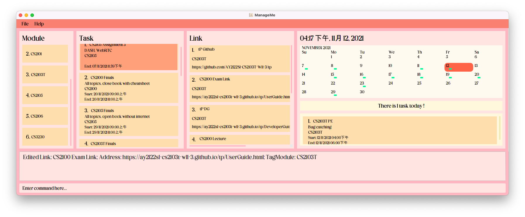
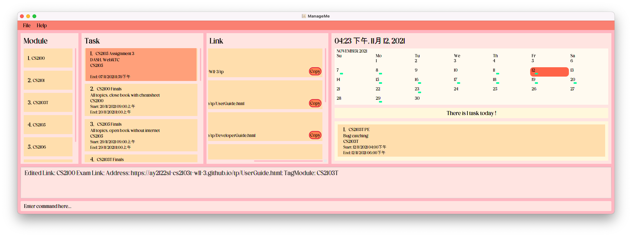
I believe the rationale for "copy" feature is for us to easily copy the link and paste it in our browser. However, with the pre-populated data, the "copy" button does not show up even when I expand the window to cover the entire monitor. This creates great inconvenience to the users, as the user now has to manually drag the vertical bar to navigate to the copy button and click on it. Window at full width:
Upon scrolling to the right: