Team's Response
No details provided by team.
The 'Original' Bug
[The team marked this bug as a duplicate of the following bug]
Not enough visuals in User guide
Note from the teaching team: This bug was reported during the Part II (Evaluating Documents) stage of the PE. You may reject this bug if it is not related to the quality of documentation.

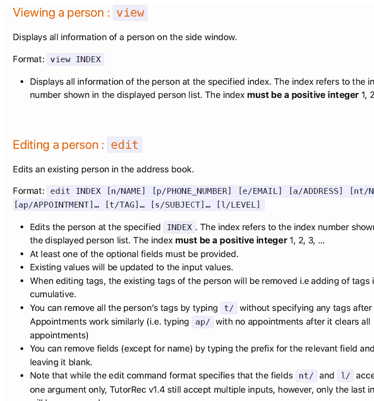
Currently there are only visuals for the "find" command and no visuals for the other commands. I feel that there should be more visuals especially for more crucial commands that is more likely to be used such as add command should be added to the user guide so that users can see what is the expected outcome or how to run the command.
[original: nus-cs2103-AY2324S2/pe-interim#1355] [original labels: type.DocumentationBug severity.VeryLow]
Their Response to the 'Original' Bug
[This is the team's response to the above 'original' bug]
No details provided by team.
Items for the Tester to Verify
:question: Issue duplicate status
Team chose to mark this issue as a duplicate of another issue (as explained in the Team's response above)
- [ ] I disagree
Reason for disagreement: [replace this with your explanation]
The User Guide lacks diagrams to orientate the user to the interface. The only diagrams are in the
findcommand and thequick startsection.Still, the diagrams provided are not annotated and assumes that the user understands where to write the commands, where the command feedback will be shown, where the student will be added and where the appointments will be added.
This could increase the learning curve and decrease the effectiveness of the guide.