 cassiozen
commented
8 years ago
cassiozen
commented
8 years ago Wow, this is amazing! So much cleaner, I really like it!
But be aware of two things:
- There isn't "metadata". All a collection have is a bunch of "fields".
- There are no default or obligatory fields, which means a collection might not have a title or a body.
To cope with this, the CMS has an "inference system" - a fancy name for a built in list of rules and synonyms used to try to guess the following fields: title, short title (or short description), author and content body.
Now, I said all this to explain how it works, but what i'm trying to say is:
-
I think we should always display the name of the fields. We might infer them, but we can't just say "title" if the collection configuration defines "headline". We also can't just display a text area for the content body"because the collection might not have one.
-
Again, we don't have a distinction of what is metadata and what is not. So I love the idea of trying to separate and put the most important fields first (and we can infer them), but I don't think we should hide the other fields in a separated edit area (because they might be important for the content, not just metadata).
... And a few minor tweeks...
- We don't have auto-saving / save as draft. It's an awesome idea we could implement in the future, but right we don't have them.
 biilmann
 rafaelconde


 budparr
 verythorough
 calavera
 cassandraoid
 eliwilliamson


 rd18aac
 imorente
 indysigner
 erquhart
 danielpost
 kosirm
 Benaiah
 andreasvirkus
 tech4him1
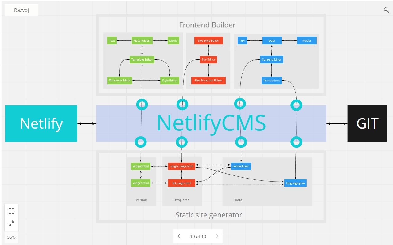
 ParisaTork
The Current State
Honestly there's a lot going on, and nothing major in need of improvement, but in the other hand there's just so much room for improvement that I think every element could use some love.
Some of the things that I focused on:
My Proposal
Some things to consider:
I think Markdown should be the default, and there's really no need to switch to a fancy preview in the editor itself, because we already have an actual preview taking up half of the screen 👍
When creating a new post, let's focus on the actual writing. Start writing. Let's keep the other metadata and required fields away until you need to fill them in.
On one hand we want to provide a clean and distraction free environment, on the other we have half the view with a preview of something we can't really control. It could be flashing GIFs for all I know. To alleviate this I think we should just change the opacity of the Preview to 65%, which can go back to 100% on hover.
As you can see, there's a new drawer in the bottom. When you click on it it expands to reveal some other additional metadata that you might want to fill in.
It can take up half of the screen when expanded, if there's more content we'll switch to a scroll area after that.
The Empty State
With a couple more fields, which is customizable (right?) 😅
Here's an example of a field being filled in
Validating
When the user hits the Publish button, the app should run some validation and prevent the post of being published if there's some required fields missing.
Like this
This is part 1 of the improvements to the Editor, I still have some things left to cover, but I would love to hear your thoughts and suggestions 👍 💯