 sachgits
commented
7 years ago
sachgits
commented
7 years ago am so waiting for this too
Open bdougie opened 7 years ago
sachgits
commented
7 years ago am so waiting for this too
 erquhart
commented
7 years ago
erquhart
commented
7 years ago @rafaelconde 🙏 🙏 🙏
I'd at-mention @danielpost but he's not a collaborator. Maybe I should add him as a collaborator...
erquhart
commented
7 years ago Oh snap it worked! Going to add him anyway :)
 danielpost
commented
7 years ago
danielpost
commented
7 years ago @erquhart Sweet, thanks!
I'm too busy for the next ~2 weeks but I'm going to take a crack at designing potential interfaces for the CMS over the summer.
EDIT: With that being said, I think it's important to prioritize properly. Do we want to optimize the current state of the app for mobile, or do we want to wait for the new design? Do we start working on a mobile version when the main parts of the new design aren't even set in stone yet? I'm guessing #180 is a better place to discuss those issues though.
erquhart
commented
7 years ago @danielpost super excited that you're looking into this! I think it'd be okay to do this as a part of the greater design improvement effort, since it's slated for 1.0.
 tech4him1
commented
7 years ago
tech4him1
commented
7 years ago The main improvement that I see on this is just to make it responsive -- most of the general UI as it stands should work fine on mobile. @erquhart Do you think this should be done mainly after the general UI improvement, or as part of it?
erquhart
commented
7 years ago A little of both, there will be some basic effort to ensure that things are more or less responsive, but actually optimizing for mobile will probably happen post-1.0, as it goes beyond just the UI. The markdown editor, for example, might need a bit of work to function properly on a touch device.
erquhart
commented
6 years ago So this isn't addressed in 1.0, but it's sort of better. The real reason we aren't pushing mobile is that there are technical issues beyond layout responsiveness - for example, Slate doesn't officially support touch input. Making the CMS work on a mobile touch device will require a good amount of effort, but it's definitely something to push for.
 01ivr3
commented
6 years ago
01ivr3
commented
6 years ago there appear to be some traction for adding mobile support to Slate https://github.com/ianstormtaylor/slate/issues/1656#issuecomment-372186682
tech4him1
commented
6 years ago Updated Slate mobile issue: https://github.com/ianstormtaylor/slate/issues/1720.
erquhart
commented
5 years ago Closing #1339 as a duplicate of this.
tech4him1
commented
5 years ago Updated Slate issue: https://github.com/ianstormtaylor/slate/issues/2062.
 binaryoverload
commented
5 years ago
binaryoverload
commented
5 years ago Any update on this? It'd be really handy to be able to edit my blog on mobile :)
 niyabits
commented
5 years ago
niyabits
commented
5 years ago Any updated on this? Can I work on this issue if no one is doing that? I really want the feature.
erquhart
commented
5 years ago Hi @yashguptaz - we’re always open to community contributions! I would recommend starting with a small PR that addresses one aspect of this issue. Maybe try making the sidebar in the collections view responsive?
If you’re up for that, create an issue outlining what you want to tackle first, and maybe spell out design decisions there (Eg., where the collections sidebar would be on mobile, is it hidden, how does show/hide work, etc).
Let me know what you think!
Sent with GitHawk
 edrex
commented
4 years ago
edrex
commented
4 years ago Fix for https://github.com/ianstormtaylor/slate/issues/2062 was released Nov 27 in 0.50.0 so updating netlify's slate deps currently 0.47 should help significantly (likely will cause some breakages that need to be fixed though).
 austincondiff
commented
4 years ago
austincondiff
commented
4 years ago We are building this into our UI refresh as part of #2557. Responsive design is something we are prioritizing in each screen and component as part of this effort. You are welcome to help as @erquhart mentioned. We are working off of the v3-ui-redesign branch.
edrex
commented
4 years ago I'm happy to help with testing, as mobile editing is important for me. Is that branch ready for testing?
austincondiff
commented
4 years ago  Nixinova
commented
4 years ago
Nixinova
commented
4 years ago +1, mobile editing is really needed. Also, when editing a markdown widget while on mobile, it's completely broken: you can't type anything, only copy paste, as the cursor jumps all over the place and only half the stuff I type actually goes into the textarea. Here's me trying to type "Most of the stuff I type doesn't get put in the textarea", with spaces replaced by underscores: ___f____p_n___
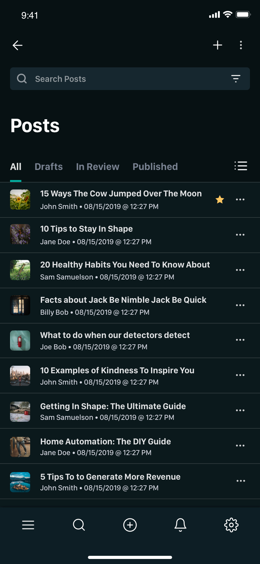
austincondiff
commented
4 years ago Here are some mobile concepts...


erquhart
commented
4 years ago @austincondiff as I’ve mentioned in chat, these designs are 🔥🔥🔥
@edrex sorry for the late reply here but just so everyone is clear, upgrading to Slate >= 0.50 will require a complete and exhaustive overhaul of the markdown widget internals. This will definitely happen, just not at the top of the pile yet.
 eur2
commented
4 years ago
eur2
commented
4 years ago @austincondiff This is wonderful! @erquhart Any hope this responsive design is included in a future version of netlify-cms?
 truongoi
commented
4 years ago
truongoi
commented
4 years ago  erezrokah
commented
4 years ago
erezrokah
commented
4 years ago Very cool @truongoi thanks for sharing!
 goodevilgenius
commented
4 years ago
goodevilgenius
commented
4 years ago I see a lot of commits on this issue. Is there any information on when there might be a release, even maybe a beta release?
For me, mobile is critical. I specifically decided to put together a Netlify CMS instance in order to post to my blog from my phone. I don't need a CMS when using my desktop.
erezrokah
commented
4 years ago Hi @goodevilgenius, there is a bigger effort on improving the UX and UI. You can track it here: https://github.com/netlify/netlify-cms/projects/9
Also see https://github.com/netlify/netlify-cms/issues/441#issuecomment-603811698
 erikkroes
commented
3 years ago
erikkroes
commented
3 years ago Just to add another voice, not being able to use a mobile phone is a real let down. This 3.5 year old issue is a reason for me too look for other options.
 blakedietz
commented
3 years ago
blakedietz
commented
3 years ago Just to add another voice, not being able to use a mobile phone is a real let down. This 3.5 year old issue is a reason for me too look for other options.
I strongly agree with this sentiment.
 clarkhacks
commented
3 years ago
clarkhacks
commented
3 years ago Just throwing my had in the ring.
 jtrobinson1993
commented
2 years ago
jtrobinson1993
commented
2 years ago Loving the work being done by @austincondiff and others.
Surprised there doesn't seem to be more push from Netlify themselves to modernize the design. The designs look amazing. The CMS really does have a ton of potential, and an enhanced design would go a long way to realizing it.
 dvejmz
commented
2 years ago
dvejmz
commented
2 years ago Just want to add my voice to everyone who's been asking for a mobile-friendly content admin experience from NetlifyCMS. I chose NetlifyCMS for its simplicity and flexibility. Releasing a functional mobile-friendly UI would certainly help cement NetlifyCMS as one of the leading headless CMS solutions out there so I hope this happens soon!
 searls
commented
2 years ago
searls
commented
2 years ago I ran into this today and decided to iterate on a CSS hack. Here's a gist of some CSS overrides I made that successfully cap the width of the main view and the editor to the width of my phone screen


 stale[bot]
commented
1 year ago
stale[bot]
commented
1 year ago This issue has been automatically marked as stale because it has not had recent activity. It will be closed if no further activity occurs. Thank you for your contributions.
 ashutoshsaboo
commented
1 year ago
ashutoshsaboo
commented
1 year ago not stale
 BernardMcWeeney
commented
1 year ago
BernardMcWeeney
commented
1 year ago This is still an issue, when will it be natively supported?
blakedietz
commented
1 year ago For feedback I ended up just getting rid of netlify cms and going with Working Copy on iOS and checking out the repo for mobile support.
On Thu, Jun 15, 2023 at 11:04 AM BernardMcWeeney @.***> wrote:
This is still an issue, when will it be natively supported?
— Reply to this email directly, view it on GitHub https://github.com/decaporg/decap-cms/issues/441#issuecomment-1593436923, or unsubscribe https://github.com/notifications/unsubscribe-auth/AATOL3CL4D6UZLM4DJFK7ILXLM6CBANCNFSM4DN2W3XA . You are receiving this because you commented.Message ID: @.***>
-- Blake Dietz
 martinjagodic
commented
1 year ago
martinjagodic
commented
1 year ago We want to make this happen. A lot of work is done on the new UI, which has better support for smaller screens, but it might take some time to release it.
If you need this now, I suggest that you implement the solution by @searls mentioned here: https://github.com/decaporg/decap-cms/issues/441#issuecomment-1321010883
 hithismani
commented
1 year ago
hithismani
commented
1 year ago I know this has been a challenge. I've adapted @searls's code and made it work for majority use cases on mobile.
https://manikumar.in/blog/mobile-optimized-decap-netlify-cms/
Even if it won't be as good as a native solution, I do feel it's good enough for majority projects.
Here's a sample:
 earlman
commented
1 year ago
earlman
commented
1 year ago thanks @hithismani !! the styles are working great.
I'm just minifying them and adding them directly into the HTML so I don't have to add any code to my 11ty build config.
<body>
    <!-- Include the script that builds the page and powers Netlify CMS -->
    <script src="https://unpkg.com/netlify-cms@^2.0.0/dist/netlify-cms.js"></script>

    <!-- Netlify Identity Widget -->
    <script type="text/javascript" src="https://identity.netlify.com/v1/netlify-identity-widget.js"></script>

    <!-- Mobile Styles -->
    {# Adapted By Mani Kumar (https://manikumar.in/blog/mobile-optimized-decap-netlify-cms/) From Source:
    https://gist.github.com/searls/7fd2c3223571a58a81006e7da66bd064 #}
    <style>
       @media (max-width:799px){[class*="DropdownList"]{position:fixed;min-width:20%;width:90%;margin:auto;height:fit-content;top:auto;left:0;right:0;bottom:10px;background:#e6f4fd;border:2px solid #3a69c7;}[class*="StyledModal"]{width:90vw;width:90%;}[class*="LibraryTitle"],[class*="BackCollection"]{display:none;}[class*="CollectionTopNewButton"]{padding:0 10px !important;height:auto;}[class*="LibraryTop"]{overflow-x:auto;height:fit-content;padding-bottom:10px;}[class*="ControlPaneContainer"]{padding:0 10px;}[class*="BackCollection"],[class*="BackStatus"]{font-size:.6rem;}[class*="AppHeaderContent"],[class*="AppMainContainer"]{margin-right:0;margin-left:0;min-width:calc(100vw - 24px);max-width:100vw;}[class*="AppHeaderContent"]{display:flex;justify-content:space-between;}[class*="AppHeaderQuickNewButton"]{width:100%;}[class*="AppHeaderButton"]{padding-left:4px;padding-right:4px;}[class*="EditorContainer"],[class*="ToolbarContainer"]{min-width:initial;overflow-x:auto;}[class*="ToolbarSubSectionFirst"]{display:flex;flex-direction:column;}[class*="PublishedToolbarButton"]{padding:0 8px;}[class*="PublishedToolbarButton"]::after{display:none;}[class*="ToolbarSubSectionFirst"]{flex-direction:row;}[class*="SearchInput"]{margin-top:5px;}[class*="ViewControls"]{position:initial;}[class*="PreviewPaneContainer-ControlPaneContainer"]{padding:0;}[class*="ControlPaneContainer"]{max-width:100vw;}[class*="EditorControlBar"] [class*="ToolbarContainer"]{display:flex;flex-direction:column;}[class*="CollectionContainer"]{display:flex;flex-direction:column;}[class*="SidebarContainer"]{position:initial;width:initial;}[class*="CollectionMain"]{padding-left:0;margin-top:20px;}}
    </style>
</body>@earlman : Thank you! :)
I've actually been asking folks to install it via jsDelivr (you can try it's minified code as well, or I'll push a dedicated file soon):
<link rel="stylesheet" href="https://cdn.jsdelivr.net/gh/hithismani/responsive-decap@main/dist/responsive.css"> <!-- Unminfied -->Only suggesting this approach so that I can push updates to the code even if Decap changes some class names or if someone reports a bug :)
 20240817-bot
commented
2 months ago
20240817-bot
commented
2 months ago Mobile support out of the box please! Can this be prioritized?
 elrender
commented
2 months ago
elrender
commented
2 months ago Dear Maintainers,
@erquhart @demshy
There is a fork of DecapCMS called StaticCMS which is archived as of today: https://github.com/StaticJsCMS/static-cms
Thanks to @KaneFreeman really great work, there is already a complete mobile view implementation. I am not very good in javascript code but I think it shouldn't be hard to adapt code from a fork to the main DecapCMS repository. What do you think?
martinjagodic
commented
2 months ago @elrender maintainers' focus is on a new UI, that will be responsive. In the meantime, please use the CSS library from the good people who shared it above.
I would be open for a PR that implements above solutions directly into Decap, I think that could be simple enough.

- Do you want to request a feature or report a bug? Enhancement: It would be nice to quickly check in on a post on the CMS from my phone
- What is the current behavior? The current UI has no consideration for mobile and non-usable from a mobile device.
- If the current behavior is a bug, please provide the steps to reproduce. Look at the https://cms-demo.netlify.com/ from your phone.
- What is the expected behavior? The editor can be ignored for now because it would require a larger scope. However, the editorial workflow and list of posts could be tweaked quickly fit on a mobile screen. Even it was just a list of post.
I recently had a situation where I was AFK and needed to ship a blog post from my phone. My only option was logging into GitHub and merging the PR, but it would have been nice to just hit publish from the CMS
- Please mention your node.js, and operating system version. iPhone 7