Team's Response
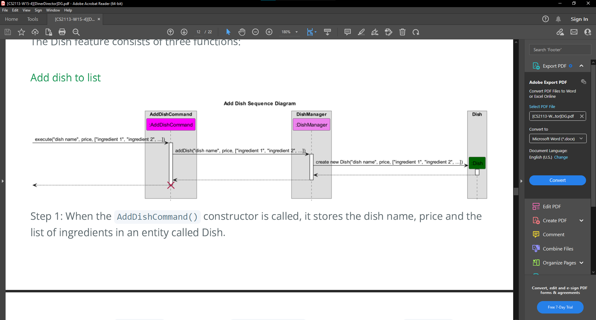
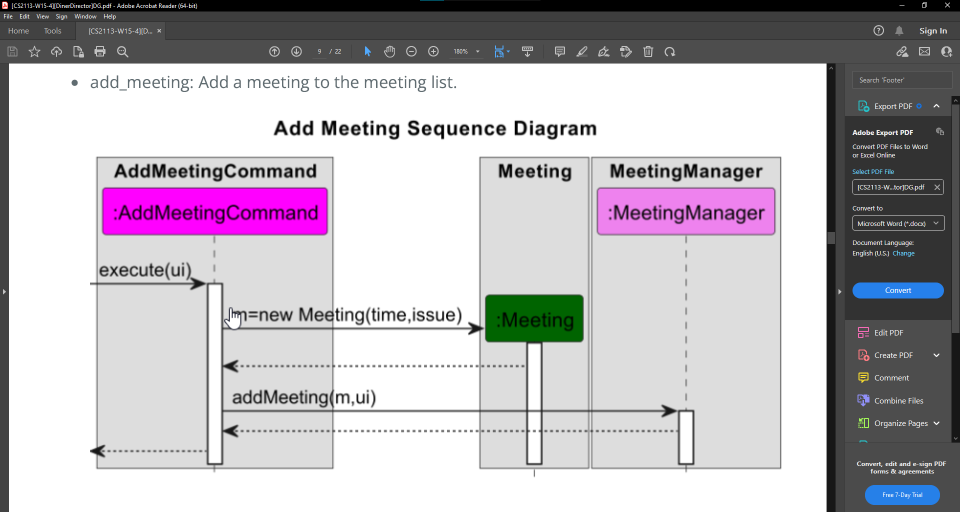
We think that the color of Dish can be seen clearly. This is the same color used for the :meeting in the add meeting sequence diagram, which can also be clearly seen.
Items for the Tester to Verify
:question: Issue response
Team chose [response.Rejected]
- [x] I disagree
Reason for disagreement: I was not mentioning that I cannot see the colour of the box that "Dish" is contained inside. I can see that its dark green clearly. The issue here was that the text colour of dish is black, and the poor contrast between dark green and black makes it hard to see the word contained inside the box, which in this case is 'Dish'. This issue is more prominent here as the sequence diagram is rather 'zoomed out' and the font size of 'dish' is smaller than that of 'meeting'.
This is how it appears when I open the DG PDF at 180% scale.


As you can see, as the sequence diagram is rather big, there was slightly lesser issue seeing the word 'meeting' as compared to the second sequence diagram. When the font size is small, the poor contrast makes it very hard to see the word 'dish'.
Unable to clearly see the
:Dishentity, might need to zoom in. Even zooming is hard to see as the colour chosen does not contrast well with the text colour.