Revised COVID Update Facility Locator Text.docx
@mmiddaugh approved revised before/after Coronavirus Update text for Facility Locator. Also we need to be sure that this text continues to maintain the Chatbot Flipper function.
Closed mmiddaugh closed 4 years ago
Revised COVID Update Facility Locator Text.docx
@mmiddaugh approved revised before/after Coronavirus Update text for Facility Locator. Also we need to be sure that this text continues to maintain the Chatbot Flipper function.
@mpelzsherman @brangi thank you for your excellent collaboration and awesome work. We do need to make a few changes based on our design review:
To confirm, search results for community care locations will not use sentence case due to the format of PPMS data. The team determined that the risk of incorrectly handling edge cases, such as acronyms, names like "McDonald" outweighs the benefit of forcing the data into sentence case for consistency.
merged
Issue Description
Implement new design for urgent care mash-up
Updated styling
Top paragraph intro text (now in issue #12061
General styling updates for search results cards
Search result card styling
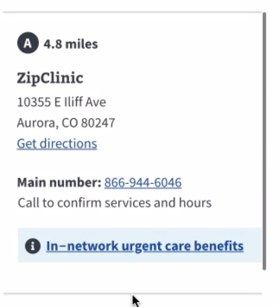
Community urgent care providers (in VA's network) and urgent care pharmacies (in VA's network)
Cards contain:
Note: Urgent care pharmacies (in VA's network) are currently hidden from the drop-down but are set to return at the end of August. This will ensure the styling and behavior is consistent when they return.
New styling
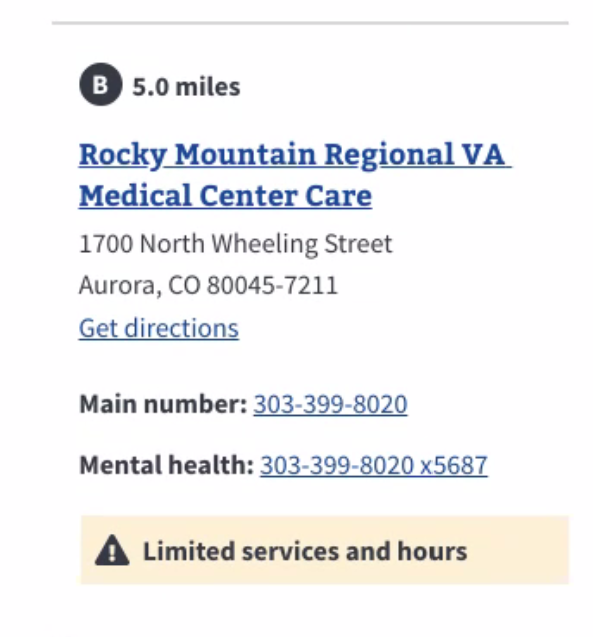
VA health cards contain:
New styling
Other facility types
Search result cards will be handled in a separate issue for VA Benefits, VA cemeteries, Vet Centers and Community care providers (in VA's network)
Updated behavior
Analytics
Front end tasks
Acceptance Criteria
[ ] Designer comments on this issue to approve page styling
[x] Search result cards should be displayed with the same font, regardless of facility type. #10874
[x] Veteran can choose to view urgent care results as
[x] When VA facility type = Urgent care and VA service type drop down = All urgent care, the search results list should include both VA urgent care locations and Community urgent care providers (in VA's network), organized in ascending order by distance
[x] When VA facility type = Urgent care and VA service type drop down = All urgent care, the search results list should include only VA urgent care locations will contain a facility operating status alert box (if appropriate based on data)
[x] When VA facility type = Urgent care and VA service type drop down = All urgent care, the search results list should include only Community urgent care providers (in VA's network) will contain a hyperlinked "In-network urgent care benefit" info alert box.
[x] When VA facility type = Urgent care and VA service type drop down = VA urgent care, the search results list should include only VA urgent care locations organized in ascending order by distance
[x] When VA facility type = Urgent care and VA service type drop down = Community urgent care providers (in VA's network), the search results list should include only Community urgent care providers (in VA's network) organized in ascending order by distance
[x] All other VA facility type search behavior will be maintained.
[x] Unit tests pass
[x] E2E tests cover current code and regression
[x] End-to-end tests show 0 violations.
[x] The data returned matches API response (for given user or scenario)
[x] All axe checks pass
[x] All color contrast checks pass
[x] All zoom testing passes
[x] All keyboard checks pass
[x] All screenreader checks pass
[x] No content is cut off or receives focus offscreen
[ ] Existing issues expected to be resolved with this design and implementation should be closed once validated.
Appendix
Ensure compliance with design specs (expand)
- Defined color palette for all elements (foreground, background and fonts) - Defined states - Enabled vs disabled - Hover vs active - Defined margin and padding spacing - Defined fonts and sizes - Defined iconography, as appropriate - Field labels - Error messaging, as appropriate - References to style guide/design system components - Link words and urls - Responsiveness breakpoints - Expected interactive behaviorEnsure your code changes are covered by E2E tests (expand)
- Add E2E tests if none exist for this addition/change. - Update existing E2E tests if this code will change functionality. - Include axe checks, including hidden contentRun axe checks using the Chrome or Firefox browser plugin (expand)
- Ensure no heading levels are skipped. - Ensure all buttons and labeled inputs use semantic HTML elements. - Ensure all buttons, labeled elements and images are identified using HTML semantic markers or ARIA roles. - Ensure form fields have clearly defined boundaries or outlines. - Ensure form fields do not use placeholder text. - Ensure form fields have highly visible and specific error states.Test for color contrast and color blindness issues (expand)
- All text has appropriate contrast.Zoom layouts to 400% at 1280px width (expand)
- Ensure readability and usability are supported when zoomed up to 400% at 1280px browser width - Ensure no content gets focused offscreen or is hidden from view.Test with 1 or 2 screen readers (expand)
- Ensure the page includes a skip navigation link. - Ensure all links are properly descriptive. - Ensure screen reader users can hear the text equivalent for each image conveying information. - Ensure screen reader users can hear the text equivalent for each image button. - Ensure screen reader users can hear labels and instructions for inputs. - Ensure purely decorative images are not announced by the screenreader.Navigate using the keyboard only (expand)
- Ensure all links (navigation, text and/or image), form controls and page functions can be reached with the tab key in a logical order. - Ensure all links (navigation, text and/or image), form controls and page functions can be triggered with the spacebar, enter key, or arrow keys. - Ensure all interactive elements can be reached with the tab key in a logical order - Ensure all interactive elements can be triggered with the spacebar, enter key, or arrow keys. - Ensure focus is always visible and appears in logical order. - Ensure each interactive element has visible focus state which appears in logical order.How to configure this issue
product support,analytics-insights,operations,service-design,tools-be,tools-fe)backend,frontend,devops,design,research,product,ia,qa,analytics,contact center,research,accessibility,content)bug,request,discovery,documentation, etc.)