[ ] Assign this ticket to the team member(s) responsible for addressing feedback provided by Platform.
[ ] Comment on this ticket:
If the Platform reviewer has any Thoughts/Questions that require responses.
When Must feedback has been incorporated. As appropriate, link to any other GitHub issues or PRs related to this feedback.
When Should/Consider feedback has been incorporated, or if any feedback will not be addressed. As appropriate, link to any other GitHub issues or PRs related to this feedback.
[ ] Questions? For the most timely response, comment on Slack in your team channel tagging @platform-governance-team-members.
[ ] Close the ticket when all feedback has been addressed.
Thoughts/questions
Thanks for engaging with the collab cycle! Good to see y'all again.
Feedback
Practice areas will document their feedback on the VFS-provided artifacts following the Must, Should, and Consider Framework. Platform Governance reviewers may also provide additional notes that don’t comment on the artifacts themselves but are important for implementation (eg. engineering/coding notes).
[ ] Must: If updating page name and URL, work with CAIA on link updates I like the new page name! If it does indeed ends up changing away from Performance Dashboard, the corresponding URL and link text to the product need to be updated as well across the site. Please work with CAIA who can help with updating the link in the sitewide footer (they own the component in Drupal) and for identifying and updating other entry points across the site.
[ ] Should: Include a heading inside the Usage details tab, describing its content The Highlights tab contains an H2 doing this; the Usage details tab should, too.
[ ] Should: pursue filter-style design for time ranges As-is, the dashboard has two sets of controls (pill buttons and tabs) doing functionally similar things: toggling between views. I recommend keeping the tabs but/and changing the date filters from pill buttons to either a select or radio button toggle, which changes the model from toggle to filter and gives room to grow when the team can add more date options.
[ ] Should: use realistic numbers/indicators for testing Not all the graphs will always go up. I recommend including some unsuccessful or red/declining indicators in the design so research participants can get a more rounded view of how the product might look in production.
[ ] Consider: move date filters down into tabs content Right now, the date toggles are higher in the visual hierarchy for the page but it seems to me like the big stories here, and the primary ways the team is divvying the content, is actually the tabs, Highlights and Usage details. I would consider moving those date filters down into each tab - so that those tabs become the first choice users make, followed by date comparisons.
Governance team actions
[x] Format feedback as individual tasks (check boxes)
[x] Assign this ticket to the VFS team member that opened the Slack request
[x] Add the VFS team product label
[x] Add the VFS team the feature label (if applicable)
[x] Add the touchpoint labels
[x] Add the practice area labels
[x] Add the Collaboration Cycle initiative milestone
Next Steps for the VFS team
@platform-governance-team-members.Thoughts/questions
Feedback
Practice areas will document their feedback on the VFS-provided artifacts following the Must, Should, and Consider Framework. Platform Governance reviewers may also provide additional notes that don’t comment on the artifacts themselves but are important for implementation (eg. engineering/coding notes).
[ ] Must: If updating page name and URL, work with CAIA on link updates I like the new page name! If it does indeed ends up changing away from Performance Dashboard, the corresponding URL and link text to the product need to be updated as well across the site. Please work with CAIA who can help with updating the link in the sitewide footer (they own the component in Drupal) and for identifying and updating other entry points across the site.
[ ] Should: Include a heading inside the Usage details tab, describing its content The Highlights tab contains an H2 doing this; the Usage details tab should, too.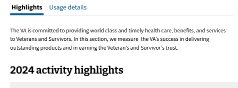
[ ] Should: pursue filter-style design for time ranges As-is, the dashboard has two sets of controls (pill buttons and tabs) doing functionally similar things: toggling between views. I recommend keeping the tabs but/and changing the date filters from pill buttons to either a select or radio button toggle, which changes the model from toggle to filter and gives room to grow when the team can add more date options.
[ ] Should: use realistic numbers/indicators for testing Not all the graphs will always go up. I recommend including some unsuccessful or red/declining indicators in the design so research participants can get a more rounded view of how the product might look in production.
[ ] Consider: move date filters down into tabs content Right now, the date toggles are higher in the visual hierarchy for the page but it seems to me like the big stories here, and the primary ways the team is divvying the content, is actually the tabs, Highlights and Usage details. I would consider moving those date filters down into each tab - so that those tabs become the first choice users make, followed by date comparisons.
Governance team actions