der-stefan / OpenTopoMap

A topographic map from OpenStreetMap and SRTM data
https://opentopomap.org
Other
470 stars 119 forks source link

Some ideas about natural areas #170

Closed max-dn closed 5 years ago

max-dn commented 6 years ago

I collect some ideas on how we could render mountain regions and natural areas. After the next update we have region:type in the database (#164)

What else belongs to this group? We have

Not all of this is defined in the wiki, but it exists in our database e.g. natural = valley as area and natural = arete is also used for normal valleys.

For processing, I would build something, which analyses the location and the size of the areas. The Alps have a size of 3.7e + 11 units, its largest subgroup are the Lavanttaler Alpen with 1.2e + 10. We should hide the label for the Alps, when we show the Lavanttaler Alpen.

For rendering I would use the existing style for valleys and mountains. In areas with many natural = ridges and natural = valleys it looks pretty good.

max-dn commented 5 years ago

Just to show where I want to go to: These are all areas and lines mentioned above. The labels are calculated with an algorithm similar to the labels of lakes, but I try to avoid horizontal lines.
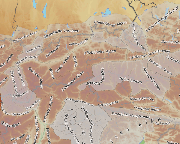
Alps

We also render natural=valleys which are mapped as areas, so Valle di Sasso Bisòlo is shown and also Valle di Preda Rossa, which is a area.
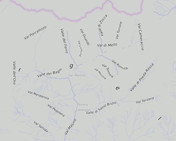
Bergell (this region and of course the "rgel"-rest of "Bergell" shoud disapear in that zoom level)
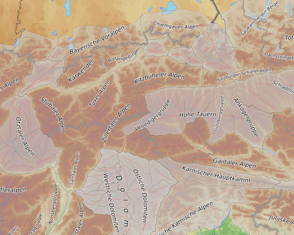
der-stefan commented 5 years ago

Wow, this looks great! If you smooth some lines and don't put labels on straight lines, this will be even greater!

max-dn commented 5 years ago

The first try now is a segment of a circle through the area (if you see straight lines, they are segments of very large circles...): Alpen 2

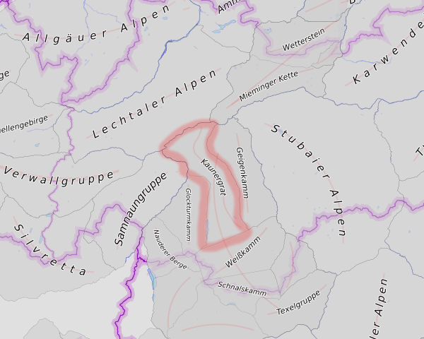
the fallback for areas which can't be covered with a segment is still the same as before, like for "Rofangebirge" above (center, upper third) or the "Kaunergrat" here: Kaunergrat

Should we do smoothing for lines? Some of the valleys are smooth enough, some are not...

der-stefan commented 5 years ago

Very nice! Should we already give in a try in the online OTM?

max-dn commented 5 years ago

I will need some days... I have still problems with strange shaped areas and i want to do some tests what to show in which zoom level. At least to give a hint for rendering.

mboeringa commented 5 years ago

I will need some days... I have still problems with strange shaped areas and i want to do some tests what to show in which zoom level. At least to give a hint for rendering.

I wouldn't bother to much with that particular shape. While maybe an interesting test case, this is clearly wrong tagging: what seems to have happened here is that someone took the outline of a now defunct landuse=forest multipolygon, now superseded by more detailed forestry tagging, and just slapped mountain range tagging on it without regard for the real outlines of the range. As a consequence, if we have to believe this feature, the highest peaks are actually not part of the range, as they aren't incorporated in the former landuse=forest MP but are excluded by the "inners" representing the highest ridges above the tree line and thus devoid of trees.

See the wikipedia article about the Rila mountain range for a map that more clearly shows the range: https://en.wikipedia.org/wiki/Rila

Looking at the object's history, confirmed my suspicion and indeed reveals its history as a forest feature: https://www.openstreetmap.org/relation/253825/history#map=11/42.1110/23.5316&layers=C

max-dn commented 5 years ago

Reminder for myself: For the sake of completeness, we should also show natural=gorge. But first let's see, what we have to change after we saw this on a map...

max-dn commented 5 years ago

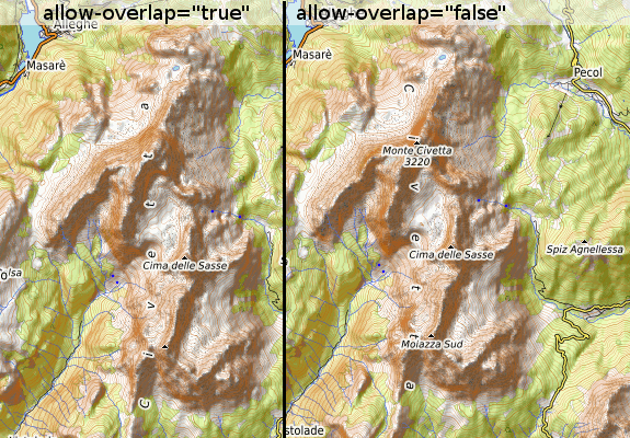
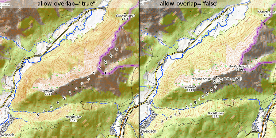
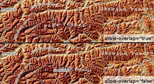
I'm not happy with the regions yet. I think the label covers too many more important things like peaks.

I tried to label the areas last and let mapnik search for free space. Thats mostly ok, mapnik is smart enough. Sometimes that doesn't work and the label moves to the edge of an area or covers just a small part in the center of a large region...

civetta here the label is ok

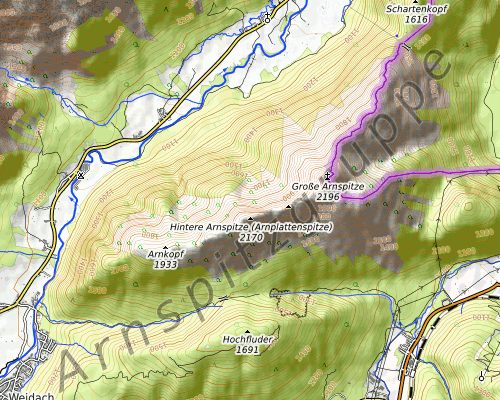
arnspitz here the label is too far at the edge, but you see the summits...

tauern here you see the Großglockner, but someone could think the "Hohe Tauern" is only the area east of this summit.

Another approach would be a transparent label that can be overridden (like in freemap.sk or dianacht.de). But this works only with big characters (large areas with short names in high zoom levels) and I think this labels don't fit to the current style with its strong contrasts and the small fonts: arnspitz

der-stefan commented 5 years ago

Thanks, @max-dn for your explanation. As you already suggested, transparent labels don't fit well in our map style. In my opinion region labels are more important than single peak names. I think Mapnik can be told to place the letters over the whole line instead of placing them on one side only.

mboeringa commented 5 years ago

In my opinion region labels are more important than single peak names.

Agree, and at scales that peak names become truly important (larger than 1:50k), it usually does not make sense to render region names, as a single map view will only cover a small portion of the region.

max-dn commented 5 years ago

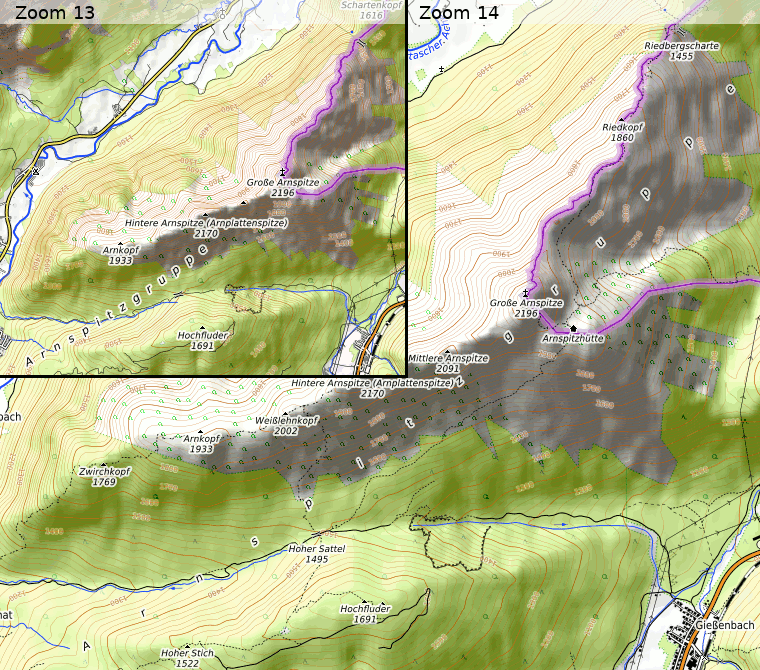
I divided the labeling in two parts: Zoom 5-11 is the same as now and areas are more important than peaks. In Zoom 12-17 the peaks (saddles, streams...) are more important than mountain_areas (ridges, valleys, canyons, natural_areas...). There is a large list of possible placements for the label, so in most cases mapnik will find some place for the area's name. The Arnspitzgruppe is still some kind of problem, but only in Zoom 13. In Zoom 14 it looks ok.

Arnspitzgruppe

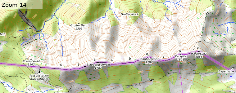
We also allow to place the label one character height above/beneath the line. That's important for ridges, which tend to connect the peaks and we get collisions between peaks, saddles and the label for the ridge:

Blauberge Blauberge, Way 615921043