Open PySimpleGUI opened 2 years ago
I am not really sure...I have thought about this before but couldn't come up with a method that makes the lines very crisp. Here is a solution I just drummed up although I am pretty sure you have thought of some variation of this method. Basically this attempts to make as close to infinitely many points as possible and connect them with lines. I do think it is possible to improve on this greatly, all I understand about the problem is you need very small points and a specific y to x scaling to make it look crisper.
import PySimpleGUI as sg
import numpy as np
def draw_spline_curve(canvas, points):
lastPoint = points[0]
for point in points[1:]:
# make the points smaller by using linspace
xVals = np.linspace(lastPoint[0], point[0], num = 50 )
yVals = np.linspace(lastPoint[1], point[1], num = 50 )
values = []
# build up values array
for i in range(len(xVals)):
values.append( (xVals[i], yVals[i]))
lastSmallerPoint = values[0]
for smallPoint in values:
canvas.draw_line(lastSmallerPoint, smallPoint)
lastSmallerPoint = smallPoint
# reassign last point to curpoint for next iteration
lastPoint = point
def main():
canvas = sg.Graph((500, 500), (0,0), (500, 500), key='canvas',background_color='white')
layout =[[canvas]]
window = sg.Window('tester', layout).finalize()
draw_spline_curve(canvas, [(x + 250, (1/50)*(-x**(2)) + 500 ) for x in range(-500, 500)])
while True:
event, values = window.read()
if event == sg.WIN_CLOSED:
break
window.close()
if __name__ == "__main__":
main()
@PySimpleGUI I realize when looking at the code I can make a modification to make it a lot simpler and probably more efficient but it still does not solve the crispness issue
import PySimpleGUI as sg
import numpy as np
def draw_spline_curve(canvas, points):
lastPoint = points[0]
for point in points[1:]:
canvas.draw_line(lastPoint, point)
lastPoint = point
def main():
canvas = sg.Graph((500, 500), (0,0), (500, 500), key='canvas',background_color='white')
layout =[[canvas]]
window = sg.Window('tester', layout).finalize()
draw_spline_curve(canvas, [(x + 250, (1/50)*(-x**(2)) + 500 ) for x in np.linspace(-500, 500, num = 50000)])
while True:
event, values = window.read()
if event == sg.WIN_CLOSED:
break
window.close()
if __name__ == "__main__":
main()
Oh wow! That looks great!
I've not looked at this at all, so you're ahead of me on this one. That was quick work! I'm impressed.
I don't know if it would be of help, but there's a multi-point draw:
You can pass it a list of points and it'll draw lines between each point.
I get a similar look using this:
import PySimpleGUI as sg
import numpy as np
def main():
canvas = sg.Graph((500, 500), (0,0), (500, 500), key='canvas',background_color='white')
layout =[[canvas]]
window = sg.Window('tester', layout).finalize()
points = [(x + 250, (1/50)*(-x**(2)) + 500 ) for x in np.linspace(-500, 500, num = 50000)]
canvas.draw_polygon(points, fill_color='white', line_color='black' )
while True:
event, values = window.read()
if event == sg.WIN_CLOSED:
break
window.close()
if __name__ == "__main__":
main()
You know better than I do about these curves. I just know the methods that are available 😀
@PySimpleGUI even better, never really looked into that method ever. I guess I gotta read the docs! Tinkering with the line_width property has given me a nicer result in this very specific example
import PySimpleGUI as sg
import numpy as np
def main():
canvas = sg.Graph((500, 500), (0,0), (500, 500), key='canvas',background_color='white')
layout =[[canvas]]
window = sg.Window('tester', layout).finalize()
# reduced step var 'num'
points = [(x + 250, (1/50)*(-x**(2)) + 500 ) for x in np.linspace(-500, 500, num = 100)]
# increase line_width argument
canvas.draw_polygon(points, fill_color='white', line_color='black', line_width=4)
while True:
event, values = window.read()
if event == sg.WIN_CLOSED:
break
window.close()
if __name__ == "__main__":
main()
Oooo.....
Yeah, that's nice!
I've no clue how to go about using something like this to connect 2 rectangles like in a network diagram.
I think your line drawing version is likely superior though. I'm not sure how to indicate (I've forgotten if it's even possible) that a "fill" should be transparent. The draw_polygon
will fill automatically. I think your version is likely better in this situation. I'll look at the tkinter method create_polygon
to see what's possible.
Having a demo that's got diagrams like yours would be really great. There so SO many applications for something that has boxes connected by lines. These curved lines are the difference between a very very simple diagram and a professional-looking one.
It's through projects like yours and capabilities the Jason write and my own experimentation that builds the base of knowledge and makes it possible for more and more people to make bigger applications.
One of the demos is a simple drawing application that shows how to click and move things around. You too have shown others how to do a similar operation. Now if someone wants to make a diagramming program, they'll have a nice jump-start.
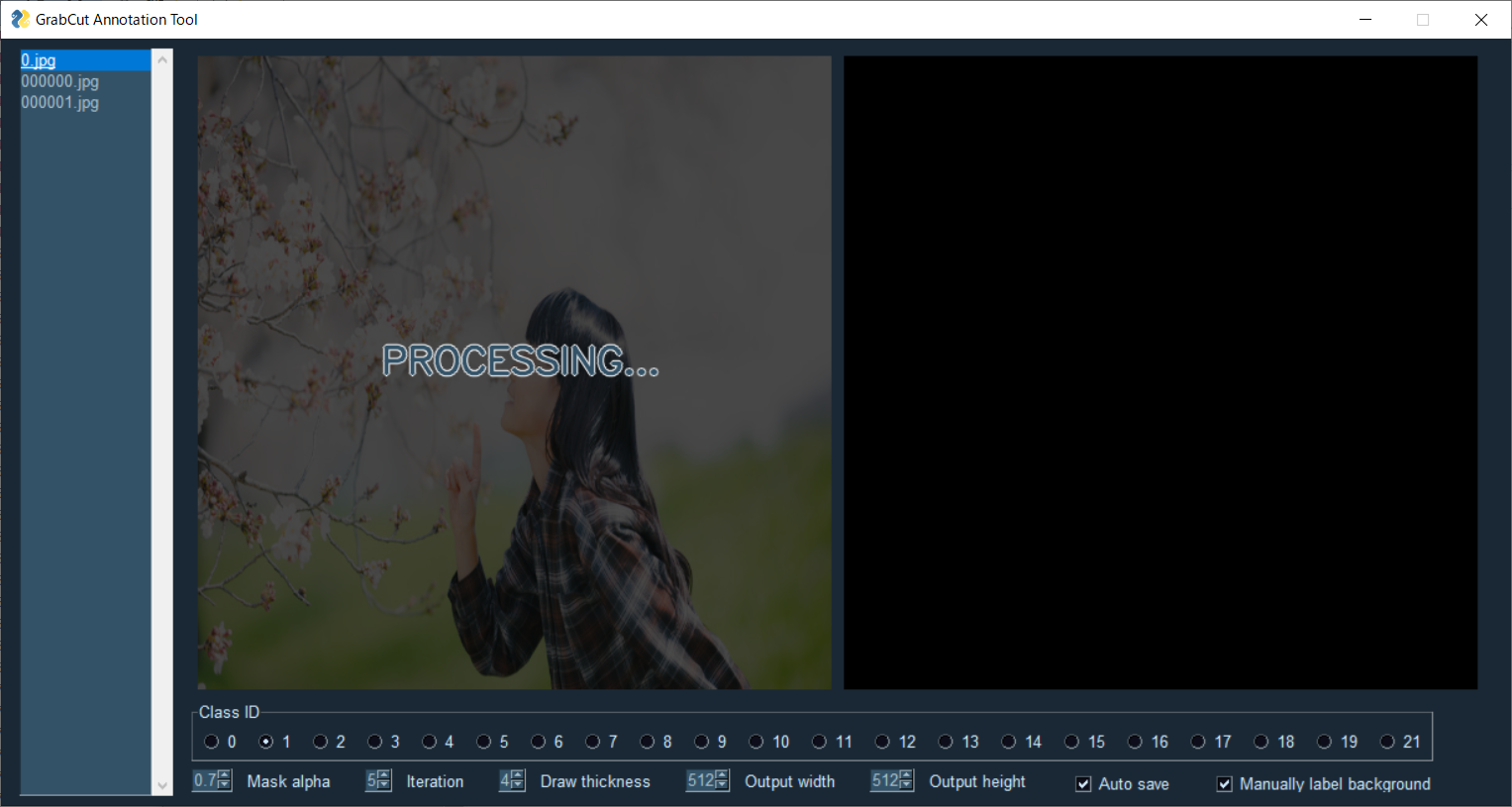
While "poking around" yesterday to see a few things people built, I ran across this remarkable program that I wouldn't believe is a PySimpleGUI program.
Annotation tool using GrabCut() of OpenCV.
It can be used to create datasets for semantic segmentation.
* Due to GrabCut's algorithm, it is suitable for annotation of data with clear boundaries.
│ app.py │ config.json │ ├─core │ │ gui.py │ └─util.py │ ├─input │ └─output ├─image └─annotation
Source code.
Image files are stored in this directory.
Directory to save annotation results.
Start it with the following command.
python app.py
The following options can be specified.
You can switch the annotation target by clicking the file list.
keyboard shortcut ↑、p:preview file ↓、n:next file
You can specify the initial ROI by right-drag the mouse when "Select ROI" is displayed.
After the drag is finished, GrabCut processing is performed.
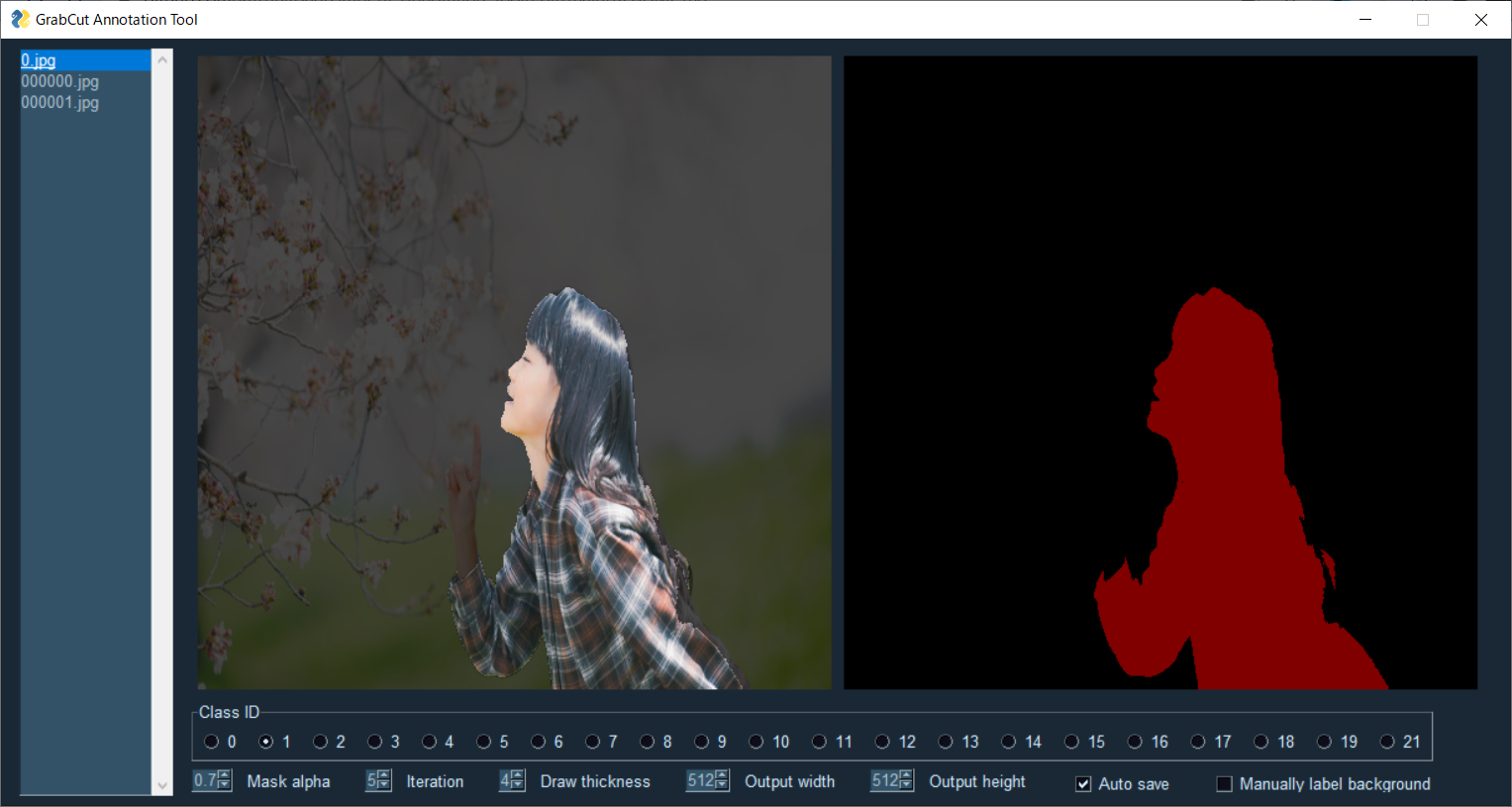
The area is selected.
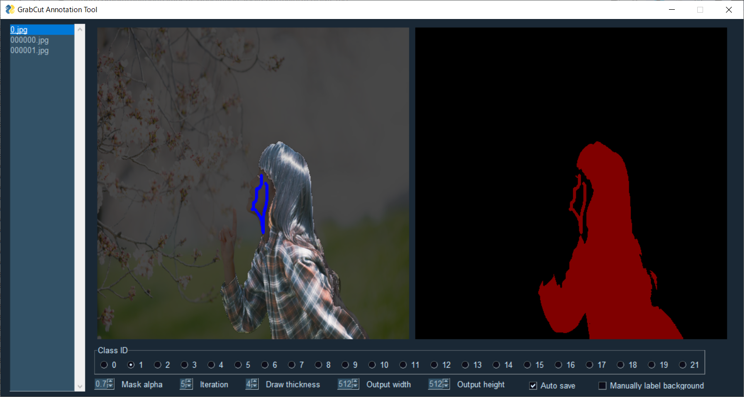
You can specify the background by dragging the right mouse button.
You can switch to foreground specification by unchecking "Manually label background".
keyboard shortcut Ctrl
You can specify the foreground by dragging the right mouse button.
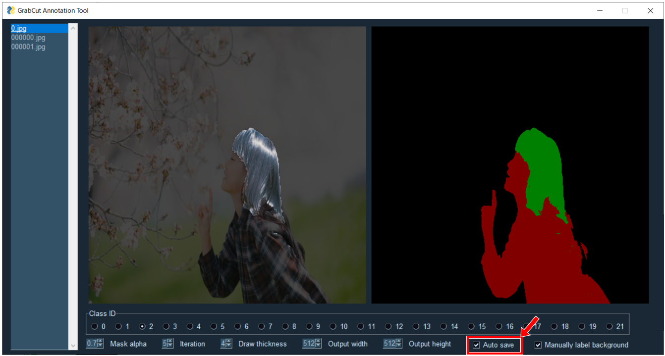
You can switch the class ID by pressing the check box.
The single digit ID can be switched with a shortcut key.
keyboard shortcut 0-9
After switching the class ID, it is necessary to specify the ROI.
Resized images and annotation images are automatically saved for each GrabCut process.
If you do not want to save automatically, uncheck "Auto save".
If you want to save other than auto save, press "s" on the keyboard.
Kazuhito Takahashi(https://twitter.com/KzhtTkhs)
GrabCut-Annotation-Tool is under Apache-2.0 License.
The sample image uses the photograph of フリー素材 ぱくたそ.
@PySimpleGUI The craziest part about this being implemented using the graph element is that I have literally no idea how they drew that image on the right using the available methods.....not even the slightest idea. I would never have even guessed this used the graph element to be honest. Also feel free to make a demo program that incorporates the textbox widgets I made, no problem! I would love to see that. I am pretty curious as to how this spline drawing could be used so I will probably start coding something up and see what works. If I come up with anything worth mentioning I will post it here!
Please do lemme know if you end up adding something. No pressure to do so, however. I'm impressed you whipped up a little piece of sample code within a few hours of me asking about splines in general.
It's been great chatting with you. Thanks for taking a moment and working with me on this spline question. Keep on making stuff! You've got great instincts and can clearly work on problems quickly.
I'm curious what your approach would be to get curved lines between the boxes. I've not looked at the problem, but I've looked enviously at screenshots of network diagrams that have smooth, curved lines between the nodes. Do you now how to go about doing something like that?