This is lovely and very well made, but I feel that for the sake of keeping 90s feeling and gothic atmosphere, it should be a bit closer to the PC original. I would keep the orbs at the bottom or top somewhat like in the D2 UI.
Open AJenbo opened 4 years ago
This is lovely and very well made, but I feel that for the sake of keeping 90s feeling and gothic atmosphere, it should be a bit closer to the PC original. I would keep the orbs at the bottom or top somewhat like in the D2 UI.
orbs cover too much of the screen imo
It works very well on PoE


Also keep in mind: the mock up posted above by Ajembo would imply using scaling trickery since, for example, in the original game, the skill icons are larger than the player character.
So first and foremost we would have to decide if a console/mobile UI would try to keep assets at the original resolution, or if it would allow scaling. If scaling is to be allowed, then the orbs can be easily resized and made less cumbersome. Also missing is a description/health/properties bar for enemies, which would likely have to be placed on top, D2 style, so my suggestion would be as follows:

We can also contact the author of the original UI mockup to collaborate with us, since he seems to know what he's doing regardless. :)
One particular reason I would really like to keep the orbs is because of the angel/devil motifs. They're one of the best bits of the original UI and a neat reference to the duality of mankind, a topic prevalent in Diablo. Belzebub mod did it nicely by cutting them from waist down. We could cut them similarly and put them on the corners, the motifs now serving as sole support for the orbs.

And finally for a possible mobile UI: the upcoming PoE mobile uses a single split orb for both health/mana, which is also a great alternative!
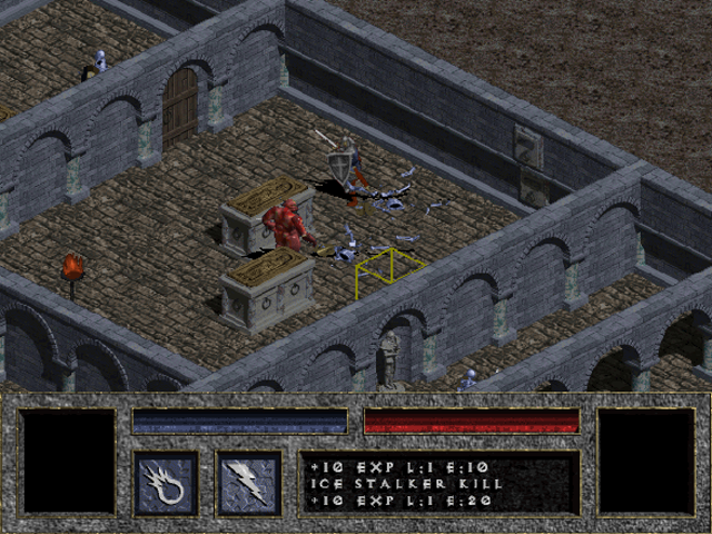
I actually like Ajenbo's idea. The original UI was too bulky and ugly and everything was squares designed specifically for 640x480. It almost looks as bad as Diablo 2's UI did. Belzebub did a good job but its still a bit much. Personally I liked how the PSX port simplified things to health/mana bars and a potion row.
Conveniently removing the UI makes things fit better for widescreens, and for fullscreen you can increase vertical tiles to compensate.
I'd like to add stackable scrolls and potions, which should make the four-potion belt more viable, especially with controllers. On the PSX it was very annoying to pause the game and put potions back in the belt. Ideally it could be a hotkey like:
While holding L3:
- L1: Use slot 1
- L2: Use slot 2
- R1: Use slot 3
- R2: Use slot 4
The PSX had instead two buttons for mana or life.
The Switch is a 720p device, but the screenshot AJenbo found is 360p. I'm guessing the screen is too small for 1x scaling to look good?
The original HUD is not very obstructive at 720p and up. However, it is problematic at 480p and lower. Unfortunately, onhover windows weren't really a concept yet in the 90s, so the main reason D1's HUD is so big is because it has that permanent text window. Diablo II got rid of it and cut HUD obstruction in half.
Making an optional minimalist HUD is a good idea. The buttons and slots aren't baked in, so I like the idea of simply rendering them on their own, and then making some simple hp/mana bars out of a solid color.
As far as making things controller friendly, the big problem is potions and how much heavy clicking was required in vanilla. This is an absolute chore on a gamepad and AJenbo's screenshot doesn't address that. The PS1 port also didn't really address this properly.
In my opinion, what needs to be done for gamepad ports is for potions to stack to 99 on your belt and not exist in the inventory at all. L1 uses a health potion, and L2 uses a mana potion. The game will use fulls if present first. That completely eliminates the controller headaches with potions. Dedicating buttons to swapping types or introducing "while held" modifier mappings is way too complicated and will play like crap.
@Sheepo99, Beelzebub's dev didn't cut the orb statues at the waist to reduce their size, he did it to offset his increasing of the orb sizes, so that his HUD wouldn't be taller than classic's HUD. Also, your screenshots are way higher than 360p and not really relevant to the problem at hand.
Not sure what you mean by 1x not looking good? My current thinking is to use 360p for phones and 480p for other devices (width would be auto adjusted to the device aspect).
For potions not to exists in the inventory would give an unfair carry capacity to controllers and would require changes to save games. Controller already uses heal/mana on L2/R2 (first matching item from the belt from left to right). On thing I do think would be ok would be to use items directly from the inventory, or automatically move them to the belt when others are used.
Not sure what you mean by 1x not looking good? My current thinking is to use 360p for phones and 480p for other devices (width would be auto adjusted to the device aspect).
I don't own a switch, but I know it's 1280x720. If you render at 640x360, then you're scaling at 2x, right?
For potions not to exists in the inventory would give an unfair carry capacity to controllers and would require changes to save games. Controller already uses heal/mana on L2/R2 (first matching item from the belt from left to right). On thing I do think would be ok would be to use items directly from the inventory, or automatically move them to the belt when others are used.
All I know is that the process of moving items around is 10x more tedious on a controller, so it should be reduced as much as possible on gamepad mode. Situations like:
-having to manually move potions from inventory to belt -having to reaarrange or drop potions in inventory to make room for loot -having to select potions in order to sell them
These could be eliminated from controller play if potions simply stacked on the belt and never went in the inventory. You could also create some kind of potion cooldown setting if you thought it was unfair. Personally, I think it's much harder to play with a controller, so it wouldn't bother me.
But I get that you don't want to create separate savegames. Though you could probably just give the player two belts, the stackable belt that is hidden in mouse mode, and the normal belt that is hidden in gamepad mode. That way, the only way a potion would exist in your inventory is if you switched from mouse mode to gamepad mode.
But I get that you don't want to create separate savegames. Though you could probably just give the player two belts, the stackable belt that is hidden in mouse mode, and the normal belt that is hidden in gamepad mode. That way, the only way a potion would exist in your inventory is if you switched from mouse mode to gamepad mode.
Well it's more that i want to avoid making any changes that will alter the save-game format since it would break comparability. Not that both couldn't be supported at the same time. So this means we cannot change the geometry of the inventory (including belt), but we can automatically move things or allow using items directly from the inventory.
I have played it a lot with controller (don't have a Switch, but I have a game bad hooked up to the PC and also a handheld device) lately and there are definatly improvments that can be made still, but it's also not to bad as is. But this topic should really only deal with the UI and not scheme, see #418 for that.
Here's a quick mockup I made of a minimally obstructive hud for low resolutions that is 33% the size of the original one. The background is also transparent so you can still see what's in the corners.

I also had one with vertical health bars. I actually like the look of this one better, but I need to think of where to put spell icons.

horizontal one looks very nice, I hate these vertical bars :D
At one point in time diablo had health bars. The UI was redrawn about 5 or 6 different times and IMO it got uglier each time. I think Brevik mentioned in an interview that the team had a hard time deciding on the final version.
For a console mobile UI, I'm ultimately fine with the 1st concept posted by ajenbo, but i'd still prefer a single life/mana orb split in half instead of the bars on the top left corner. The orbs are just one of those very Diablo things we should not discard, especially since it has been so influential on later RPGs.
If we're talking a simplified modern interface (non-console) tho, I'd recommend adopting something very close to the PoE interface, as a opposed to a Diablo 3-style centerpiece interface. Orbs on corners look much better IMO.
In my opinion, scattering UI elements across the screen is bad design because it obstructs the viewable world too much. When HUD is confined to one area (like the bottom), it effectively widens the game aspect. D1's HUD may be tall and obstructive, but you never feel like it's obstructing what you want to see or click on. That's not true when stuff is just floating around viewable space.
Of course, the benefit of this being an open source project is that there is no one true design we have to agree on. As long as people code in what designers have proposed, users can just cycle through HUD layouts the way they will cycle through any other option.
Please also bear in mind if you're talking about mobile devices, not all mobile users have a controller, I would love devilutionX to have touch-only input support on mobile and tablets. It's obviously not very related to this issue, but my point is that adjusting the UI for small screens should be flexible enough to accomodate for possible touch input support in some future updates.
Definatly for Android and iOS we will have a virtual touch controller by default, and only switch to a real controller in case we detect one, like we currently do with Mouse+Keyboard/Controller on Mac/Linux/Windows. And yeah the different UIs should be selectable, either via INI or option menu, but we will probably pick different defaults depending on the target device.
Putting all potatoes in the same bag isn't always a good solution. Console interfaces differ notably from PC interfaces on this approach. The further away a player is from the screen the more difficult it will be to visualize and navigate a set of options that are all cluttered together, especially if using a controller. This is why the D3 and PoE console interfaces are much different from their PC counterparts, and often make use of separate elements in different parts of the screen to help differentiation.
How about adding PSX version UI (or enhancing it a bit)? Maybe assets are available to reuse?
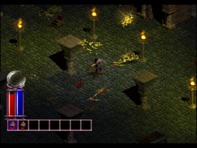
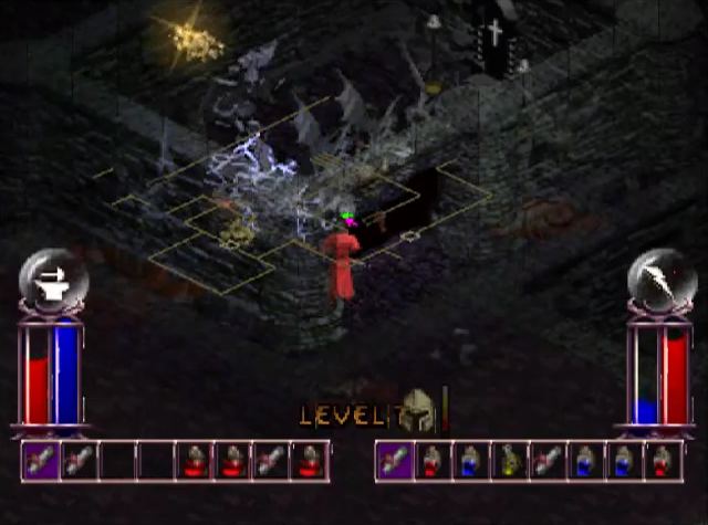
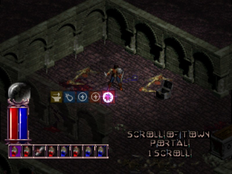
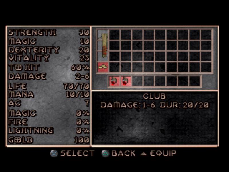
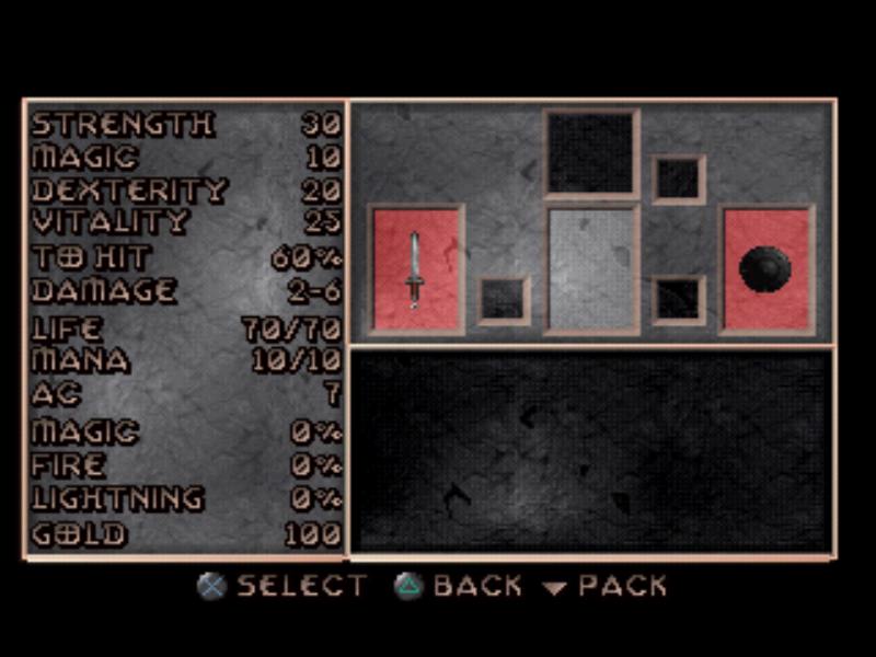 Here are more examples: https://diablo.noktis.pl/diablo-na-psx
We don't have access to the psx assets (the format isn't known either), but it's not a bad idea to implement it for the users that would rather have that version.
I find the UI on the RG350 is super tiny, hard to read the font. I'd love to see the PSX (or something similar) UI implemented to be able to see my stats.
I find the UI on the RG350 is super tiny, hard to read the font. I'd love to see the PSX (or something similar) UI implemented to be able to see my stats.
There are definitely other handhelds out there with larger screens better suited for 640x480 content. And the future will bring even more, so that's quite a bit of work when they can always just emulate the PS1 version that already had to deal with all these downres issues.
Adding my bid:

something that might benefit a controller based ui is an osk or auto name generation. i'm playing on an odroid go advance and i have to plug in a keyboard to set the name before i can play.
@NeonLightning actually that is already part of the official builds, what version are you using?
DevilutionX v1.0.1. it's the version compiled for the distribution EmuElec on the odroid go advance. so I probably need to take it up with the dev for EmuElec.
Could you hook us up with there contact info?
Very interesting discussion. I'd just like to add a few things to consider here from my point of view:
The UI should try to avoid drastically altering gameplay I see some proposals where we would be changing how the game feels and the game balance quite substantially. I think we should do our best to stay true to the original experience here. Either that, or ensure that changes don't make the game easier than it already is, and keep mouse+keyboard in mind as well.
The final result should ideally be widescreen The game panel is 640x352 today. That's easy to scale to 1280x720 (x2) and 1920x1080 (x3) with zero loss in detail. I see a few 4:3 proposals above and would seriously suggest reconsidering those. Most if not all modern displays are 16:9 today, and the original game area is basically 16:9 already. We should tap into that.
Consider implementing inventory auto-adjustment I think we could create an automatic sorter of some kind that automatically arranges items in the inventory in an optimal way. That should reduce the need of manual intervention and would help with controller support.
@julealgon are you on the chat? I think a few things would be easier to communicate there.
Here is one of the latest UI drawings by BillieJoe who is working on this idea:

Your 3rd suggestion is very much needed for this to be a good experience.
The aim is to have it be a *x352 resolution on small non-4:3 screens. Most of the work for getting the game to automatically adjust to the screen aspect has already been done and is the current focus for the next release.
Have you played the game on either one of the supported handled heled/consols or using a controller? It's a really good context to have for getting a feel for what may or may not work.
@julealgon are you on the chat? I think a few things would be easier to communicate there.
What chat? I guess the answer is no 😆
Here is one of the latest UI drawings by BillieJoe who is working on this idea:
Looks very nice. I guess mobile will mostly require it's own UI to function properly with touch screens.
Most of the work for getting the game to automatically adjust to the screen aspect has already been done and is the current focus for the next release.
Interesting. As a big fan of integer scaling, would just like to call out that we should at least give options for integer/pixel perfect scaling no matter the platform. If that's on the cards, I'm in.
Have you played the game on either one of the supported handled heled/consols or using a controller? It's a really good context to have for getting a feel for what may or may not work.
Not yet. My Switch is not modded and I currently don't have a controller to play on the PC. I have just started messing up with this project these past couple weeks so not enough time to look into controller controls. I think Diablo 3 lost quite a lot with the focus on accessibility though, so that's why I'm always wary when folks start taking about any significant simplifications to fit console controls. When it starts trimming actual game features them I think we should stop and reconsider.
I'll be honest though in saying I personally believe it is a bit early to integrate gamepad support in the game. I'm aware it has mostly been done already, but I think it would be better to focus on more foundational work (put the hellfire logic in place and refactor the code) before we introduce these more significant changes. The more we add stuff while the code is in this poor state, the harder it will be to clean it up later. From what I could tell, controller logic is all over the place now and it already scares me a bit.
With all the digging you have been doing you would think you had read the start of the readme :) https://discord.gg/devilutionx
Sure, you can enable intergerscaling on any device that uses SDL2.
Gamepad support has been in since version 1.0.0 and is really solid. I have completed the game multiple times with each hero type using both handhelds and a PC with a controller. I think the scheme we came up with works even better then the official PlayStation port. Almost all the related code lives in https://github.com/diasurgical/devilutionX/tree/master/SourceX/controls what little else there is out side of that folder is very minimal.
Refactoring should come after tests (and yes Hellfire). We do also have to strike a balance with improvements and portability, and in the end, like any other hobby project, people only working on the parts they are willing to work on. Most of what I do is either cleaning up code (like the render) and then implementing some low hanging fruit while at it (like widescreen support), and then making sure that contributions are clean before they get merged. So code quality is increasing, but only at the speed that we have the capacity for.
Before https://github.com/diasurgical/devilution/blob/master/Source/scrollrt.cpp after https://github.com/diasurgical/devilutionX/blob/master/Source/scrollrt.cpp
We still have a long ways to go in terms of cleaning up code, but there was also a time even before then: https://github.com/diasurgical/devilution/blob/aedf7555d1f8c685dcf7cd57b9636f1b88a3095e/Source/scrollrt.cpp
In short, I think the strategy we have been following has let us both keep the project interesting while also improved code quality over time.
With all the digging you have been doing you would think you had read the start of the readme :) https://discord.gg/devilutionx
OMG that link is so hidden in there at the top!!!! I swear I never noticed it at all 😆 Sorry about that, that was on me. I can tell you I went through that readme quite a number of times.
...and in the end, like any other hobby project, people only working on the parts they are willing to work on.
So true. I've been doing that myself by focusing on areas that I'd like to see improve. That's why I was mostly skipping anything gamepad-related to be honest.
So code quality is increasing, but only at the speed that we have the capacity for.
I'm sorry if my post came out as suggesting we are not doing a good job. This project is absolutely amazing and has sparked an interest in me to start playing around with game development, something I had never done before. I'm really glad for the insane work you folks put into this, as I'd never be capable of reproducing it. Just wanted to make this absolutely clear in case I made the wrong impression.
In short, I think the strategy we have been following has let us both keep the project interesting while also improved code quality over time.
Totally fair. It will still take some time before we can clear the code to a close-to-ideal point so I fully understand. Also, while I'm not personally interested in gamepad controls myself, I can see its appeal is absolutely huge. Again, I apologize if my comment came out too harsh. Priorities are different for everybody, as you well put it.
No worries I know your comments are well meant, I just wanted to make some of the considerations behind our choices clear.
I like your work. For my small 5" screen i need game view full height, no thing obscuring enemies above and below, and any tappable buttons to the left or right. Based on prior work I'm' thinking along these lines:

Really good idea to put the buttons on the side since the original game is 16:9 (4:3 - minutes the panel), a lot of devices will have additional screen width that can be used for UI without obscuring the original view.
The buttons in the lower right might be a bit small for thumb usage, but some testing migth be needed to figure out the correct sizing.
Lol you used the one with the devil pope :joy:
This is looking really good so far. Great job with the custom UI.
that last one looks good for mobile, but i think for controller based something like this https://github.com/diasurgical/devilutionX/issues/493#issuecomment-558885912 would be a good choice personally. but i'm not a coder or a ux dev. appreciate all the work that's been done sofar.
I would like to suggest something that could also address Couch Co-op. I think we could try to use an UI that could allow up to 4 local players.
All the elements could be inside a smaller version of the current panel or simply floating.
What do you think?

I think for two players this would work great. On the other hand 3-4 players I think would be too cluttered unless you made it split screen. Would you have it so the game pauses and brings up one inventory or both players have their own UI above the potions?
Probably not as cluttered if you are running 16:9 720p
True, but 4 people trying to move around items in their inventory at once would be fun xD
I'd like to say that, to me, for this to work, the spell icons will need to be smaller, and the belt redesigned to be like D2's (2 rows with automatic fallback but only one visible at any given time).
Another attempt, trying to reduce the area (orbs borrowed from PoE):

That looks significantly better to me. The combined orbs is a bit weird for Diablo, but the space saving is dramatic so I'd probably be for it.
Better then the two bars in PSX
One 'easy' fix that's needed is "forced landscape".
Now the splash and video are shown in portrait too, but the menu it is not. (rotating to landscape fixes it)
The original UI is very mouse-centric, something similar to the following would be a nice improvment and work well with a widescreen view (without the pannel the original is just 8px away from 16:9).