Team's Response
No details provided by team.
The 'Original' Bug
[The team marked this bug as a duplicate of the following bug]
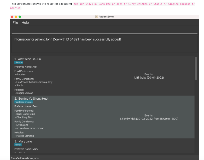
Screenshot in UG as a result of executing an example command does not actually show the patient added
Expected
For the screenshot to include the entry for the new patient "John Doe".
Actual
While the response message from the application is provided, no screenshot of the new patient added is provided. This may be inconvenient for new users who may wish to find out what the new contact added looks like on the GUI.
[original: nus-cs2103-AY2324S2/pe-interim#1688] [original labels: type.DocumentationBug severity.VeryLow]
Their Response to the 'Original' Bug
[This is the team's response to the above 'original' bug]
Hi! It does show the added patient information, as the main point of the screenshot is to show the success message after adding the patient.
Items for the Tester to Verify
:question: Issue duplicate status
Team chose to mark this issue as a duplicate of another issue (as explained in the Team's response above)
- [ ] I disagree
Reason for disagreement: [replace this with your explanation]
## :question: Issue response Team chose [`response.Rejected`] - [x] I disagree **Reason for disagreement:**  I reported this bug because I thought the visuals did not match the explanation. The reason the team gave for rejecting this was that the main point of the screenshot is to show the success message after adding the patient. In that case, a screenshot like this one would have sufficed.  However, they chose to include the entire UI, including the contact list. As a reader, I would be looking through the contact list expecting to find the details of the contact who was just added. However, the screenshot was only of the default placeholder contacts in the application. The team could have avoided this bug by: 1. Only showing a screenshot of the relevant area 1. Scrolling down to show the newly added contact The team's oversight to have done neither of these things leads me to find their justification unsubstantiated.

Is there a reason the screenshot has to extend beyond the command result box? The user is unable to see the newly added patient anyway.