Team's Response
Hi, thanks for pointing this out! :3
However, we have decided to create the diagram in this way so that there are no missing details. We do not believe it hinders the readability of the diagram.
Items for the Tester to Verify
:question: Issue response
Team chose [response.Rejected]
- [x] I disagree
Reason for disagreement: 
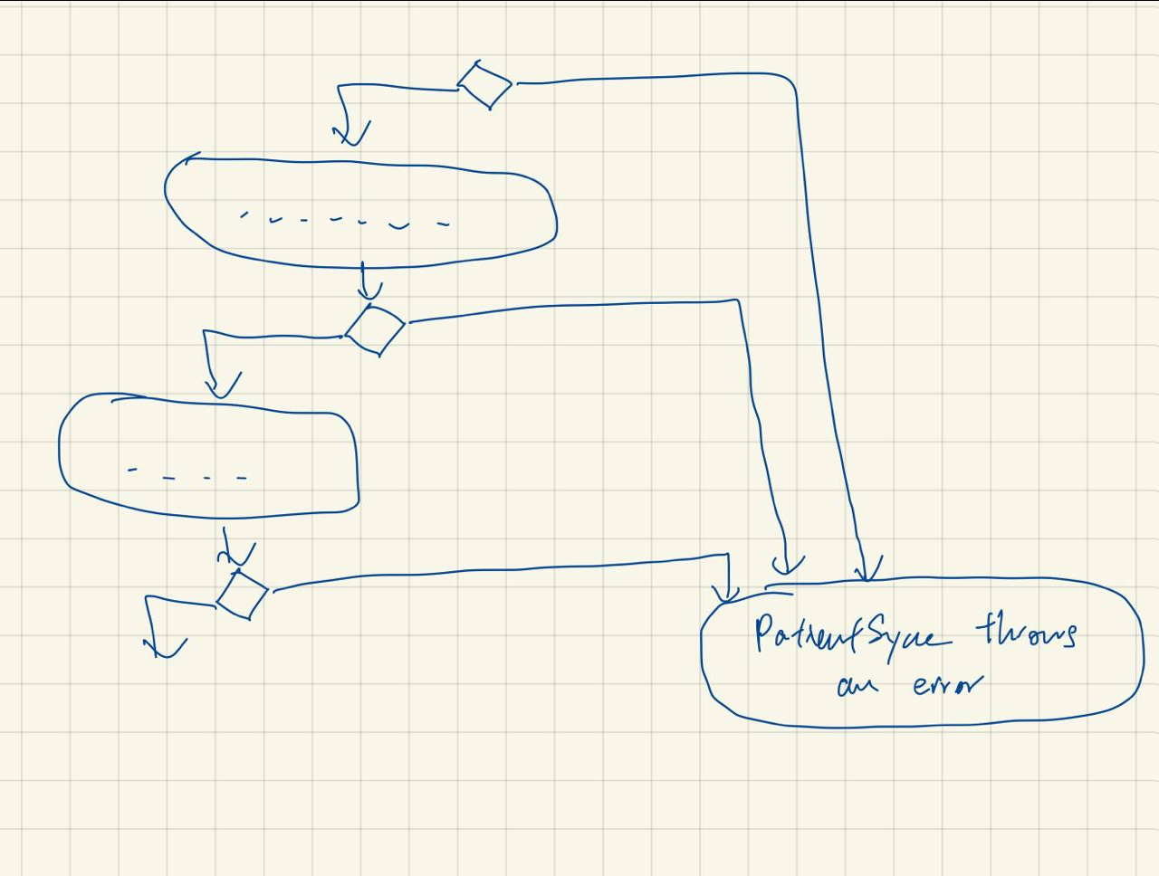
My point was that something like this would be better, so that the reader knows at one glance that all the arrows point to the same action, so they are all doing the same thing.
Having multiple action boxes for the same action would require the reader to read the same action over and over again, which would be fatiguing.
Perhaps there is a better way to format this diagram so that
PatientSync throws an erroris not repeated so many times?