Team's Response
In the case of flow diagrams or any visual representation of logic, the primary goal is to convey the flow of operations or decision-making processes effectively. There is no given standard on the position of placement for certain conditions or statements is totally up to the creator.
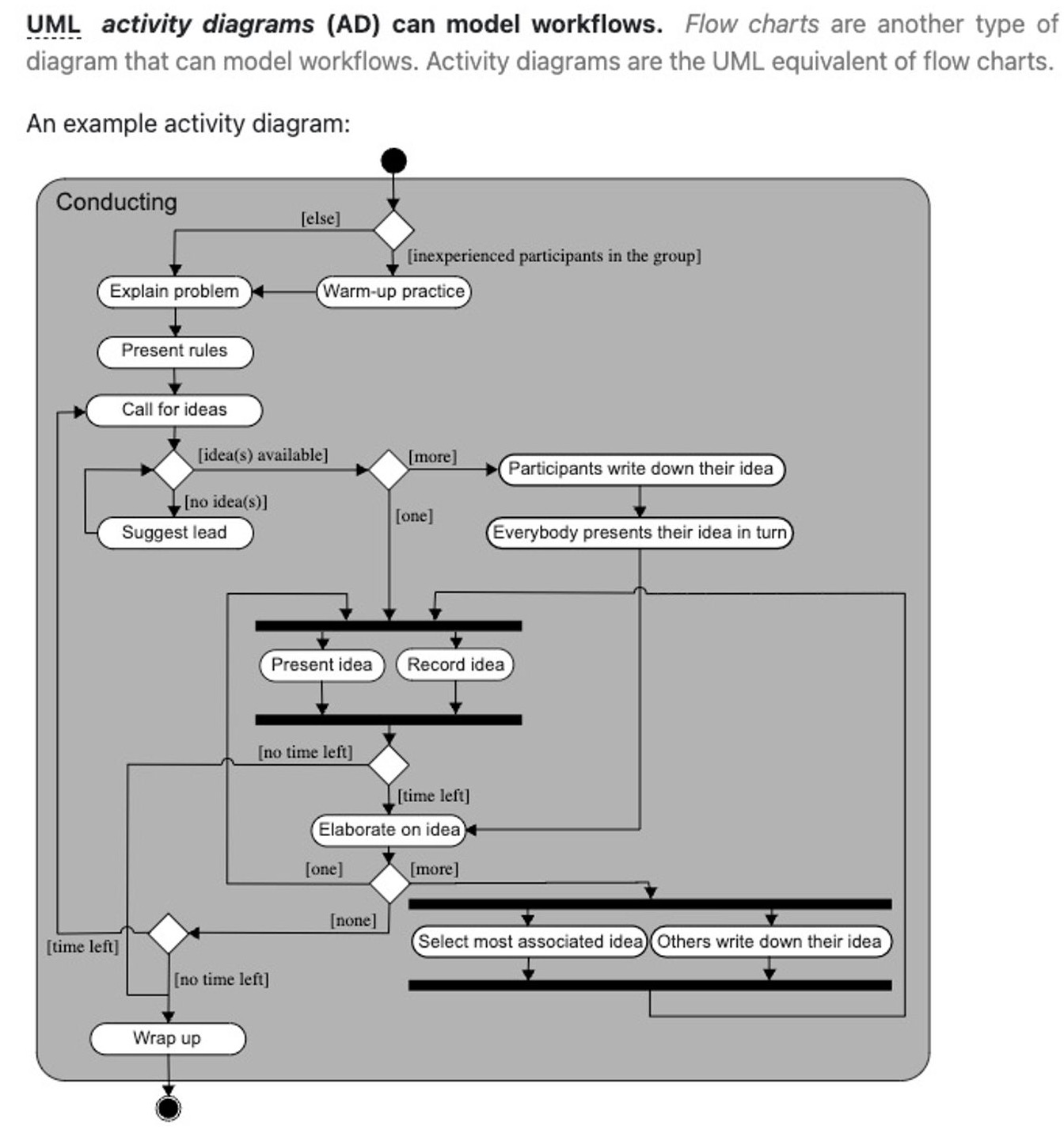
What matters most is clarity and coherence in conveying the intended logic or algorithm. If placing the [else] condition in various positions serves this purpose adequately, then there's no inherent flaw in doing so. In fact, the given example on wikipedia and CS2103 Website further supports this as the conditions are created and positioned in not only just left and right, but also all around.

Items for the Tester to Verify
:question: Issue response
Team chose [response.Rejected]
- [ ] I disagree
Reason for disagreement: [replace this with your explanation]
In this diagram for example, the
[else]condition is placed on the left for all the branches except for 1.It would be a good idea to standardise it to improve readability.