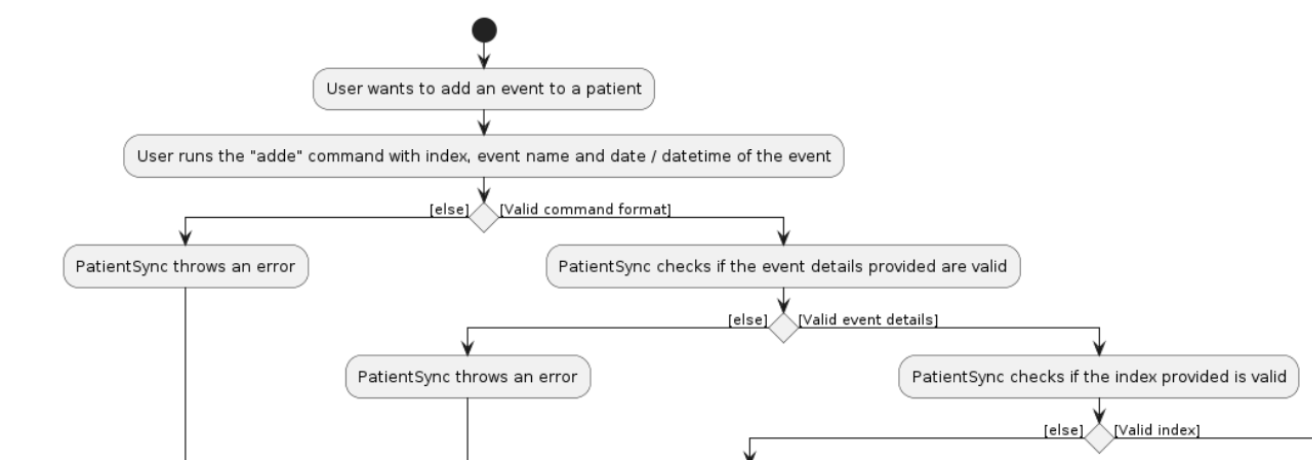
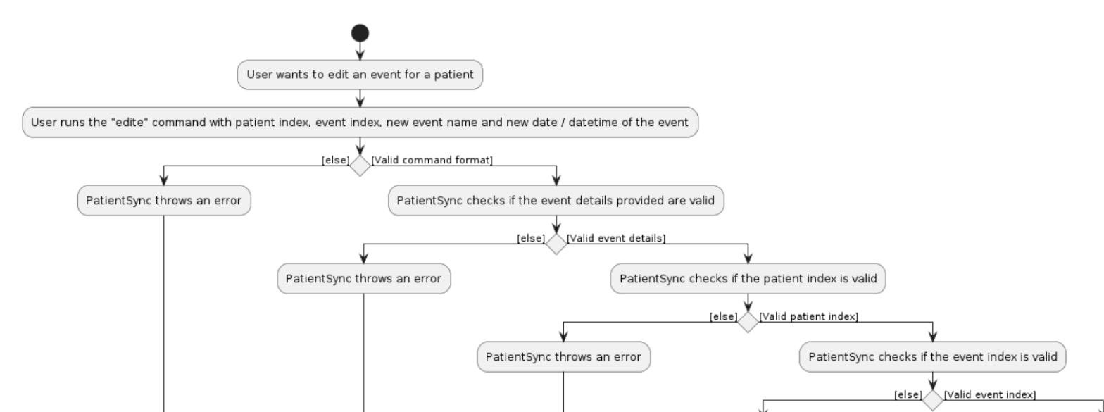
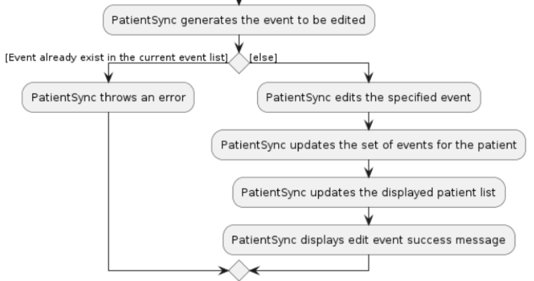
Team's Response
Hi, thanks for the suggestion, however we believe that separating the overlapping portions would actually hinder readability more, as the reader will have to refer to 2 diagrams for a single command (thus, having to scroll up and down repeatedly), making it more confusing as well.
Items for the Tester to Verify
:question: Issue response
Team chose [response.Rejected]
- [x] I disagree
Reason for disagreement: My issue with the diagrams is that the team had included a lot of extra details such as the parsing of the command.


For example, the screenshots above from the same diagram are just for parsing the command, while the details specific to the command are only a small portion of it as shown below.


Since the parsing of the command is common to many features, I thought it would have been more prudent for it to have its own activity diagram.
Including these unnecessary details distracts the reader from understanding what the UML diagram is supposed to illustrate.
## :question: Issue severity Team chose [`severity.VeryLow`] Originally [`severity.Low`] - [x] I disagree **Reason for disagreement:**  Including unnecessary details in activity diagrams would not hinder the reader from ultimately understanding the diagram, however, it **_would_** inconvenience the developer, who has to sift through more information.  I disagree that it the problem is purely cosmetic, as the main issue is that the diagram contains more details than necessary.
As seen from the screenshots above, there is quite a lot of overlap between the activity diagrams of the add event and edit event command. Maybe the common parts could be extracted out to a separate diagram to improve readability?