dolphinsmalltalk / Dolphin

Dolphin Smalltalk Core Image
MIT License
303 stars 58 forks source link

MethodBrowser blank icons under high DPI scaling override mode #1097

Closed dram closed 3 years ago

dram commented 3 years ago

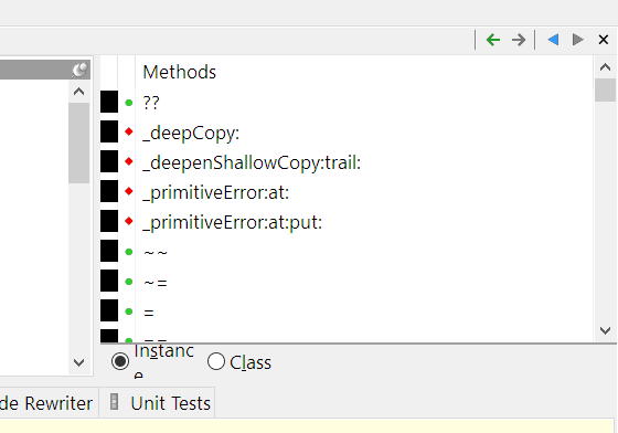
Describe the bug When running Dolphin under high DPI scaling override mode and scaled by "Application", the icon column will show black rectangle for blank icons.

To Reproduce Steps to reproduce the behavior:

  1. Open Dolphin "Properties" dialog
  2. Select "Compatibility" tab
  3. Click "Change high DPI settings"
  4. Enable "Override high DPI scaling behavior"
  5. Select "Application"
  6. Run Dolphin and browser any class, see the method browser

Expected behavior The icon column should show nothing for blank icons.

Screenshots image
Please complete the following information):

Additional context If I change Icon blank to Icon null in MethodBrowser class>>resource_Class_browser_method_list, it will work properly.

blairmcg commented 3 years ago

Sorry, but this is a bit of a "it hurts when I do that" bug report. We could make the change, but it is rather pointless since Dolphin does not support high DPI scaling and there will be (and are) all sorts of other problems with telling the OS that it does. It doesn't make sense to change the setting to "Application".

dram commented 3 years ago

OK, I'm not familiar with high DPI scaling, just try a bit.

Anyway, just for record, I put following lines in startup script, the result seems not quite bad:

Icon class compile: '
blank
    ^self null
'.

SmalltalkSystem current defaultFont: (Font name: 'Segoe UI' pointSize: 9.5).
blairmcg commented 3 years ago

If you set the DPI compatibility mode to Application you are telling Windows that the application is capable of scaling things itself to maintain approximately the same physical size, and to make any other adjustments to optimize appearance. For example let's say we have a toolbar that is notionally using 16x16 buttons. These look reasonable at old school 96dpi, but will be far too small at 200dpi. Ideally an application is aware of this, and takes the DPI into account. If running at 200dpi it might choose to switch to larger 32x32 toolbar buttons. Or at 150dpi it might use 20x20 or 24x24, but scale down the 32x32 icons instead of scaling up the 16x16 icons, as the appearance should be better. Similarly fonts need to be scaled to maintain an appropriate point size that takes account of physical DPI and the magnification in display settings. DPI can vary in multi-monitor setups, and apps should ideally respond to this dynamically, even as one moves a window between monitors. Of course Dolphin does none of this - see #308.

If you specify Application scaling for Dolphin, then if you have a 4k+ monitor (and it is not very large), then you will definitely notice that the toolbars are too small, and the icons used in lists and trees are too small. You will also notice that the fonts are too large (which seems contradictory, but is because of some scaling code that does exist for other reasons that does the wrong thing), which is I guess why you have scaled it down.

One thing worth trying if your objective is to reduce the text fuzziness apparent when using system scaling, is to try enabling GDI Scaling:

This is superficially very attractive as it results is nice crisp text with few apparent disadvantages. Yes the focus rectangles are overheavy, and some Windows controls don't scale (e.g. radio/check buttons), but it looks massively better. Unfortunately there is a big issue with the Scintilla editor that is referred to in #308, as it suffers from the kerning errors described in the MSDN article.

I did try running like this for a while, but the caret positioning errors just got too annoying, and I prefer code in proportional fonts so the workaround of using a non-proportional font for the code windows doesn't work for me. The commentary in #308 suggests this might be a Windows bug, but I don't think it is. The problem is described in the MSDN article:

Kerning and clipping with imprecisely scaled fonts

As we mentioned above, many fonts are not precisely scaled. For example, 20pt font is not exactly twice the height and width of 10pt fonts. The GDI Scaling is done using the size of the 100% scaled applications. Any difference in scale will impact how the characters look next to each other (too close or too far apart) or how they fit into the objects within the app.

This is less of an issue for the display of text than it is with the editor because it results in the caret position being miscalculated.

A mid-way position is to leave Scintilla using DirectWrite drawing (so it is not affected by GDI scaling), but then the fuzzy text is juxtaposed with the crisp text elsewhere, and looks worse. Also the auto-completion prompt (which uses GDI, as it is, AFAIK, a Window control) looks particularly bad.

It is possible that the blank icon needs some adjustment to make it display properly. The scaling algorithm is messing it up. I'll reopen the bug to look at that.

dram commented 3 years ago

Sorry, I forgot to mention that I'm using a 2k laptop with 125% scaling, icons are small but still acceptable.

Thanks very much for your elaborated explanation, very enlightening!

I scaled down the font size to work around some wrapped text, e.g. "Instance" in the screenshot.

Will have a try with GDI Scaling, but "Application" mode with those little tweaks seems good enough for me.