 alnopa9
commented
4 years ago
alnopa9
commented
4 years ago @ChinoyIndustries @smdunn921 @amberpeddicord @bobbyfunks @lmcneil7 @benjaminc2020 @Bryant-LettucePrime @biancamaginley @robftg @frabbitry @BMT45 @ebeshero
Closed ebeshero closed 4 years ago
alnopa9
commented
4 years ago @ChinoyIndustries @smdunn921 @amberpeddicord @bobbyfunks @lmcneil7 @benjaminc2020 @Bryant-LettucePrime @biancamaginley @robftg @frabbitry @BMT45 @ebeshero
 bobbyfunks
commented
4 years ago
bobbyfunks
commented
4 years ago @alnopa9 whatever alyssa
 ChinoyIndustries
commented
4 years ago
ChinoyIndustries
commented
4 years ago I'm just gonna drop this here
 frabbitry
commented
4 years ago
frabbitry
commented
4 years ago Sandbox/Pie_chart_of_US_population_by_state.png
ChinoyIndustries
commented
4 years ago Sandbox/is-this-a-pie-chart-or-an-impressionist-painting.jpg
 benjaminc2020
commented
4 years ago
benjaminc2020
commented
4 years ago Sandbox/age.structure.of.college.png
 ebeshero
commented
4 years ago
ebeshero
commented
4 years ago So, remember this is also supposed to be a discussion of yours and others' examples! Are you finding some common kinds of misrepresentation in these graphs that you're sharing?
 amberpeddicord
commented
4 years ago
amberpeddicord
commented
4 years ago 
I found this graph in an article titled "27 Worst Graphs" (or something to that effect) and it did not disappoint. This graph is attempting to show a comparison of the sales of popular fast food chains. I believe that the data is shown in the heights of the logos, which shows an accurate proportion of the sales figures for each chain. However, the area of each shape shows an entirely different proportion. Because we aren't given any information regarding the way to read the graph, we aren't able to fully see the data being shown. Along with that, I thought the addition of the comparison to the GDP of Afghanistan was...an odd choice. It definitely shows how large the fast food industry is, but it is clear that it doesn't fit with this graph!
This is one example of something that I've noticed with all of our graphs, and that's a lack of information regarding the way to read them. On many of the graphs that people are pushing, the data being shown is ambiguous. As a viewer, it's difficult to make something of a chart if we aren't given enough information of how to even read it.
 robftg
commented
4 years ago
robftg
commented
4 years ago 
This graph is satire but it is a bad graph none the less showing how an accurate x/y axis is necessary and needs to be visible but also how easy people are to manipulate just by showing them an upward trend anyone is going to say "Hey that looks good" before they take a closer look into the very faint grid lines of the graph.
benjaminc2020
commented
4 years ago 
This graph is bad because it displays data quite confusingly. It is supposed to show the age correlations of people enrolling in college by age, year, and amount enrolled. Instead, the graph is 3-dimensional and broken on the y-axis. This presents the data in a skewed manner and ultimately makes the graph untrustworthy, leaving the viewing not knowing why the top part of the graph mirrors the lower part, and how much of each age there is.
benjaminc2020
commented
4 years ago
This graph is satire but it is a bad graph none the less showing how an accurate x/y axis is necessary and needs to be visible but also how easy people are to manipulate just by showing them an upward trend anyone is going to say "Hey that looks good" before they take a closer look into the very faint grid lines of the graph.
This is pretty funny. I agree, this is the type of satire you would find in comic strips section of a newspaper.
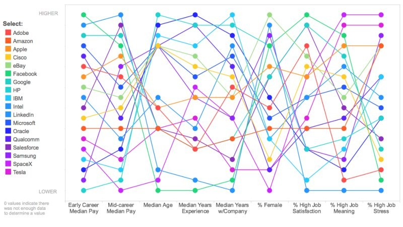
bobbyfunks
commented
4 years ago 
this graph is just impossible to make any sense of. With seemingly arbitrary information and way to many lines it doesn't really convey a point. They are trying to say that the specific lines highlighted are different from most I guess. It's just horrible to look at and even worse to try to make sense of it.
bobbyfunks
commented
4 years ago 
this one's just stupid. Like if you want to be a pie-chart, be a pie-chart. There is probably too much information for a good pie chart anyway, but the point would be made better if it were in actual pie-chart form. I think whoever made it was trying to be clever or different but I think it just ends up looking silly.
 lmcneil7
commented
4 years ago
lmcneil7
commented
4 years ago  This graph is bad because it's misleading. It makes it seem that The Times is doubling the Telegraph's sales, but their sales are only better by 10%. The main point is to make it seem that The Times is doing better than anyone else including their biggest competitor, but it just leads to false advertisements and creates doubt among their audience. Since their sales are in-fact better, there's no need to create a bad graph.
 smdunn921
commented
4 years ago
smdunn921
commented
4 years ago 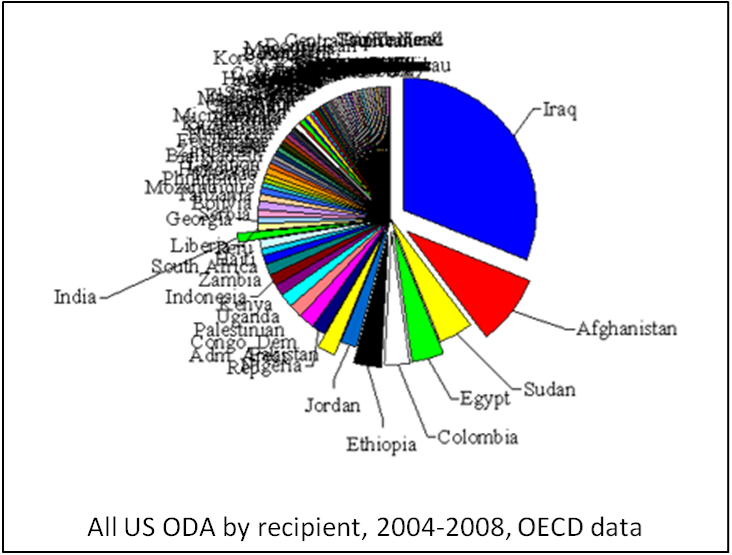 so i found a graph. read it and weep... literally. i say this because you cannot read most of it because there is so much going on textually. it's sort of like @bobbyfunks graph in that in his you cannot make sense of the lines, whereas in this one you can't make sense of the words.
i also found another graph which is a mess and a half in that you cannot tell what is going on anywhere in the graph. at least it has color to it but this one is again similar to @bobbyfunks's jumble he posted. i guess i'd rather have colorful ones like some of them here than black and white ones like some posted, but either way they are not at all helpful in showing what their creator wanted to show.
ebeshero
commented
4 years ago Here is a question to think about: Could any of these graphs be redeemable? For some of these, the data representation so terrible that it is actually lying to the viewer, so we would imagine just scrapping the whole thing. For others, do any seem actually legitimate enough that with some digital tools someone could navigate the data? What would they need to be able to read the graph?
It's much too easy to lie with numbers and graphs on digital humanities projects, and in the digital world generally! We will be posting links here of the good and the bad with graphing and using digital visualizations to share information on DH projects. Please begin by reading "A short tour of bad graphs" Also, take a look at this set of slides to illustrate problematic graphs.
Discussion points (due for Monday, 1/28)
(For GitHub practice, try downloading image files of bad graphs, pushing them to the DHClass-Hub Sandbox folder, and linking to them here in the Issues discussion. To make a link to a file, go find it in a new tab and copy its web address. You can just paste the address here. Or try pasting the image into the issue.)