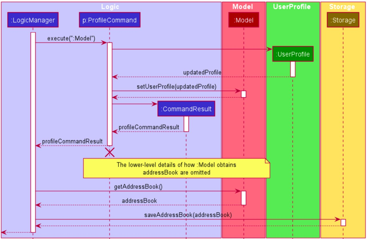
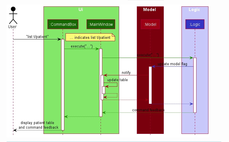
Team's Response
Thank you for the response :) Some of diagrams are created in red-green colour blind colour scheme (which might differ from the normal one). Therefore, we are really sorry that some of them are hard to see. In fact, these diagrams allow 2 of our teammates who are red-green colourblind to be able to see the diagrams well. Not only that, the rest of our teammates, are able to read the words just fine, so we find that this colour is acceptable. Please forgive us.
Items for the Tester to Verify
:question: Issue response
Team chose [response.Rejected]
- [x] I disagree
Reason for disagreement: I disagree with the team's response as I feel that there is room for improvement with respect to the color choice of the Model component. Given that the team has members that are red-green colour blind, there could be a better choice of colours for the Model component and they could have changed the colours for the Model component across the DG to fit both non-colour blind and colour-blind users since they have both types of users and are sufficiently equipped with the knowledge of which colours would be best to cater to both colour-blind and non-colour-blind users.
Moreover, some of the other diagrams uses this shade of red, which is a much better choice for colour contrast:

In comparison to the choice used in this issue:

If the person who did this diagram is red-green colour blind and was not aware of how this contrast came off to non-colour blind readers, then I think he should not be at fault for it. However, as the nature of this project is very much team-based and there are indeed non-colour blind members on the team, this diagram (and similarly other diagrams with this colour contrast) should have been proofread by all members and improved upon.
It can be difficult to see the black labels when put against the dark red background in the diagram, especially since the font size is not big if reader do not zoom in.
Cosmetic bug.