Pinging @elastic/kibana-design (Team:Kibana-Design)
Open linyaru opened 3 years ago
Pinging @elastic/kibana-design (Team:Kibana-Design)
Pinging @elastic/eui-design (EUI)
Hey @linyaru !
Fair points all around especially about indicating that these items trigger a menu. We’ve established a pattern within buttons to always show a down arrow icon when triggering some sort of menu, but failed to promote this pattern to the header buttons. Most likely this was due to trying to keep them within a square aspect ratio.
As for the user icon, yes this could be better than some simple initials and eventually it should be once we can have more personal user settings in which they could replace with an image. Otherwise, I think using the person’s initials is far better for recognition than a random image like Github uses.
In the end a lot of this is compromises on how many things need to be one the page at once. I think the simple addition of some sort of menu indicator (a caret) will go a long way here for discoverability which is the main hindrance. Otherwise, I don’t think we truly have the space or prominence to give towards a longer username and Space name.
Just to give you an idea of how many more "things" can be added to these headers here's an example from Discover

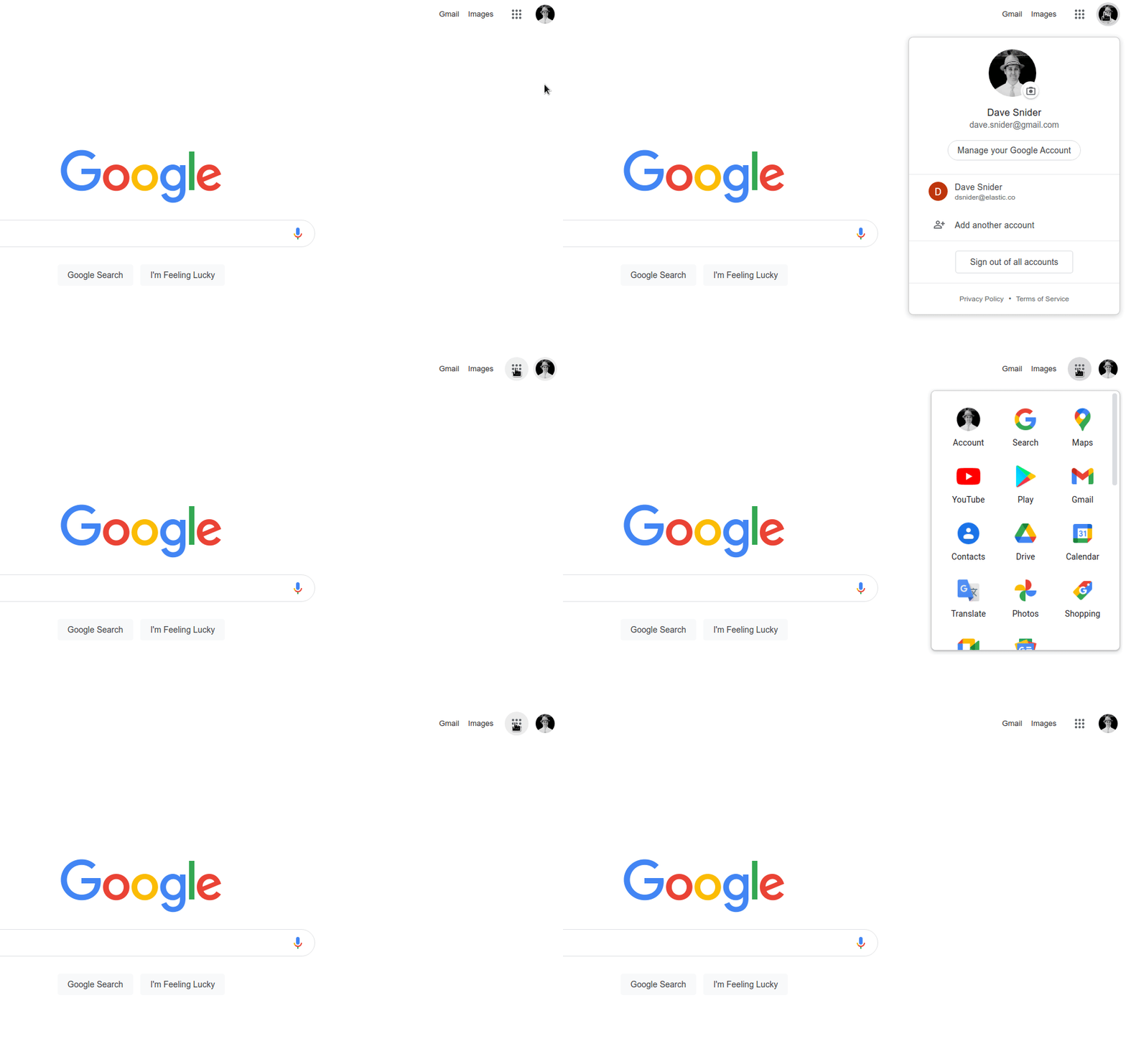
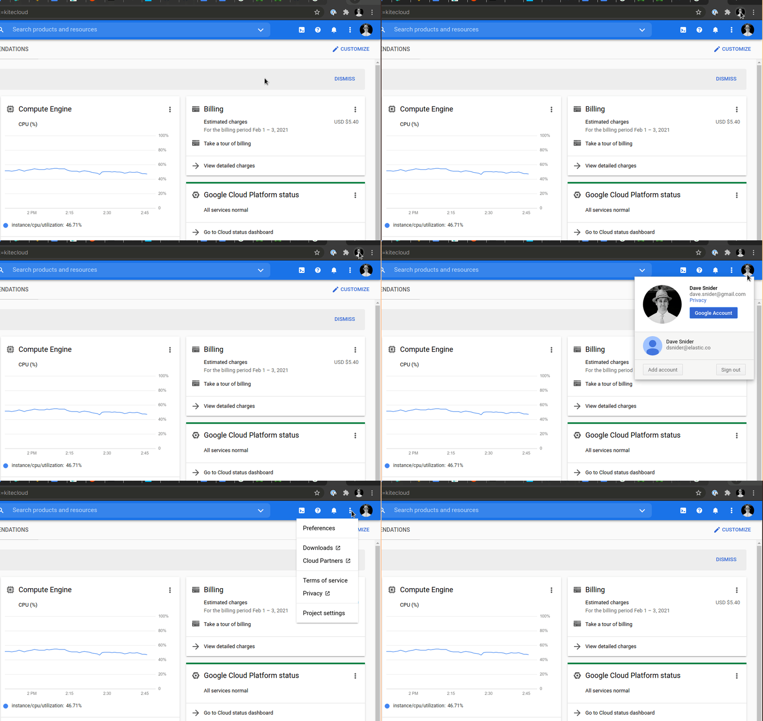
Agree with @cchaos that added carets everywhere don't scale towards our requirements. I also agree that this gets closer to standard practice when actual image avatars are used (which I would prioritize as a step towards solving this). For every successful product with see with a caret on avatars, we can come up with just as many that don't.


I would perhaps further specify Kibana users into two categories:
Those with named Kibana user accounts with the ability to customize their initials (or at least have created the usernames). Navigation to my initials to access the user menu makes intuitive sense:

Those logging in via an access delegation service without the ability to customize initials; in the case of our SAML integration, email addresses are lower-case and the subsequent initials are also lower case. If my name had started with an "a" or "i" it would be much harder to tell that this is a user icon. Having written this down, I realize that this in fact seems to be more of an SSO integration issue within the Stack than Kibana design.

Beyond this, the User and Space icons are visually similar but offer different behaviours when clicked on. As the Space icon behaviour is switching between things, I think that a caret would make more sense there than over the user icon.
Describe the feature:
Currently the Space and User icons in Kibana are coloured circles containing one-to-two letters; the letters on the Space icons are determined by the Kibana admin, while the letters on the User icon is either the First-Last abbreviation of the user Full Name (if provided), or the first letter of the username.
In doing internal enablement, we have encountered numerous cases of users:
It would be helpful we could make these icons more semantic (interpretable as pertaining to spaces and user accounts), and also accentuate the clickable nature of these icon. For example, many platforms use an arrow beside the user icon to indicate that it is a menu:
Describe a specific use case for the feature: