elementary / granite

Library that extends GTK with common widgets and utilities
https://elementary.io
GNU Lesser General Public License v3.0
283 stars 60 forks source link

New Tabs Design #14

Closed elementaryBot closed 7 years ago

elementaryBot commented 7 years ago

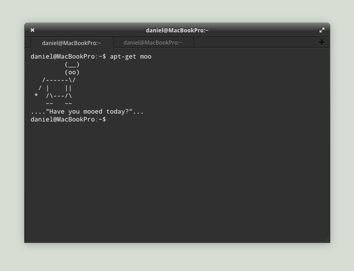
When making a App with tabs, designers always focus on something: they make the selected-tab's color the same as the content inside that tab. Look at Chrome or Firefox (or even Midori), the selected-tab's color is the same of the URL color. Actually, they are somehow connected with that URL and the buttons on URL bar.

http://uxmovement.com/navigation/designing-tab-navigation-the-right-way/

This is more difficult to accomplish in pantheon-terminal, because the content is black (and transparent). Given that, the Elementary designers must have felt that making the selected tab's color the same of the window decoration would be a great idea. And I agree.

But we have a little problem, we lost the sense of connection. The tabs are not touching or "merging" with the decorations. Now we have three things on the top: The decoration, the selected tab and the non-selected tabs. This makes the top of the window very cluttered and hard to navigate.

Sorry about my english

Launchpad Details: #LP1138120 Paulo Roberto de Oliveira Castro - 2013-03-01 16:31:21 +0000

elementaryBot commented 7 years ago

Upside-down tabs break that tab metaphor even more; instead of visually connecting with the content, they stupidly connect with the app-wide controls (toolbar, titlebar, etc.). This makes less sense.

Launchpad Details: #LPC Cassidy James Blaede - 2013-03-03 05:06:08 +0000

elementaryBot commented 7 years ago

Yes, you're right. My solution don't make sense in this point of view. What about making the inside of the terminal opaque and making the tab's bar match it's color? I think that the color used in Sublime Text 2 would fit well for this purpose.

Also, why this mockup was abandoned? http://fc02.deviantart.net/fs70/f/2011/165/8/2/terminal_by_danrabbit-d3hzas4.png

Launchpad Details: #LPC Paulo Roberto de Oliveira Castro - 2013-03-03 05:54:10 +0000

elementaryBot commented 7 years ago

That mockup was not abandoned, it's still in progress. But the dark theme is NOT up to the terminal, it's up to eGTK.

Launchpad Details: #LPC David Gomes - 2013-03-06 16:02:29 +0000

elementaryBot commented 7 years ago

The biggest problem we have is that the tabs really have no way to know what color makes sense to display with the content. From a visual design perspective, using upside down tabs or tabs-on-top removes this problem because we do know what color toolbars are. But as Cassidy says, this does break a little bit from the pure logic of it. But realistically, these solutions are not trivial to implement in GTK either.

I wish we could mark a report as "deferred", because while this is a problem I'm not sure exactly what we can do to really fix it at this time.

Launchpad Details: #LPC Daniel Fore - 2013-03-19 21:28:48 +0000

elementaryBot commented 7 years ago

Finding the right colour to put on the tab is a problem. But maybe the tab colour could be based on the background colour that is used for the content area? Also, the current tab colour matches with no content area at all. Seeing that most tabbed apps have a white background, perhaps the tabs can be white by default as well?

Another thing I noticed is the dark-to-light gradient behind the tabs, which I think doesn't make any particular sense. And why have a one pixel line between the tab and the toolbar when the tab is already clearly attached to the content and not to the toolbar?

I have adjusted these in a mock-up: http://i.imgur.com/upwhckJ.png and http://i.imgur.com/Xi2GRG5.png. It feels more condensed and cleaner to me. Also saves two pixels, hehe.

In the mock-up I've changed the position of the new tab button. Can anyone explain to me why you've chosen to put it in the left corner? Personally I think it makes more sense to put the button on the side where the new tab is added. People usually go through their existing tabs and then decide to add a new one. It also separates the add/close buttons better.

Launchpad Details: #LPC Kevin Kleinman - 2013-06-15 11:03:30 +0000

elementaryBot commented 7 years ago

Kevin, there should be some separators between those passive tabs.

Launchpad Details: #LPC Yi Dai - 2013-06-17 17:47:31 +0000

elementaryBot commented 7 years ago

Dark toolbar, light active tab

I think Chrome's tab design works really nicely because of the contrast between the clear window border and the white rest of the app. In order to make the tabs pop and associate themselves with the content, the toolbar and window border should be darker, while the tab should be brighter.

Although one cannot know definitely the color of the inside of a tab, it is often white or another light color (see: files' background, most website background colors, default Scratch background color). This commonality is the justification for a lighter tab color and a darker toolbar color.

------------or----------------------------or--------------------or--------------------or-----------------

Tabs on Top

Tabs on top. When you think about it, it makes a ton of sense! The location bar and toolbar buttons almost always correspond to the current tab, excluding the App Menu.

Support for:

Evidence against:

With tabs on top, to contrast the window decorations and tab bars, the window decorations and inactive tab bar areas should be light or dark, and the active tab and toolbar the opposite.

Launchpad Details: #LPC Cameron Norman - 2013-09-24 02:54:54 +0000

elementaryBot commented 7 years ago

Third idea: the tab is a link between its contents and the toolbar. The active tab would be the same color as the toolbar and it would be flush with the toolbar, and as flush as possible with the tab contents, while the inactive tabs would be grayed out and visually separated from the toolbar and app contents.

Launchpad Details: #LPC Cameron Norman - 2013-09-24 03:41:34 +0000

elementaryBot commented 7 years ago

You can find some artwork (by GNOME people) for my third idea on the sixth image of this article: http://worldofgnome.org/tabs-design-in-gnome-3/. It is this one (http://worldofgnome.org/uploads/2013/10/tabs10.png)/.

Launchpad Details: #LPC Cameron Norman - 2013-11-03 19:58:19 +0000

elementaryBot commented 7 years ago

Here is the GNOME page about it: https://wiki.gnome.org/GnomeOS/Design/Whiteboards/Tabs#Tentative_Design

Launchpad Details: #LPC Cameron Norman - 2013-11-03 23:20:40 +0000

cassidyjames commented 7 years ago

Is there really an action item here? It sounds like "make tabs better" but we don't know what that means exactly or what we want them to look like. :stuck_out_tongue:

danirabbit commented 7 years ago

Yeah, regardless this seems to be primarily a visual design issue which would be the responsibility of the stylesheet. Closing for Granite