 elieserdejesus
commented
4 years ago
elieserdejesus
commented
4 years ago I agree the color logic in xmit button is inverted. And change the text to show the current status will help too. The problemas I can see: 1 - Long texts will be a problem in VST plugin small screen. We need small texts (transmitting, not transmitting, preparing) 2 - Invert the xmit color will bug the JamTaba users.
@jonjamcam , any ideas?
 jonjamcam
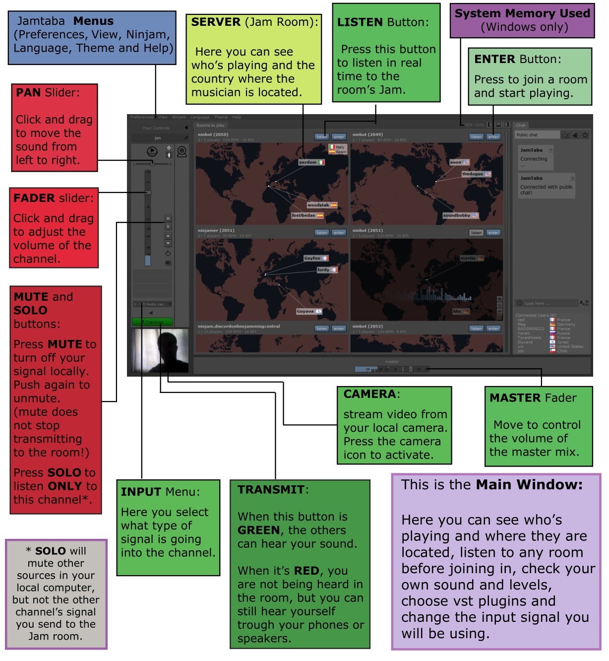
 joshrickert
Hey there! I'm a relatively new user that ran into some UX hurdles. The "Transmit" button and the red/green color scheme to show the transmission state was pretty confusing to me. When I first set up the plugin I had no idea I was transmitting live while I was clicking around, and it was hard for me to figure out what the colors indicated. So I thought I'd share a suggestion.
Could the button text be updated to say "Start Transmitting" and "Stop Transmitting" depending on the state? This is how OBS handles it.
Also, thanks for making such awesome software! This is such a boon for musicians right now.