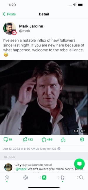
Start a new pull request in StackBlitz Codeflow.
Open jedp opened 1 year ago
Start a new pull request in StackBlitz Codeflow.
I very much agree. Alt text is supposed to be a substitute for the image when someone is not able to see the actual image (whether due to visual impairment or a browser or network issue). I do not think it is bad to let people see the alt text if they tap into the image, but I do not think there needs to be an “ALT” button over every image in the feed that has alt text.
I do think there is value to letting someone know an image has alt text before boosting it, however. One suggestion that comes to mind is we flip our current approach: Remove the “ALT” button from images with alt text, and instead put a similar “NO ALT” icon on images without so folks who try to only boost accessible images can continue to do so.
(TL;DR: I think we should remove the “ALT” badge from the feed thumbnail, show a “NO ALT” badge in the feed for an image without alt text, and let the alt text be viewed after expanding the image.)
May I ask why the decision was made to make this a setting? There wasn't really any further discussion here after my comment 2 weeks ago, and then this change was submitted and merged? I think letting users customize Elk is generally good, but I want to prevent the Preferences page becoming unwieldy if we make everything a setting.
My bad here. I merged a PR that closed several issues without diving properly in each discussion. Lets re-open it to keep discussing. We can later remove the option.
I'm sorry, I should have discussed more here, and I quickly realized the pull request I made was improper. As discussed in https://github.com/elk-zone/elk/issues/1570, a badge over the image without alts seems drastic, with time i've grown to agree with @patak-dev on this.
That being said, I still believe an option is the correct decision. The presence of the alt badge helps people know which images have an alt from a glance, without shaming. I want it in my elk feed. Other clients include a badge, including tusky and ivory.


I struggle to understand how the microscopic "ALT" indicator "ruins" images, especially given you can enlarge the image. Given the strong language and the number of upvotes on your comment though, apparently it bothers a number of people, so an option seems like the right choice.
but i want to prevent the preferences page becoming unwieldy if we make everything a setting.
I'd also like to add that in the PR, I've created a new 'wellbeing' option group that in my opinion significantly reduces the feeling of clutter
I struggle to understand how the microscopic "ALT" indicator "ruins" images I think “ruins” is a bit extreme, but with no response from @jedp, my own 2¢ are it is just a piece of visual clutter that does not need to be on the feed UI. Additionally, it does feel rather intrusive on darker images, e.g.,
a badge over the image without alts seems drastic, with time i've grown to agree with @patak-dev on this. I don't know where that conversation took place, but I don't follow your reasoning that we shouldn't reverse how the alt badges on the feed view work.
It sounds as though we are in agreement on the value of alt text and the value of having some indicator in the feed view to tell people whether the images in a post have alt text. Given those badges are extra clutter, it makes more sense to me would want to incentivize them not appearing?
Mastodon clients (and Elk especially) understandably take a lot of design cues from Twitter, but we also do better than them where we can, and I think this is one place we might be able to.
Being able to click the alt button to see the alt text is also an accessibility feature. Some people struggle to see images but don't use a screen reader. Or they might not be able to clearly read text in an image but can with actual text.
That makes sense. I do at least think there should be a “NO ALT” badge in place of it on images without alt text.
Thank you for all your work on this beautiful client.
The single thing that prevents me from using it is the obtrusive ALT button on the lower-left of each image. The value placed on alt text for images is one of the great things about Mastodon. But the placement of a button here destroys images for those who regard them seriously, such as photographers, painters, graphic artists, et al. Imagine going to a museum and seeing a big ALT sticker in the corner of every painting.
Perhaps there's an alt location for the ALT button?
Thanks for your consideration, Jed