Yes that's not really possible at the moment.
When reworking scoringutils I left plot_predictions unchanged as it's used in the forecast hub. However I think the function also needs a major update and I#d be very happy about any input.
Closed Bisaloo closed 2 years ago
Yes that's not really possible at the moment.
When reworking scoringutils I left plot_predictions unchanged as it's used in the forecast hub. However I think the function also needs a major update and I#d be very happy about any input.
I don't know. I'm not sure there is a good solution. This is a common issue I find in all plotting helpers. They're built to simplify plot creation but this has to be done at the expense of flexibility. And adding flexibility will render the interface as complex as the original ggplot2 code. If there was a good solution to be more user-friendly but as flexible, I trust that ggplot2 devs would have used it by now.
yes... I'm a little unsure what to do with the function honestly. It feels like it should be updated, but I don't really have good ideas
Okay, I think I'll write some code from scratch to get the plots we need for the hub, without any specific efforts to have a generalisable code. I'll share it here afterwards and we can decide if some parts should be merged in plot_predictions().
I had forgotten the trick of putting aes() outside of the ggplot() call, as a layer. This could work. My problem now is that the most useful aesthetics (colour and fill) are already taken:
example1 <- scoringutils::continuous_example_data
scoringutils::plot_predictions(example1, x = "value_date",
                               filter_truth = list('value_date <= "2020-06-22"',
                                                   'value_date > "2020-05-01"'),
                               filter_forecasts = list("model == 'SIRCOVID'",
                                                       'creation_date == "2020-06-22"'),
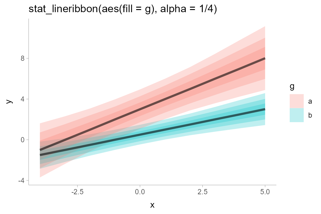
facet_formula = ~ value_desc) + aes(linetype = geography)A good solution might be to switch to ggdist::geom_lineribbon(). Then, we can do things like this:
library(ggdist)
library(tidyverse)

set.seed(1234)
n = 5000
df = tibble(
  .draw = 1:n,
  intercept = rnorm(n, 3, 1),
  slope = rnorm(n, 1, 0.25),
  x = list(-4:5),
  y = map2(intercept, slope, ~ .x + .y * -4:5)
) %>%
  unnest(c(x, y))

rbind(
  mutate(df, g = "a"),
  mutate(df, g = "b", y = (y - 2) * 0.5)
) %>%
  ggplot(aes(x = x, y = y, fill = g)) +
  stat_lineribbon(alpha = 1/4)
I have added some very dirty code in https://github.com/epiforecasts/scoringutils/tree/issue-174 to add this feature. It's mostly to not lose it but I still need to:
Example of output with the current code:

Looks nice! One option - depending on how fast you want this implemented and how fast we can get merge #166, it would also be an option to commit that to the major-update branch. The plot_predictions is the only one I left unchanged so far in order to not interfere with the Hub plots
I spent a lot of time trying to work around this but I think an unavoidable consequence of this change is that the ribbon will use a grayscale by default if you don't specify a fill aesthetic.

could we set the fill to the model if there is only one?
I don't think so.
If we do this, then we remove the possibility for the user to modify it down the line by adding a layer.
p <- scoringutils::plot_predictions(...)
p + aes(fill = model)
would not work anymore. We don't know when plot_predictions() is called if there will be a fill aesthetic.
This is an example from
?plot_predictions()Let's say I know want to plot all models on each facet (instead of just
SIRCOVID) but with different colours. Am I right that this is currently not possible withscoringutils::plot_predictions().Am I better off using ggplot2 directly in this situation?