 JohnMcLear
commented
12 years ago
JohnMcLear
commented
12 years ago They go light enough for me.
Closed jeff-h closed 11 years ago
JohnMcLear
commented
12 years ago They go light enough for me.
 Pita
commented
12 years ago
Pita
commented
12 years ago We choosed to alter the color chooser so you can't choose too light and too dark colors. Colors will always look different on different monitors and platforms
 soniktrooth
commented
12 years ago
soniktrooth
commented
12 years ago "Colors will always look different on different monitors and platforms"
Is this not exactly the reason that you shouldn't nail it down? I find the colours way too dark as well. It seems to me that you should err on the side of lighter than darker because the text is black.
Pita
commented
12 years ago You're right, the colors you can choose are a bit too dark
 jcharaoui
commented
12 years ago
jcharaoui
commented
12 years ago I use Etherpad on Linux (Debian) and I too find that the colors available should be lighter.
 jeff-h
commented
12 years ago
jeff-h
commented
12 years ago I was just using eplite for a personal list and realised that I very often find myself selecting-all-then-clearing-all-colours. I realised I do it all the time. I'm wondering if you'd consider an option for "no background colour". Even with a couple of people, it isn't necessarily always desirable to attribute authorship of everything via colour.
JohnMcLear
commented
12 years ago There is already a feature request open for this functionality.
JohnMcLear
commented
12 years ago @jeff-h please comment on my questions here: https://github.com/Pita/etherpad-lite/issues/126
JohnMcLear
commented
12 years ago  bmamlin
commented
12 years ago
bmamlin
commented
12 years ago I created a BrightColorPicker JQuery plugin and used it to replace Farbtastic with some brighter colors in an etherpad-lite fork. It looks like this:
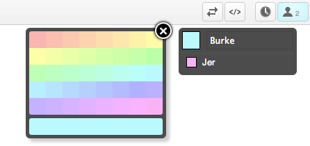
It's obviously much simpler than Farbtastic's widget, but I prefer the simpler (and brighter) options. I'm a n00b to github and don't want to presume anyone will care... especially given Pita's comments above and since this issue has been closed for months. If this is worthy of a pull request let me know, I'm happy to share. -Burke
 0ip
commented
12 years ago
0ip
commented
12 years ago Looks good @bmamlin!
Can you remove that close button (has alignment problems anyway) and instead put our two cancel and save buttons in the bottom right? (++ Usability ++ Mobile support)

(quick and dirty paint.net draft)
And to keep a consistent dialog design, please remove this box-shadow. If you have finished those small changes, please make a pull request. It looks nice and solves our problem. ;)
bmamlin
commented
12 years ago Thanks! Here's an tweaked version with some of your suggestions:

The save button doesn't really add anything, since clicking on any color automatically applies the color and dismisses the dialog (less clicks == better, IMHO). For aesthetic balance, I've made the preview swatch the same width as the Cancel button.
It appears to be working across latest Chrome/Safari/Firefox. Some behavior that isn't communicated in an image: tapping the user's swatch toggles the color picker and, as I've mentioned, selecting any color instantly applies it. You can give it a try here.
If it looks okay, let me know and I'll submit a pull request.
Cheers,
-Burke
UPDATE: after chatting with 0ip, I'll work on a fix for Android and try tweaking the spectrum a bit.
0ip
commented
12 years ago Link is apparently broken.
update: fixed
bmamlin
commented
12 years ago Thanks for the suggestions, 0ip! Here's the color picker with recommended changes:

It's running here. Give it a whirl and let me know if you have any more suggestions before I make a pull request.
0ip
commented
12 years ago Tested it again on Android 4.0.1:
The textfield 'overlays' the picker so that you can't select any color. It works if I reduce the text to one line - even without a save button. Probably something hacky like z-index: 999 helps? Not sure...
Can you update your demo? It doesn't contain the recently pushed mobile patch.
Edit: looks like we can remove the save button
 marcelklehr
commented
12 years ago
marcelklehr
commented
12 years ago IMO the actual problem is the text color. The text is too dark and therefore makes dark author colors useless. My suggestion (as in #303) is to adjust the text color for each used author color: If the author color is too dark, the text color will change to white, and if the author color is too bright, the text color will again change to dark (Not for the entire document, but just for the sections with the same author color). This would still enable the user to choose from the complete range of colors.
bmamlin
commented
12 years ago Ugh. Blasted Android 4.0.1! You're right that the text field is being "clicked" before the color DIVs. Unfortunately, setting the z-index is not enough. I can get the color choices to work (clickable) as DIVs if they're displayed as block with relative positioning, but as soon as I try making them inline-block, float, or absolute positioned (to get them laid out properly), they're under the text field again. I suppose an image might work, but one of the nice features of the BrightColorPicker is that you can configure the brightness (I was hoping to make it a EPL setting so admins could tweak the brightness of colors for their implementation in their settings file).
Stuck for now... but haven't given up hope. :-)
bmamlin
commented
12 years ago Happy New Year! Well, I tried all kinds of tricks to get around the bug in Android 4.0.1's browser (z-level, divs, spans, tables, etc.) without success, so I built a fallback to an mapped image for unsupported browsers. I suppose the image could be used in all cases, but I'm holding out hope that – at some point – admins might be able to tweak the brightness to their liking.

I left the Cancel button (for people who don't realize they can just tap their color swatch again to dismiss the picker), but removed the Save button, since tapping on a color now applies it immediately in all browsers.
As it stands, it's working in at least latest Chrome/Safari/Firefox + Android 3.0+ from my testing.
JohnMcLear
commented
12 years ago nice work, will look more into this next week
0ip
commented
12 years ago Can you update your instance to the latest version? -> simplifies testing on android
0ip
commented
12 years ago Btw, it works >IE7 (according to IETester)
bmamlin
commented
12 years ago 0ip, this site has the latest version of my changes (you might have to shift+reload or clear you cache to update css/js files)... but you probably mean the latest version of EPL. The cloudfoundry site is actually running this fork's cf-support branch, which is a variant of Pita's EPL. A branch of Pita's EPL with the latest BrightColorPIcker is available here, but I don't have that running on a public site. If you need my branch on a public site, I can try to find a way to get it up & running somewhere.
JohnMcLear
commented
12 years ago In rare use cases people will want to set their background color to black or really close to white.
I know of teachers do this to reveal an answer.
-----Original Message----- From: Burke Mamlin [mailto:reply@reply.github.com] Sent: 02 January 2012 17:11 To: John McLear Subject: Re: [etherpad-lite] Allow wider range of colours (#151)
0ip, this site has the latest version of my changes (you might have to shift+reload or clear you cache to update css/js files)... but you probably mean the latest version of EPL. The cloudfoundry site is actually running this fork's cf-support branch, which is a variant of Pita's EPL. A branch of Pita's EPL with the latest BrightColorPIcker is available here, but I don't have that running on a public site. If you need my branch on a public site, I can try to find a way to get it up & running somewhere.
Reply to this email directly or view it on GitHub: https://github.com/Pita/etherpad-lite/issues/151#issuecomment-3331469 This email and its attachments may be confidential and are intended solely for the use of the individual to whom it is addressed. Any views or opinions expressed are solely those of the author and do not necessarily represent those of the organisation from which this email originated. If you are not the intended recipient of this email and its attachments, you must take no action based upon them, nor must you copy or show them to anyone. Please contact the sender if you believe you have received this email in error. This email was sent by School Email - Safe Webmail and Hosted Email for Schools
0ip
commented
12 years ago What's the status on this? In my opinion we can merge this.
JohnMcLear
commented
12 years ago @0ip or @bmamlin Can you please open a pull request for this and I will merge.
Ta
Pita
commented
12 years ago We had a large discussion about that. My main concern is that the users won't like it. The reason they won't like it is that this have to less colors. This topic about color is a really emotional topic and many people worry about it. In my opinion we can try to merge this and see if it the users like it or not. But the only long term solution for this problem is a setting on the server side, so the server admin can choose which color picker he prefer. However John is responsible for front end, these are just my two cents
JohnMcLear
commented
12 years ago I agree with Peter.
 HoverHell
commented
12 years ago
HoverHell
commented
12 years ago As a quick&simple fix, it is possible to just change var __factor = ... in static/js/farbtastic.js to something closer to 1. It also permits darker colors as a result, but with any user discretion that's not a problem.
marcelklehr
commented
12 years ago I wrote a quick and dirty sollution for my suggesttion to change the text color to white, if the author color is too dark (see #303): The pull request lives at #349
 elijh
commented
12 years ago
elijh
commented
12 years ago I would very much like lighter colors.
 zeigerpuppy
commented
12 years ago
zeigerpuppy
commented
12 years ago this looks like a good change, maybe would please even more people if there was a "darkness" slider on the left of the palette that darkened/lightened the colour ranges.
JohnMcLear
commented
12 years ago I would suggest this goes in as a plugin once the plugin framework is implemented. I'm not overly keen on the amount of clicks required for the colorwheel but I believe it's important to give users the ability to have light text on dark background if they so choose.
@elijh please be aware that dark backgrounds now change the text color to white so the text is still visible.
 h3ndrik
commented
12 years ago
h3ndrik
commented
12 years ago I can't access the "Enter your name" Field on Android 2.3.3 (HTC Sense). All it does is jumping into the text(pad) area. Additionally the cursor isn't shown in the text(pad) area.
marcelklehr
commented
12 years ago Well, why don't you open a new issue?
(Is this fixed, btw?)
0ip
commented
12 years ago @bmamlin It would be cool if you could make a plugin of this color picker! :)
 gulaschskanone
commented
8 years ago
gulaschskanone
commented
8 years ago @0ip take a look at ep_brightcolorpicker and feel free to improve that
gulaschskanone
commented
8 years ago Need help: The plugin mentioned above discards the colors chosen so the next visit it does not have colors. Does anyone know how colors can be chose persistently?
gulaschskanone
commented
8 years ago solved
The colours available in the user colour picker don't go very close to white at present. It would be nice to be able to choose lighter colours, which would allow greater contrast on the text. It does conversely allow you to choose quite dark colours which ultimately can be quite difficult to read.
It's possible my computer's gamma comes into play — I'm using OS X, which has lighter default gamma than Windows (not sure about Linux) so on Windows I would expect this issue to be even more noticeable as the same colours will appear even darker.