ethereum / fe

Emerging smart contract language for the Ethereum blockchain.
https://fe-lang.org
Other
1.6k stars 180 forks source link

Need to create a logo #38

Closed cburgdorf closed 3 years ago

cburgdorf commented 3 years ago

Logo

One idea that I had was something like a polygon based rock where an iron band goes through.

E.g.

https://upload.wikimedia.org/wikipedia/commons/thumb/2/25/Banded_iron_formation_Dales_Gorge.jpg/1200px-Banded_iron_formation_Dales_Gorge.jpg

g-r-a-n-t commented 3 years ago

@cburgdorf it would be nice to see a few mock-ups of different concepts and then decide from there.

I was initially thinking of using something that looked like a tile on the periodic table, but am open to anything that looks cool.

https://en.wikipedia.org/wiki/Periodic_table#/media/File:Simple_Periodic_Table_Chart-en.svg

cburgdorf commented 3 years ago

Yeah, I can see that, too. In fact, that's what inspired my quick and dirty make shift logo for Twitter

danieliniguezv commented 3 years ago

Hey there @cburgdorf ! A friend told me about this thread, he actually works as a part of the EWASM project. I've been working recently with him closely as a part of Ethereum Guadalajara Community (Mexico), and some of the work that I've done has been regarding the Community's Logo. There have been a couple of iterations ever since I became more involved. The whole idea behind our logo was to make Ethereum logo become a Mexican PiΓ±ata:

2D logo iteration: https://github.com/daniniguez/design/blob/add-logo-v2.1/logo/2_1-logo/ethgdl-logo-v2_1.png

3D logo iteration: https://github.com/daniniguez/design/blob/add-logo-v3/logo/3d-logo/eth-gdl-logo-320.png

I'd love to give it a shot with you guys, what is it that you are looking for, some history behind the name of the project or any ideas that you guys might have. Please let me know about your thoughts!

cburgdorf commented 3 years ago

Hey @daniniguez! Thanks for jumping on this. The linked logos look super cool. I can see you have great designer skills!

The main thoughts that went into the name are:

I personally could imagine something like a polygon based rock where an iron band goes through. But I also like the play with the tile from the periodic table that @g-r-a-n-t mentioned.

Feel free to go wild and thank you very much again for picking this up and offering your help :pray:

danieliniguezv commented 3 years ago

Thank you @cburgdorf really glad you liked my work!

This sounds really great, and interesting too!

So let me work on some thoughts and ideas and share them with you guys, and we can maybe start from there!

cburgdorf commented 3 years ago

@daniniguez just curious if you've already taken a shot at it ;)

danieliniguezv commented 3 years ago

Hey @cburgdorf ! Yes, I came up with some ideas over the weekend, did some research about iron as well, sort of wrapping a couple of things up to try and send them over sometime today πŸ‘πŸ»

danieliniguezv commented 3 years ago

Hey @cburgdorf ! So here are some ideas if you guys want to check them out:

https://github.com/daniniguez/fe/tree/logo/logo

You'll find the svg along with 400x400px png's logo proposal files. A brief README with some background research. On the png's there's an arrow shaped-like design, this was to be Iron's ancient alchemy symbol, just threw it there as well.

Let me know your thoughts!

cburgdorf commented 3 years ago

Hey @daniniguez! Thanks for the proposals!

I think the ones that resonate the most with me are these two:

A.) fe

B. ) fe tile

For A.) I think fine tuning could be done to make the e more readable. For instance, maybe if we slightly rotate the perspective just a bit so that the angle is just little bit more straight, it may already improve the readability of the e. Or maybe it could be just a tiny bit bigger or both. I also think that it may not need a the grey background at all.

For B.) I could also see that turnout quite well with some fine tuning. E.g. What if the texture was a bit more like brushed metal. I could also imagine a bit or rust to look well with it. Maybe at the Fe signature.

I also thought a bit more about the banded iron rock that you found.

I think that if we used this in the Ethereum diamond shape but not with flat sides and edges, rather with the texture of an actual rock like the one from the photo, I think that could look pretty cool. Especially if we go a step further and curve the Fe letters into the rock pretty much like how you curved them into the metal plate at B.)

These are my thoughts for now. I'm excited to see where this is going!

danieliniguezv commented 3 years ago

@cburgdorf I'm glad you liked the proposals! Let me work on these ideas and adjustments to the proposals, and I'll be sending them back to you πŸ‘πŸ»

danieliniguezv commented 3 years ago

Hey @cburgdorf ! So here are the logo proposals, I did some improvements in A) and B) and added C) and D):

A) https://raw.githubusercontent.com/daniniguez/fe/logo/logo/fe_png/fe_pol.png

B) https://raw.githubusercontent.com/daniniguez/fe/logo/logo/fe_png/fe_tile_br.png

C) https://raw.githubusercontent.com/daniniguez/fe/logo/logo/fe_png/fe_bif.png

D) https://raw.githubusercontent.com/daniniguez/fe/logo/logo/fe_png/fe_bif_en.png

Let me know your thoughts!

cburgdorf commented 3 years ago

Hey @daniniguez, thank you very much for your ongoing work on this!

I've talked to @g-r-a-n-t and we both think that, going forward, we should focus on this proposal.

We think it is a promising direction but we aren't yet 100 % sold on it. We hope that, if we focus on this one, maybe we can do a few more iterations with different variations and fine tuning.

For instance,

In other words, let's try to narrow the direction but try to iterate and fine tune it to perfection!

Another thing to keep in mind is how that will play out with different sizes and if we will need variations of it for certain sizes (e.g. twitter icon size)

danieliniguezv commented 3 years ago

@cburgdorf sounds great! Let me start working on these fine tuning ideas focused on this specific proposal, and be sending a copule of iterations, and see how they work out.

danieliniguezv commented 3 years ago

@cburgdorf here is the new proposal. In this proposal I focused primarily on the idea of a more realistic brushed metal look-alike texture, no rust at all. I'm pretty pleased with this one myself, I really liked how this one turned out:

Let me know how does this feel for you and @g-r-a-n-t .

I'm still working on the other options:

I wanted to share some thoughts with you guys. I've been thinking a lot lately about the rust stains, and while I know that somehow these rust stains are meant to be related to Rust Language, it is known that whenever a metal, in this particular case Iron, is stroke with rust it is pretty much the end of it until is completely destroyed and transformed back into dust (once again).

Going back to what you stated initially: "Iron is used to build durable things. The idea of making smart contracts out of iron implies that they are also durable. This reinforces the notion of compiler correctness." Showing rust stains on the Logo might give off a completely different idea to what we are actually trying to state with it.

Nevertheless, like I said, I am working on the other 3 options, including the rust stains, but just wanted to share with you guys this thoughts that have come to my mind along the building of this project.

Please let me know of your thoughts, and hopefully I'll be having the other options somewhere around the weekend.

danieliniguezv commented 3 years ago

@cburgdorf here is the Brushed Metal version with more realistic rusty stains:

This iteration is showing off a random pattern of rusty stains, and different possible shapes, of course fine tuning can be expected.

cburgdorf commented 3 years ago

Hey @daniniguez, sorry for the late reply. I've been on vacation with the family the past week. I really like the recent iteration and I think we should focus on the one without rusty stains. It looks very promising to me and I believe we are getting close to final.

I went ahead and took it for a test drive on hour Twitter channel: https://twitter.com/official_fe I didn't announce anything and we don't have a huge follower base yet so this is just me testing in production haha :)

With the image being scaled down, the fine lines become less visible and it doesn't look like separate cubes anymore. I guess we could address that with different versions of the logo for different sizes but maybe another way to address that could be to make the lines stronger in general.

Another thing that maybe could need some iteration are the reflections of the light. I'm not an expert at all but it looks to me as if there are two many reflections suggesting multiple sources of light. I'm also not exactly sure if the reflection in the center of the e is correct / realistic. But that feels like nitpicking. Maybe it's possible to fine tune the reflections but wouldn't be a deal breaker if not.

@g-r-a-n-t what are your thoughts?

g-r-a-n-t commented 3 years ago

Both of these designs are really cool @daniniguez. I also prefer the first one.

I agree with @cburgdorf and think the reflections could be improved a bit, but I don't have any clear suggestions. It might be worth considering making the brushed effect more subtle. It seems like there might be too many streaks of light moving across the material.

danieliniguezv commented 3 years ago

Hey @cburgdorf , @g-r-a-n-t !

Awesome to hear @cburgdorf that you were spending some quality time with your family, that's the best and really needed from time to time. Hope you a had a good holiday!

I'm so happy to hear that you both like the logo and the results that we're getting to with the design, and really thrilled to see it already in your twitter account, at least as a test drive for now :)

So let me work on the input you guys have provided, and take this baby for a real nice fine tuning. Hopefully by the end of the day I'll might be able to send you back the logo so we can revise and get ready for launch!

danieliniguezv commented 3 years ago

Hey guys, @cburgdorf @g-r-a-n-t ! So here is the update, if you want to check it out and see for any changes or tuning to be done.

The png file is 400px x 400px which is ought to be a standard size for profile pictures. Let me know if this size works out for you guys or any other sizes that might be needed.

cburgdorf commented 3 years ago

Wow! That fine tuning turned out really really well! I like it a lot :+1: I think that this could become the final version. However, if there was one more thing I would be interested to see, it would be to try to increase the thickness of the lines once more. I imagine there's probably a turning point where if they become too thick, it will ruin the nice effect but I would be interested to see how much further we could go.

If we look at this screenshot then, we can see that the lines are mildly visible on the profile pic but not really visible on the tweet sized version.

image

I would be interested to see if this could be tuned so that this characteristic of the logo maintains for such smaller sizes. Alternatively, if a one size fits all approach isn't possible, we could also try an approach with two logos, one for regular sizes, one for tiny sizes.

I also want to tell you that we are going to reward you for your work. Grant will handle the details of that but I think this may use the Gitcoin bounty system. So, if you see a Gitcoin bounty popping up, don't be alarmed, it is for you.

Let me know if this size works out for you guys or any other sizes that might be needed.

Having the SVG is great and we can create pngs from that as we see fit. If possible, it would be great to also get the source file with all the different layers (no matter if that's a gimp, illustrator, whatever format) just to be future proof.

If you like to continue with more design work, here are two more ideas (apart from what I mentioned above):

  1. A background for twitter. Notice that I created a background just by copying and pasting the logo over and over with gimp...I actually think it's quite decent given that I'm not a designer but I bet you could come up with something much nicer!

  2. Often with logos one can also create a version with the colors inverted to work on other backgrounds. I could imagine this might work with this logo, too. E.g. if I wanted to print the logo on a black t-shirt than maybe a version with inverted colors would look cool!

These are just ideas if you feel like continuing to support Fe with design work. Don't feel obligated.

g-r-a-n-t commented 3 years ago

The logo looks great!

@daniniguez please send me your Gitcoin profile and let me know if you have a preferred token or just want Eth.

danieliniguezv commented 3 years ago

Hey guys! I'm so happy to hear this! :)

@cburgdorf :

Again, I'm so happy with the results that we've come to and so glad that you guys liked the logo! And want to thank you for the reward, and the opportunity to become part of this project πŸ‘πŸ»

danieliniguezv commented 3 years ago

Thanks a lot @g-r-a-n-t for letting me become part of this project and for the reward! I'm really glad to hear that you guys liked the logo πŸ‘πŸ»

Of course, my profile is daniniguez. Eth is perfect! Thank you!

cburgdorf commented 3 years ago

Thanks again for the tweaks! The visibility of the cube effect definitely improved and I would say it is pretty much perfect for the profile sized image. For the tweet sized version (bottom of the screenshot) it is still quite hard to recognize the lines especially when you don't know that they are there.

image

I believe that it may be best addressed with a specialized version for tiny sizes. Because if we increase the thickness further for the regular sized version, we may enter territory where we improve the results for tiny sizes but ruin it for the regular size.

I went ahead and uploaded the svg source file to the repository

Ah, so, are you using the svg file as actual project file or is there also something like a .xcf (gimp), .ai (Adobe Illustrator) that would make sense to save along the svg file?

Also, I guess the svg file needs to be updated to the version with the thicker lines.

And let me tell you that you did an amazing job with the background idea you came up with

Haha, thanks, I was quite surprised how nice it turned :) Happy to see you iterating on this or any other ideas!

Again, I'm so happy with the results that we've come to and so glad that you guys liked the logo! And want to thank you for the reward, and the opportunity to become part of this project πŸ‘πŸ»

Thank you for appearing out of nowhere.Open Source is great. Random people around the globe come together for a good cause :)

gitcoinbot commented 3 years ago

Issue Status: 1. Open 2. Started 3. Submitted 4. Done


This issue now has a funding of 0.3864 ETH (149.99 USD @ $388.17/ETH) attached to it as part of the ethereum fund.

gitcoinbot commented 3 years ago

Issue Status: 1. Open 2. Started 3. Submitted 4. Done


Work has been started.

These users each claimed they can complete the work by 266Β years from now. Please review their action plans below:

1) theperfectpunk has applied to start work _(Funders only: approve worker | reject worker)_.

I will select an appropriate shape of rock and embed a layer of iron bands through it. 2) daniniguez has been approved to start work.

Issue was first approached through project's Github Issue #38 with different solutions and proposals starting 9/21/20.

As of 26/10/2020 a final revised version was posted and approved. The work progress history may be addressed at https://github.com/ethereum/fe/issues/38#issuecomment-717779362.

Learn more on the Gitcoin Issue Details page.

danieliniguezv commented 3 years ago
I believe that it may be best addressed with a specialized version for tiny sizes...

For sure! I'll be working on different versions/different sizes approach and upload them to the repository.

Ah, so, are you using the svg file as actual project file...

This svg file is the actual source file. I use Inkscape for illustration, and Gimp for image manipulation. Should this file be opened with Inkscape you will be able to edit the vector file.

So in this particular case for the logo design, I did it with vector illustration by means of Inkscape.

I guess the svg file needs to be updated...

File updated ✓

Updated README at logo branch, inserted the final logo.

Haha, thanks, I was quite surprised how nice it turned :) ...

Sure thing, I'll be trying out some ideas and iterations inverting colors as well :)

Thank you for appearing out of nowhere...

Haha sometimes life feels like that, it is amazing indeed, let's keep up the awesome work :)

gitcoinbot commented 3 years ago

Issue Status: 1. Open 2. Started 3. Submitted 4. Done


Work for 0.3864 ETH (150.06 USD @ $384.76/ETH) has been submitted by:


cburgdorf commented 3 years ago

This svg file is the actual source file

Ah alright then :ok_hand:

File updated βœ“

Thanks, I think we can also condense the PNG logos to just keep the final version (the one with the thicker lines)

I need to figure out why our Mac OSX builds are failing (unrelated to your PR) but once I figured that out, I think your PR will be ready to merge.

bollattime commented 3 years ago

Hello, I’m a experienced designer. I’m working on this logo design. I have made an demo logo with Damascus and polygon. I’ve complete it.

fe jpg

cburgdorf commented 3 years ago

@bollattime Thank you for your effort but we have decided to go with this logo:

image

danieliniguezv commented 3 years ago
I need to figure out why our Mac OSX builds are failing ...

I did noticed that issue yesterday, wasn't sure if it was actually related to my PR.

If you wish to double check anything else please go ahead, else we might be ready for the final merge :)

Still, I'll be working on background image and colors option iterations :)

g-r-a-n-t commented 3 years ago

@daniniguez funds have been paid out.

https://etherscan.io/tx/0xce3e14cb79644284824544162db8887497b03f3992200a14bba279f0f3a82fb7

There seems to be a bug in the bounty UI where it's stuck on "pending verification". I'll reach out to the gitcoin team in the next couple weeks if it doesn't work itself out.

danieliniguezv commented 3 years ago

I did noticed though that the bounty UI was somehow stuck, wasn't sure if there was something else to be done on my end regarding this.

Thanks a lot @g-r-a-n-t ! The funds have arrived πŸ‘πŸ» Happy that you guys liked the logo :)

cburgdorf commented 3 years ago

Hey @daniniguez, I just wanted to check back with you and ask if you have something to share regarding a specialized version for tiny (tweet-sized) sizes?

danieliniguezv commented 3 years ago

Hey @cburgdorf, totally, I'll be trying to upload the pending work in between today and tomorrow πŸ‘πŸ»

danieliniguezv commented 3 years ago

So, I've added the SVG and PNG files with an iteration for smaller size versions. Let me know if this works at all:

If you shrink this image as small as tweet-size the lines do become a whole lot more visible.

Also, I worked on the proposal for the merch design. The colors are not actually inverted thinking of a black shirt idea, rather I dialed down the black and made it a bit more of a grey tone and added a white sort of highlight/glare, and for the white shirt the logo remains the same as the original final iteration:

I'll be sending you guys as well an idea for the twitter account background.

Please let me know your thoughts!

cburgdorf commented 3 years ago

Yeah, indeed, it works better for tiny sizes. I do think the other version looks better for regular sizes but its ok to use different versions to adapt.

I think there might be some fine tuning needed to the edges.

image

Twitter doesn't actually let you choose different logos for tweet sized / profile size so I think that maybe this is the right balance to ensure it looks decent in both places.

image

I'm not sure if it will work for something as tiny as favicons

image

If we look at the Mazda car brand for example, their regular sized logo also is of a 3D shaped metal look (which is rare to find these days tbh. Most logos became very simplified)

image

But if I visit mazda.de (Ironically the .com site doesn't do this) we can see that they use a very simplified pure black version for the favicon.

image

Not much to do with 16 x 16 (or 32 x 32 sometimes) pixels. There's not much structure left if we scale down our logo as is to 16 x 16 px so we may want to think ahead how a very simplified version could look like.

Also, I worked on the proposal for the merch design.

Nice! Its not a very urgent concern right now so I don't wanna chase down a rabbit whole right now. That said, I can see us giving out t-shirts for Devcon for sure.

I'll be sending you guys as well an idea for the twitter account background.

Sounds good :+1:

danieliniguezv commented 3 years ago
I think there might be some fine tuning needed to the edges.

Yep, totally agree, it somehow gave out the impression of having a sort of rough edges.

Tuning the edges:

Added a favicon PNG 16 x 16 px to the repository and did some tests as to see how it looks on actual tab.

This is the logo with lines:

image

This is an iteration without lines at all:

image

This is an iteration of a simpler version:

image

The SVG file for the simpler version:

cburgdorf commented 3 years ago

Tuning the edges:

Nice! Can you open a PR to put that in as an alternative version for smaller sizes. Also, can we downsize it right away? I know it is an svg and hence can scale up and down but I think that if we add in in the same size as the original version than it may not obvious to everyone what the purpose is and which logo should be used.

This is the logo with lines:

image

Interesting, the lines are more visible than I would have thought. But maybe that's just because I've been looking at these logos for so long. Chances are that to any outside it wouldn't be all that recognizable.

This is an iteration of a simpler version:

image

I have an idea for an iteration here. Not sure if it works but I'm wondering how a 2D (not 3D) Fe with a grid of white lines would look?

danieliniguezv commented 3 years ago
Nice! Can you open a PR...

I've opened the PR. Updated/downsized files, did some cleaning, if you wish to double check. As of now the files in the repository are:

Interesting, the lines are more visible...

I was quite surprised myself too haha. I feel that it actually sits well, considering that it's very rare to have a 3D-Favicon.

image

I have an idea for an iteration here...

Nevertheless, the 2D iteration feels nice too. This test is with the 2D iteration with grid, weirdly enough to say, the grid is far less visible in comparison with the 3D model:

image

danieliniguezv commented 3 years ago

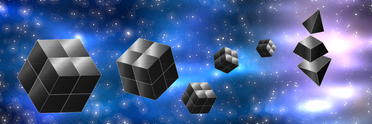
Hey guys how are things going? Just checking back in. @cburgdorf I wanted to let you know that I came up with an idea of a background image for Twitter. For some reason I was thinking a lot about outer space while thinking of the iron cubes and came up with this idea:

As you can see, I included a 3d version of Etherum's logo built out of iron blocks, so the whole idea behind this is that the iron cubes (Fe) are somehow floating through space towards Ethereum and building it.

There seems to be a bug in the bounty UI where it's stuck on "pending verification".

@g-r-a-n-t just wanted to let you know that a couple of days back I was browsing around gitcoin and saw that the bounty's UI is still stuck:

image

Thanks a lot guys! Please let me know your thoughts!

g-r-a-n-t commented 3 years ago

@daniniguez someone else seems to be running into a similar issue and already wrote an issue. I've described what we're seeing in a comment.

https://github.com/gitcoinco/web/issues/7959#issuecomment-735489418

danieliniguezv commented 3 years ago

@daniniguez someone else seems to be running into a similar issue and already wrote an issue. I've described what we're seeing in a comment.

gitcoinco/web#7959 (comment)

Thanks @g-r-a-n-t ! I just checked in, and the issue has been solved πŸ‘πŸ»

image

cburgdorf commented 3 years ago

@daniniguez in case you haven't seen it yet. Your logo looks really nice on the new website: https://fe.ethereum.org/

danieliniguezv commented 3 years ago

hey @cburgdorf !!! nice to hear from you :) it looks amazing!!! love it. so glad i had the opportunity to collaborate with you guys :)

so Fe, up and running?

cburgdorf commented 3 years ago

so Fe, up and running?

Still in alpha but we are aiming for a first non-alpha release this year. I believe 2022 is when we will see first applications to use Fe for real :)

danieliniguezv commented 3 years ago

sweet!!! that's so great to hear! website is pretty cool too. really loved the colors and layout.

i'll for sure be sharing your project with our community/meetup @ethgdl (Ethereum Guadalajara)!